
Building a Passive House: Science, then Art
We wanted the process of creating our new home to be fun, so from the outset we approached the build as a mix of science experiment and art project.
For the structure, this meant utilizing building science research to properly air seal, insulate, and ventilate to ensure that we ended up with a house that’s hopefully durable, stingy with its use of electricity, and that functions well on a daily basis for many years to come.
In terms of design, it meant spending an inordinate amount of time on the floor plan, carefully defining how we would move through and live in the structure, while also carefully considering the seemingly infinite options when it comes to finishes, both for the interior and the exterior of the home (with an emphasis on low or no VOC products to protect indoor air quality) .
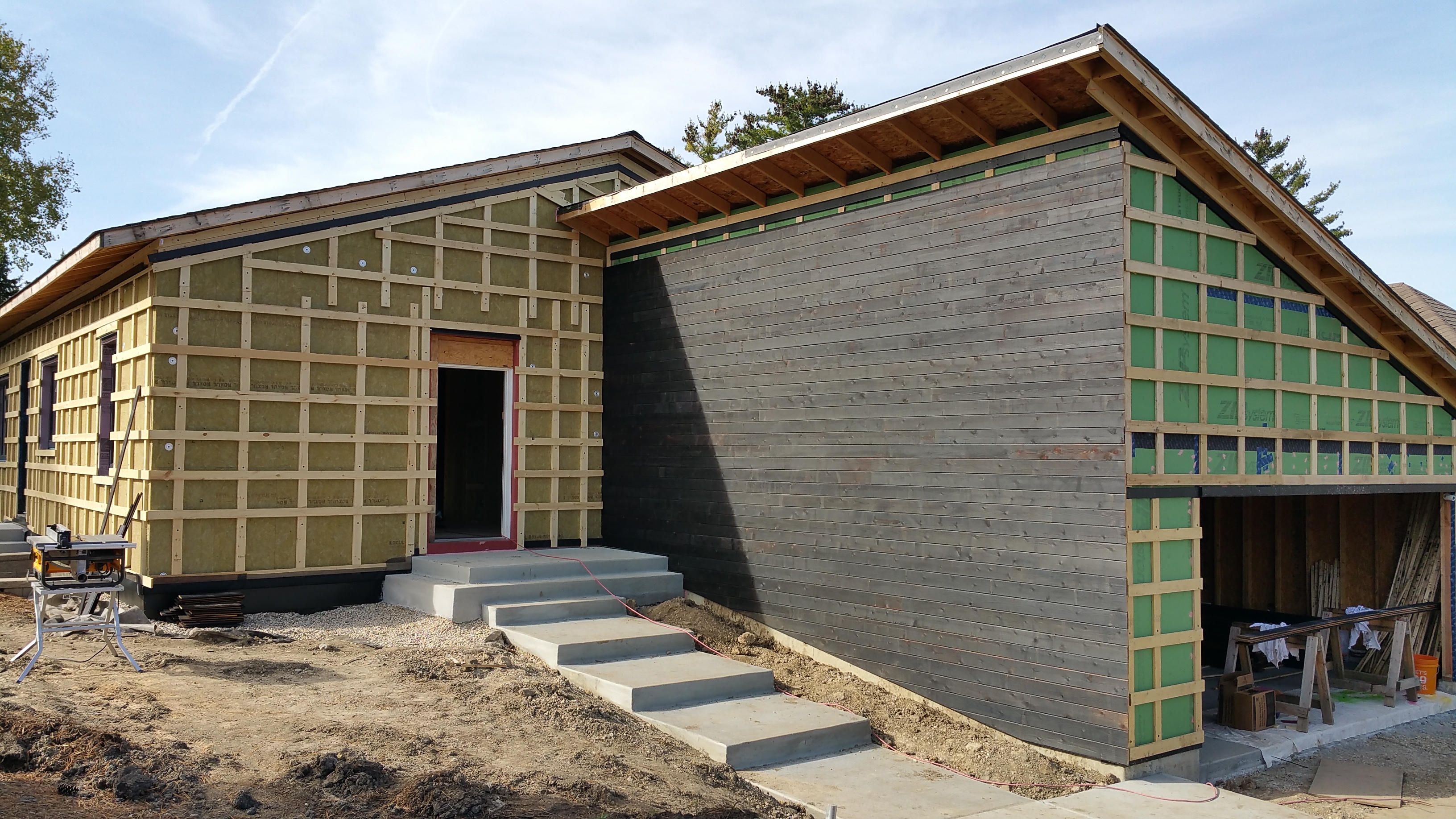
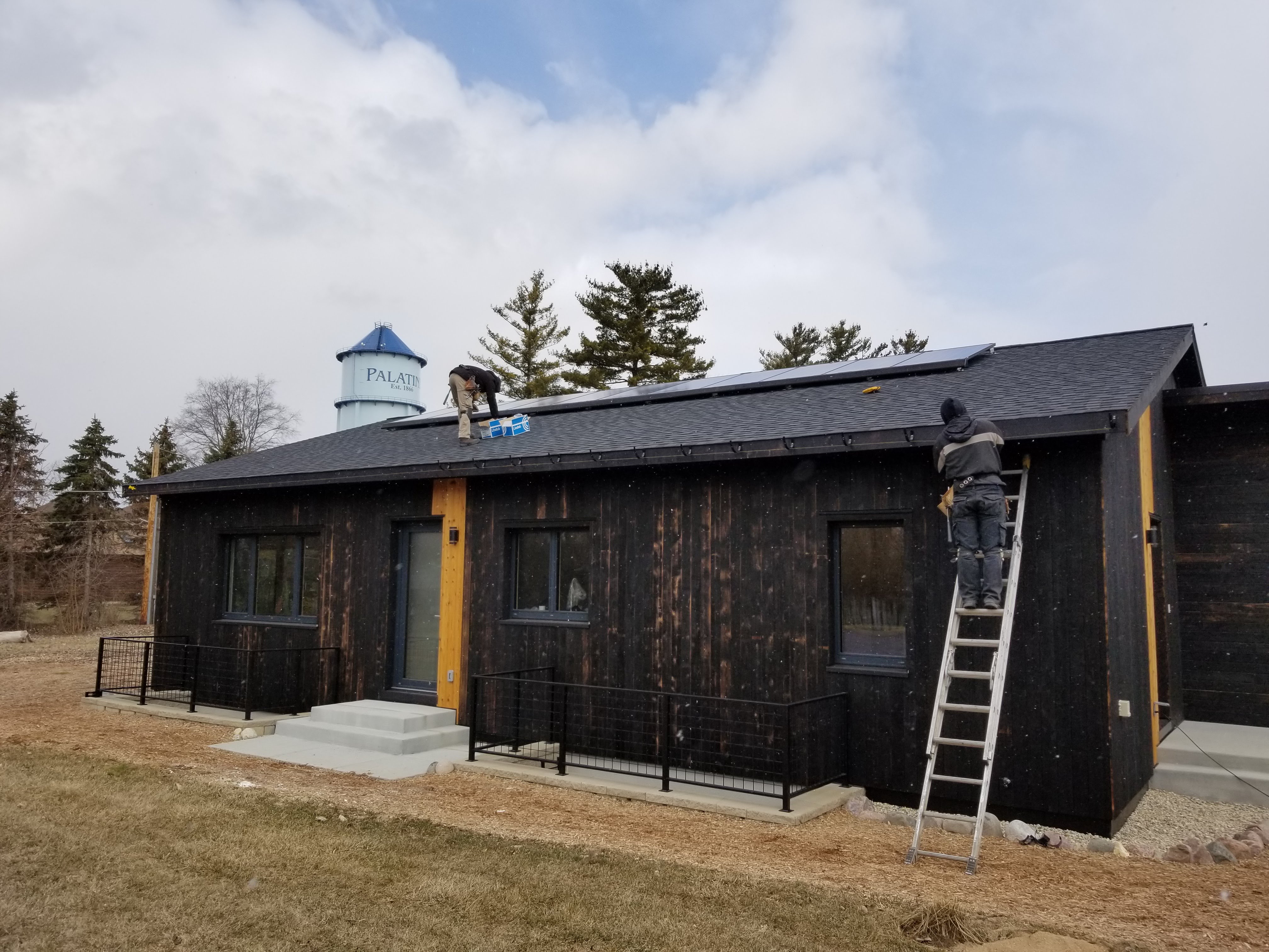
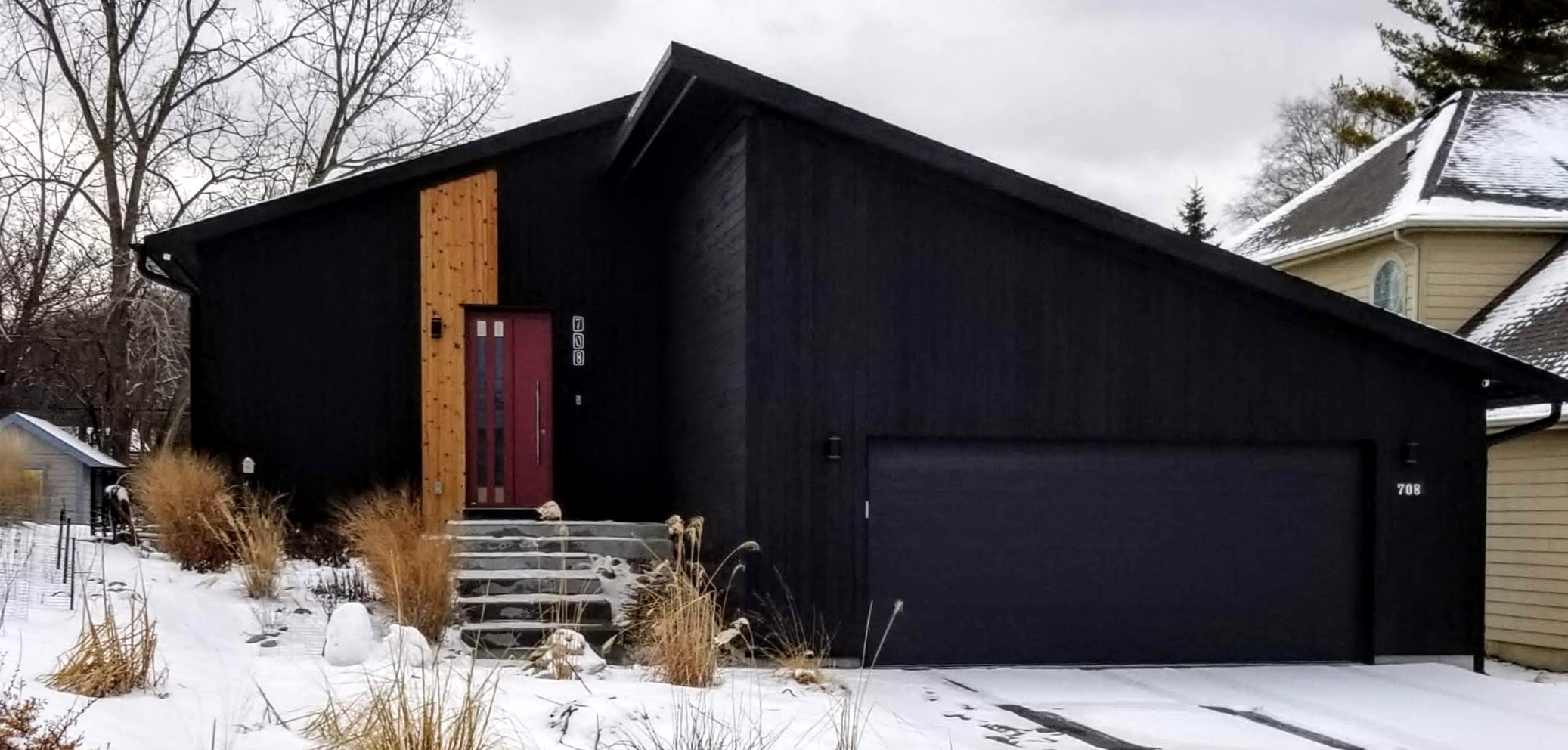
With most of the wall assembly details finally in place on the house, putting up the charred cedar siding represented the first real transition from science to art. And with Passive House details mostly taken care of, we could begin to make decisions in real time regarding how we wanted the house to look, both inside and out, in terms of finishes.
Since our house is relatively small, at least by recent American standards, many of the sins associated with McMansions were easy to avoid (McMansion Hell faces lawsuit).
On a side note, if trends continue, owners of these McMansions may be in for a rude awakening when it comes time to sell:
South Barrington McMansions Languishing
McMansions at Fire-Sale Prices
“… what we see far more often are Luxuriously Appointed Freaks lived in any old how… When a lot of money comes along before culture arrives, we get the phenomenon of the gold telephone… And when I say culture I don’t mean academic knowledge, I mean information: information about what is happening in the world, about the things that make life interesting.”
— Bruno Munari, Design as Art
Affluent Chicago suburbs aren’t alone in facing this dilemma:
McMansions No One Wants
Killing the McMansion
If such reports prove to be accurate, and tastes really are fundamentally changing, perhaps it can be tied to a growing awareness of climate change and its implications. After all, these larger homes tend to be energy hogs, not to mention maintenance nightmares because of poorly planned and executed construction details — in part, a consequence of preferring quantity over quality. Moreover, there’s a growing chorus of voices espousing the benefits of simplicity (e.g., the tiny house movement, or minimalism). This is often wedded to an appreciation for the handmade or artisan object, as opposed to the mass-produced and, typically, homogenous product.
Nevertheless, it seems doubtful that the suburbs will ever be abandoned wholesale, and for any number of reasons.
For more on suburbia, go here: Building in the Suburbs
Massing: Basic Forms
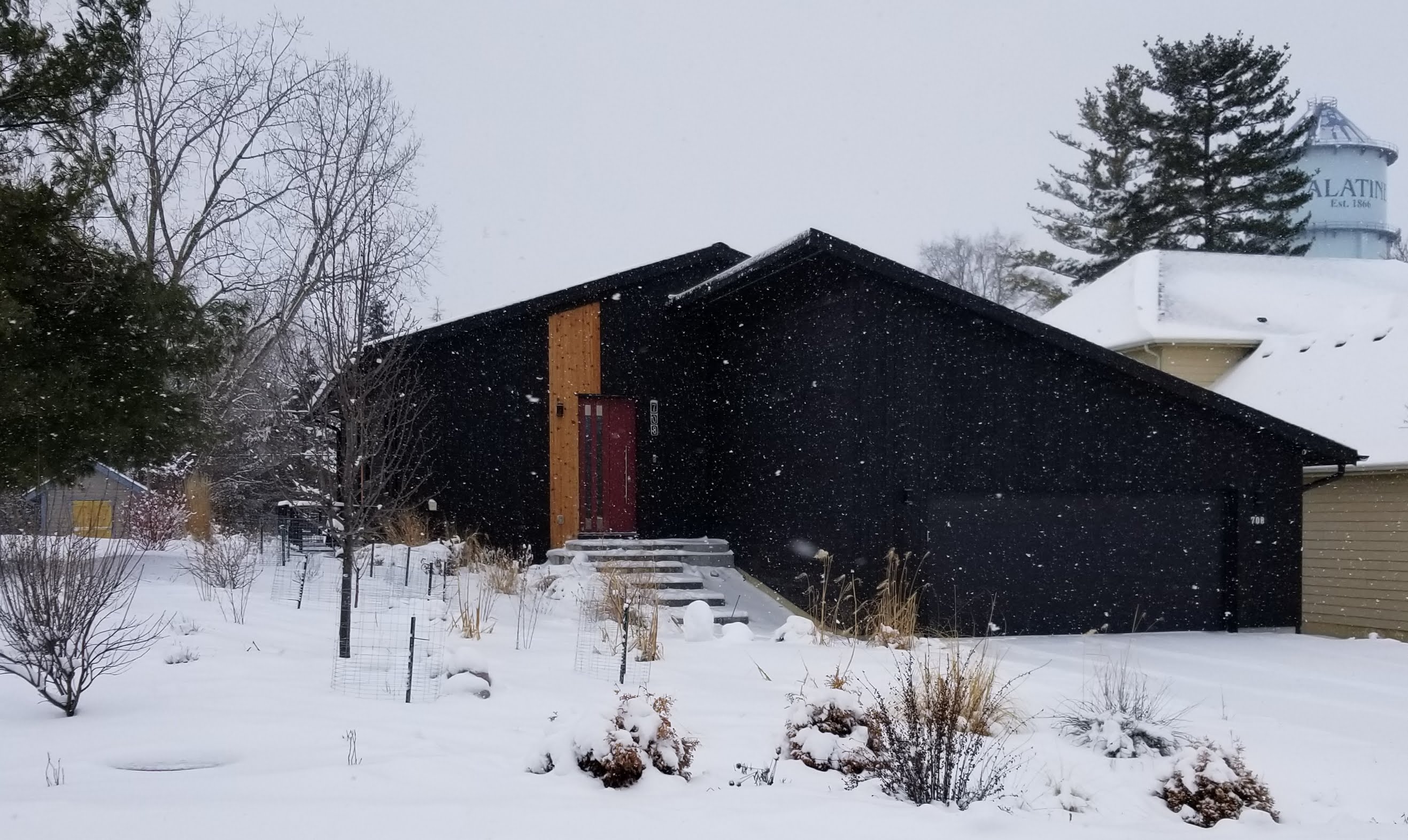
For our house, the structure is a basic rectangular box with a gable roof (long sides face north and south with the gable ends to the east and west). It’s not unlike the basic form most children would come up with if prompted to draw a house. We really like the simplicity of this kind of roof style for aesthetic reasons, but also for the ease of installation and the long-term durability of the roof.
“When we concentrate on the essential elements in design, when we omit all superfluous elements, we find forms become: quiet, comfortable, understandable and, most importantly, long-lasting.”
— Dieter Rams
Bronwyn Barry has even coined a hashtag for this use of very basic forms, #BoxyButBeautiful, especially popular with Passive House design since it can help eliminate potential thermal bridges while making air sealing more straightforward.
We tried to avoid having the garage as part of the front of the house, in particular having the garage door facing the street (a look I’m not fond of), but physical limitations, in terms of the lot itself, left us with little choice in the matter. So rather than repeat the gable roofline of the house, we went with a shed roof for the garage. The shed roof adds some visual interest, while it also ensures that any rainfall in this area immediately gets sent to the north side of the house where we want it — away from the foundation as well as bypassing the driveway altogether (water flows to the north on our street).
We also felt that these two rooflines fit in well with our Urban Rustic design aesthetic. As a mash-up between early 20th century city and farm, both the simple gable and stark shed rooflines would be equally at home in an agricultural setting or on a densely packed inner city block.
In addition, it was important to us to have some fun with color, so on the exterior using black charred cedar with some natural highlights would give us the bold look we were going for, while accent walls inside with bright, playful colors would help bring the interior to life, accompanied by hand-made or hand-selected decorative objects in various bold colors.
When done well, this child-like use of color can lend a space or structure a real sense of vibrant energy.
Already a fan of Jack White’s use of color for album artwork and the staging of live shows for The White Stripes, I appreciated the way he chose to decorate the exterior of his Third Man Records in Nashville. A form that was as basic as it gets — single story brick warehouse — becomes vivid and hard to miss, in a good way, with a splash of color on what would otherwise be a monochromatic black box. The “insert” around the front door, offering a little shelter with some nice shadow lines, along with the crisp signage finish off what is a clean, sleek, but still playful, look.

He’s done something similar with the interiors, in this case for the Detroit store:
Siding Layout for our Charred Cedar (Shou Sugi Ban)
Since we were building custom, rather than working within the constraints of tract housing in a larger subdivision (as we did with our first house) where many of the design choices are already made for you, we knew we wanted to take some chances in terms of materials and layout.
It also helps that we’re in a neighborhood with mixed architectural styles, including single-family homes and townhomes, with structures and exteriors running the gamut between old and new, as well as traditional and contemporary. We felt like this gave us more latitude to try something different without upsetting the overall look of the neighborhood.
With a smaller structure and only two basic rooflines, we knew any experimentation or design risk was going to have to occur at the level of siding materials and their orientation.
Knowing its weaknesses, I never imagined using wood for any part of the exterior of my house should the day come when I could build my own home. Brick, stone, metal, any number of man-made products (e.g. PVC or Boral), all seemed like the smarter way to go to avoid maintenance headaches and costly repairs. I assumed we’d end up using Hardie plank siding, or one of their paneling configurations, or maybe even some kind of metal product.
But then I came across charred cedar, or shou sugi ban.
It’s hard to remember now exactly where I saw it for the first time since it would’ve been before 2015 probably, but I think it was a Dwell magazine profile of Terunobu Fujimori’s work. I may have even first seen the same architect featured in Philip Jodidio’s book Architecture Now! (HOUSES, volume 1). Regardless, once seen, it was hard to forget.
When we first began working with our initial builder, Evolutionary Home Builders, I brought them some rudimentary drawings I had done, expressing our desire to try something creative and out of the ordinary, especially in terms of siding layout.

Instead, their architect, Patrick Danaher, came back with an extremely conservative layout, one that’s fairly omnipresent when looking at single story ranch homes in the Chicago area.

Our use of charred cedar would have been the one change from what is typically a combination of brick or stone on the bottom 2/3 of a wall with painted or stained wood up above, usually with a limestone ledge in-between to visually and physically separate the two materials.

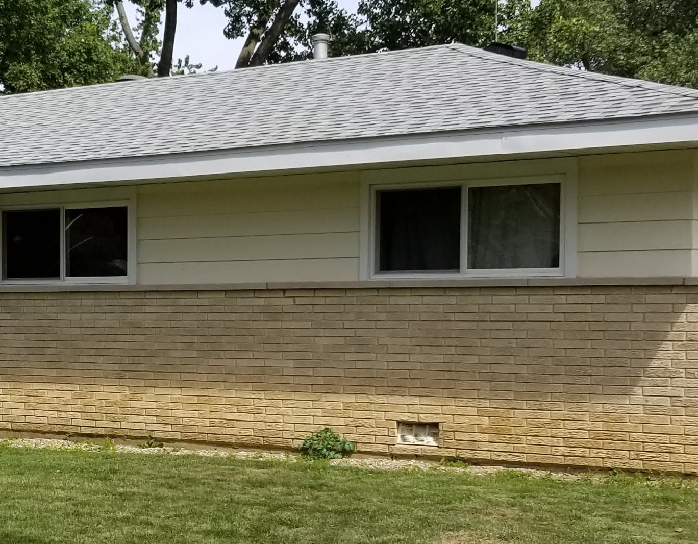
The photos above are included not to disparage this look, which I actually like, but to give specific examples from our area of this traditional layout; one that’s seen on probably thousands of homes in just the Chicago area alone. Although attractive, I couldn’t help but feel that this layout was a cliched repeat of what’s already been done countless times before, which, nevertheless, would’ve been entirely appropriate had we been asking for a more traditional look.
Instead, it was pretty shocking to get their initial drawings since I had clearly expressed our willingness to think outside the box in order to experiment with something unique and fun, even avant-garde (or, at the very least, contemporary). The fact that Brandon Weiss (the owner) and Eric Barton (chief field officer) were also in these design meetings and they, too, had nothing to offer on this point did not seem to bode well for our project.
Initially I lacked the confidence to argue against Patrick’s suggested layout (they’re supposed to be the experts, right?). I just assumed my ideas were simply too bizarre to work. Over time, particularly as I saw how they did things with a lack of care and a lack of attention to detail (see below), combined with looking around online and seeing how other projects experimented with unique siding layouts, I eventually realized there was no reason not to try something bolder and more well thought-out.
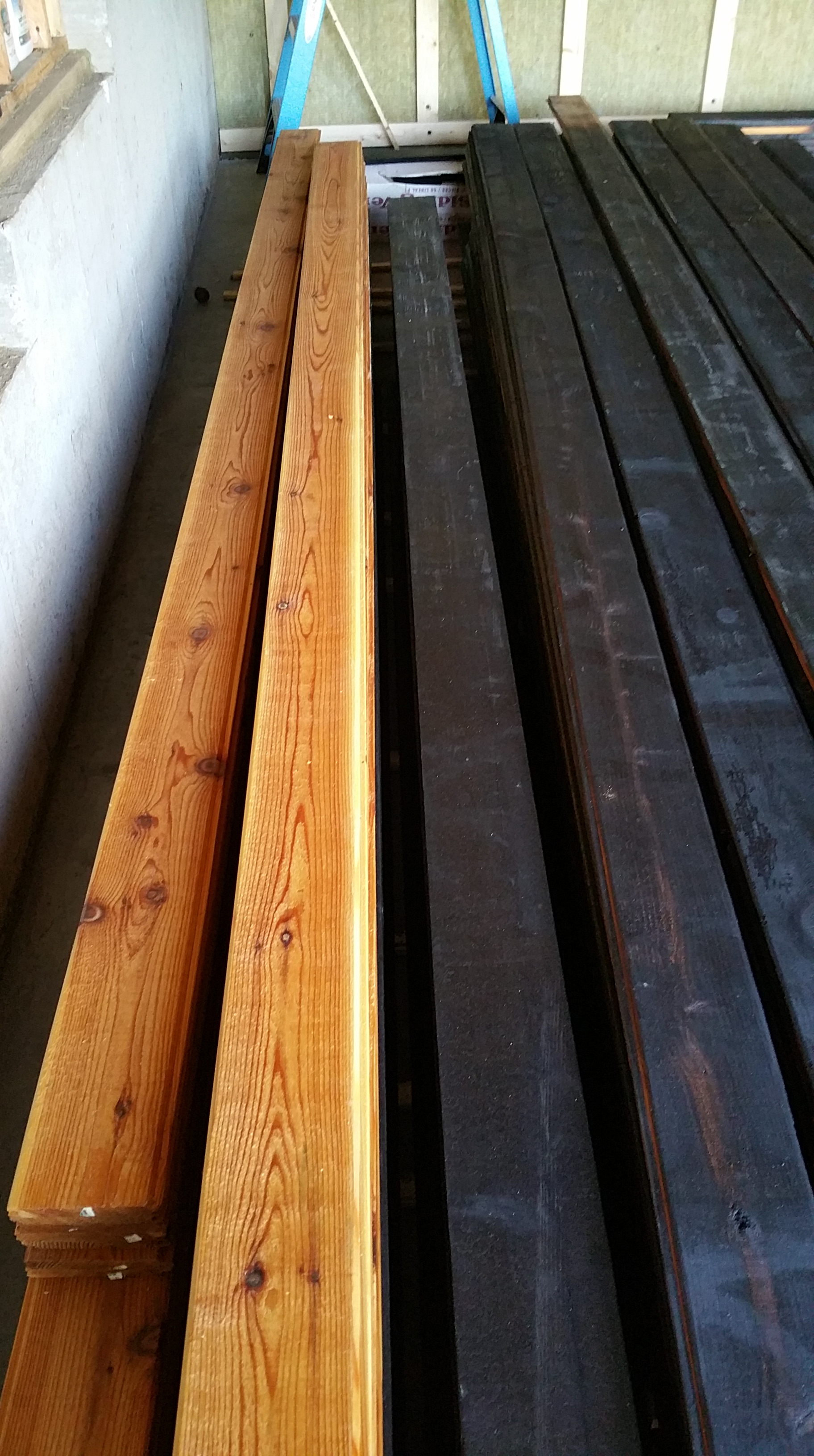
In the meantime, I put together a fairly large sample board, mixing the charred cedar with the natural cedar mostly in accordance with their initial suggested layout:

This sample board, although attractive, confirmed a couple of things I was worried about:
First, the layout was way too traditional looking, even with the charred cedar.
Second, this amount of natural cedar around the house would be a pain to maintain over the years, costing me significant time and energy, if not money (the maintenance labor would be DIY), probably requiring a fresh coat of tung oil at least every other year, if not annually. Since we wanted a natural look, any kind of traditional spar varnish, or other shiny clear-coat, didn’t seem appropriate. Although one option, open to us even now, is to just let the tung oil break down and let the natural boards turn gray over time (although it can be a somewhat unpredictable process).
Finally, since we felt the charred wood next to the natural was visually so electric, I thought it best to limit the combination to try and heighten the effect.

In the end, Patrick’s suggested layout struck me as rather staid and uninspired (if not, to put it bluntly, half-assed).
On a side note, we didn’t have much luck with the three or four architects we came across during our build. They seemed mostly disinterested when they weren’t outright lazy. See the floating toilet in our initial drawings:
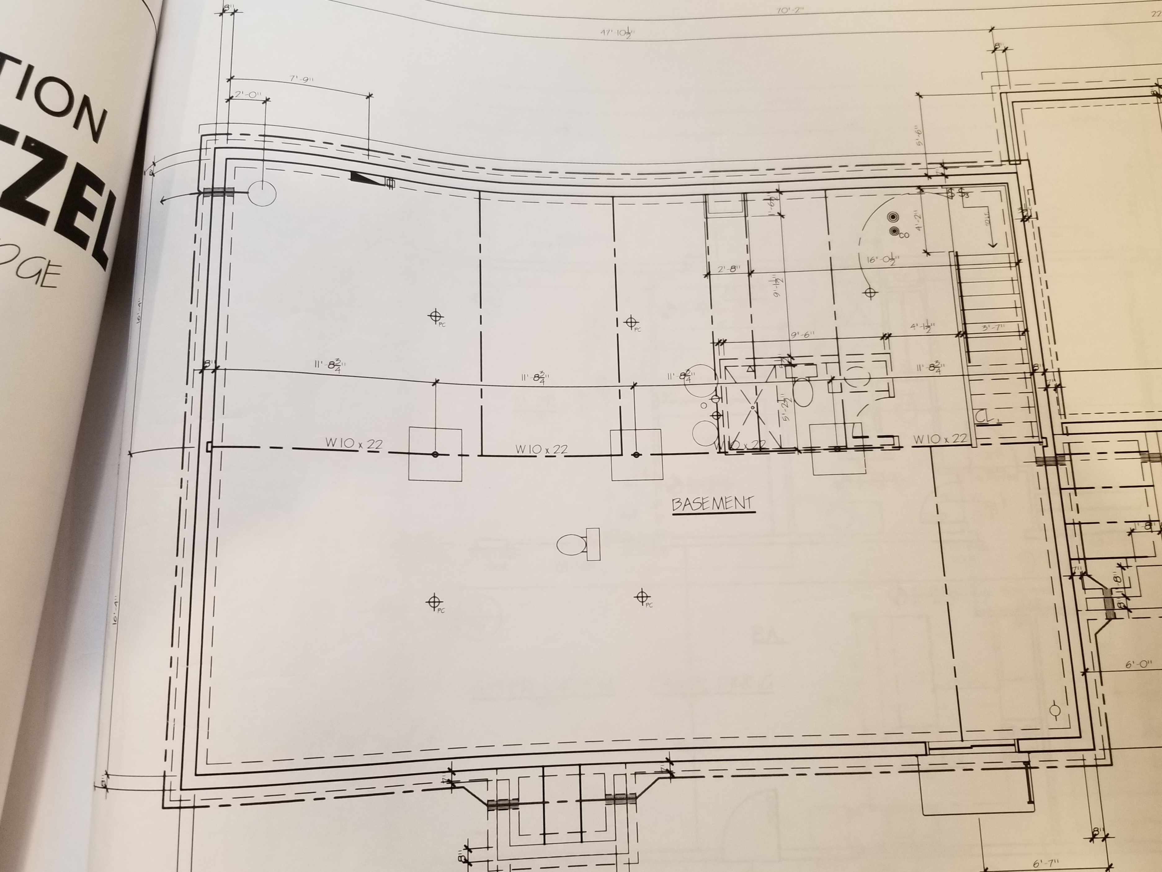
No one — not the architect of record, not Patrick, not even Brandon the owner — could be bothered to give the drawings even a cursory edit/revision before handing them over to us. This certainly planted the seed, along with their generally disordered style of communication, that all was not well regarding the level of care, or even interest, our project was going to receive from them for the duration of the build.
I guess the situation could’ve been even worse:
Unfortunately, the issues we had in establishing our siding layout were emblematic of our overall experience building a new house, whether it was with architects, general contractors, or some (but certainly not all) of our subcontractors: we were shocked by the overall lack of integrity, curiosity, and workmanship.
Far too often it felt like rather than having partners in an exciting process we were actually being held back by people who didn’t seem to really enjoy what they did for a living. Making matters still worse, not only did they seem bored, but the work itself was often mediocre when it wasn’t clearly incompetent.
Unfortunately, even acting as our own GC didn’t help matters, since a competent GC with a long track record has had the time to develop relationships with subcontractors he or she can trust to deliver in terms of schedule and craftsmanship.
I keep coming back to these issues in multiple blog posts mainly as a warning to others who are considering pursuing their own self-build (or even hiring a general contractor to do the work for them), encouraging them to have realistic expectations and to better understand just what they’re up against when it comes to the construction industry — particularly if they wish to try anything new or different.
At any rate, with the decision made to use the charred cedar, we went ahead and prepped the wood before construction began. You can read about the details here:
Cedar Siding Delivered…
Oiling Charred Cedar Siding
Installing the Charred Cedar
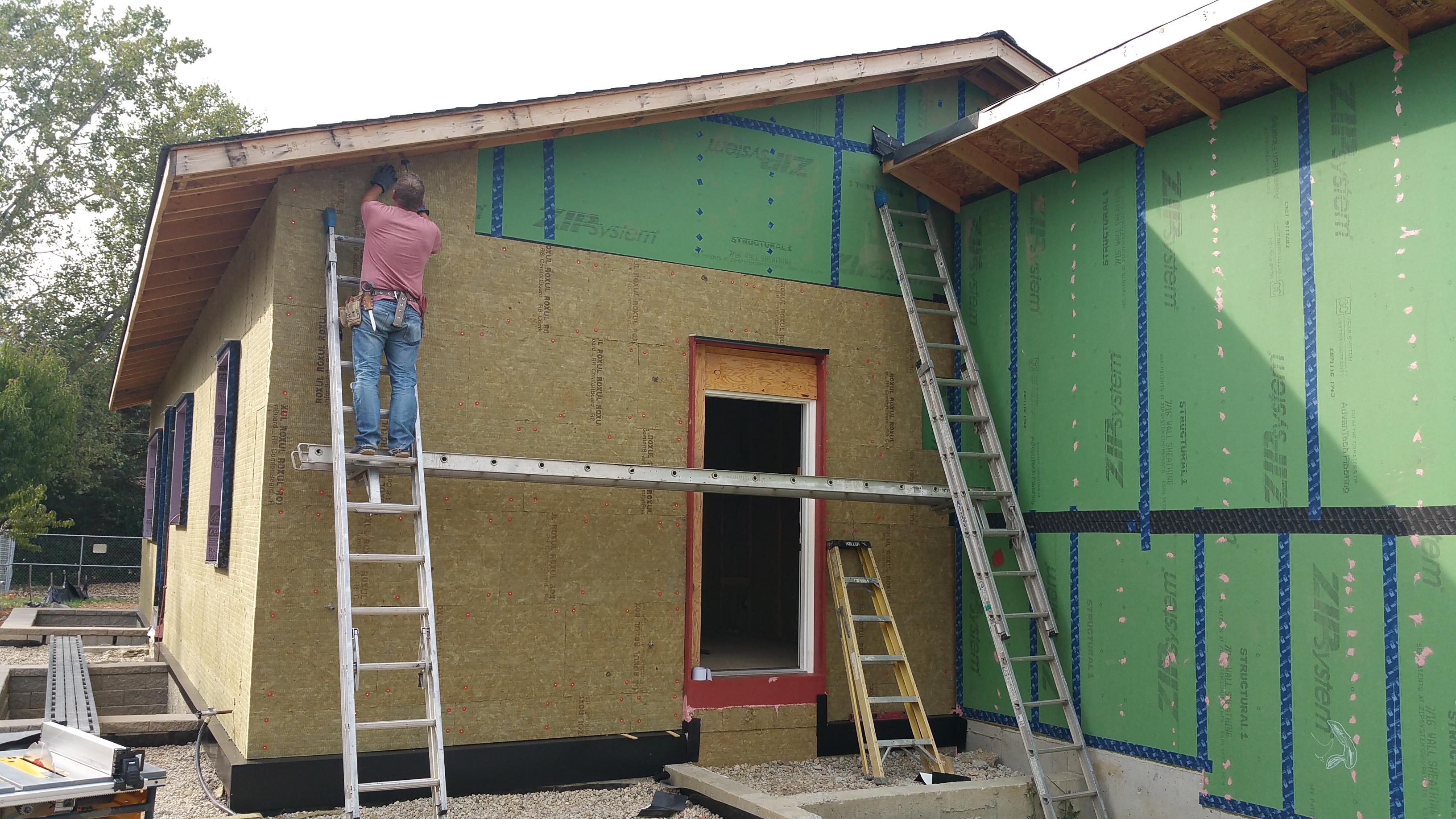
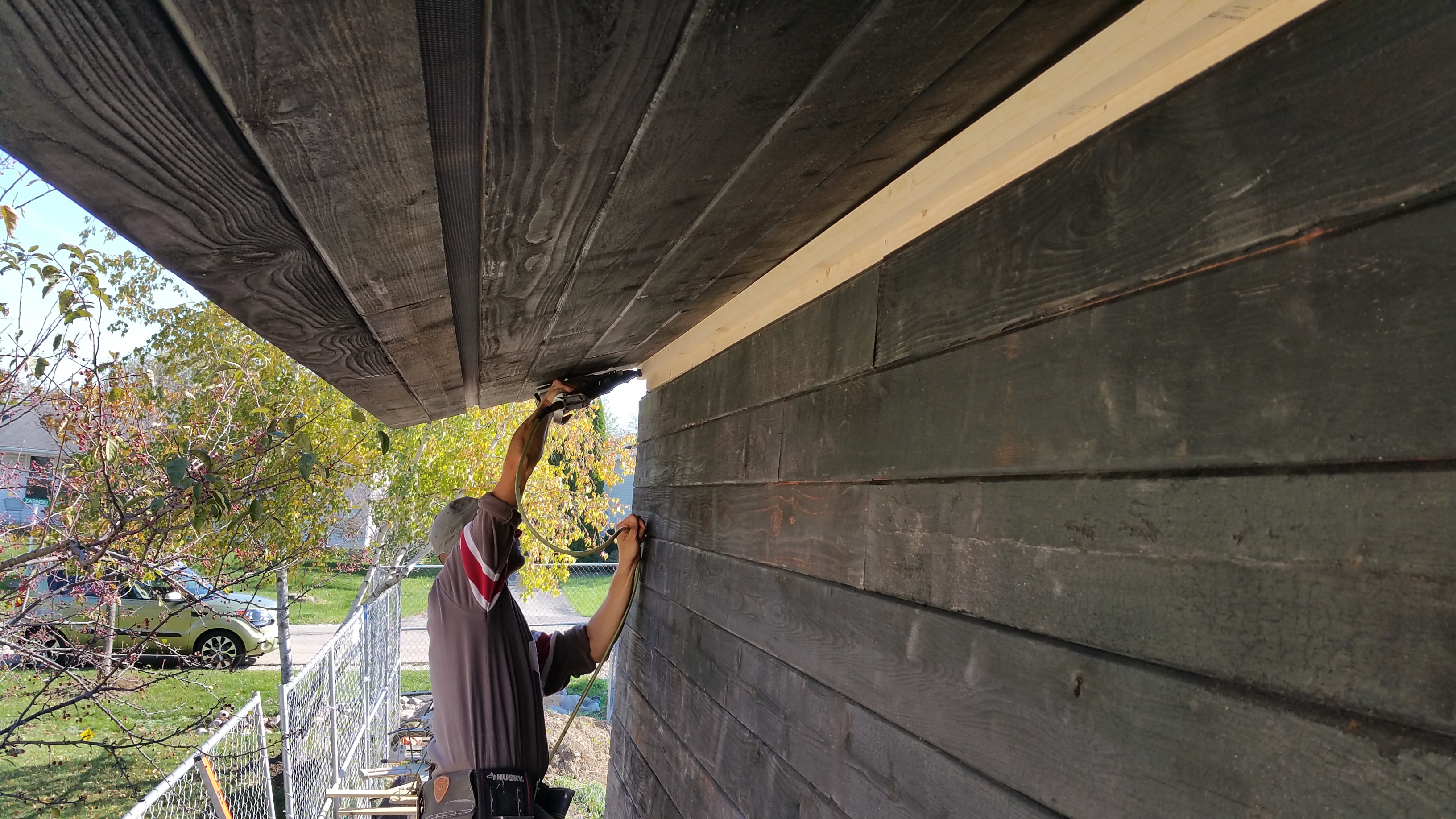
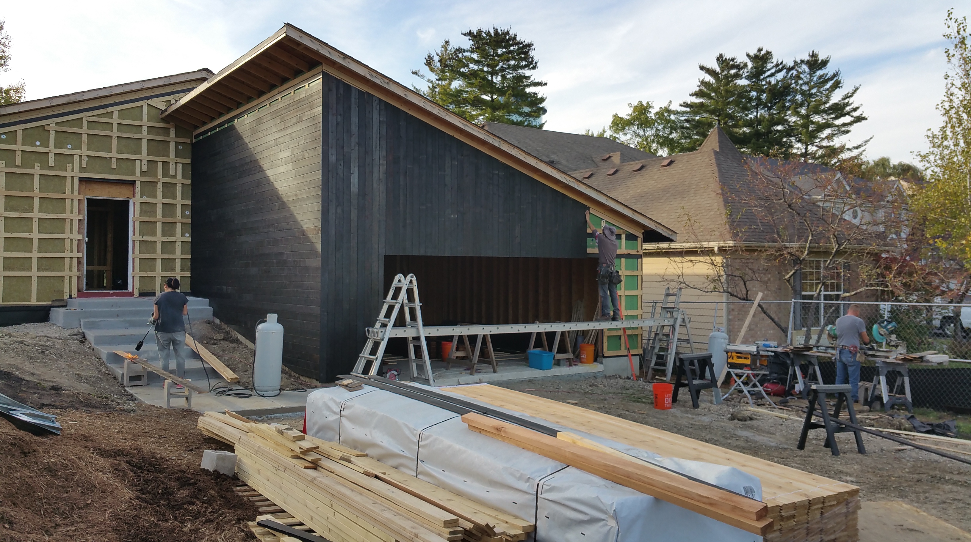
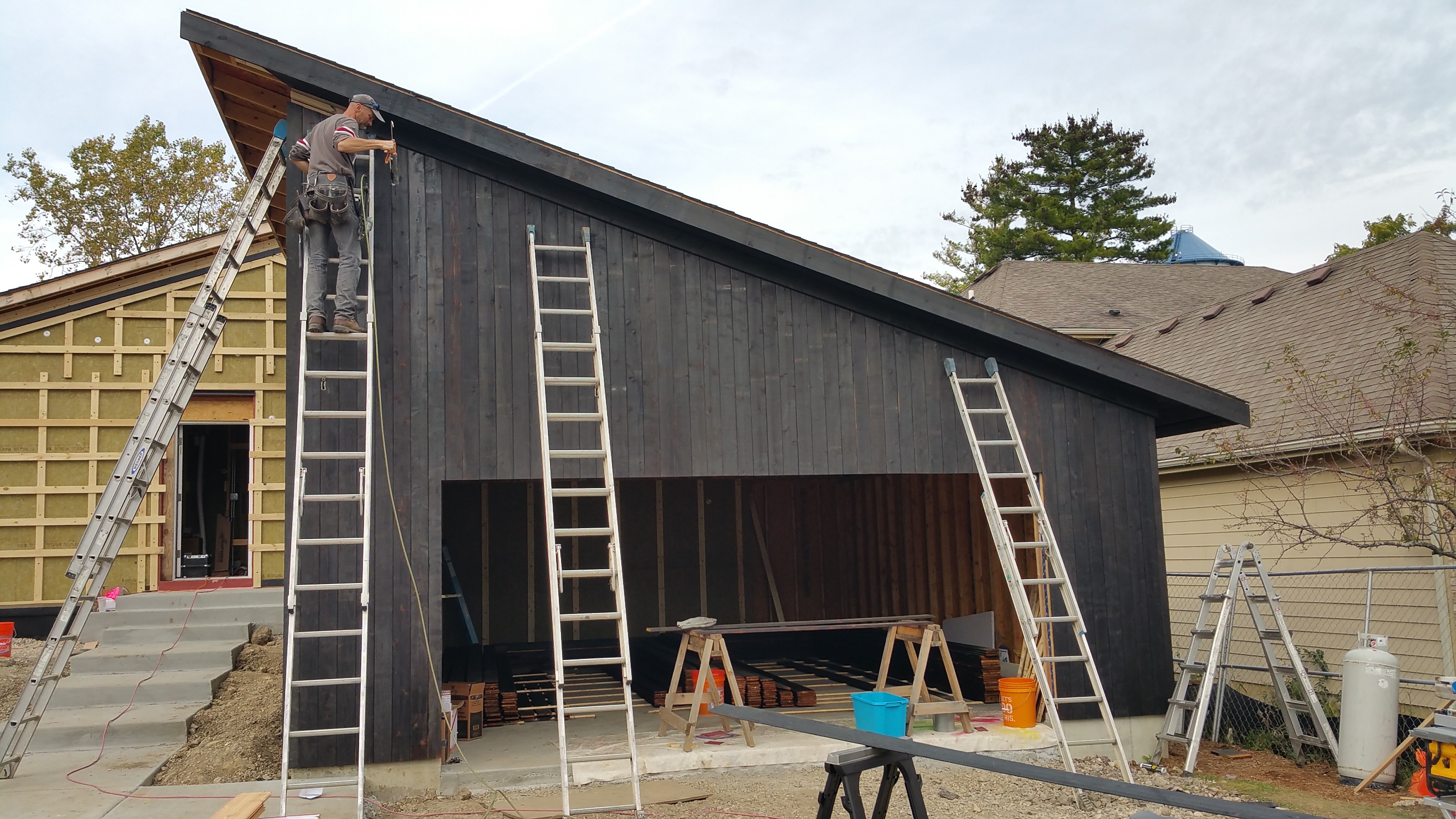
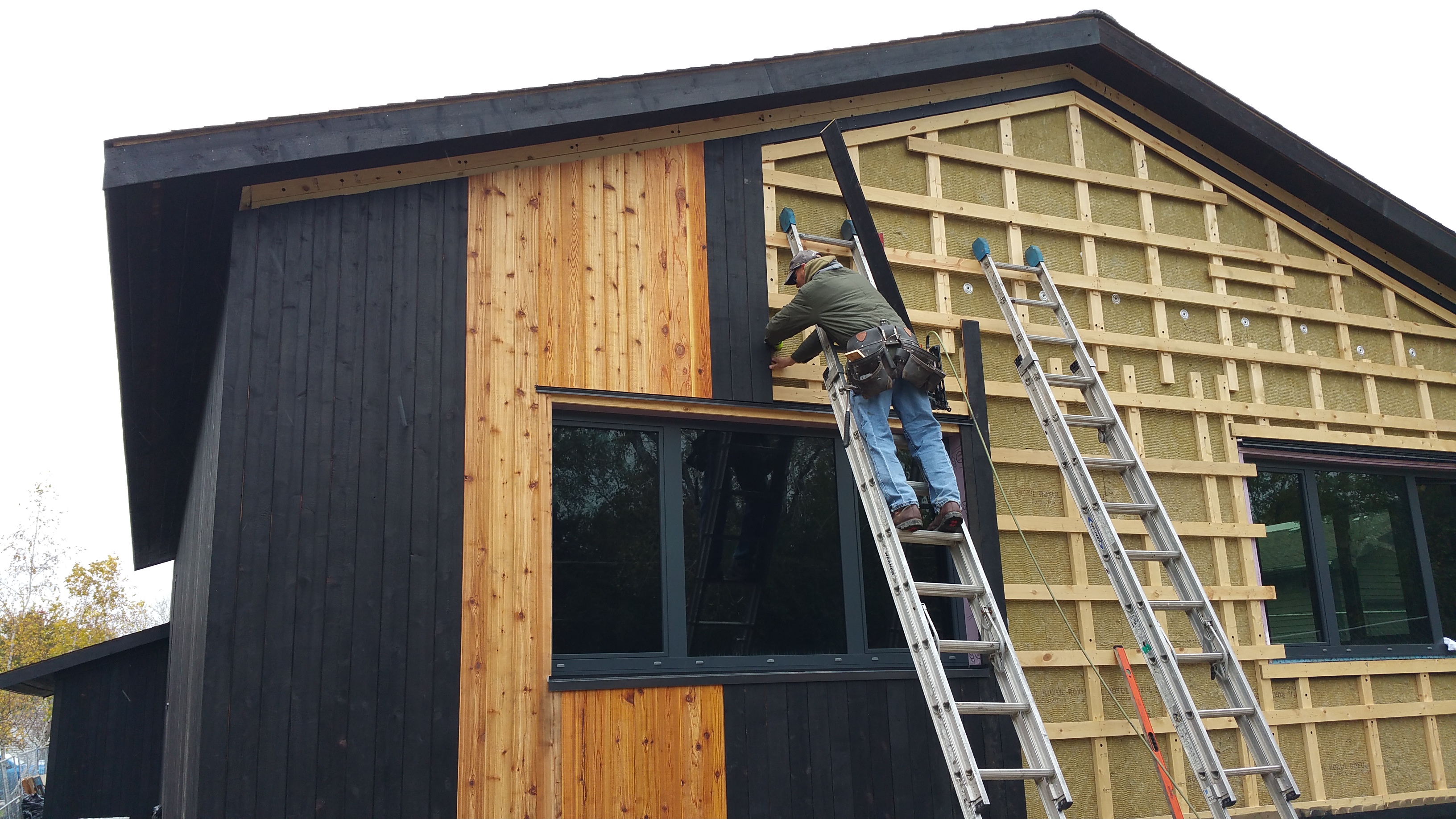
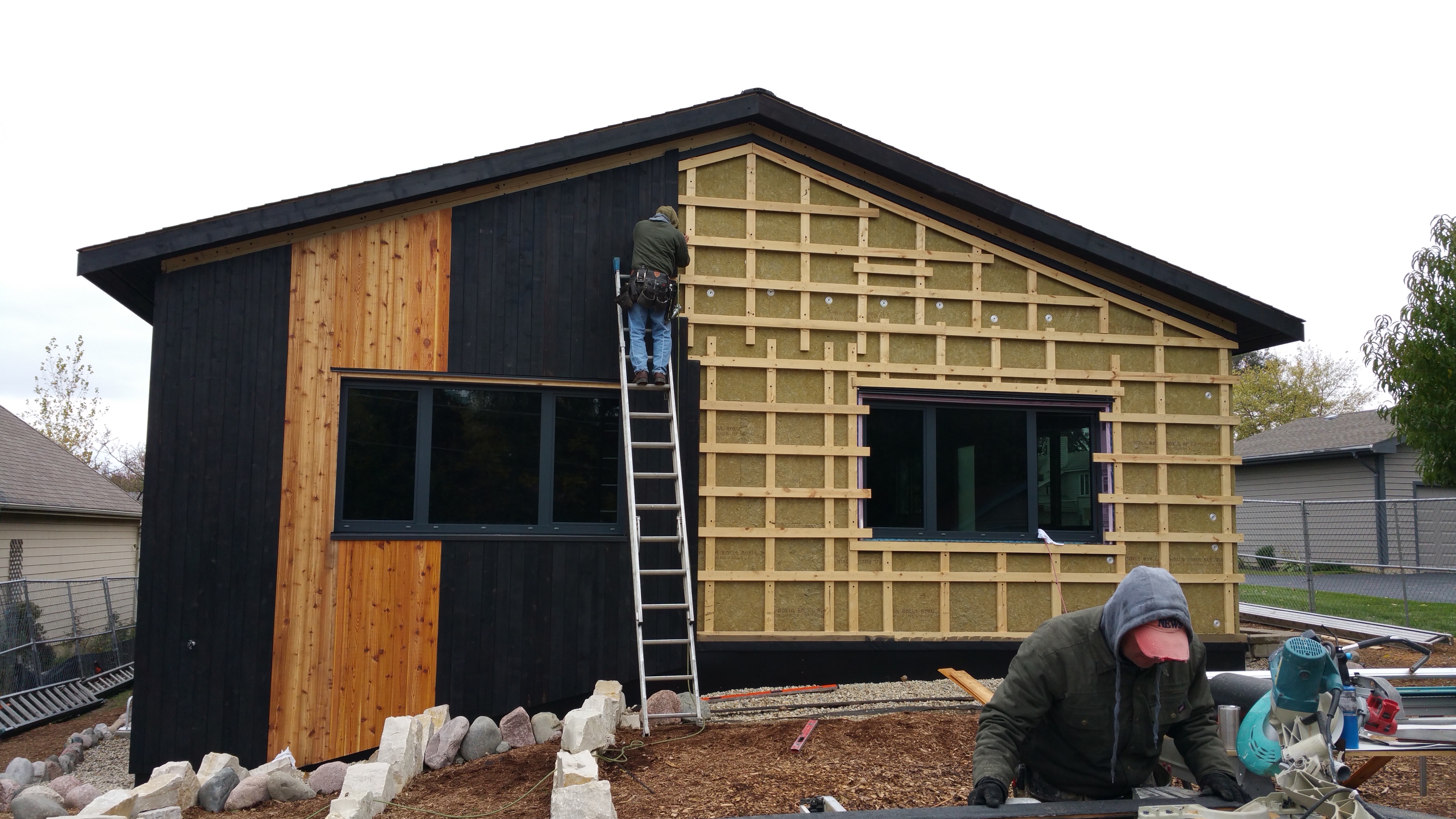
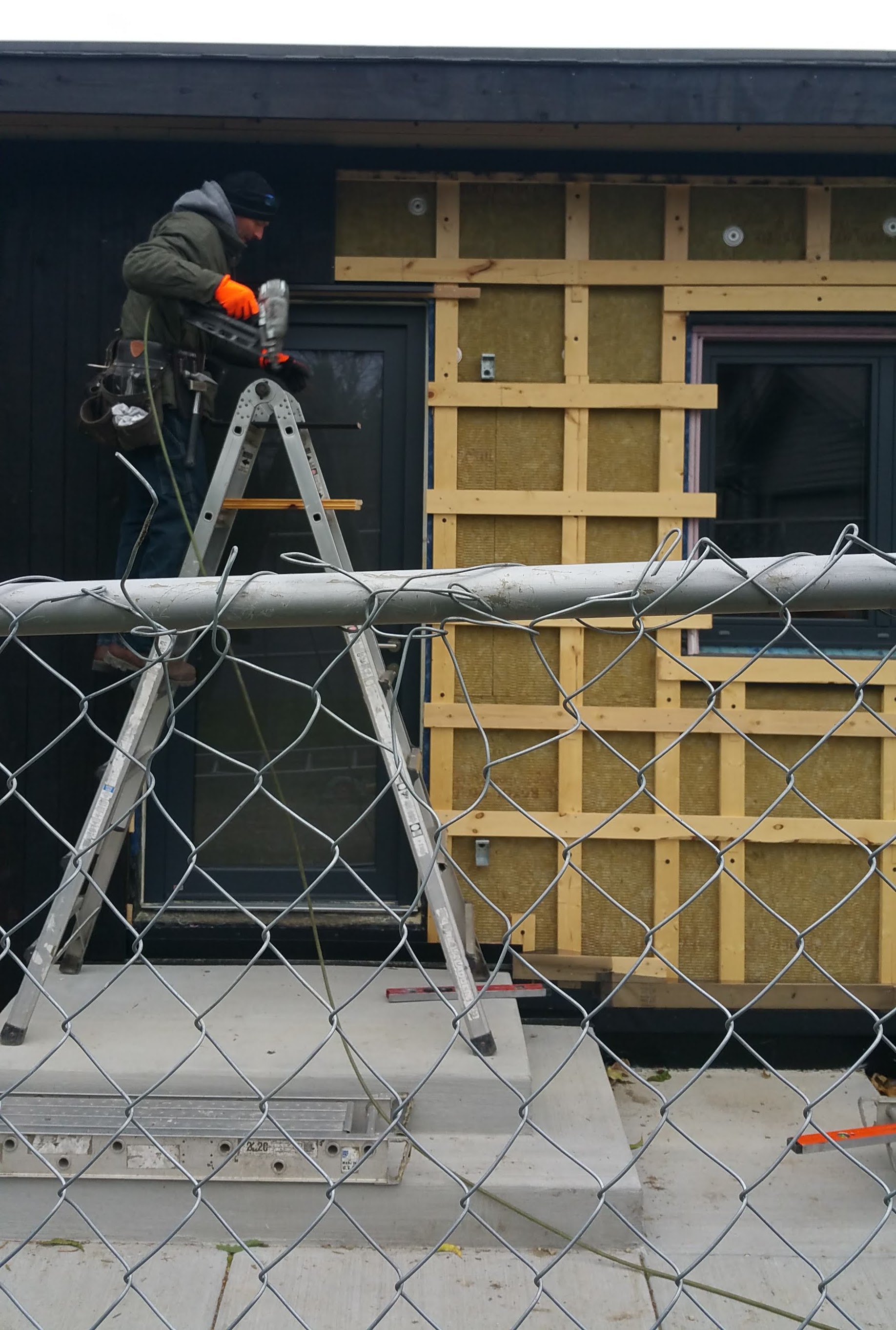
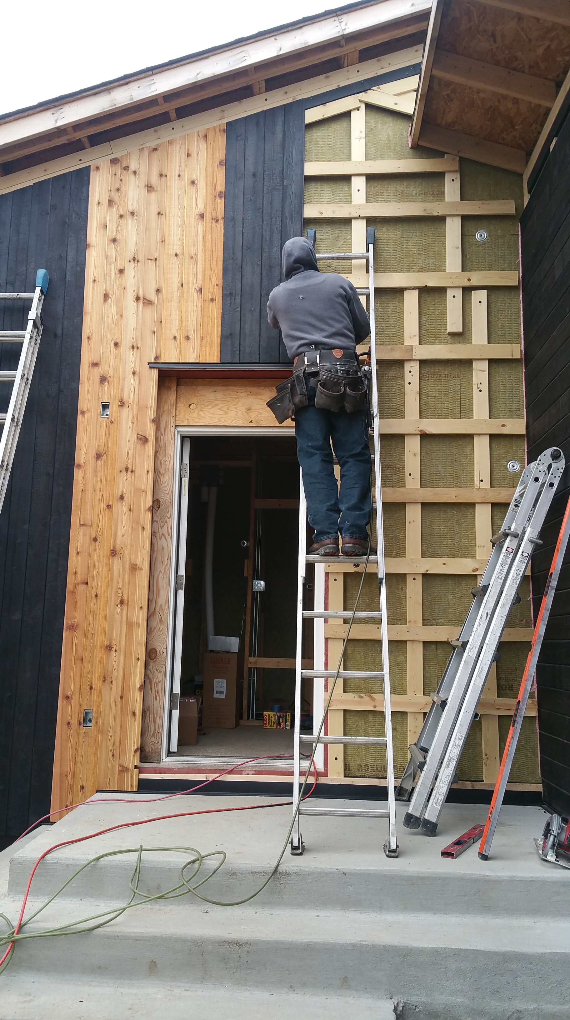
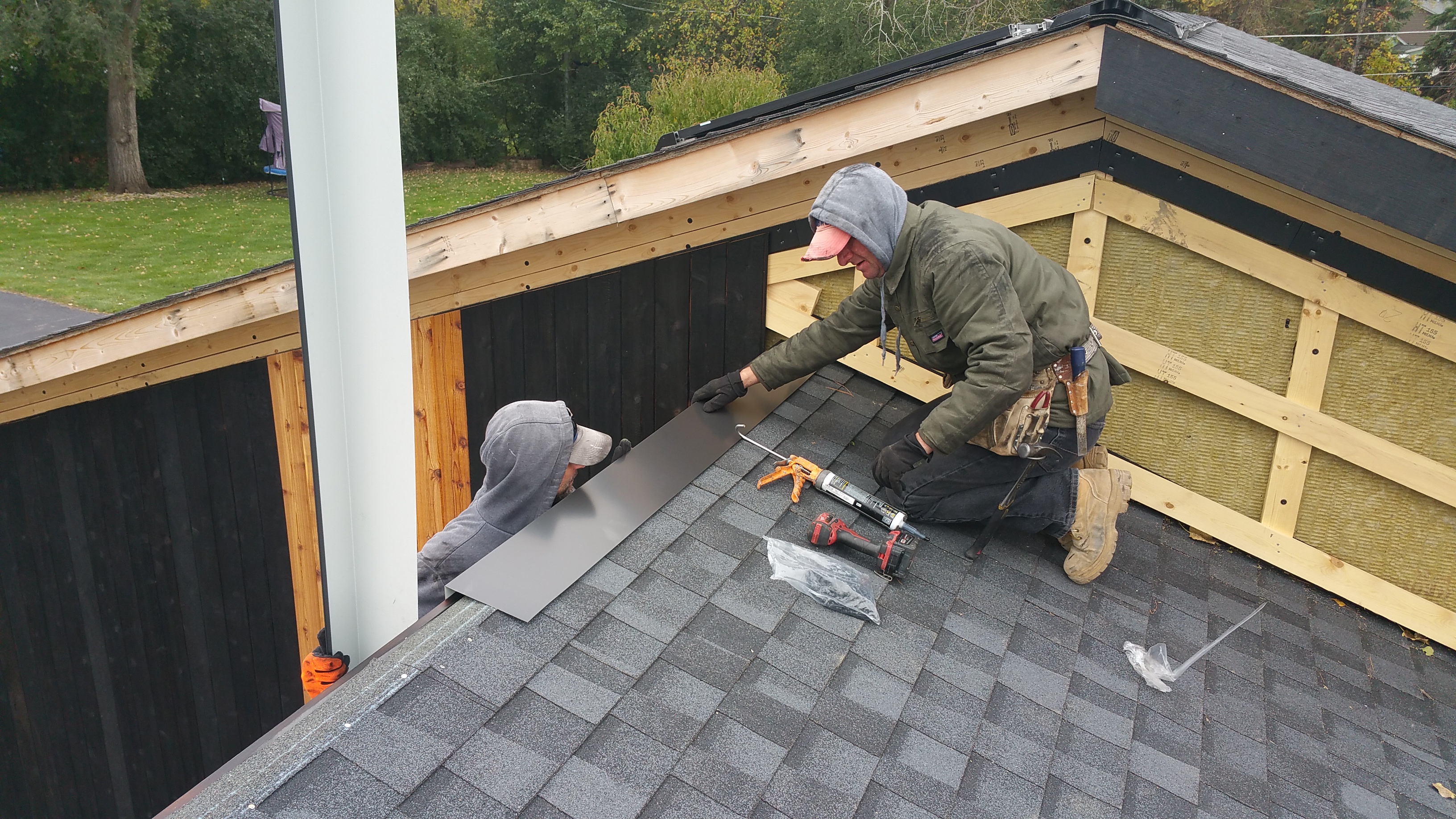
With all of the components of our wall assembly in place, Wojtek and Mark finally started installing the charred cedar on the house, beginning with the garage. This was easily one of the most exciting moments of the build.
I think Wojtek and Mark were secretly excited, too, if only because they were finally finished with all of the insulation and layers of strapping.
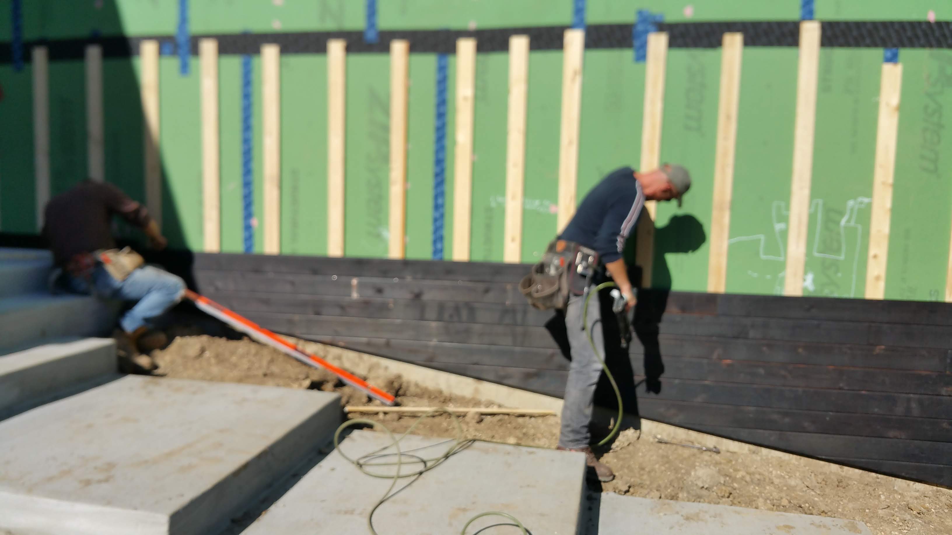
It was more than a little exciting to see the first pieces going up, especially considering how far off-track our project had gotten early on.

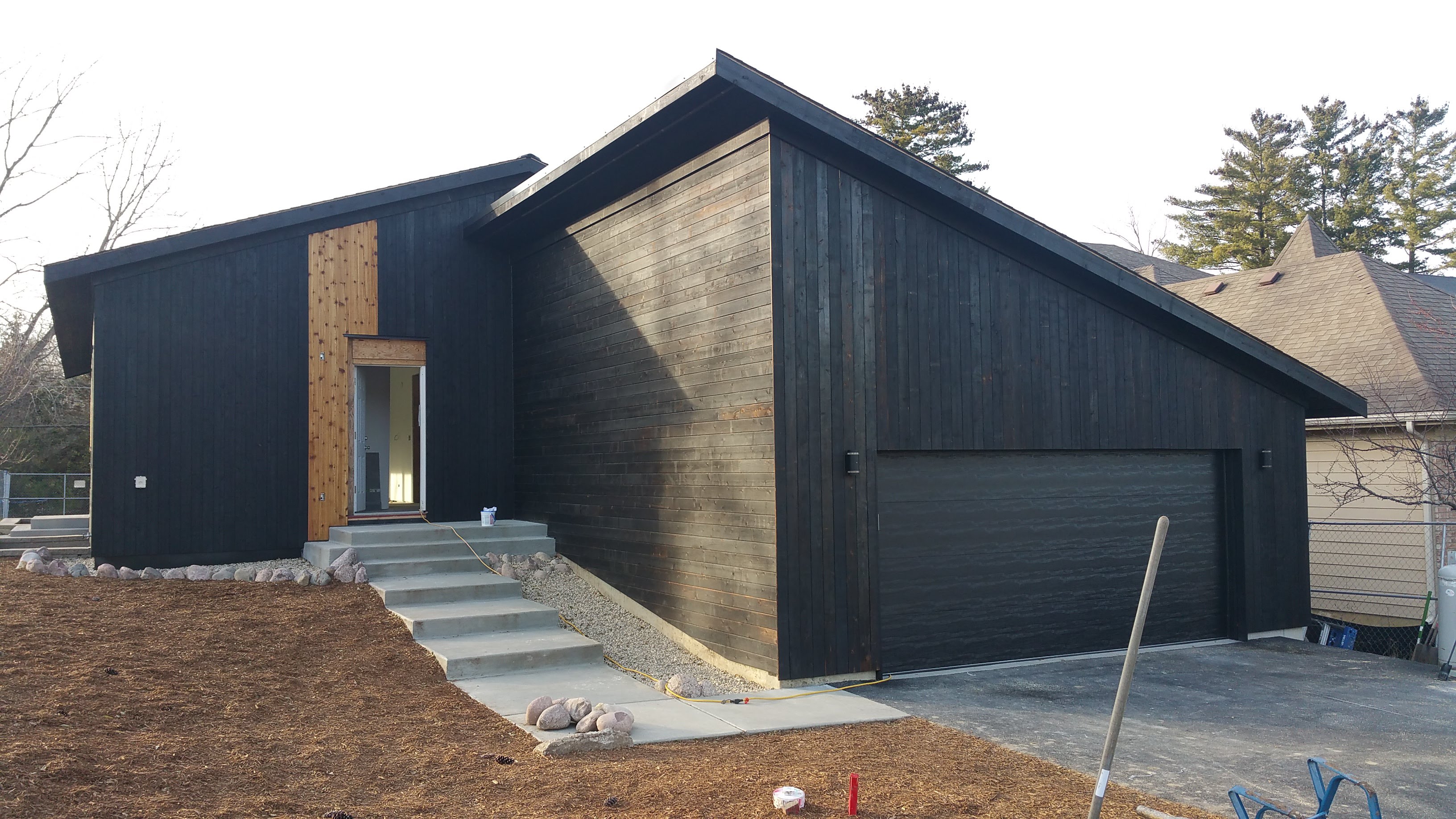
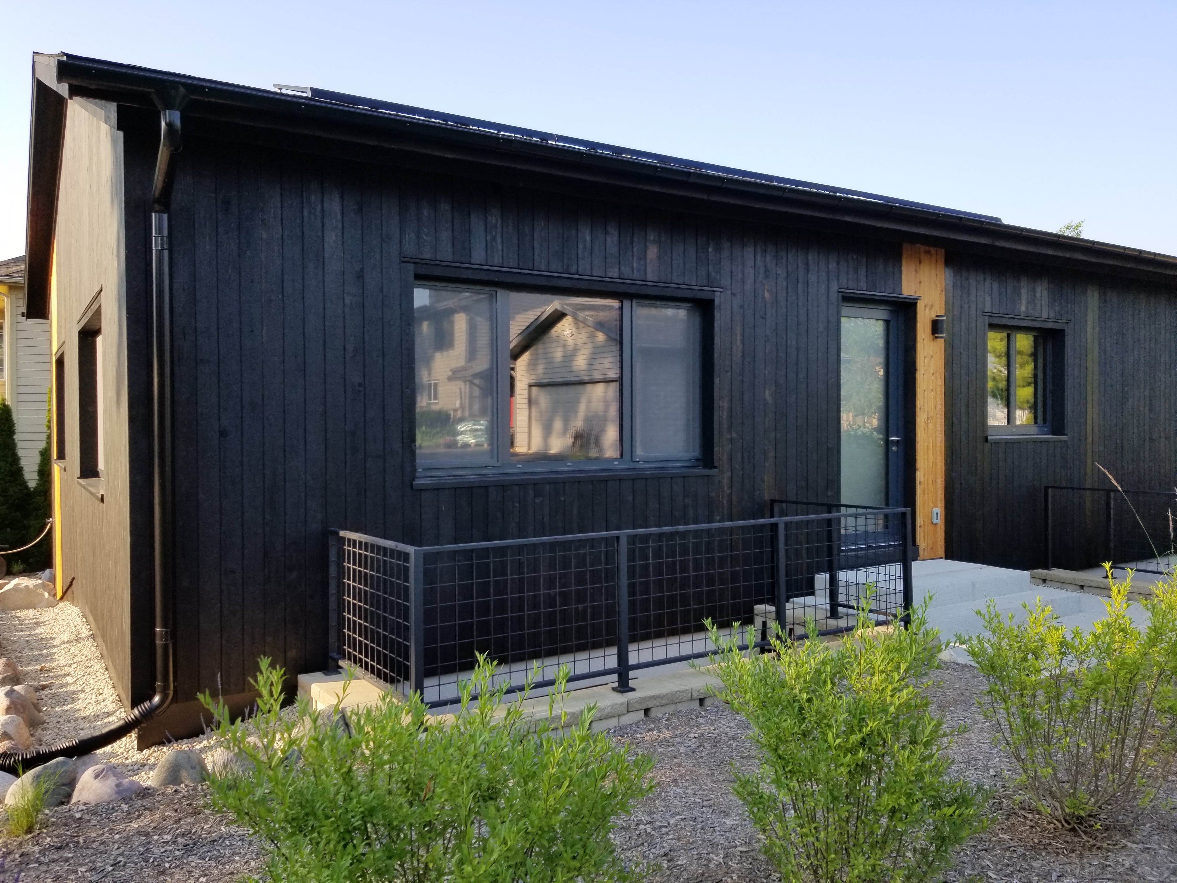
With no choice but to have the garage thrust forward and so prominent on our front elevation, we just had to make the best of the situation. One way of addressing it was to shake up the orientation of the charred cedar. Since the house itself was going to be all vertical (we just find it more visually interesting), it made sense to change the north and south sides of the garage to horizontal.

In doing so, on the south side by the front porch this horizontal orientation would draw in the viewer’s attention, hopefully pointing it towards the front door of the house. Even as you walk up the front steps this horizontal orientation, I would argue, does its subtle magic fairly well. At the street, or out in the front yard, this effect seems to work even better.

In mixing the siding’s orientation in this way it also helps to show what the material can do visually. Lastly, having these two sides of the garage oriented horizontally should also emphasize that this portion of the structure serves a different function (i.e., garage vs. house).
After having the charred cedar hidden away in storage for so long, it was extremely rewarding to finally see it going up.
It was nice to see that it was every bit as beautiful and interesting to look at as we had initially thought while making it.
In keeping with our Urban Rustic aesthetic, the charred cedar — which would look just as good on a farmhouse or outbuilding as it would on an early 20th century artisan workshop or small factory warehouse — also represents our desire to bring in elements that reflect the Japanese notion of wabi-sabi.
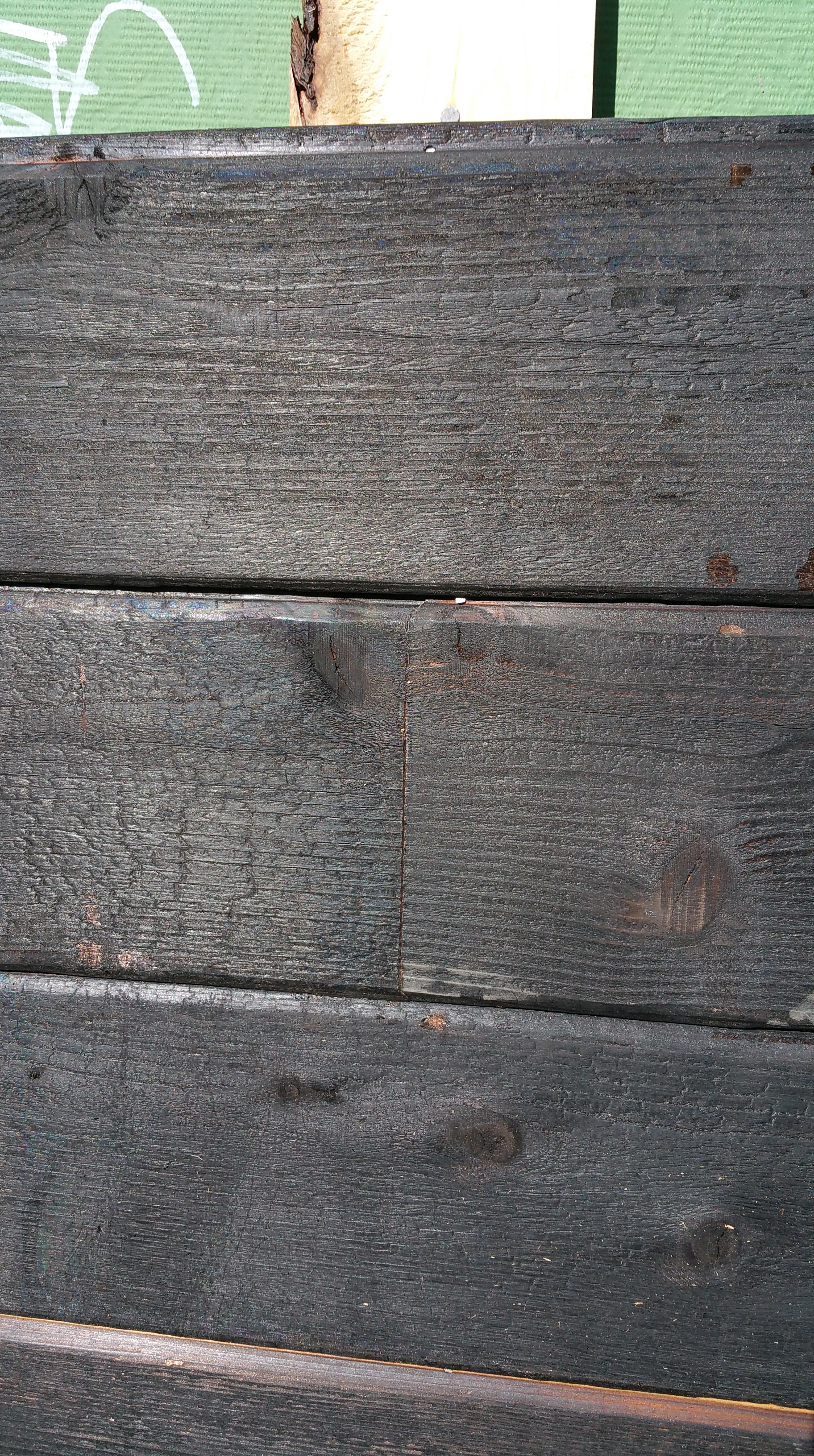
For example, stressing the wood with fire instantly gives it an aged appearance, and the amount of variation also makes clear it’s a natural material, as opposed to an industrial product manufactured to meet narrow and precise tolerances, with the goal being absolute uniformity. Whether it’s the knots, the lighter or heavier areas of char, some areas of natural cedar peeking through, or the ‘oil stain’ marks, the charred cedar emphasizes and celebrates imperfections and inconsistencies in the wood, sometimes to great effect even within a single piece — to the point where the most singular board catches your eye and you can’t help but linger over it. Instead of being annoyed by difference, the charred cedar actually encourages you to go looking for the most unique boards.
Following installation guidelines, Wojtek and Mark used only stainless steel nails to attach all of the cedar siding.


With the south side of the garage mostly complete, Wojtek and Mark could move on to the north side.
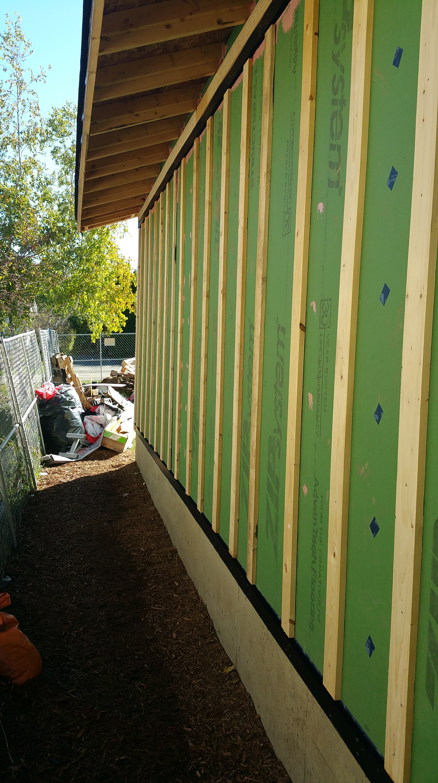

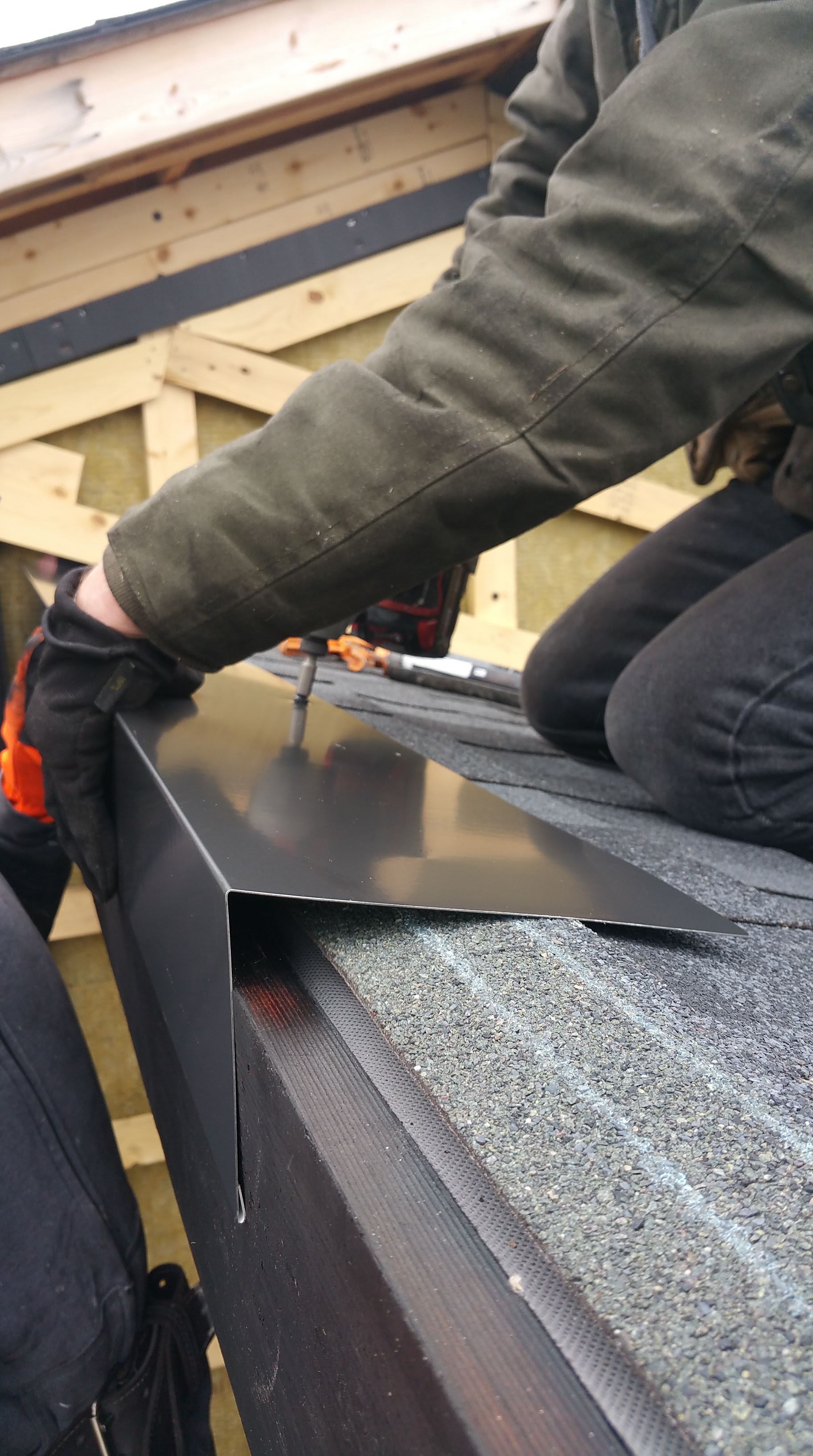
For the soffits, we were initially going to use another Cor-A-Vent product, their PS-400 Strip Vent to complete our ‘cold’ roof assemblies, which on the house already included a ridge vent.
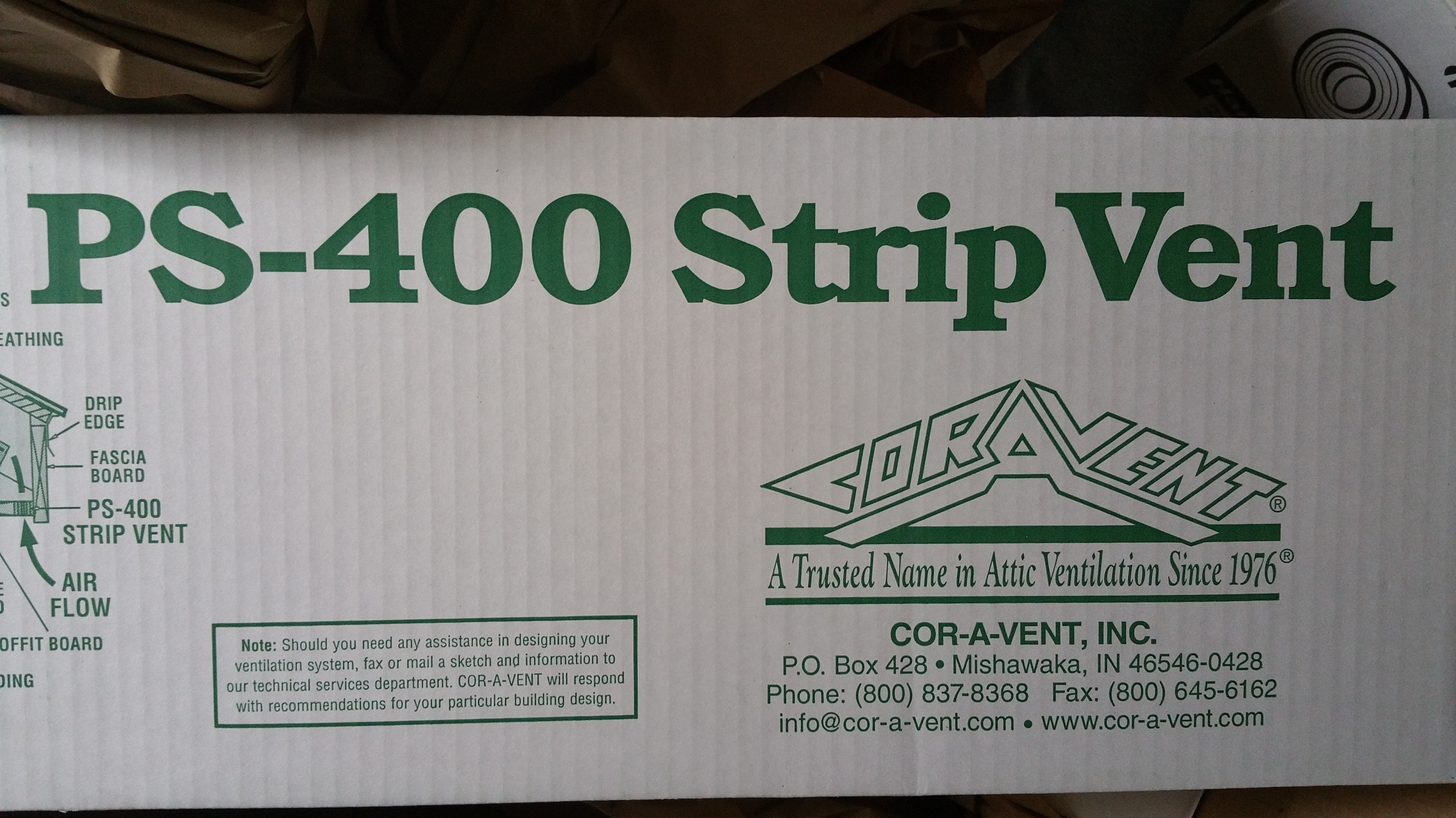
But after opening the box and really taking a look at the product, they just seemed really flimsy. I’m sure they work fine, but holding them in your hand doesn’t exactly breed confidence. Also, seeing Wojtek’s stink face as he carefully studied a couple of pieces only confirmed that we needed another option.
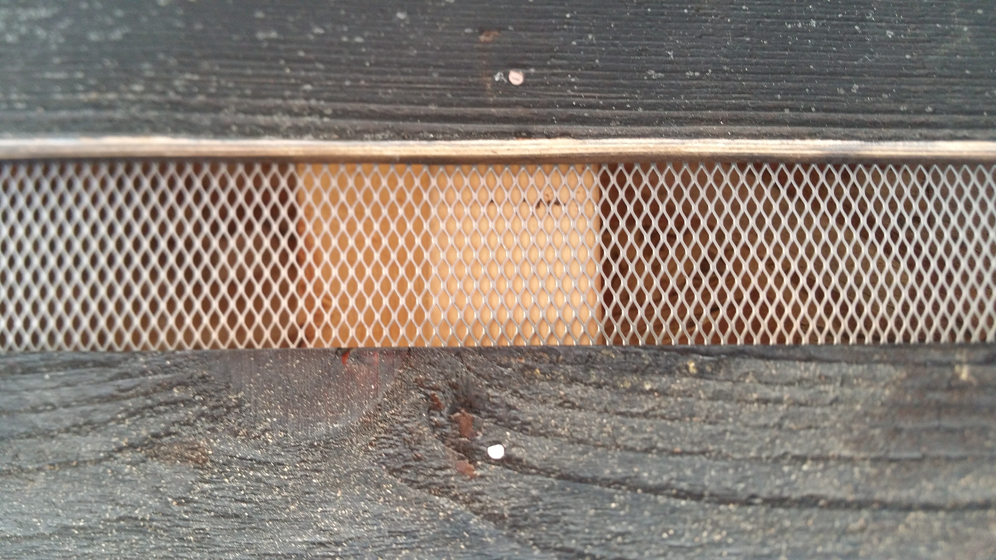
After looking around online, I ended up finding a product at a local Home Depot — Kwikmesh, a galvanized all-purpose metal mesh on a roll.

Not only did the Kwikmesh appear more substantial, I thought it would look better with the charred cedar than the PS-400, making for a nice contrast with the wood. I also really liked how it revealed some of the structure through the mesh for a more raw, unfinished look — again, in keeping with our Urban Rustic design goals.
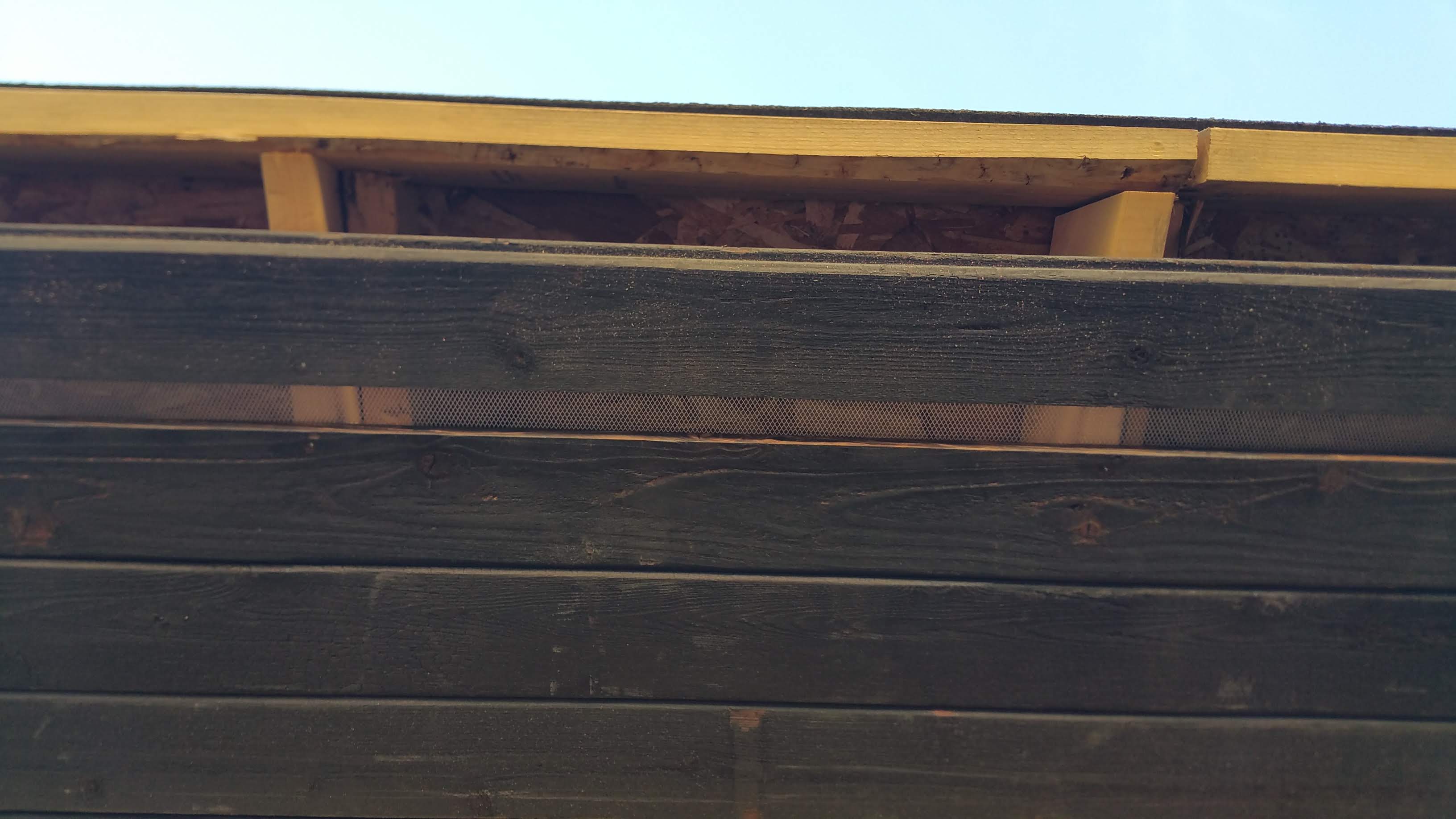
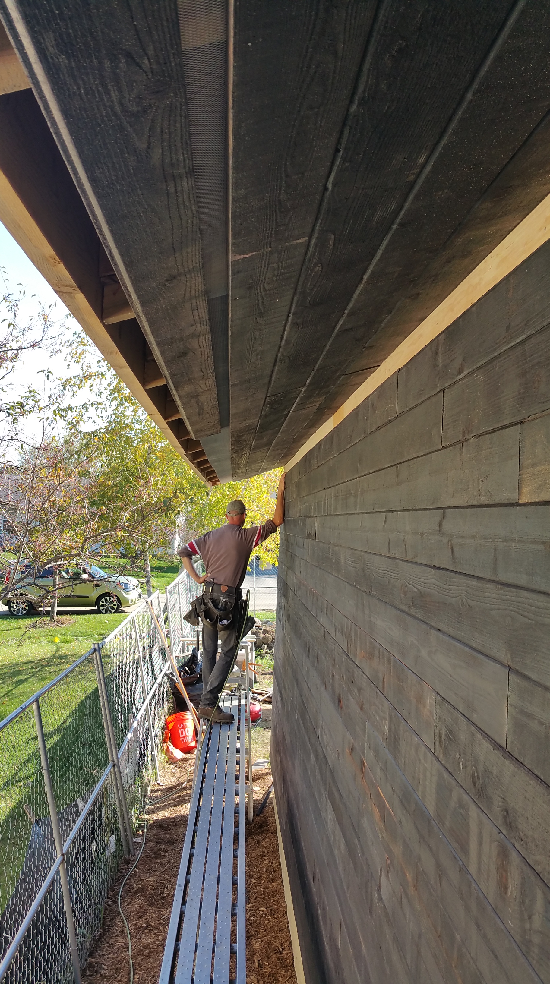

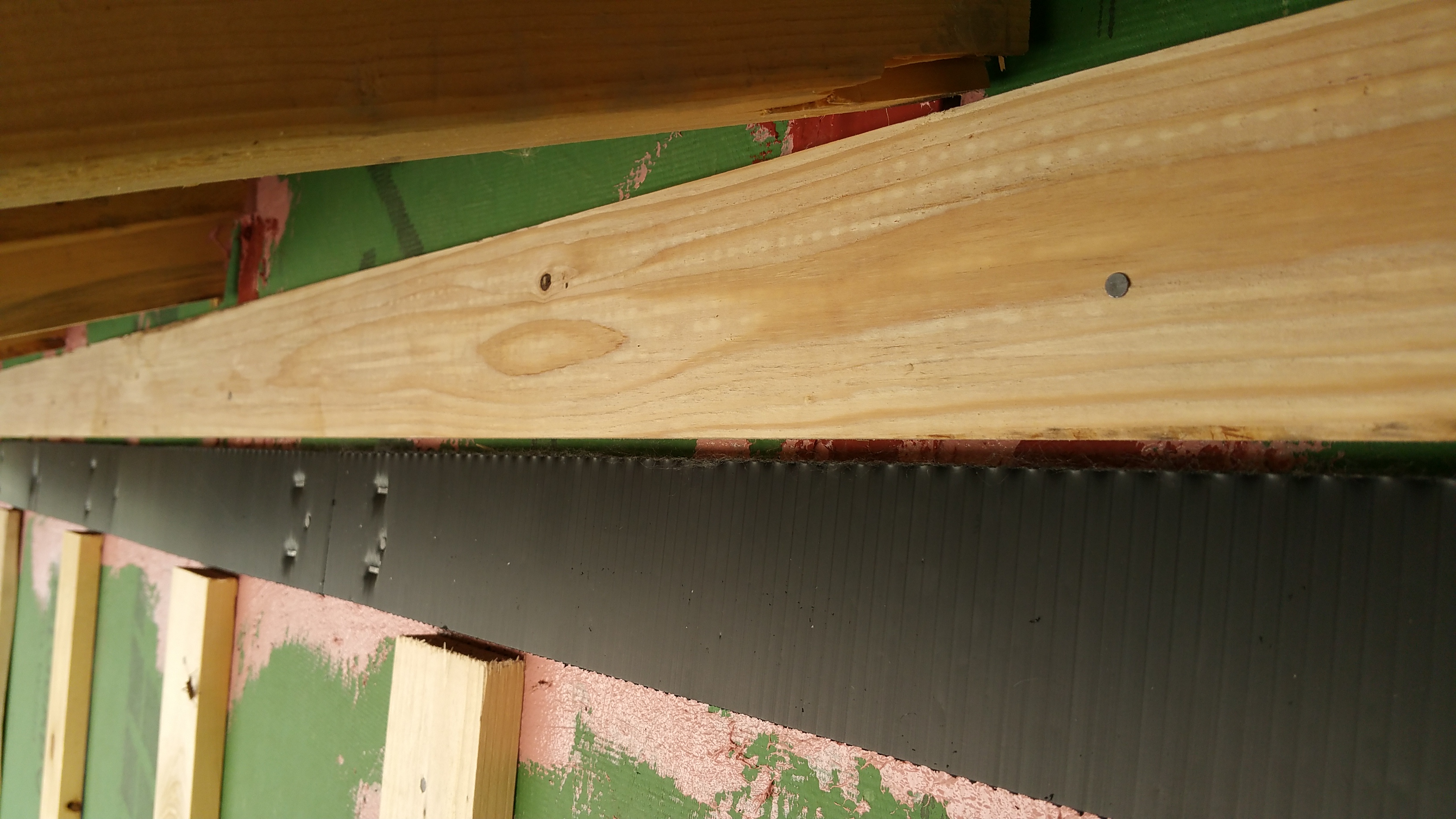
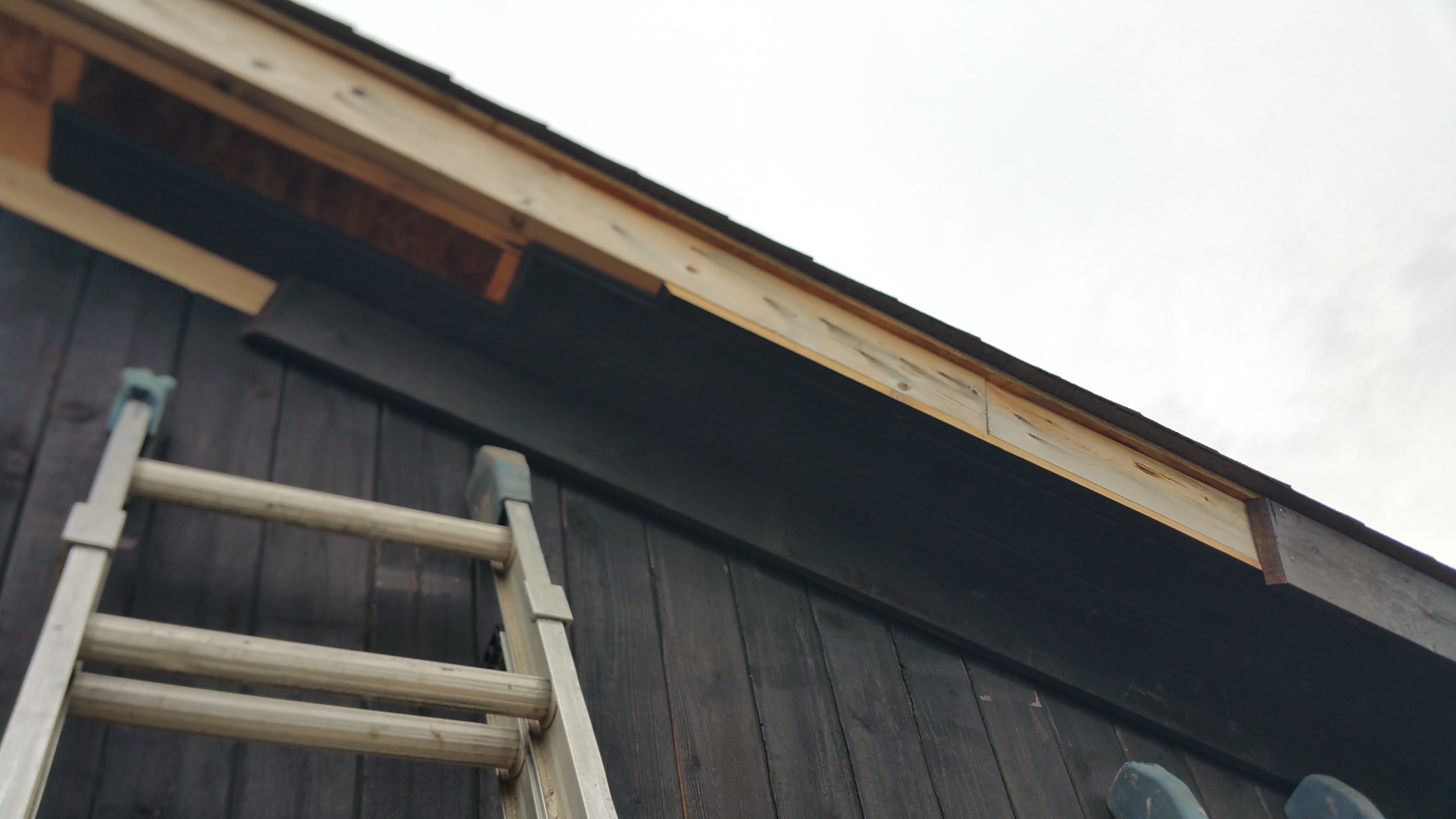
We were going to copy a Hammer and Hand diagram for the top of a wall, in particular their rainscreen detail for the frieze board:

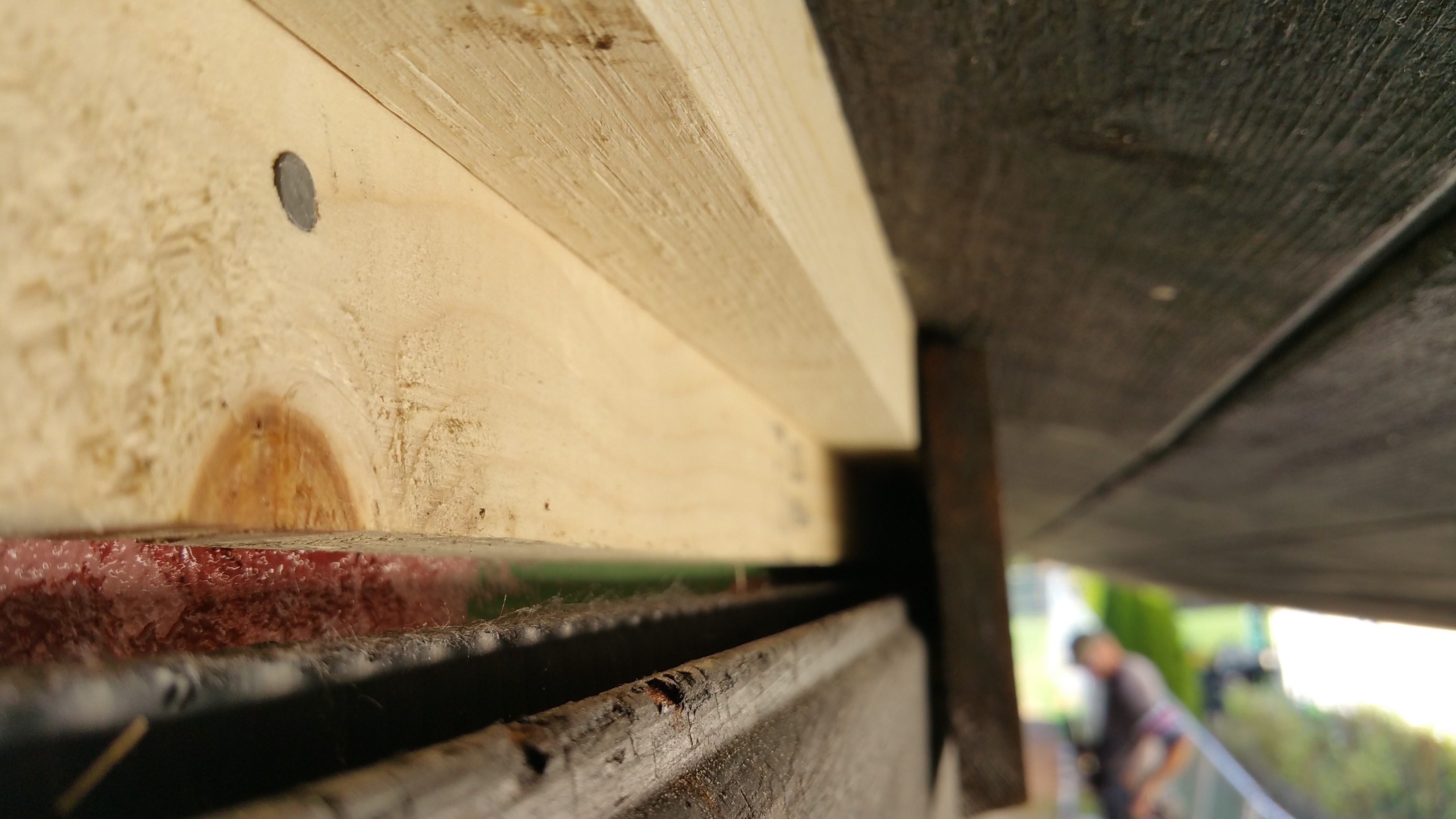
After talking through the details, Wojtek and Mark found the notch in the frieze board to be an overly fussy detail, preferring to keep this piece fully intact. To do this, they ripped down 2×2 furring strips to a thickness they could use as blocking behind the frieze board, pushing the frieze board out just beyond the plane of the siding, leaving a roughly 1/4″ continuous gap.
Apart from slightly more room directly above the Cor-A-Vent strip, the end result is much the same — a small gap between the frieze board and the top piece of tongue and groove siding allows air behind the siding to flow freely up and out of the wall assembly through the top of the Cor-A-Vent strips.
The Cor-A-Vent strips are kept about a 1/4″ below the initial blocking directly above them.
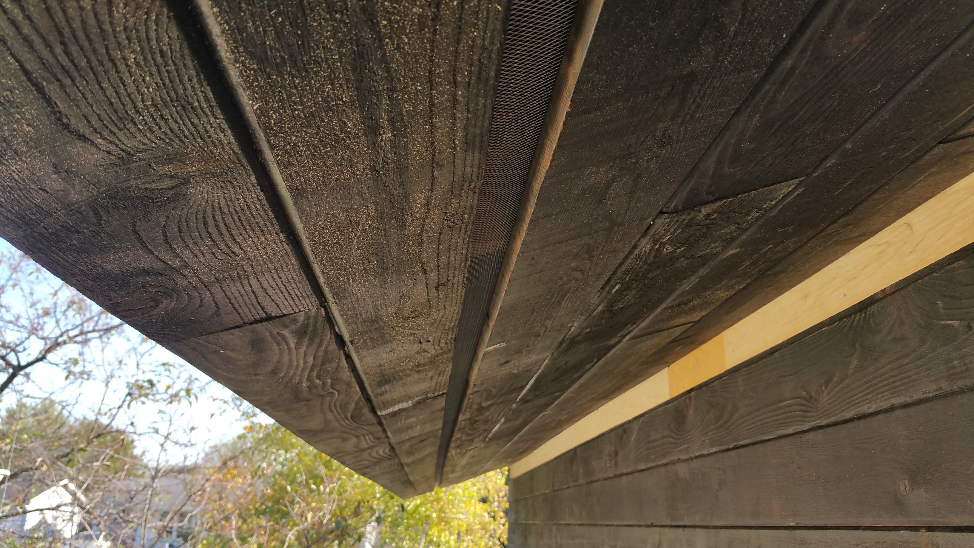
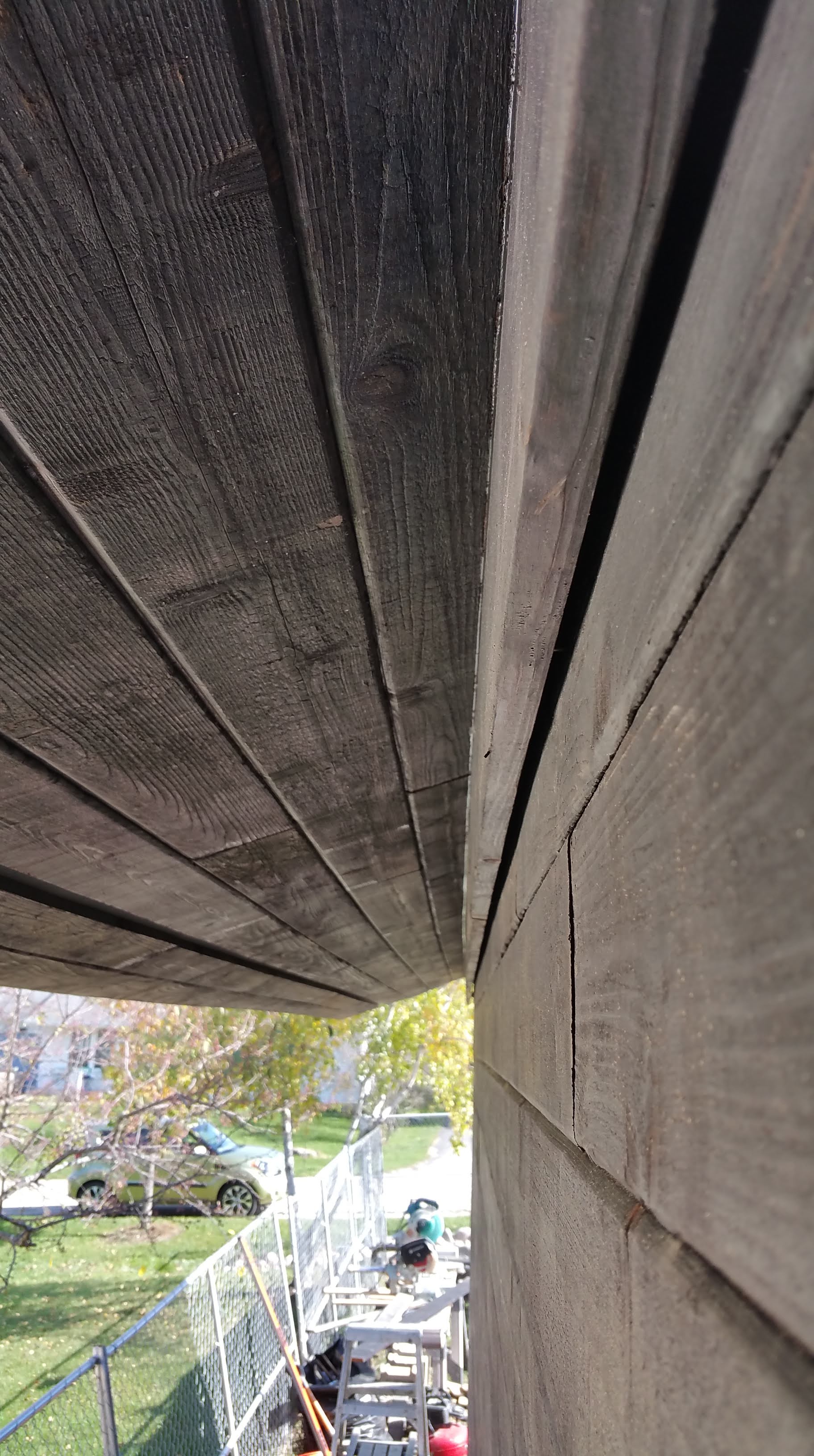
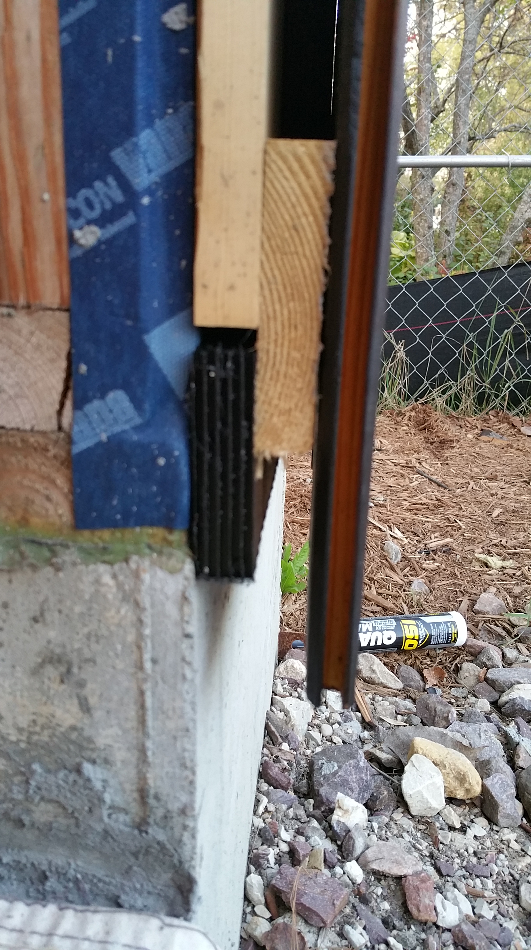
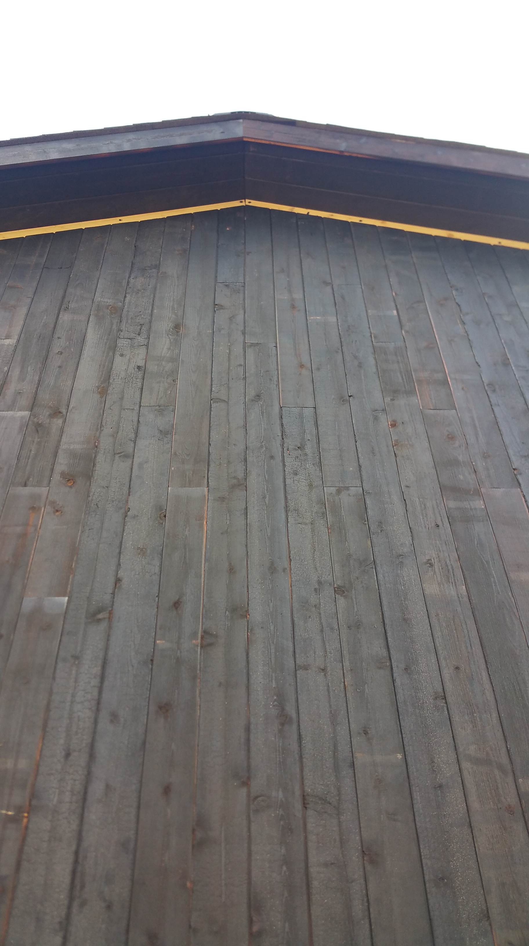
A close-up view from the side showing the details for the rainscreen at the top of the wall:
On the house, the guys adjusted the placement of the frieze blocking, lowering it so that it was in line with the first layer of 2×4 blocking, thus closing off any unnecessary open space behind the frieze board.
With the north and south sides of the garage mostly complete, the guys moved on to the front of the garage.
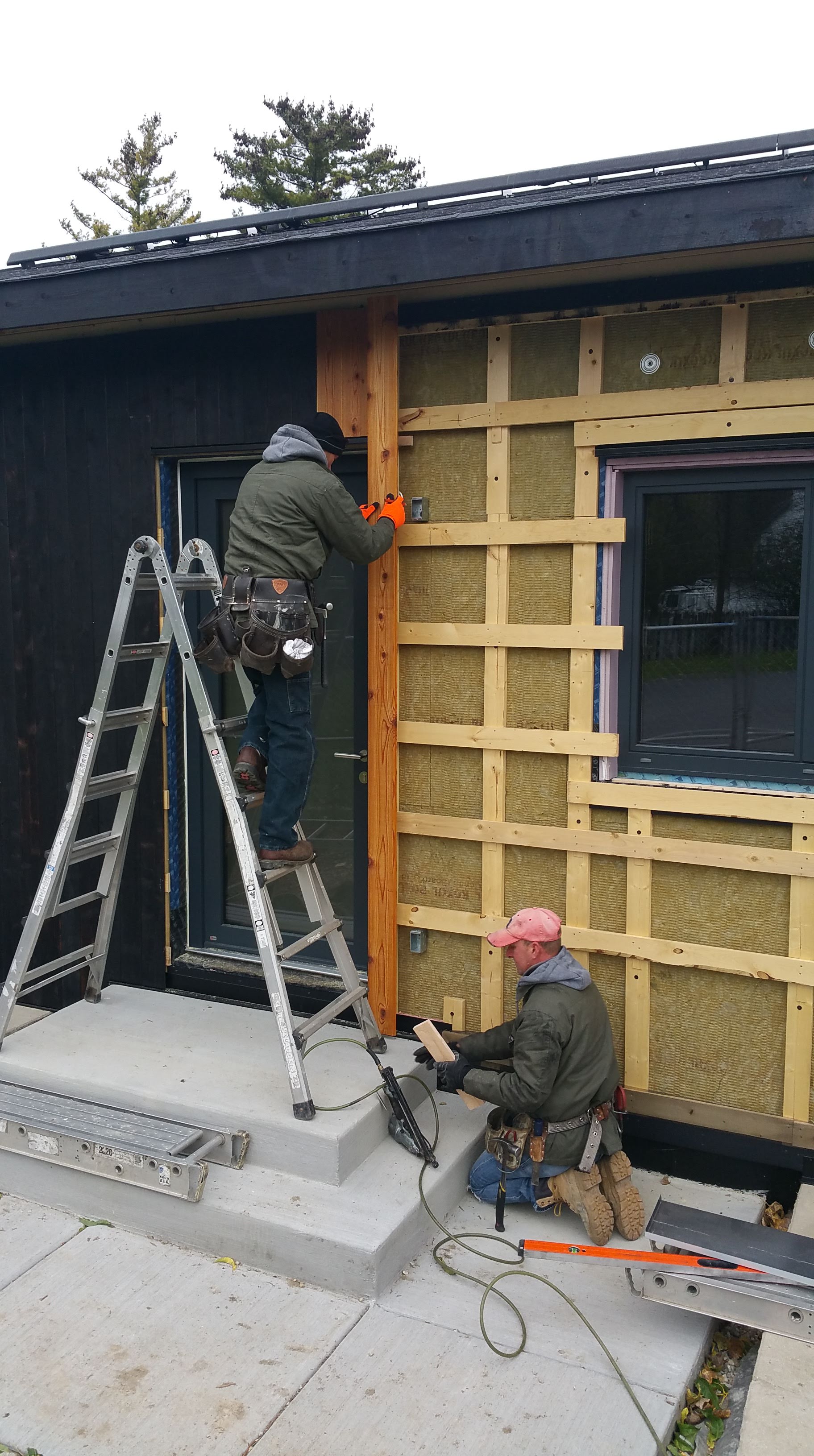
The change to our wall assembly — using 2×4’s instead of 1×4’s for our first layer of strapping so that the siding could hang down just past the metal flashing and Rockwool on the foundation — had one nasty unintended consequence for the north side of the house: the 14′ boards we had purchased, charred, and oiled were now about 3″ too short — they were initially supposed to sit just above the flashing and Rockwool, not hang down several inches below this area.
With little time to spare, since Wojtek and Mark were cruising right along, my wife Anita and our friend Maria worked tirelessly to get longer boards completed in time, while I tung oiled each board almost as soon as it was burned.
For the front of the garage, Wojtek and Mark repeated the same rainscreen details, only this time with the siding oriented vertically.

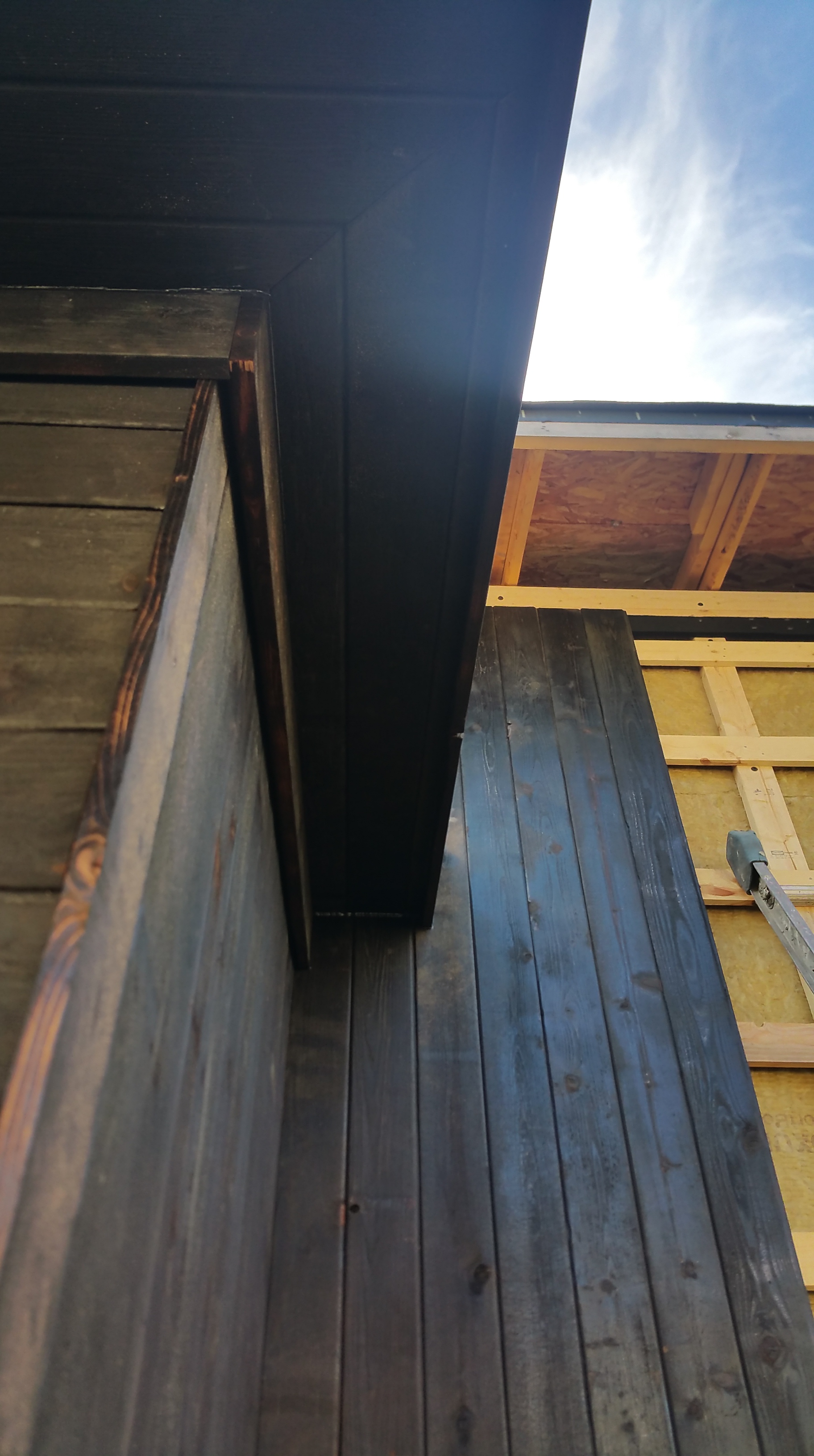
Wojtek and Mark did a nice job with the soffits at all of the outside corners.
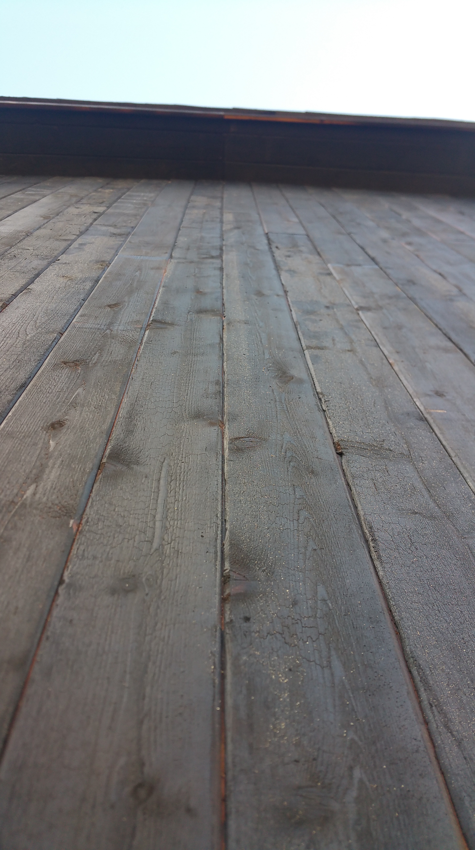
Note the ‘tiger striping’ on the bottom edge of the rake fascia board, along with the variation in color and texture from one board to another — an example of ‘perfectly imperfect’ according to wabi-sabi principles — including the subtle pencil marks for their cuts (still visible almost two years later).

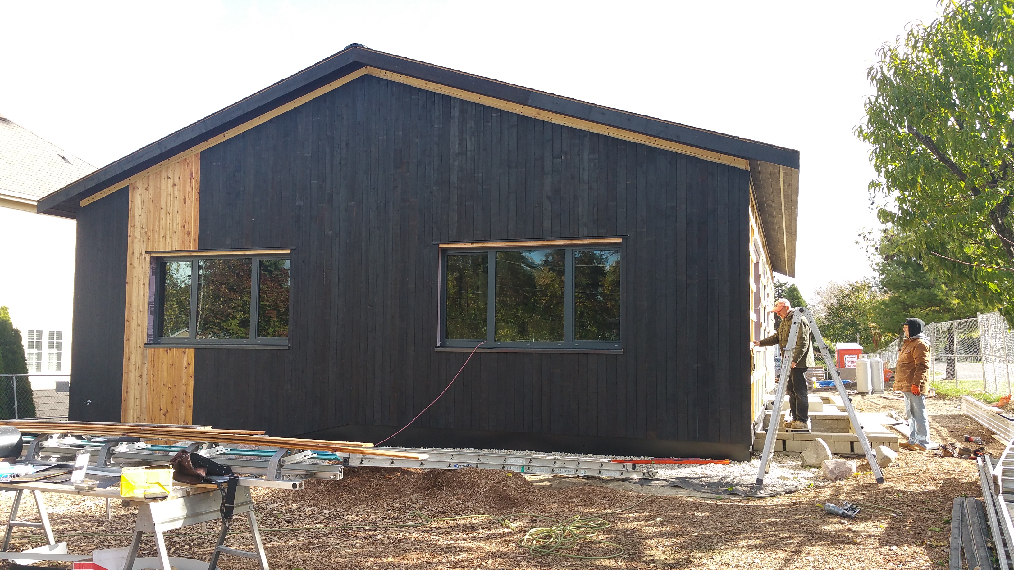
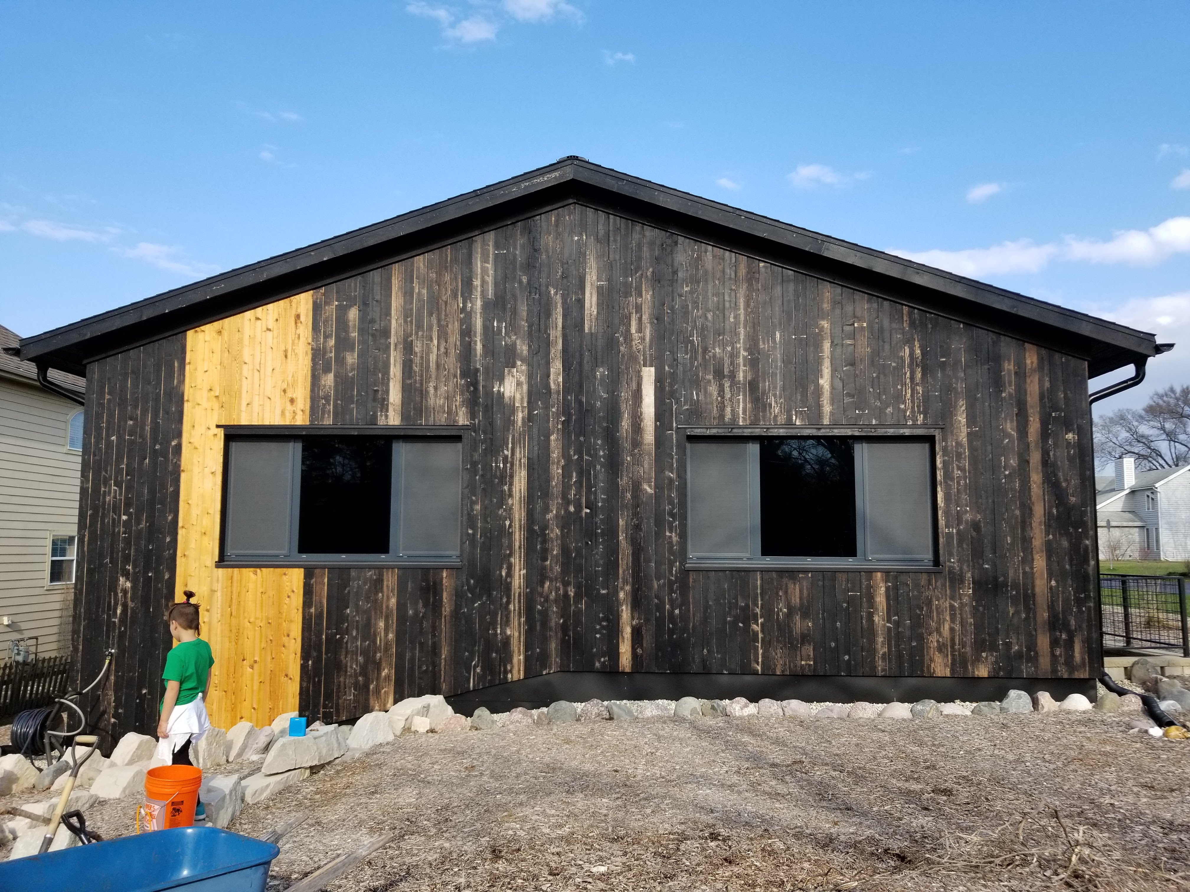
For the north side of the house I wanted to keep the charred cedar a monolithic black. The only real relief from this was the change in orientation of the siding from the north side of the garage to the house, along with a single window for my daughter’s bedroom.
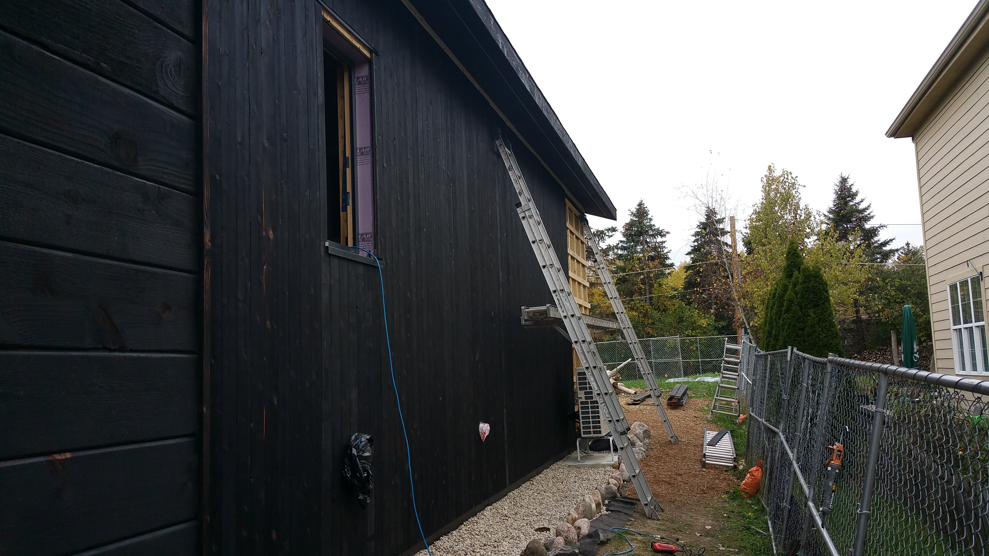
Knowing that the other three sides of the house would be getting some natural cedar accents, I thought keeping at least one side of the house entirely black would make for a nice overall effect.

The Pittsburgh Steelers did something similar, having their team logo on only one side of their helmets, leaving the opposite side a solid black. I always thought this was visually striking.
Installing the Natural Cedar Accents
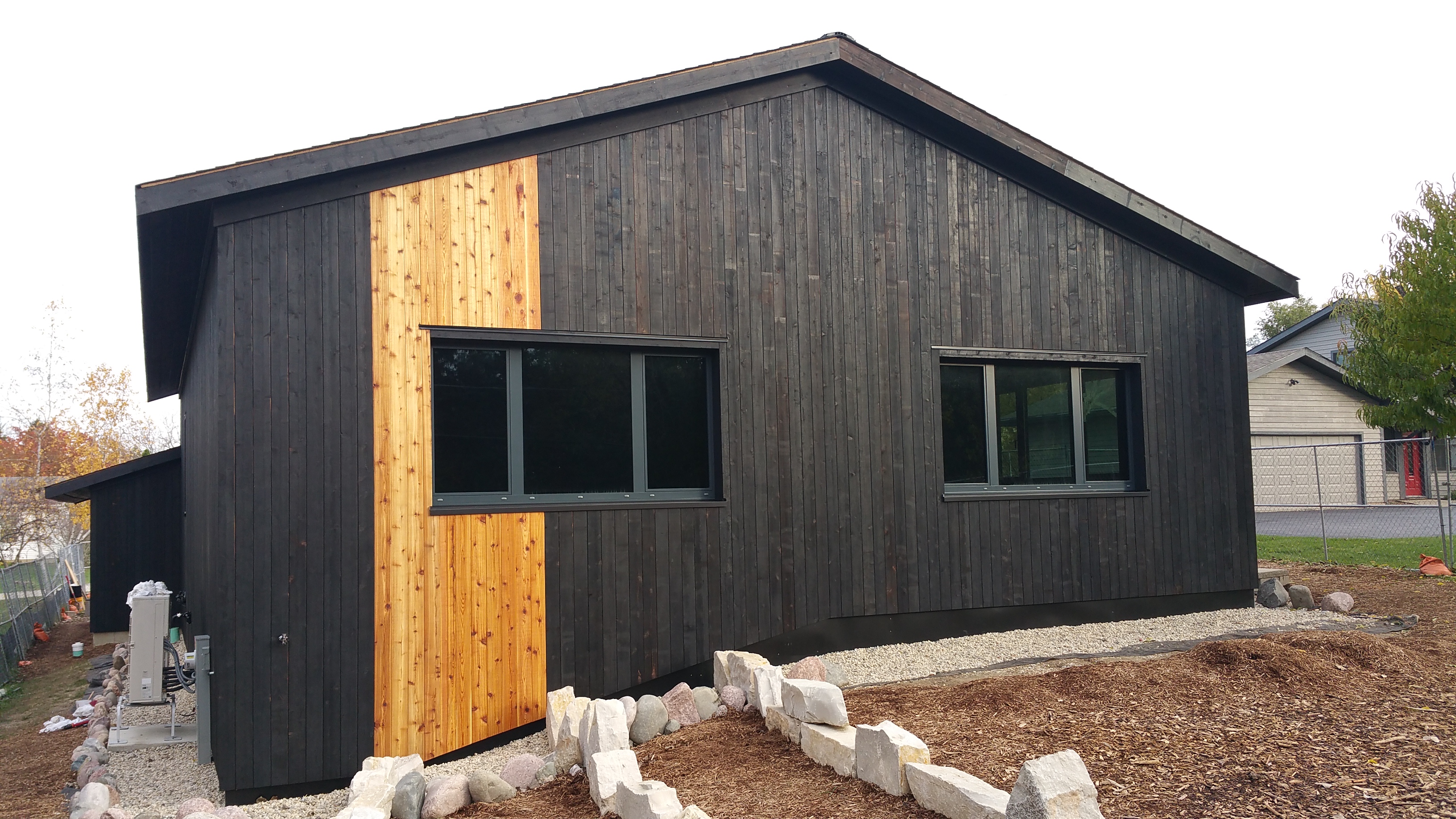
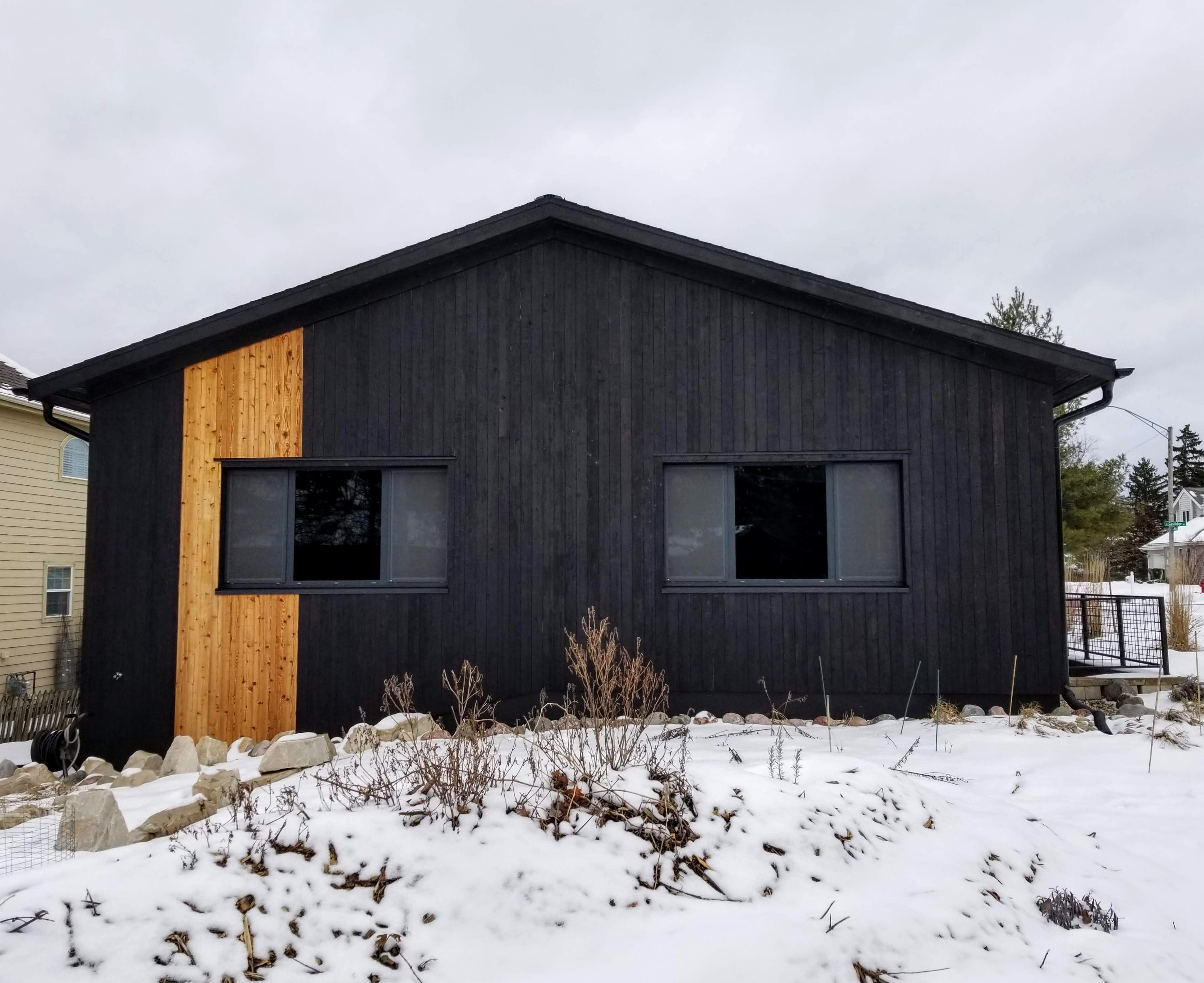
The west side of the house would be the first opportunity to use some of the natural accents. Based on my initial drawings and the sample board, I wanted to limit the natural as much as possible while still allowing it to have a strong visual punch.
I wanted to take advantage of the drop-off in grade that’s present in the backyard by using the natural boards around the window on the left. In doing so, it would draw attention to the change in grade, emphasizing that the left side of the west facade is significantly taller than the right side.
Using the structure of the window itself as a guide would help me to decide exactly how many natural boards to use.

In addition, I knew I wanted a more informal look, making it consistent with our Urban Rustic and wabi-sabi design goals, so using an odd number of boards in an asymmetrical way would help achieve this.
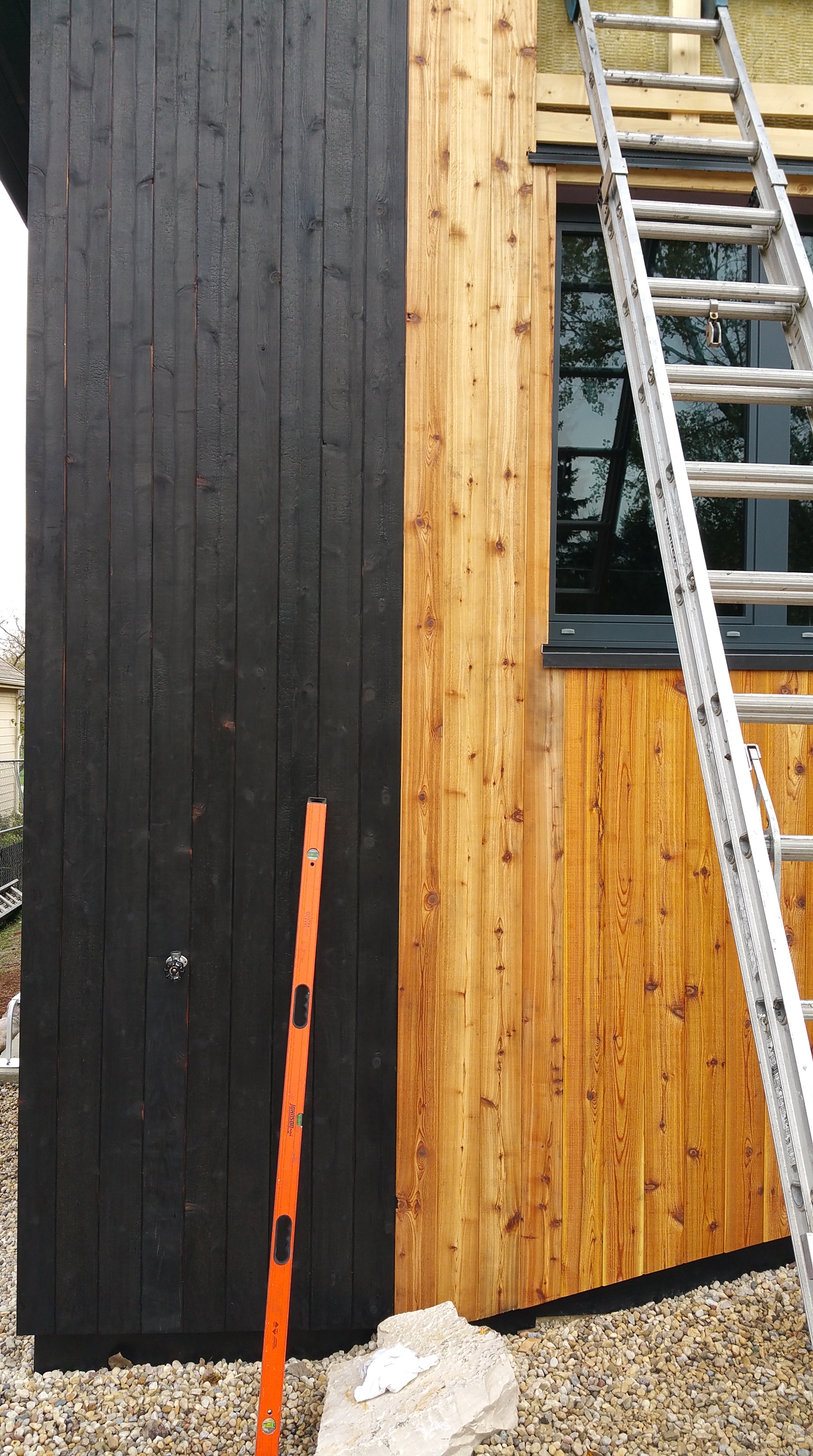
By focusing on the window in this way, 11 natural boards turned out to be the right number. Looking closely at the way the window itself is framed (large center piece of glass surrounded by two smaller pieces), if we had gone with fewer boards the natural would be too far away from the dead center of the window opening, so insufficiently ‘wrapping around’ the window, while any additional natural boards risked being too close to dead center, making the overall look too symmetrical.
“… how do you exercise the restraint that simplicity requires without crossing over into ostentatious austerity? How do you pay attention to all the necessary details without becoming excessively fussy? How do you achieve simplicity without inviting boredom?
… Pare down to the essence, but don’t remove the poetry. Keep things clean and unencumbered, but don’t sterilize. (Things wabi-sabi are emotionally warm, never cold.)… doesn’t mean in any way diminishing something’s ‘interestingness’, the quality that compels us to look at that something over, and over, and over again.”
— Leonard Koren, Wabi-Sabi
Obviously, a lot of the details regarding these decisions are subjective, but having some kind of framework for a final decision is nice to have, rather than going strictly on instinct alone.
It was only after Mark went back to the black charred siding that I was sure we had exactly the right amount of natural boards around the window.
By going just past the first piece of glass, the natural boards have a nice asymmetrical look to them — hugging or slightly wrapping around the window just enough, making a connection, but not too much.
After so many months of planning, worrying, and waiting — and then finally getting to see this combination of charred cedar with the natural cedar — watching the siding go up was easily one of the most gratifying parts of the entire build.

When the guys got to the middle of the west facade they were in for a nice surprise — dead center of the peak lined up perfectly with the seam between two boards.
On most houses the back side tends to be rather boring, as if it were mostly forgotten about (at least in visual terms). In part this is no doubt because the details used to create visual interest are normally reserved for the front elevation where they can show off to the street. Where the front might be covered with stone accents, metalwork, elaborate lighting fixtures, or some other decorative accents, the other three sides tend to blend together as the basic siding material just continues its standard layout or pattern around the perimeter of the house. These decorative accents add cost to a build, so it makes some sense to reserve them for the side of the house that most people will see.

Sometimes, however, this effect can be jarring. In a Chicago suburb there’s a house that uses elaborate stonework on the front facade, which in this particular case is actually two sides that face the street, but when you walk around to the back of the home the siding material transitions to wood. Because the transition is so abrupt, and the quality of the materials is so different, in terms of both cost and visual impact, it almost feels like walking behind the elaborate facade of a building on a movie set to discover it’s only a single wall propped up to mimic a much more substantial building. This lack of cohesiveness lends a kind of sadness to the house, as if it announces that the elaborate plans for the exterior cladding were ruined by unexpected budget constraints.
Consequently, we felt it was important to give each side of the house its own distinctive face. Because of the size and layout of our lot, and the way the houses next to us are positioned, it’s difficult to view more than one side of our home at any one time, which only encouraged us to make this a priority.
Quick side note: these windows on the west facade are the ones with Suntuitive glass. Because of this, we’ve never required any blinds or any protection from glaring afternoon sun. As a result, we’ve been able to enjoy a constant, unimpeded view of the backyard (one of our Permaculture, as well as biophilic, design goals).
More than a year after the siding had been up my daughter and I were in the backyard doing some gardening when she pointed out that the back of the house looks like David Bowie’s Aladdin Sane makeup (we have a magnet of Bowie on our kitchen fridge from a retrospective tour that came through Chicago). She has a point.
It’s not difficult to see a face in the facade, and the music reference fits in nicely with our rock ‘n roll theme for the interior of the house.
The effect of the natural cedar is also reminiscent of racing stripes, especially those seen on sports cars or muscle cars, or even motorcycles (e.g., the graphics on racing sportbikes). This was partly done with tongue planted firmly in cheek — If high-performance cars and motorcycles look good with racing stripes, why not on a high-performance home? — but mainly because I’ve always enjoyed the visual power of these types of graphics.

Also in keeping with the racing stripes idea, we wanted the house to look distinctive on every side, much like the well-designed shape of the most memorable sports cars or motorcycles that look good from almost any angle.
At the beginning of each episode of Comedians in Cars Getting Coffee Jerry Seinfeld does a great job introducing each vehicle, explaining why some of them — even if decades old and built with what we consider now to be obsolete technology — can still elicit such intense feelings of affection or outright joy.
And there’s no shortage of design options when it comes to racing stripes and their various layouts.
Many are symmetrical, for instance, a double stripe laid down in thick pairs with little space between. This style is popular on the hoods of muscle cars.

Sometimes the striping is fairly subtle, arguably more of a pinstripe effect:


And of course the racing stripes don’t always have to impart a sense of speed or domination, sometimes they’re a nod to smart, even cute, styling:


Motorcycle graphics are probably the most extreme version of racing stripes, many of them even outlandish, but mostly in a vibrant, fun way:


Ducatis look great when they’re fitted out in monochromatic red, or even all matte black, but white stripes definitely add another dimension to the overall look of the bike:
This is one of the more iconic layouts, from Honda’s factory MotoGP racing team, Repsol:

I think the layout and color combination looks even better in close-up as a screensaver:

My favorite racing stripe layout is a combination of one thick and one thin, probably because of the asymmetry since it’s typically applied off to one side, or offset, rather than applied directly down the center.

Another example of this thick-thin combination:

The other nice thing about the racing stripe idea was that, as a visual motif, we could carry it over into some of the interior finishes. This is something we intended to do with the charred cedar as well — using an element from the exterior to decorate a part of the interior.
The blue-green-white combination, long associated with Kawasaki, would prove to be the most overt example where we would borrow some famous imagery from motorcycle racing and apply it inside the house in a new context, but for much the same reason, namely trying to impart a sense of playful energy and added brightness (more on this in a future post).
At any rate, I really enjoyed coming up with a kind of narrative for the look of the house, hopefully showcasing, in a unique way, what the charred cedar and the natural boards can do visually as siding on a home.
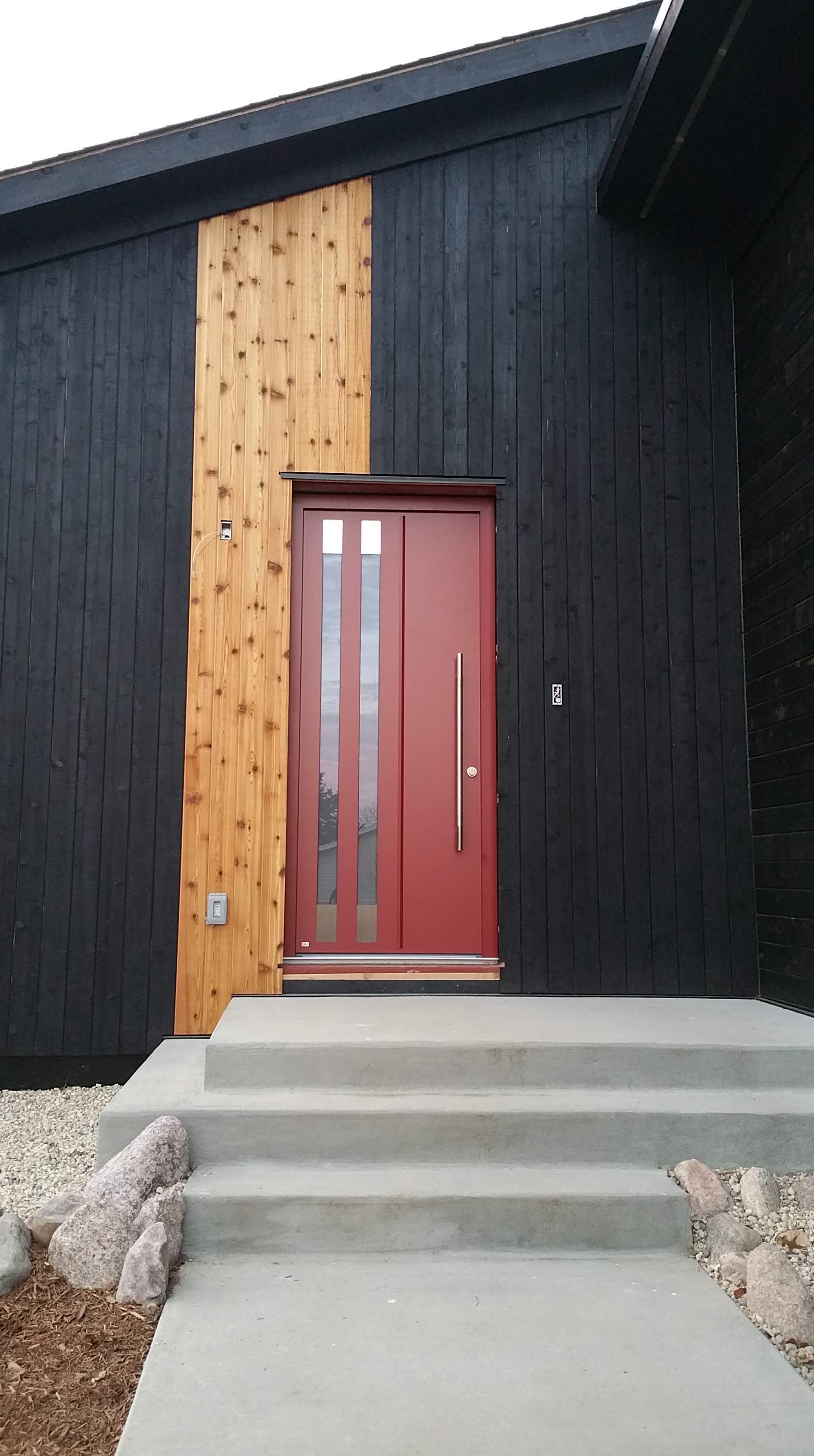
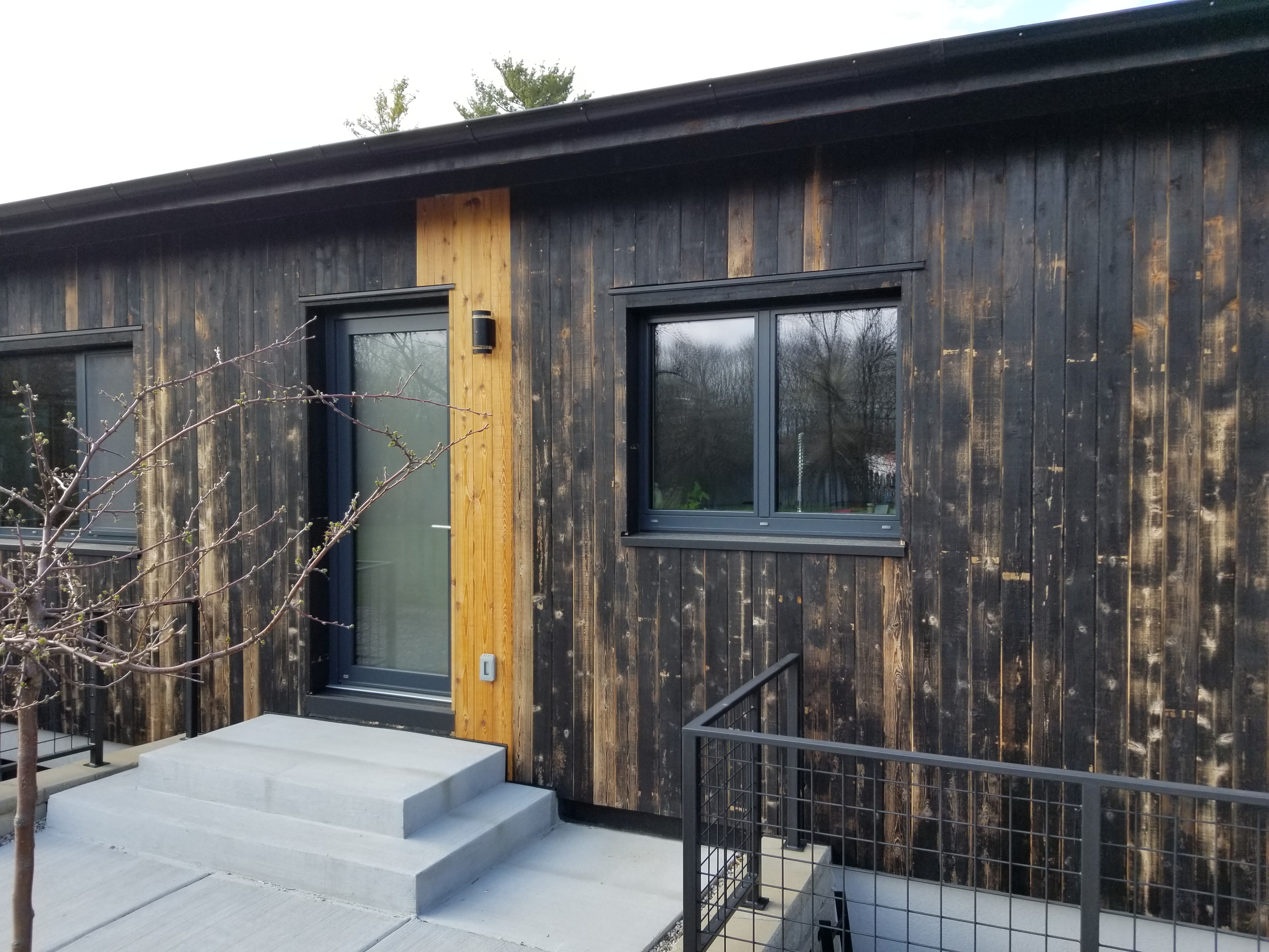
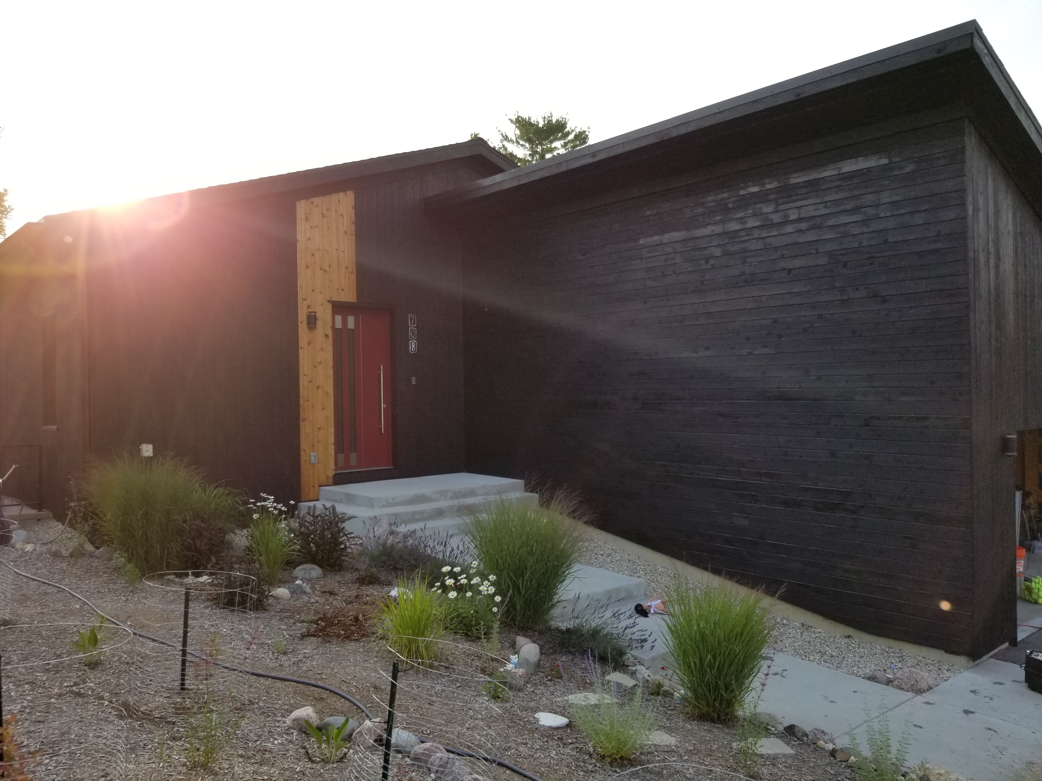
For the south side, we decided to use the kitchen door as our guide for putting up the natural cedar, while the front door would be used on the east-facing facade.
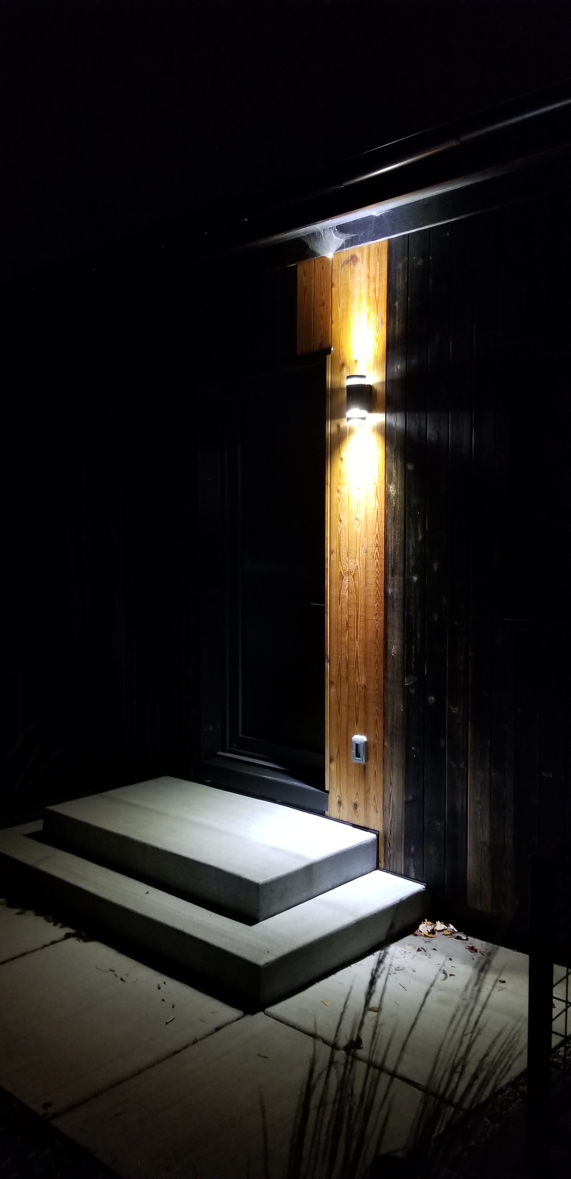
Another element around the two doors to consider was exterior lighting. A single fixture at each door would project an upward and downward concentrated beam of light, highlighting the natural boards in the dark as they pinpoint their focus on this band of natural wood surrounded by total blackness.
We started the natural boards to the right of center of the door’s glass, cheating a bit so that they started pretty much directly above the door handle.
It also worked out nicely that the natural boards ended up in an A-B-A pattern from back of the house to front; meaning to the left of the window in back, to the right of the kitchen door, and then to the left of the front door.

We ended up at 5 boards for this side of the house, allowing the striping to stay proportional to the size of the opening while sitting just beyond the eventual light fixture. It also helps that the kitchen door, made up largely of glass and a neutral gray color, doesn’t take any attention away from the natural boards.
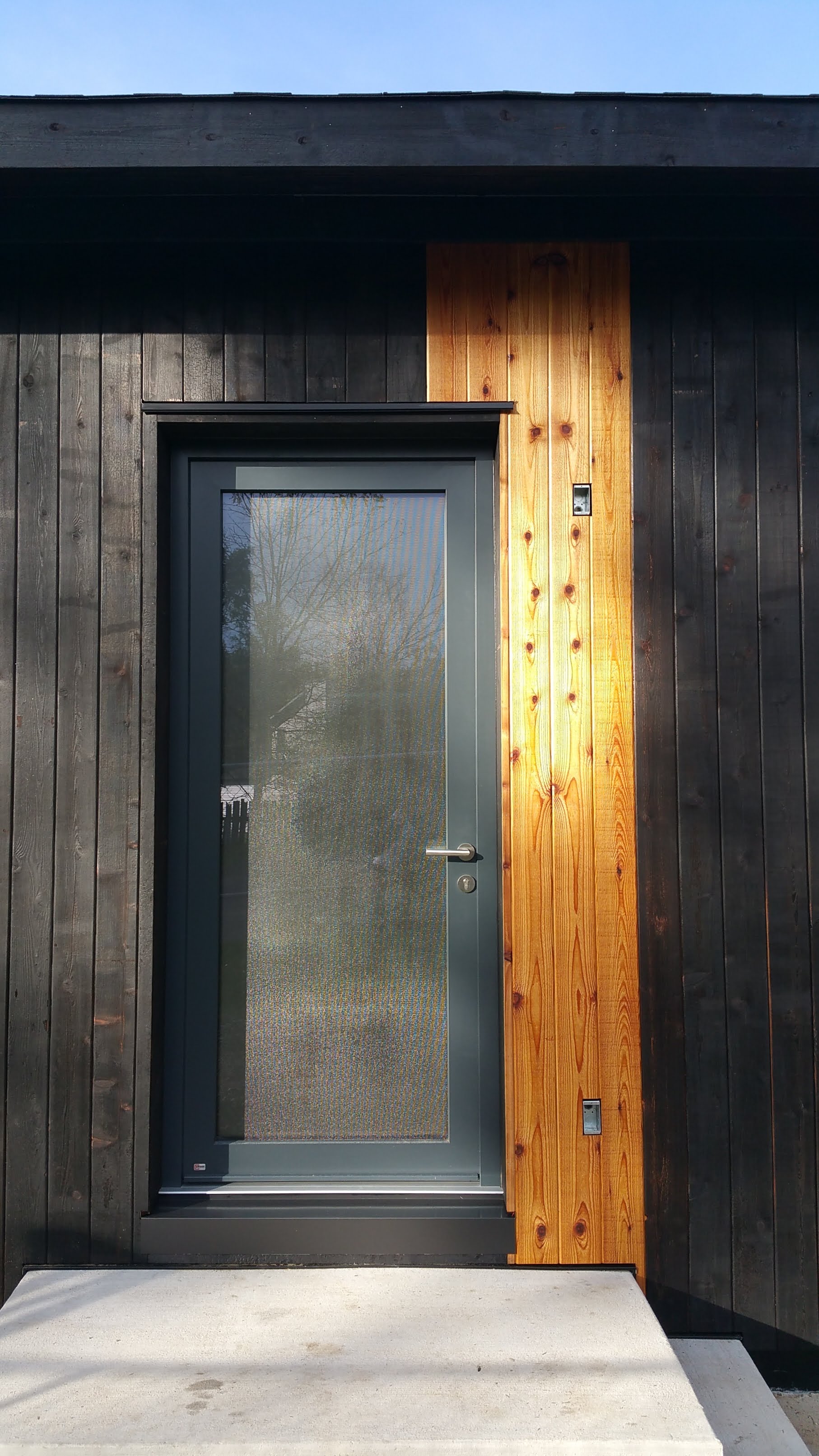
At the front door, I initially pictured the natural boards installed on the right side of the entryway. In two dimensional drawings this seemed to make sense, but after seeing everything in place in reality, it became pretty clear that to the left of the front door would be far better. To the right of the front door would’ve meant the natural boards would look ‘squeezed’.

Starting the natural boards just outside where the light fixture will sit, we ended up at 7 total boards for around the front door. Since the front door is slightly larger than the kitchen door, and it’s the main focus of the house, it made sense to have slightly more natural boards in this area.
Many thanks to Wojtek and Mark for their patience in playing along as I figured out exactly how many natural boards to use, and exactly where they should be positioned.
As each section of natural boards went up, it was evident that beyond a certain point the racing stripe effect would be lost: one too many boards and it wouldn’t look right, in effect, overpowering the opening; too few boards would mean not enough impact — less like a proper decorative accent and more like a disconnected mistake.
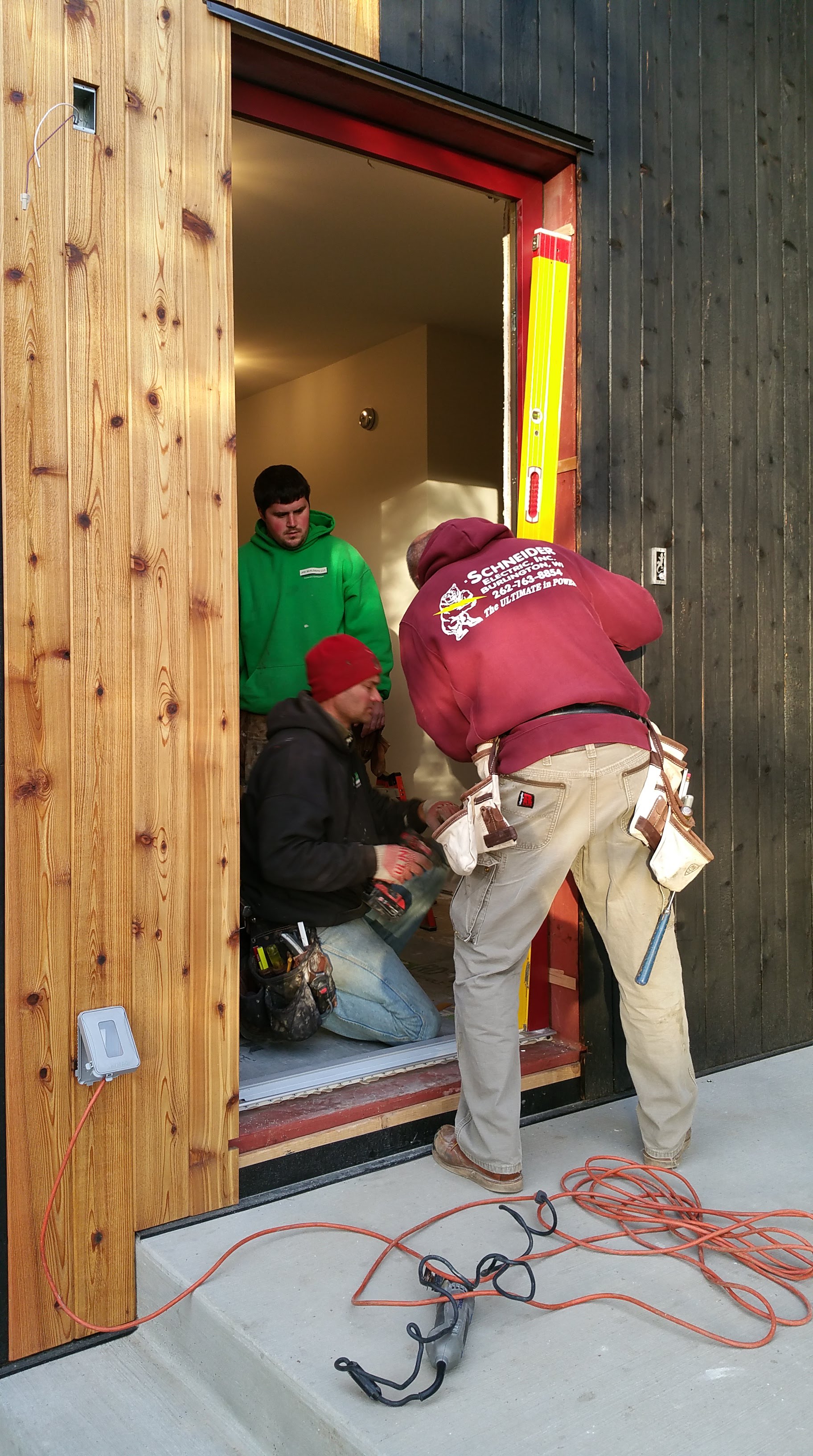
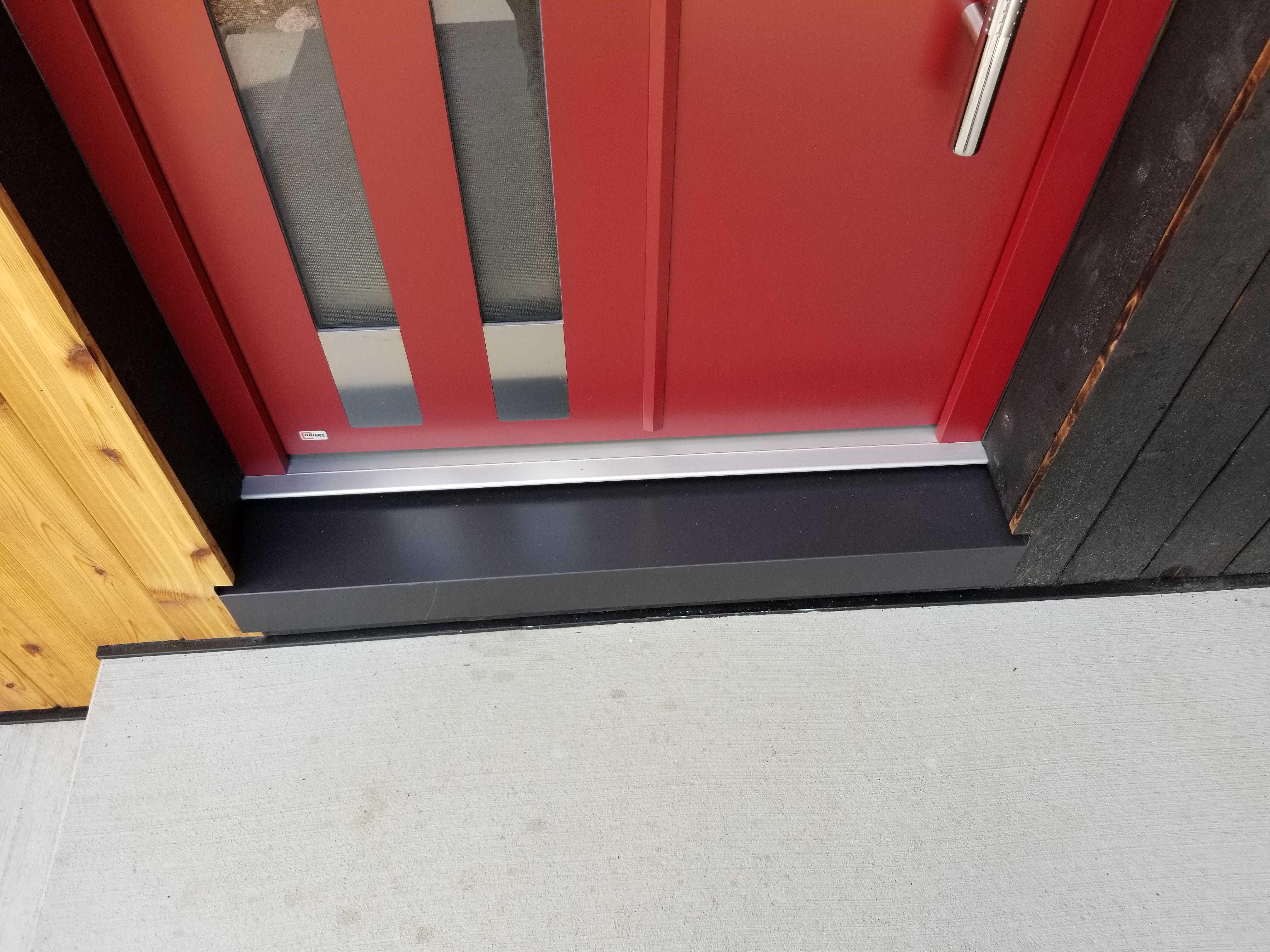
Bob Riggs, his son Brian, and Jason were nice enough to come back to install my front door for me. We used the Hannoband expanding foam tape to seal around this door, just as we did for all of the other windows and the kitchen door.
Check out the details of their installation here:
Windows, Doors, and Suntuitive
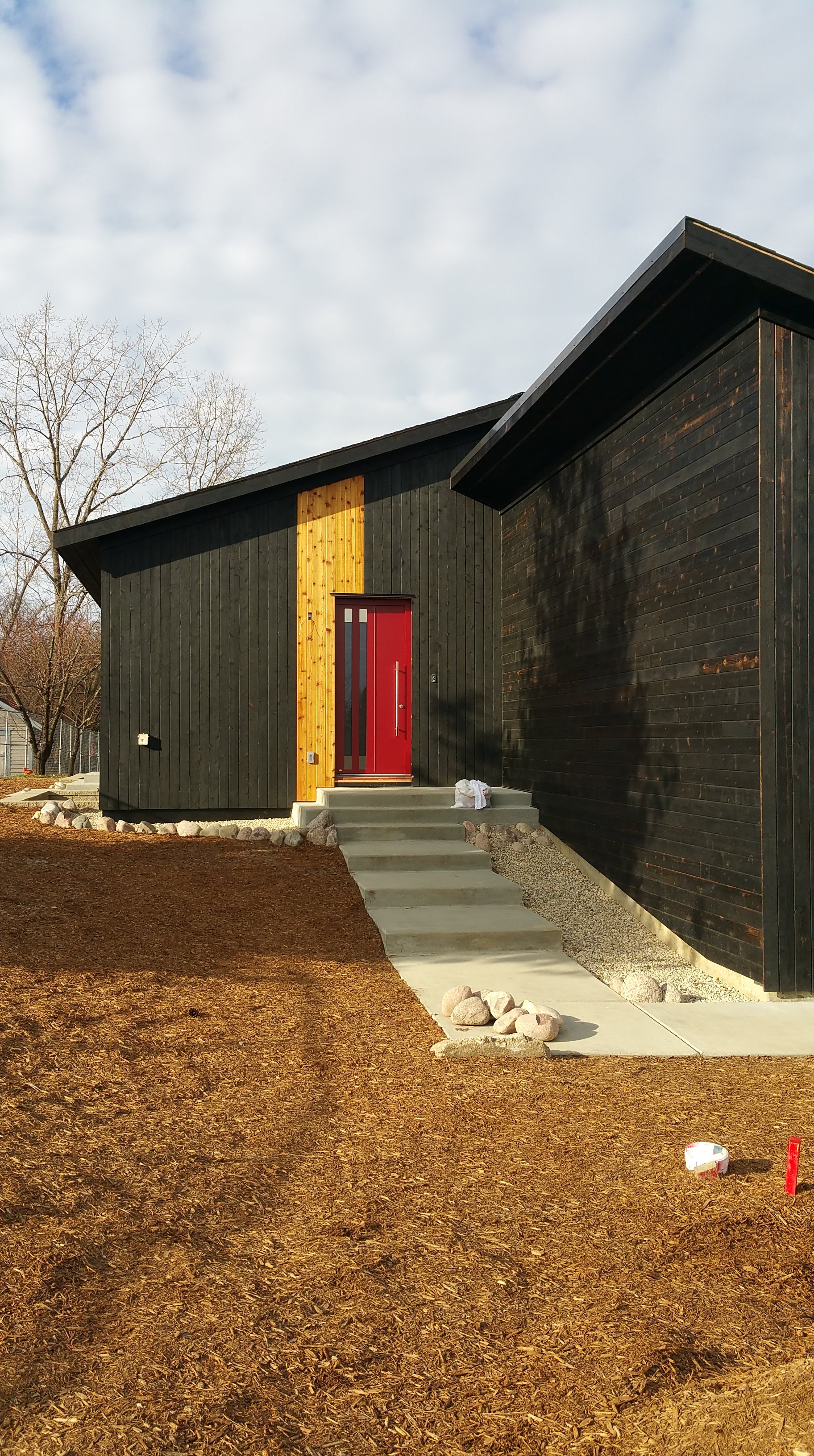
The front porch with its charred cedar, natural cedar, and the bright red door reminds me of Coco Chanel’s famous “little black dress ensemble” — the charred cedar the little black dress, the natural boards the string of pearls, and the front door the splash of red lipstick.
Our shiny front door is the one sleek, clean, and clearly new element of our exterior. This contrast between industrially produced, sharp looking object and the burnt and heavily knotted wood in some ways personifies the Urban Rustic aesthetic.
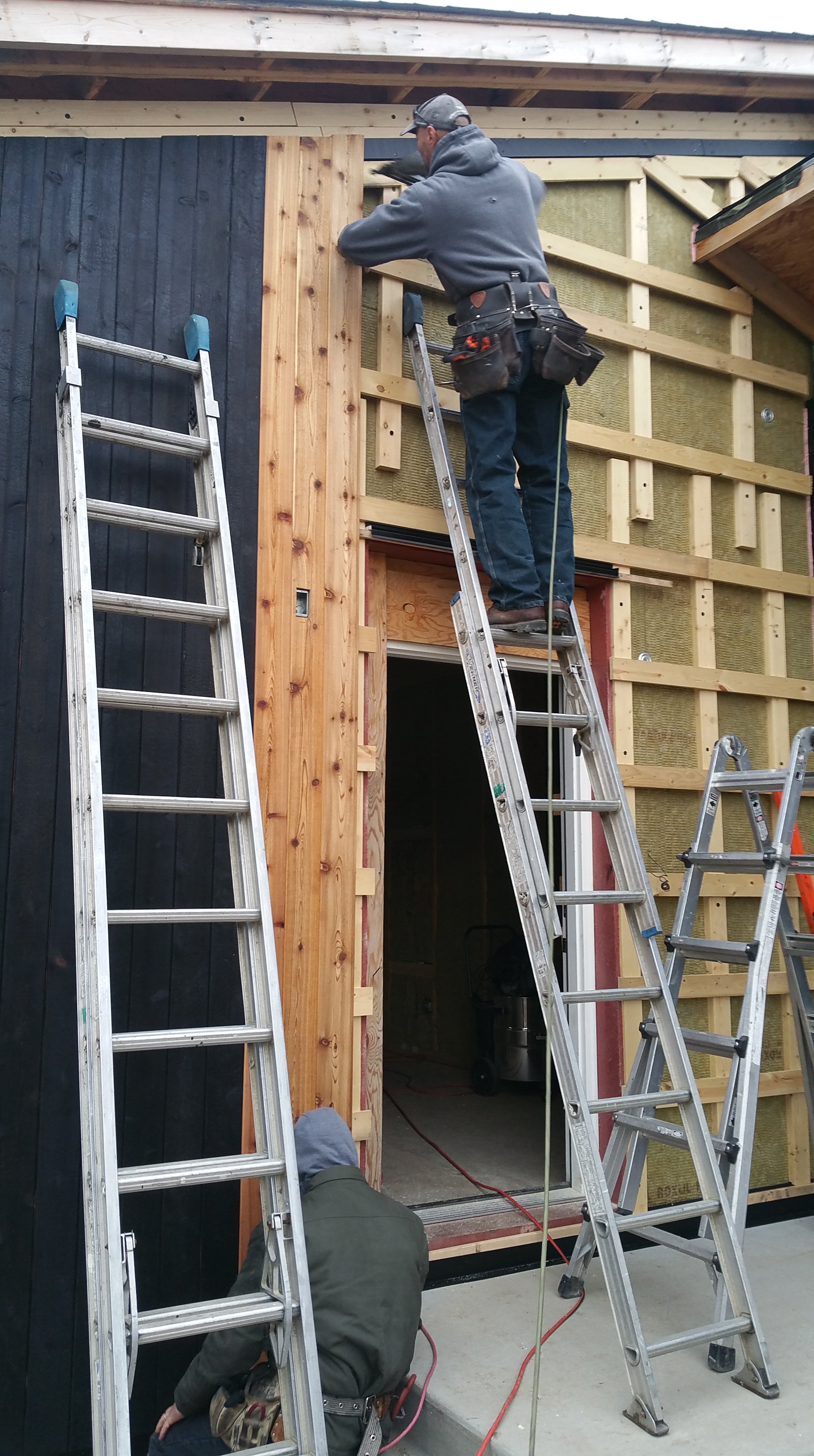
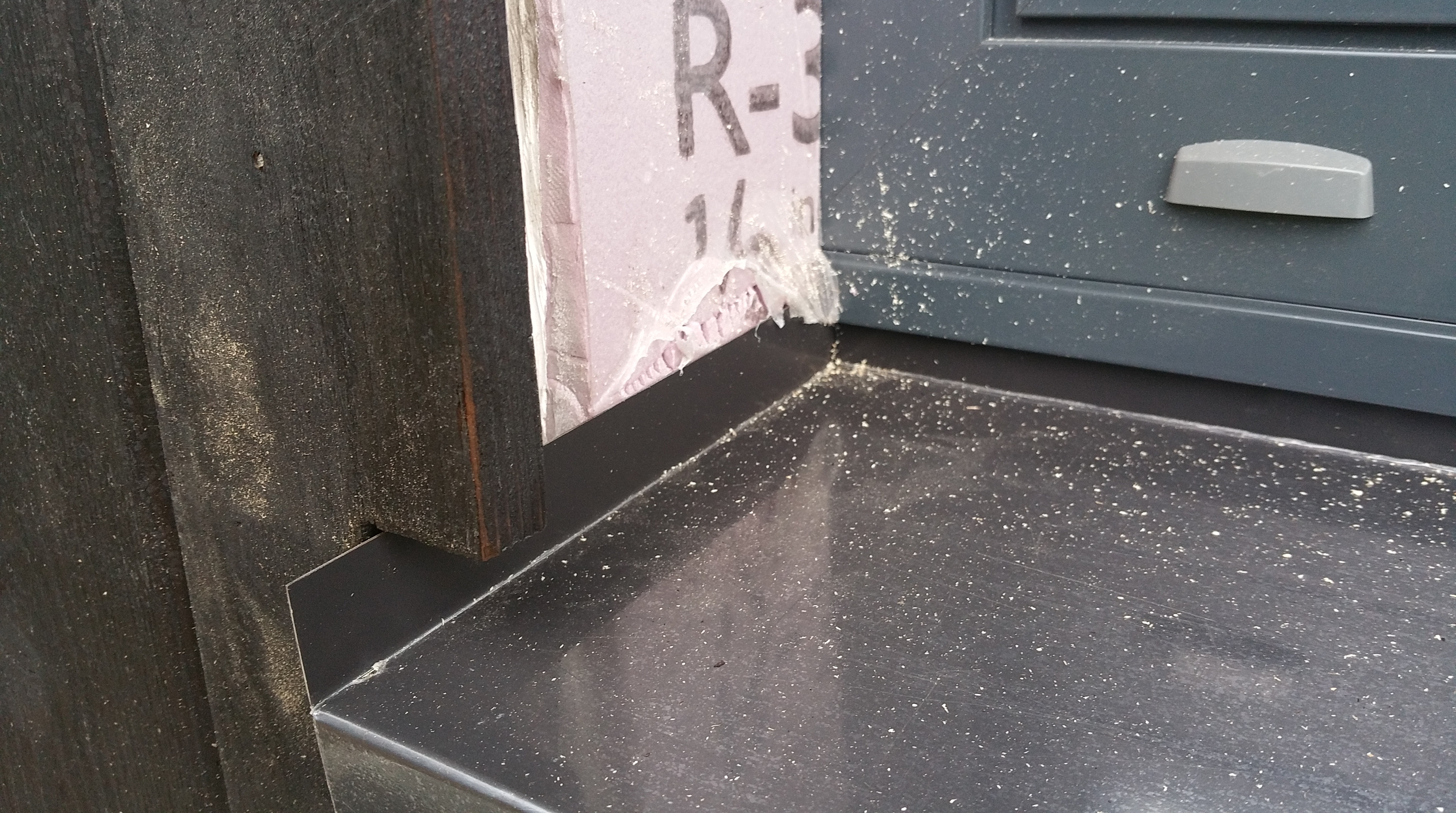
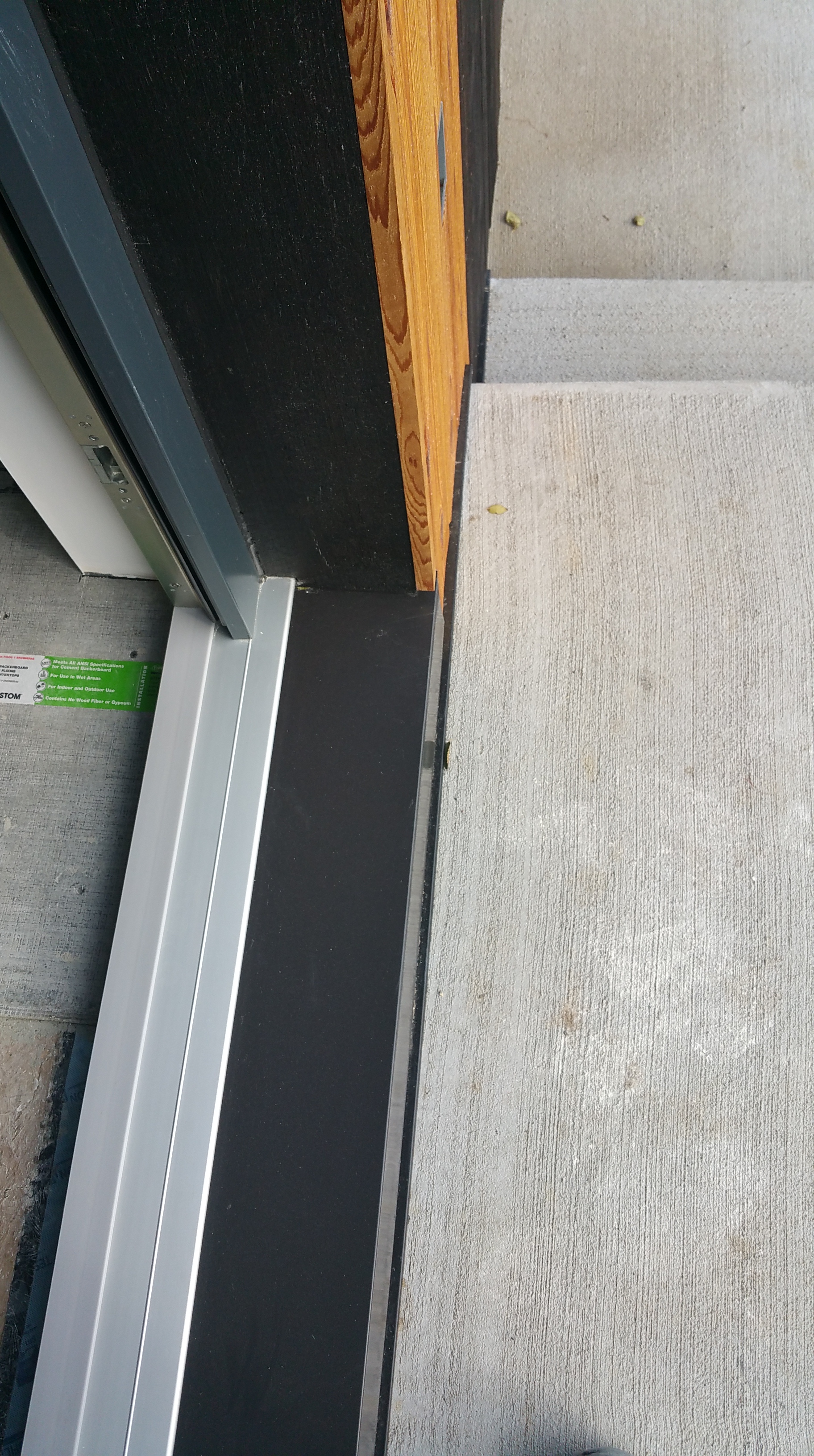
Installing Sill Pans
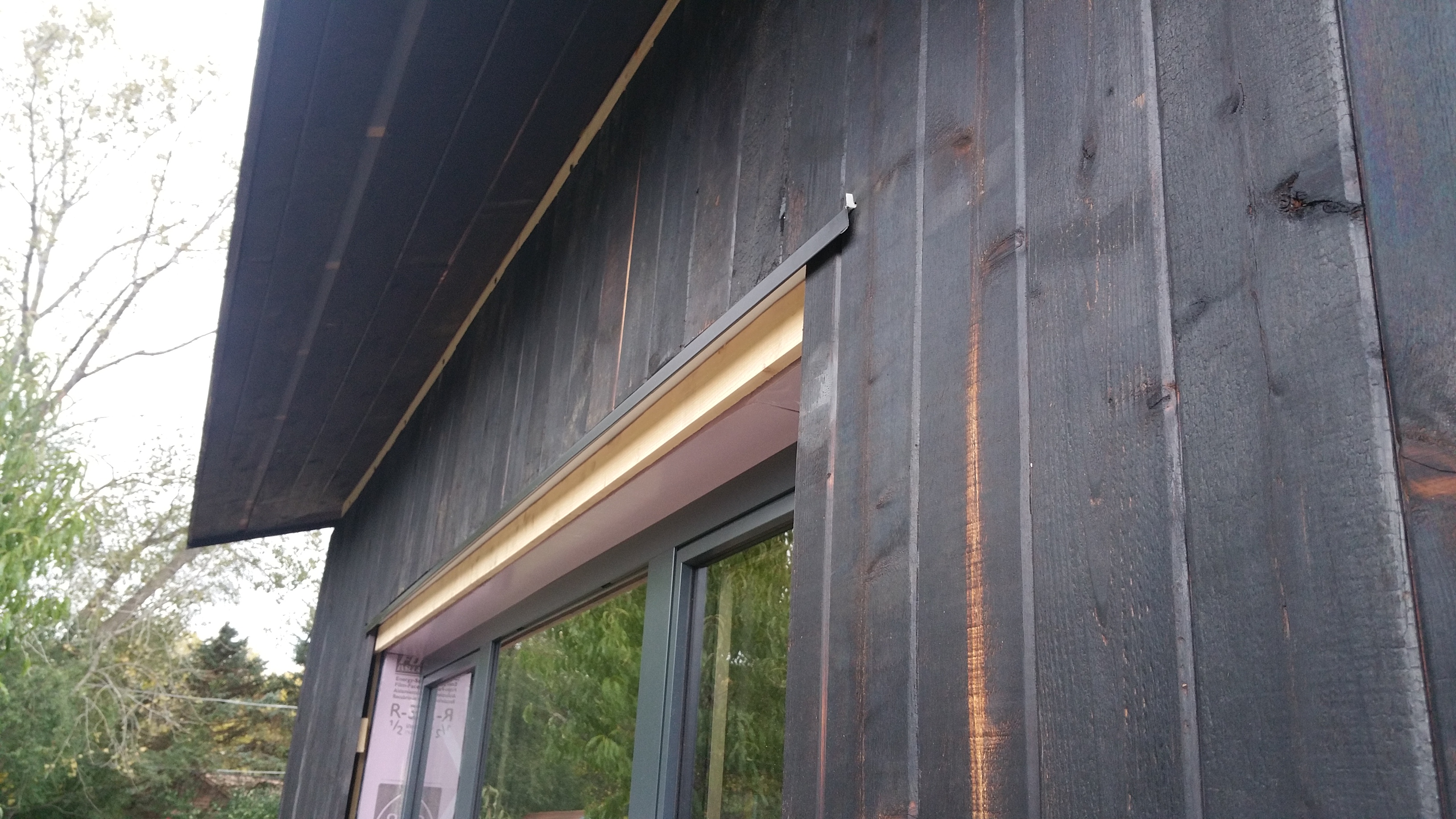
When most of the siding and overhangs were complete, Wojtek and Mark started installing the metal sill pans for all the windows and doors.
Greg, the owner of Siding and Windows Group, suggested we use Lakefront Supply for all the flashings, which turned out well as they were able to create exactly what we needed.
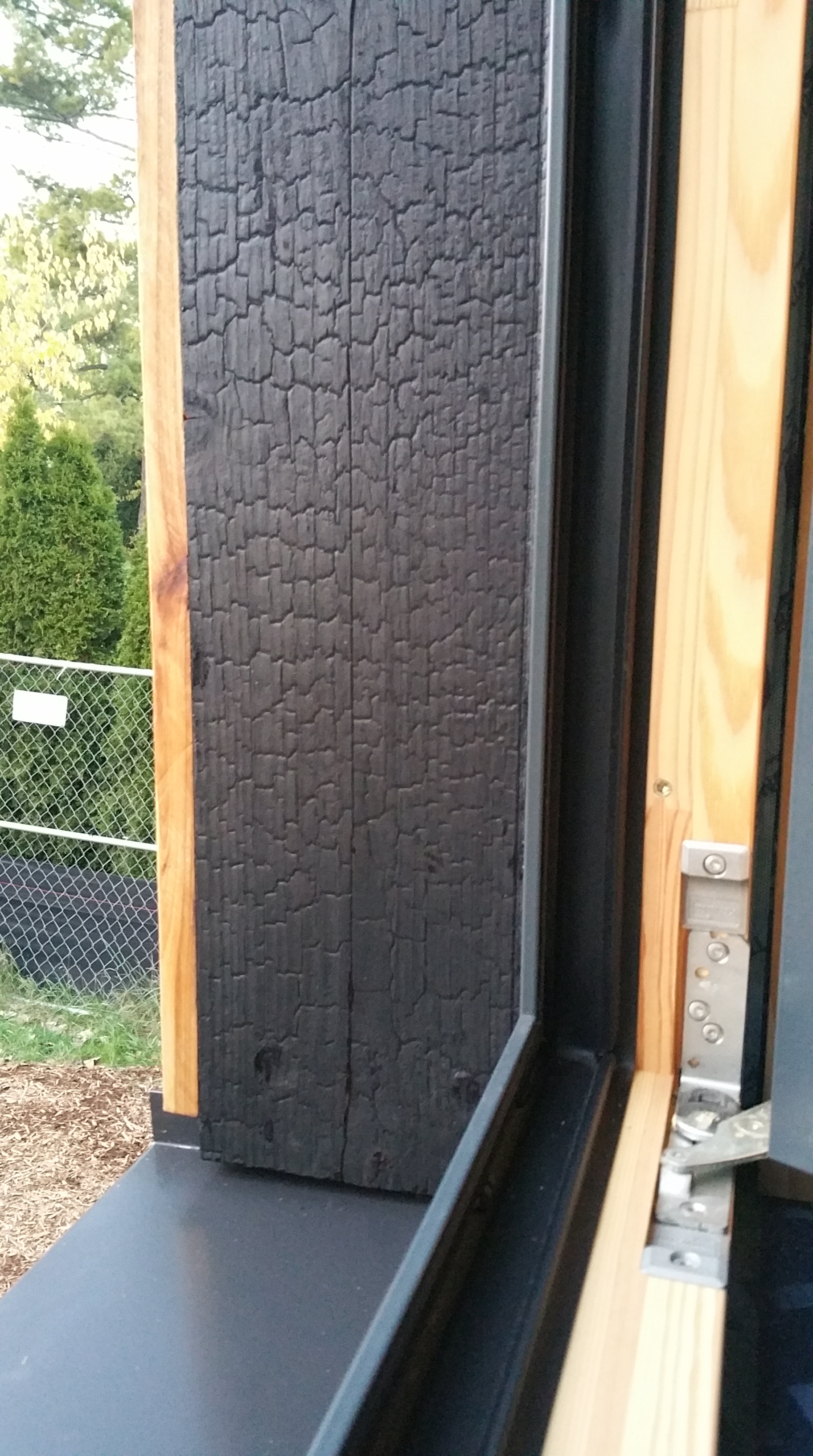
In the photo below you can see the horizontal layer of 1×4 strapping, which becomes a nailing surface for the 1×6 cedar board that will be used as a return back to the window frame.


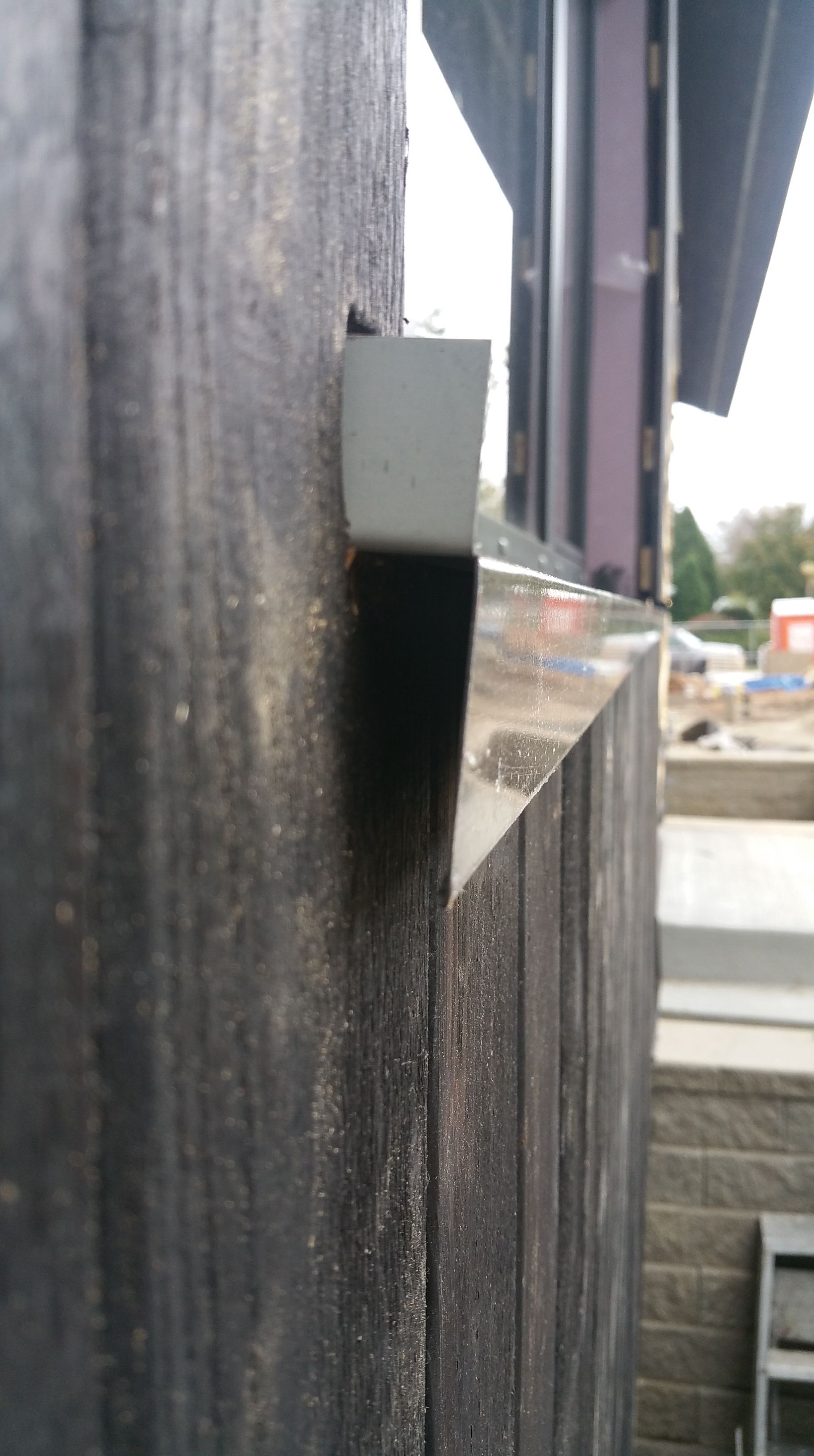
We were going for a “frameless” look for the windows so that once all the trim was installed very little of the window frame is left exposed.
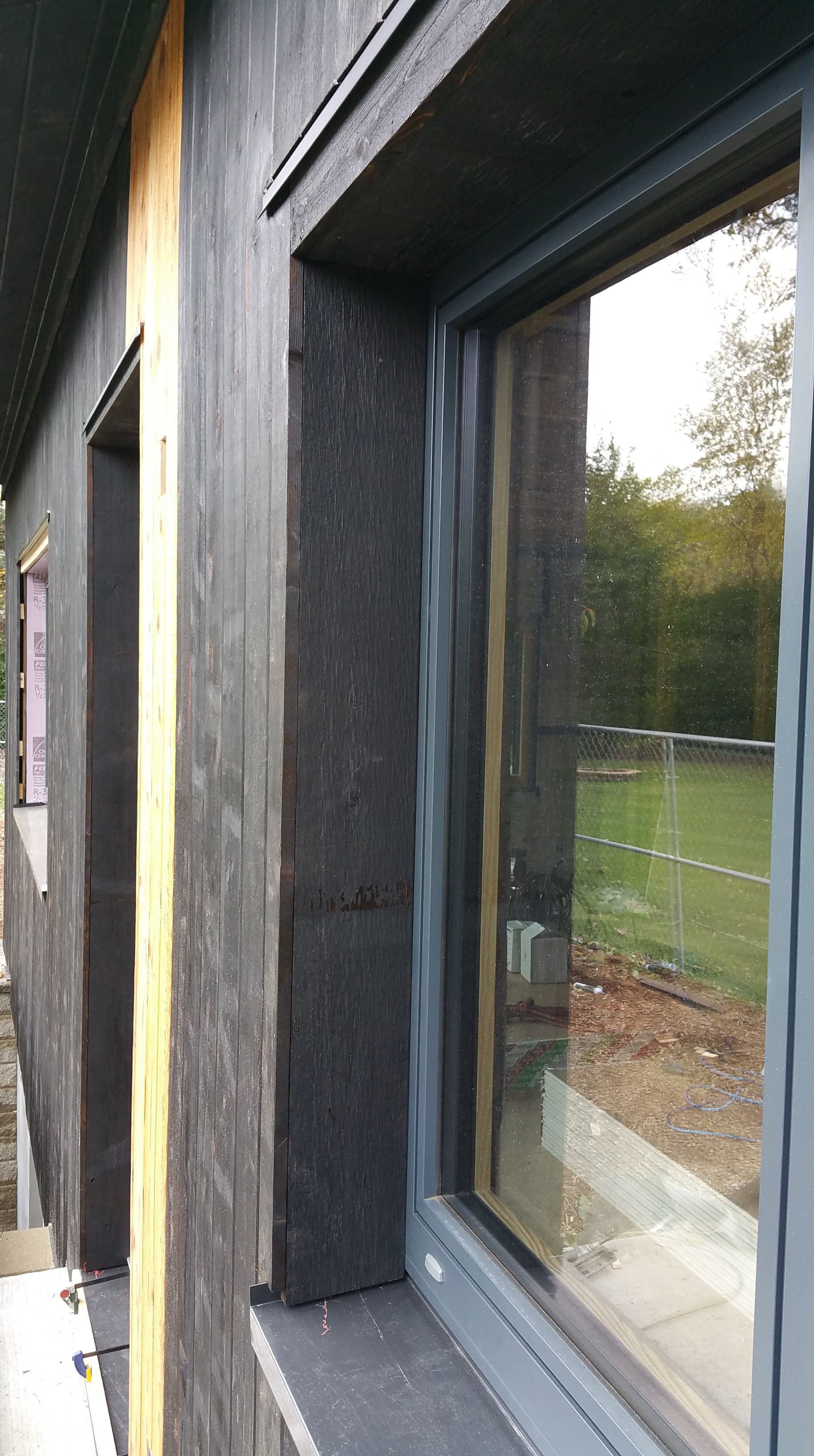
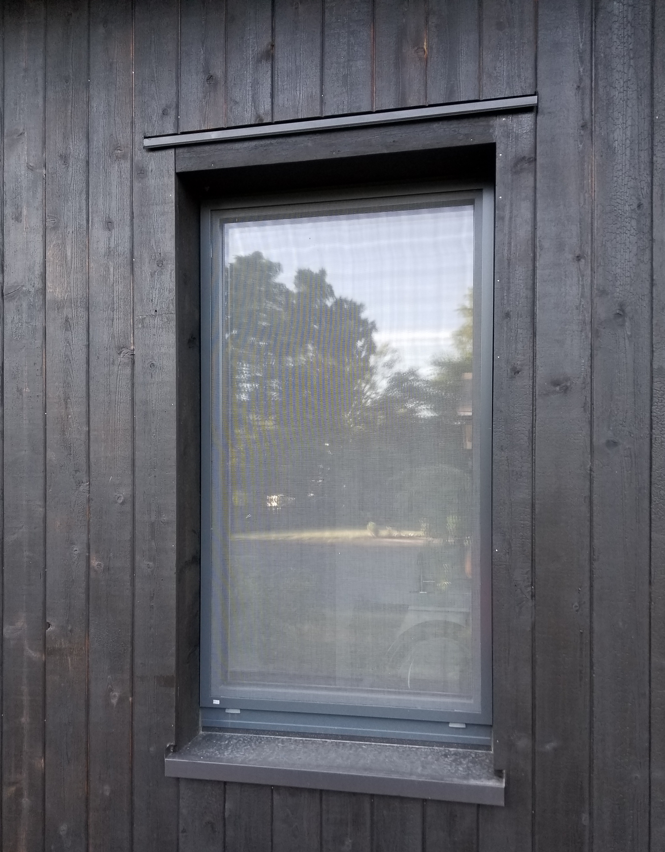
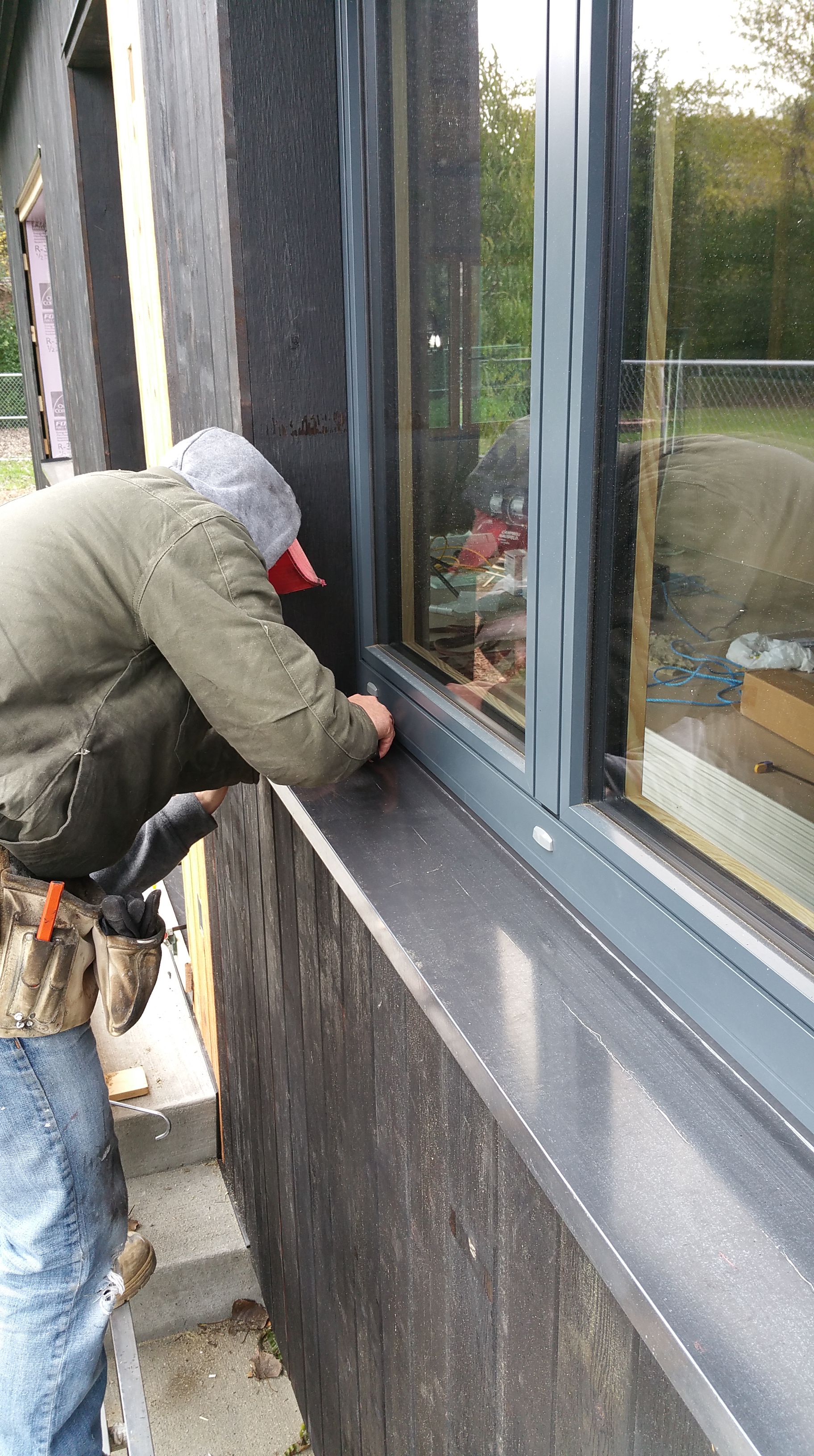
All of the elements finally in place: master bedroom window with natural accent, charred cedar used to return the siding back to the frame of the window, with the metal sill pan underneath.
Gutters and Downspouts
For the gutters and downspouts we went with Nordic Steel. They’re expensive, but they’ve lived up to the marketing claims: with a larger half-round gutter and wide diameter downspout, we’ve never had to clean out our gutters (so far, anyway). They also look really nice, and they fit in well with the Urban Rustic feel we’re going for.


Decorative Details
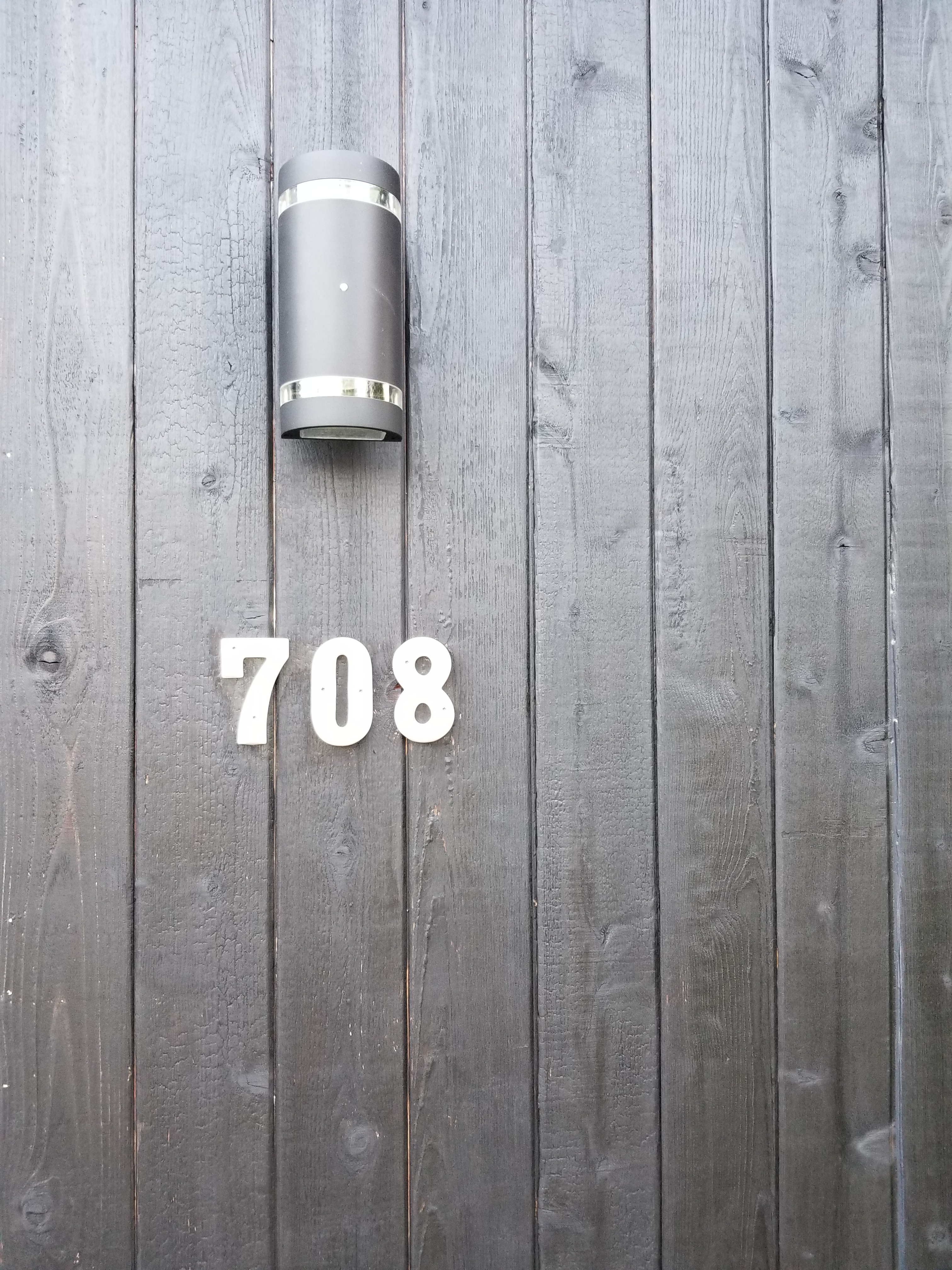
It was exciting to finally get the small, decorative pieces for the exterior out of storage. For example, I purchased our metal house numbers and our front doorbell on Etsy, at Modish Metal Art. As it turned out, Etsy proved to be an invaluable resource, both for decorating the exterior and the interior of our house (more on this later).
Our exterior lights were found on Amazon: Hyperikon

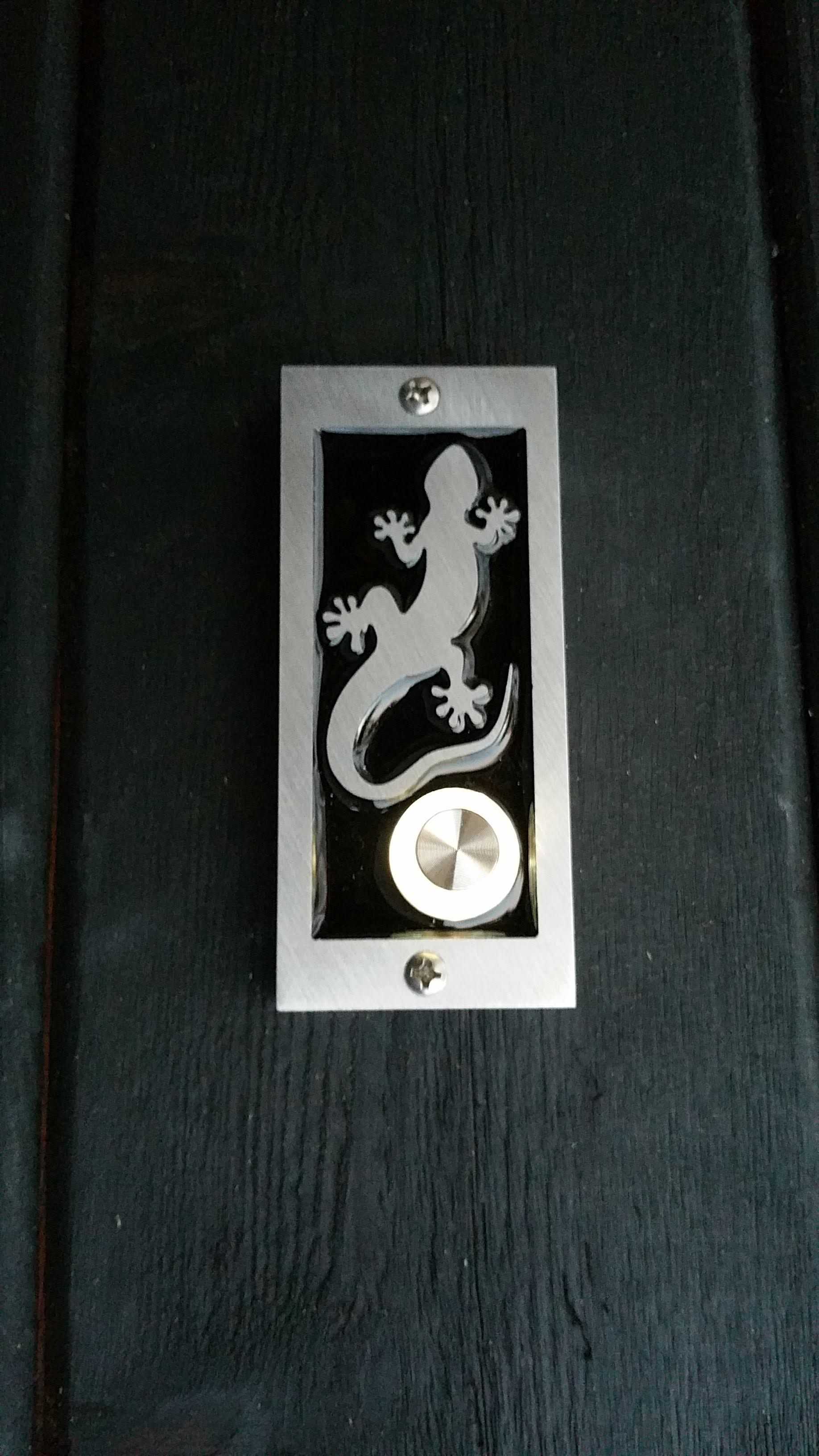

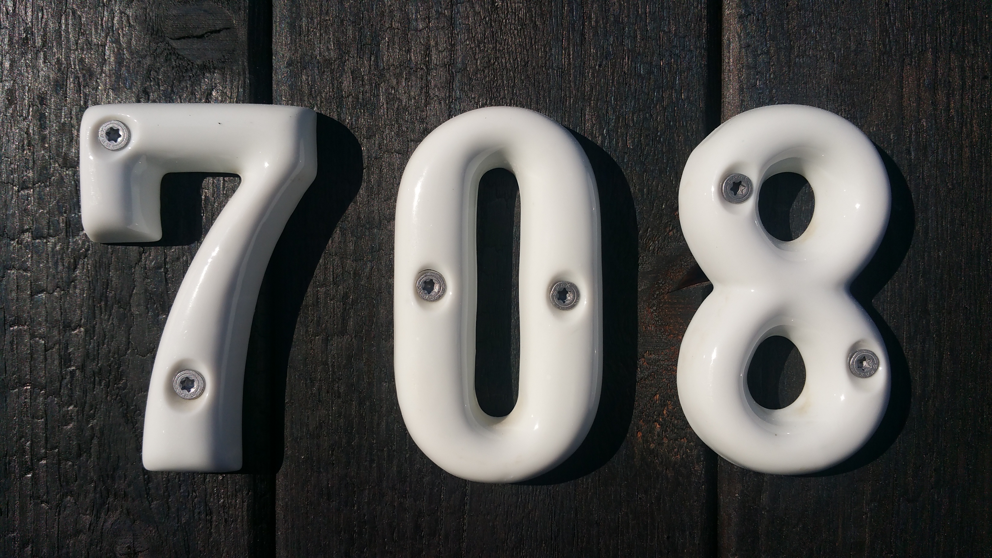
I found these white porcelain numbers on Etsy — made in Japan, so they seemed perfect for our shou sugi ban.
With some Spax screws, and the charred cedar as a background, the white numbers really pop:
Stucco for Inside Window Wells
For inside our basement window wells we initially thought we would just carry the wood siding all the way down. Once the retaining walls were in, and we saw how complicated the cuts would need to be around the stone — not to mention all the work required in hammer drilling concrete bolts into the foundation to establish strapping for the charred cedar — we realized wood wasn’t really a viable option.
After contacting Rockwool directly, they told me stucco over the exposed Comfortboard 80 would work fine, although it wasn’t presented as an option in the paperwork they had originally given to me. This was a great relief, and Wojtek had a friend who installed stucco, so it ended up working out really well.
The window bucks around the basement windows took a real beating during the prolonged construction process, so I touched up the sills with Prosoco’s Fast Flash to make sure they were watertight.

Tomasz would eventually take the stucco up to the Cor-A-Vent insect screen, and then Wojtek and Mark would lower the charred cedar below this point by several inches, completely hiding the seam between the two materials.

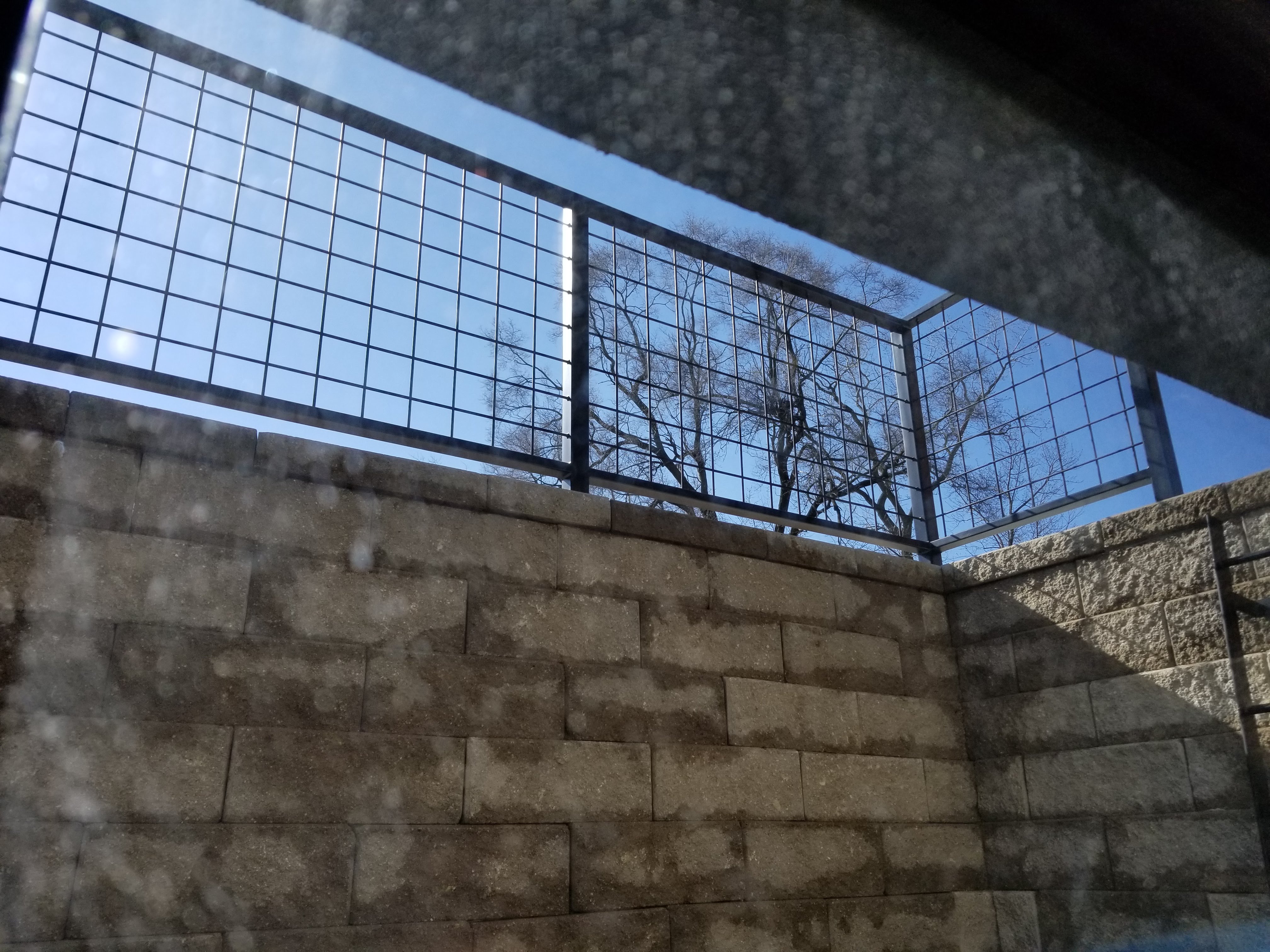
For the railings around the window wells we wanted to use a hog wire panel (in keeping with the Urban Rustic theme). Initially, I thought I would use Wild Hog Railing combined with wooden posts, but decided an all-metal railing system would be better, mainly for durability reasons.
How Durable is the Charred Cedar?
Initially at least, our luck hasn’t been great with the charred cedar.
For instance, during our first summer with the siding last year we noticed that we had some carpenter bees buzzing around the house. At first, I didn’t think much of it since the charred cedar is supposed to be insect-resistant. But then I noticed a bee digging a hole above one of the windows and realized something needed to be done.
After reading up on their lifecycle, I used a spray inside the holes that were present (about 10 total after I went looking), following up a couple of days later with a few puffs of diatomaceous earth. After waiting two more days, I then stuffed each hole with some steel wool before covering each entry point with some black sealant. Once patched, these areas are virtually invisible.
This spring and summer we kept a careful eye on these specific areas, along with the house more generally, but no bees emerged, so it looks like the problem has been resolved. Nevertheless, it’s something we’ll need to look for every May and early June.
Looking back, the bees nested in the exposed sub-fascia on two sides of the house before the siding and overhangs were installed. At the time, not understanding their lifecycle, I just plugged these holes with some caulk, thinking that would suffice. Unfortunately, it wasn’t, and their offspring emerged the following spring/early summer digging through the charred cedar fascia. If I had properly addressed these spots with a spray and then diatomaceous earth combination initially, there’s a good chance I could’ve avoided this problem altogether.
Since their offspring return to the area where they initially emerged to create their own nest sites (or even to reuse the existing one), it’s extremely important to address the problem as soon as possible, otherwise one or two small nests can quickly expand to dozens of bees swarming around the eaves of a home in early summer. And, even more sinister, it’s these nesting tunnels that attract the attention of woodpeckers who go looking for them, hammering the wood to get to the larvae below the surface, and scarring, if not ruining, the wood in the process.
In fact, this past January there was a morning where I heard a sound like a machine breaking down, almost like a chain breaking off its wheel. When the sound moved across to the other side of the house I suddenly realized it was a woodpecker. Luckily, he was sitting on a downspout right outside our window, so just opening the window was enough to startle him and make him fly off. When I went outside to look for damage I only saw a couple of small spots, as if he were just testing the wood for insects and found nothing. Thankfully, he hasn’t been back since. We’re hoping it stays that way.
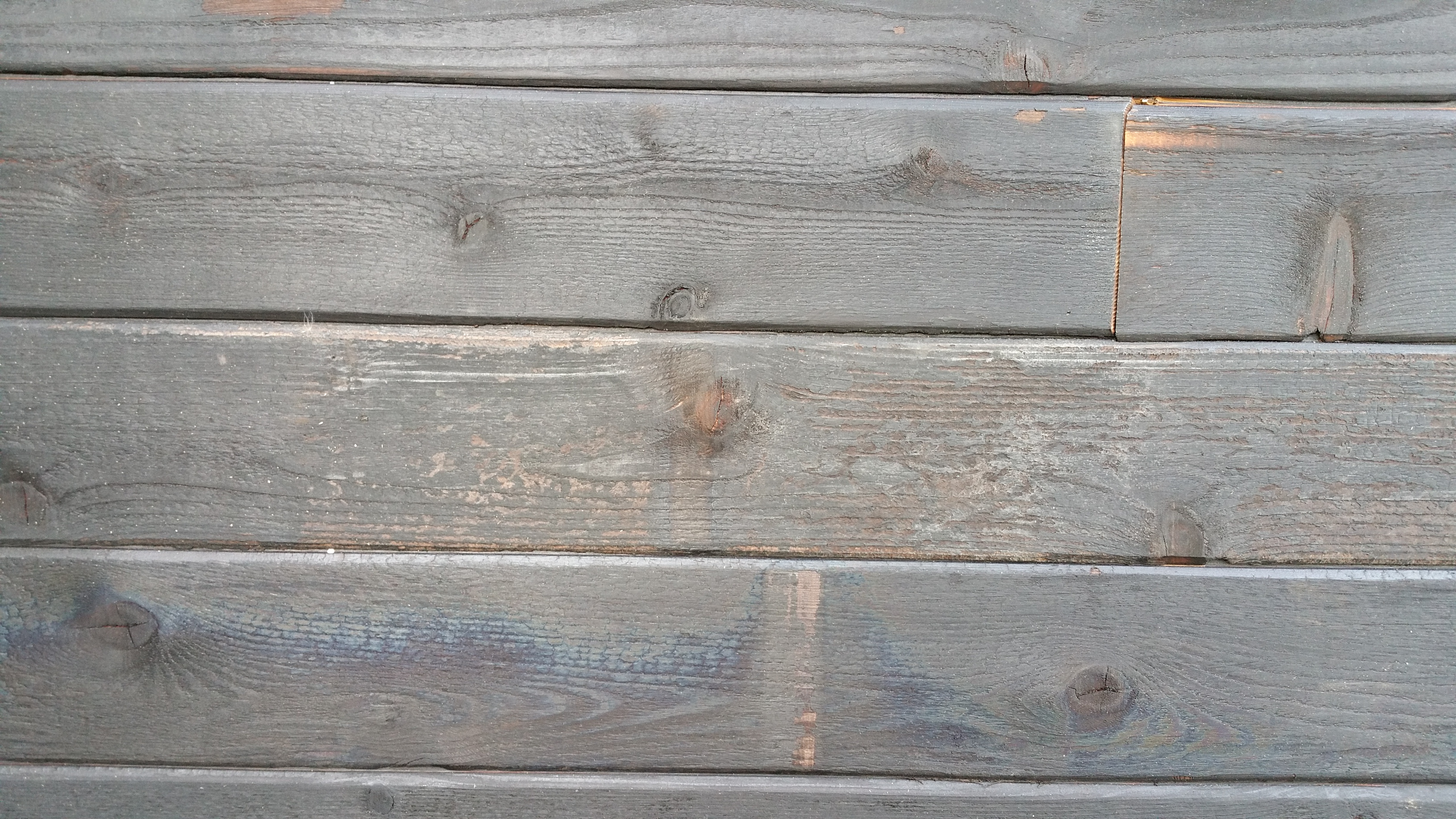
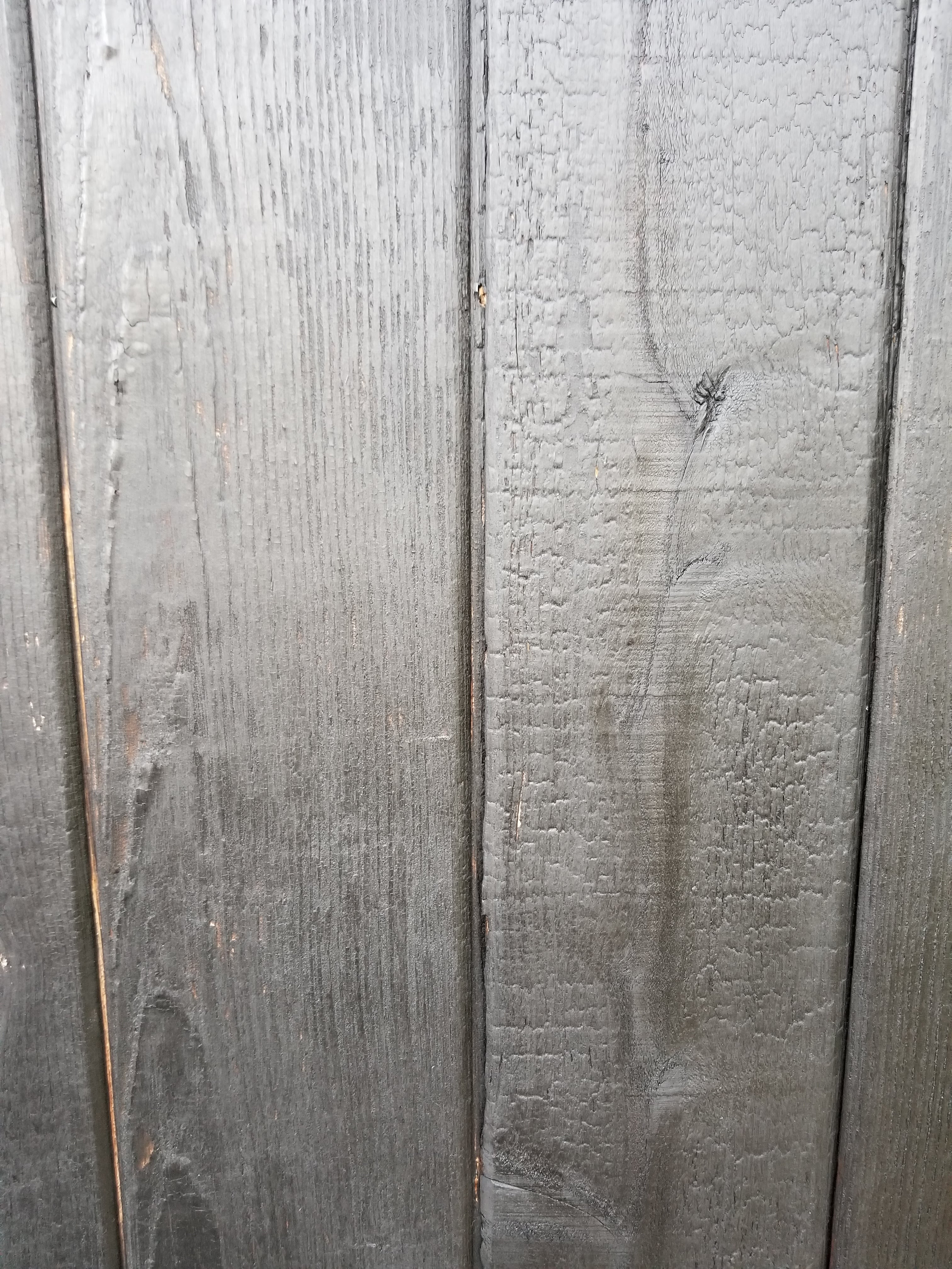
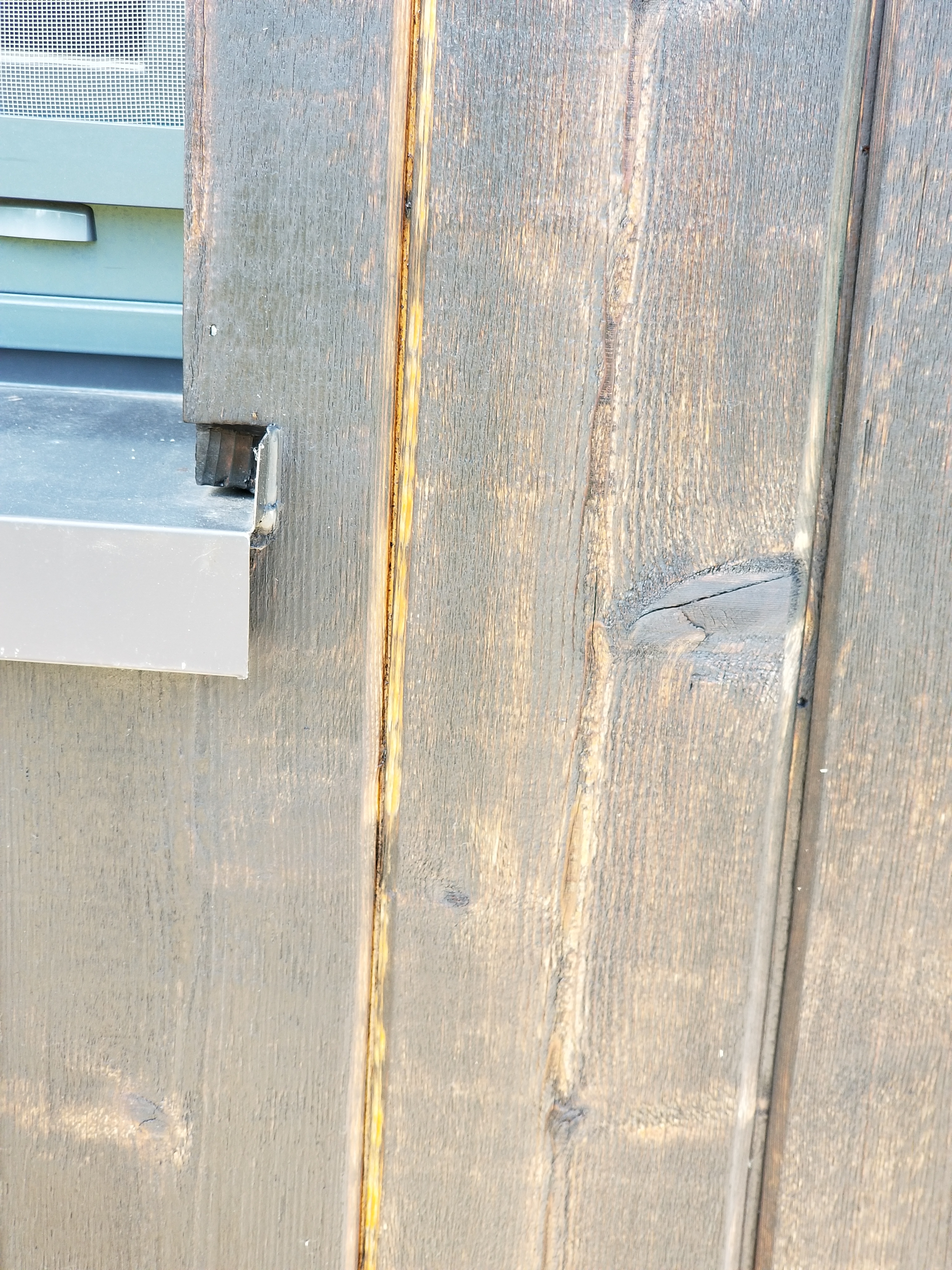
Also, after the siding was up for about a year, especially after its first summer, it started to show some wear. Since the north side has held up the best, I can only assume it’s exposure to the sun that caused most of the wear to occur on the other three sides of the house and garage (although I’m sure rain played its part, too).

In general, areas with a heavier layer of char have held up better, but sometimes even in these areas we’ve seen some missing char develop.
Here are some pictures showing the extent of the fading:

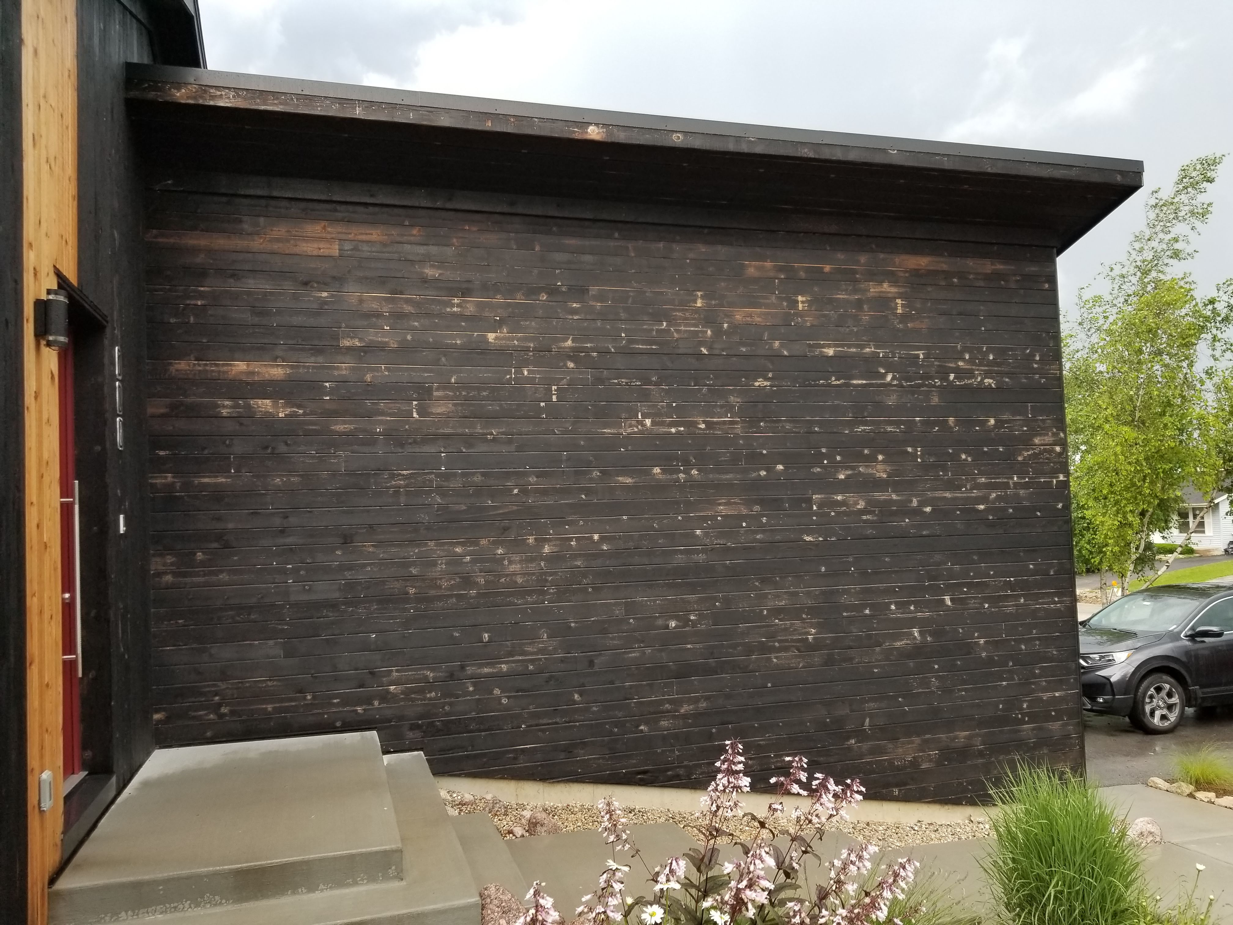
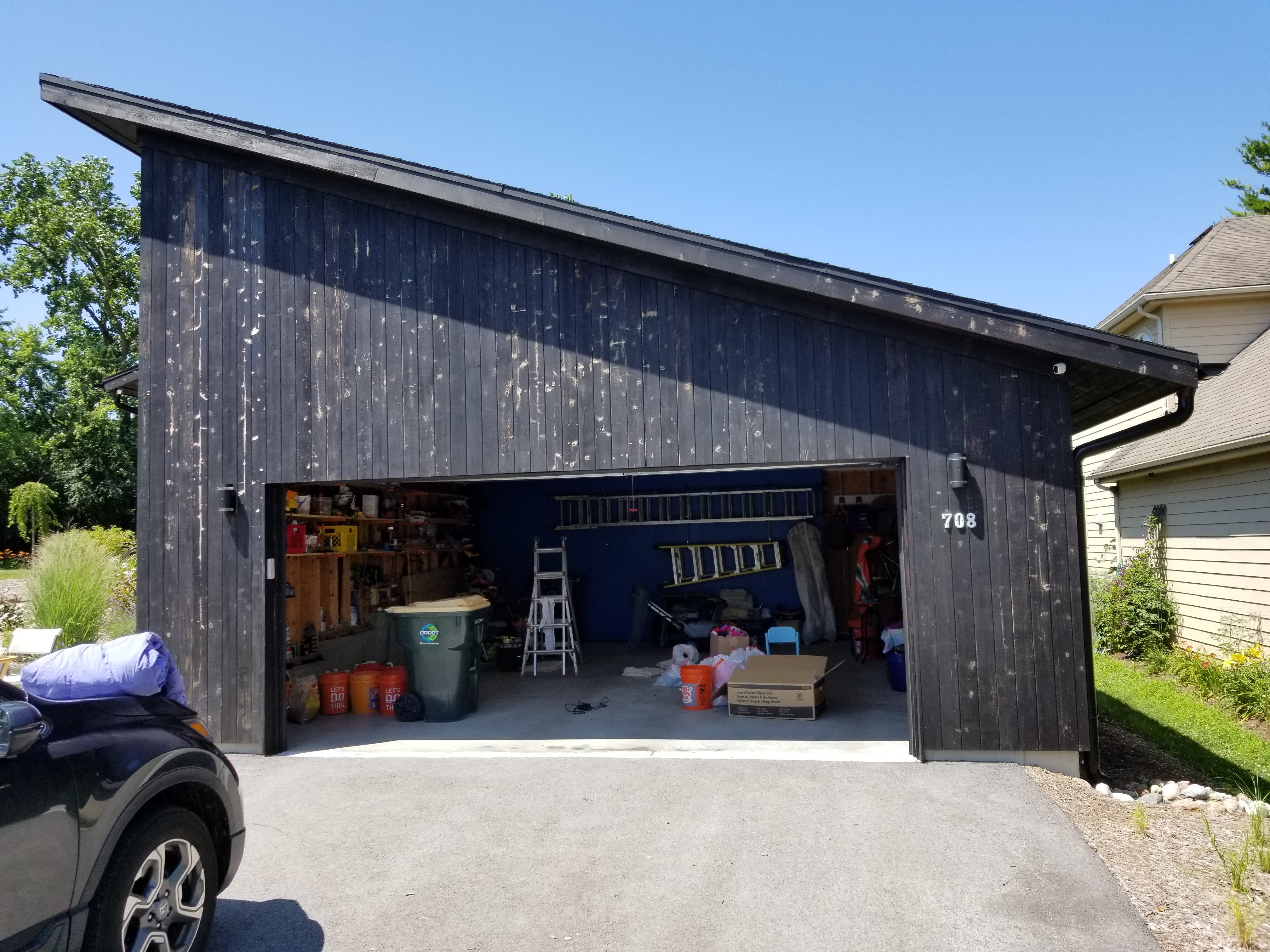
The wear occurred slowly, so it kind of crept up on us. At some point, both my wife and I started to remark on the changes. And some areas are far worse than others:
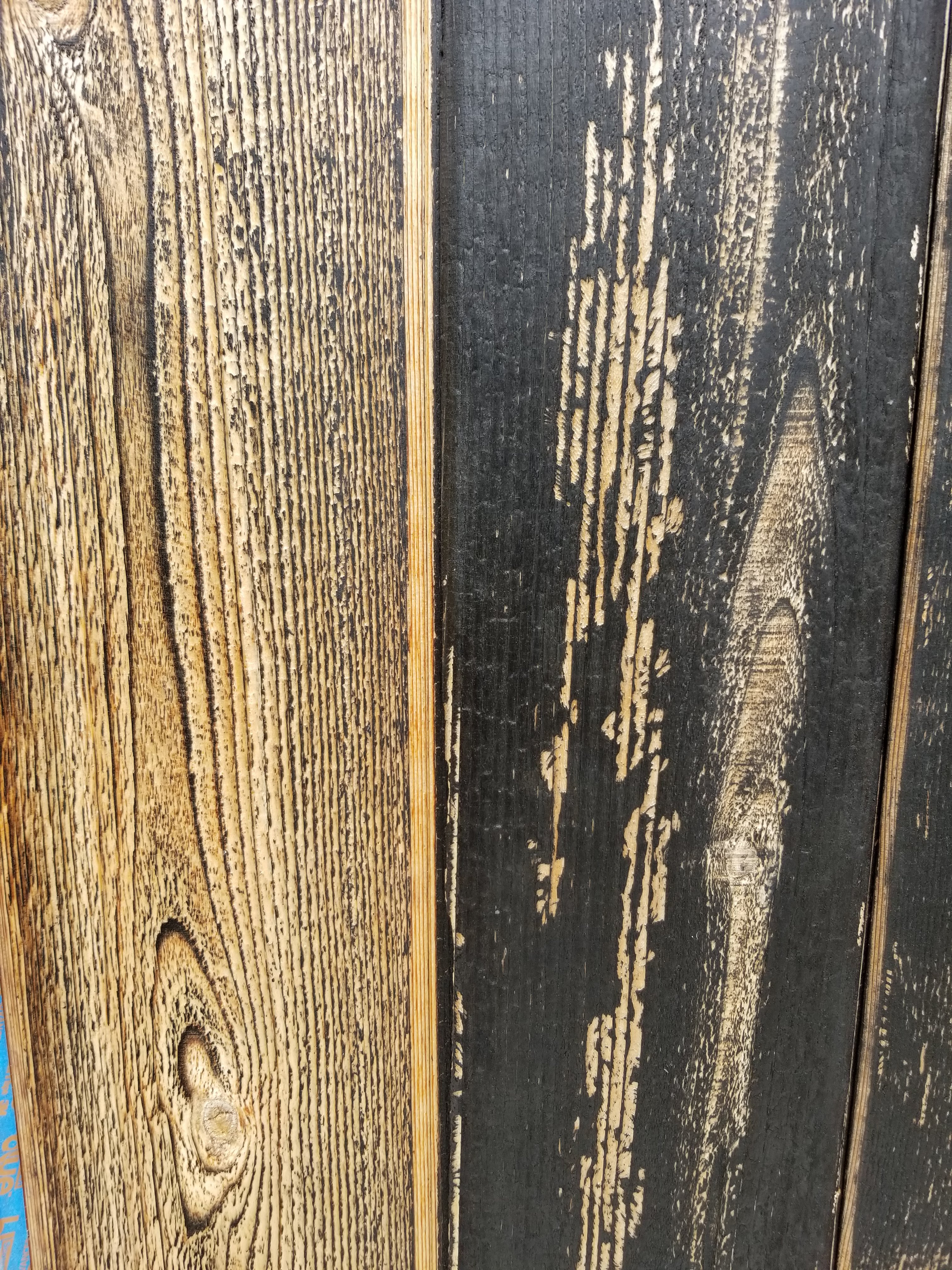
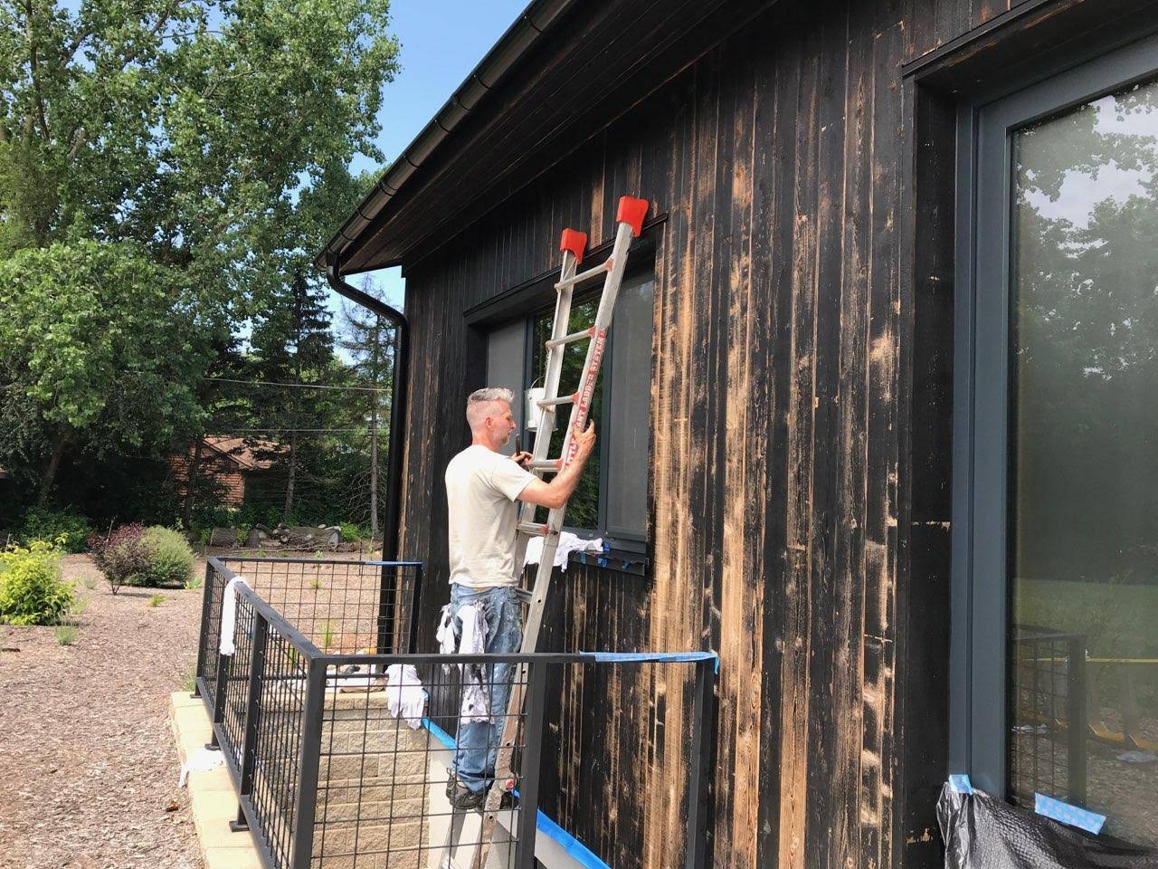
Although the charred wood wasn’t in any immediate danger, and I enjoyed this ‘aged’ look, my wife said she preferred the original, more opaque black look of the siding. And to be honest, since many of these exposed areas were turning gray, I worried about how well any product we might try in the future would soak in and adhere, so I decided to address it this year rather than wait any longer.
Thankfully, I was aware of Kent’s blog, Blue Heron Ecohaus, having seen it featured on GBA. He goes into detail regarding his decision to use Auson black pine tar instead of going with a shou sugi ban finish.
Our siding was installed in the Fall of 2017, and last summer I experimented with the recommended 50/50 mix of Auson and linseed oil, using it to touch-up a handful of boards, including all the cut edges that Wojtek and Mark had meticulously burned. Without any tung oil, these exposed edges had faded badly, almost to the same consistent gray on every piece. Again, this may be because they didn’t receive an especially heavy level of char when burned, but I can’t know for sure.
The guy in this video had a lot more fun applying the product than I did:
Even though the charred wood is said to easily last for decades, we also knew that it should get oiled about every 15 years to improve its durability, so having to do touch-ups wasn’t as heartbreaking as it might otherwise have been. I guess our 15 year mark came early. It also helped that it wasn’t necessary to do any overhangs (fascia or soffit) — those areas seem to be holding up really well, including the areas of ‘tiger striping’.
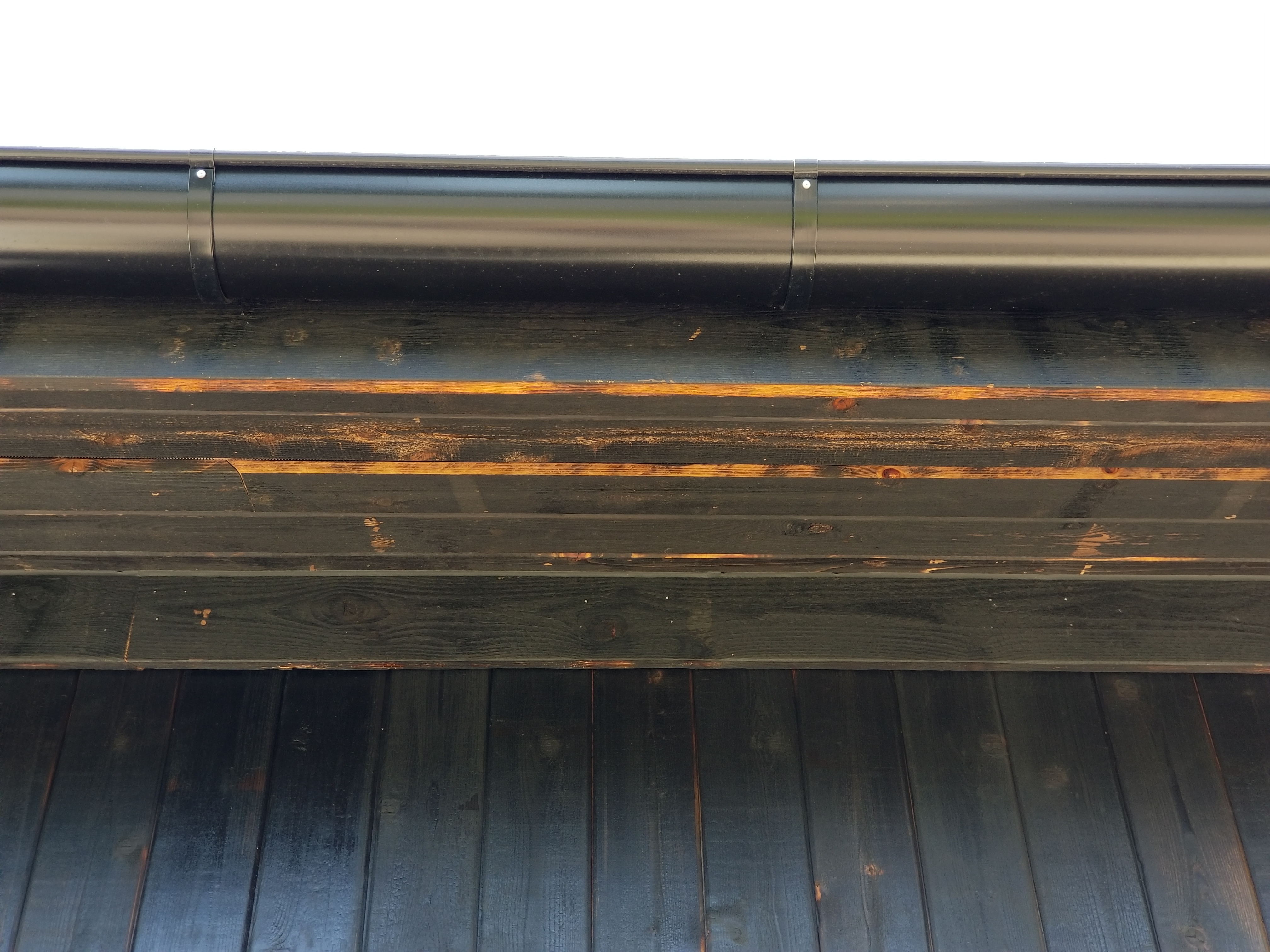
A second view of the eaves with the ‘tiger striping’, along with the soffit vent, gutter and downspout, and, if you look closely enough, a moth hanging out on the Kwikmesh screen:

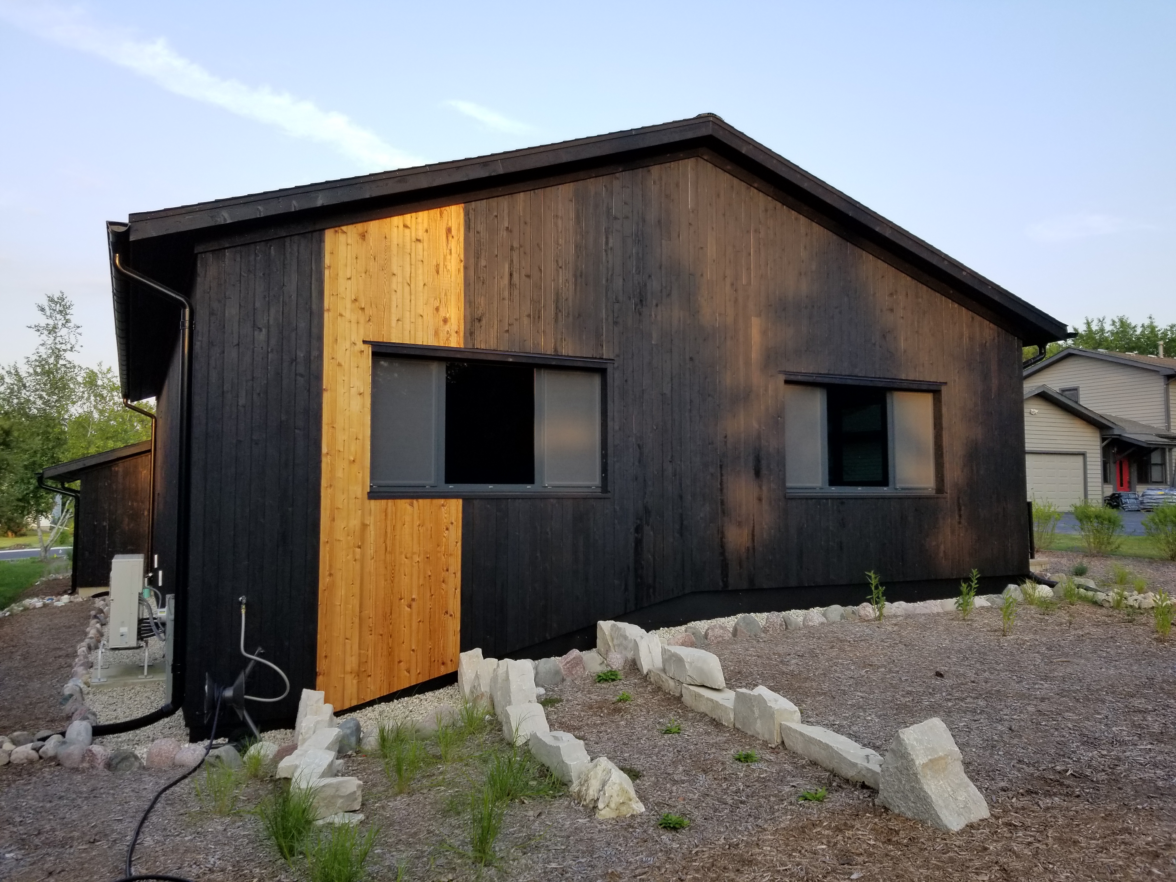
Here are some pictures of the ‘refreshed’ charred cedar:

Our little black box with revitalized skin:


If I was going to do charred cedar, or shou sugi ban, again — at this point, that’s a big ‘if’ — I would definitely insist on doing a uniformly heavy char finish (or ‘gator’ finish), and I would use the black pine tar to try and seal-in the char as much as possible. As beautiful as the lighter charred areas were when they first went up, they just couldn’t stand up to the weather — at least that was our experience anyway.
Nevertheless, the pieces of shou sugi ban that we’ve incorporated into our interior have held up nicely with just a tung oil finish, showing no signs of deteriorating, presumably because they’ve avoided any direct sun or rain (more on these areas in a future post).
Another option would be to use a metal siding version of charred wood:
Bridgersteel
I’m guessing it’s expensive, but it could be a viable alternative, especially for those unwilling or unable to do maintenance chores for the charred wood siding over time but who are, nevertheless, in love with the look of real shou sugi ban.
Still another product worth considering:
Thermory USA
This product is newer, so its long-term durability is still debatable until time proves definitively one way or the other, although the idea does seem promising.
On a bad day — like when I had to hunt down carpenter bees, or touch-up the char with the pine tar — I know I should’ve gone with a more carefree siding material like metal. And yet, on most days, when the overhangs and siding are perfectly fine, it’s hard to argue against the singular look that charred cedar can produce.
So even with all the time, effort, money, and frustration that’s gone into making the charred cedar work, I still love the way it looks every time I pull into the driveway, or notice it while working in the yard. It’s just important to understand that as with anything worth doing, or any labor of love — like building our house it could be said — it comes at a price.


You must be logged in to post a comment.