
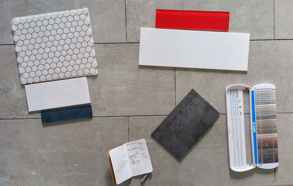
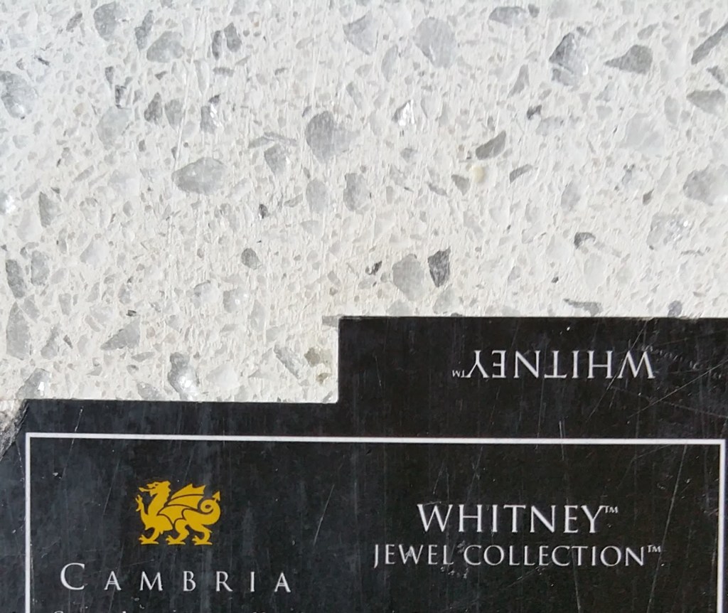
Design Elements
To create a warm, inviting bedroom and bathroom we knew we wanted to incorporate the same basic Urban Rustic design elements that we intended to use throughout the house. At their most basic level, these elements include wood, metal, and concrete (or stone). These show up at the largest scale in our hickory wood floors, our ‘stained’ concrete porcelain tiles, and our quartz countertops (kitchen and bathrooms). On a much smaller scale, these elements show up in variety of decorative objects that we have carefully curated, placing them throughout the house.

The overarching goal was a mix of sleek and modern with aged but beautifully worn. Whether for the exterior or the interior, the visual cues were rooted in a motif of early 20th century artisan workshop and small farmhouse.
“Successful modern reinterpretations of traditional architectural styles move us not only at an aesthetic level. They show us how we, too, might straddle eras and countries, holding on to our own precedents and regions while drawing on the modern and the universal… Without patronising the history they profess to love, they show us how we, too, might carry the valuable parts of the past and the local into a restless global future… [succeeding] in succumbing neither to nostalgia nor to amnesia.”
— Alain de Botton, The Architecture of Happiness
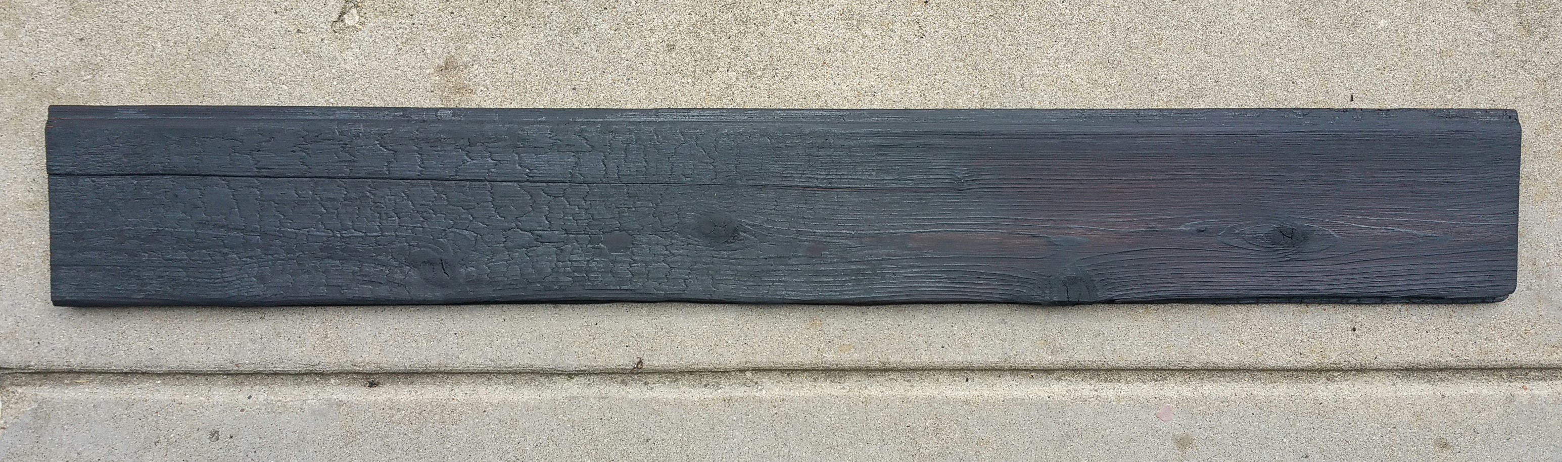
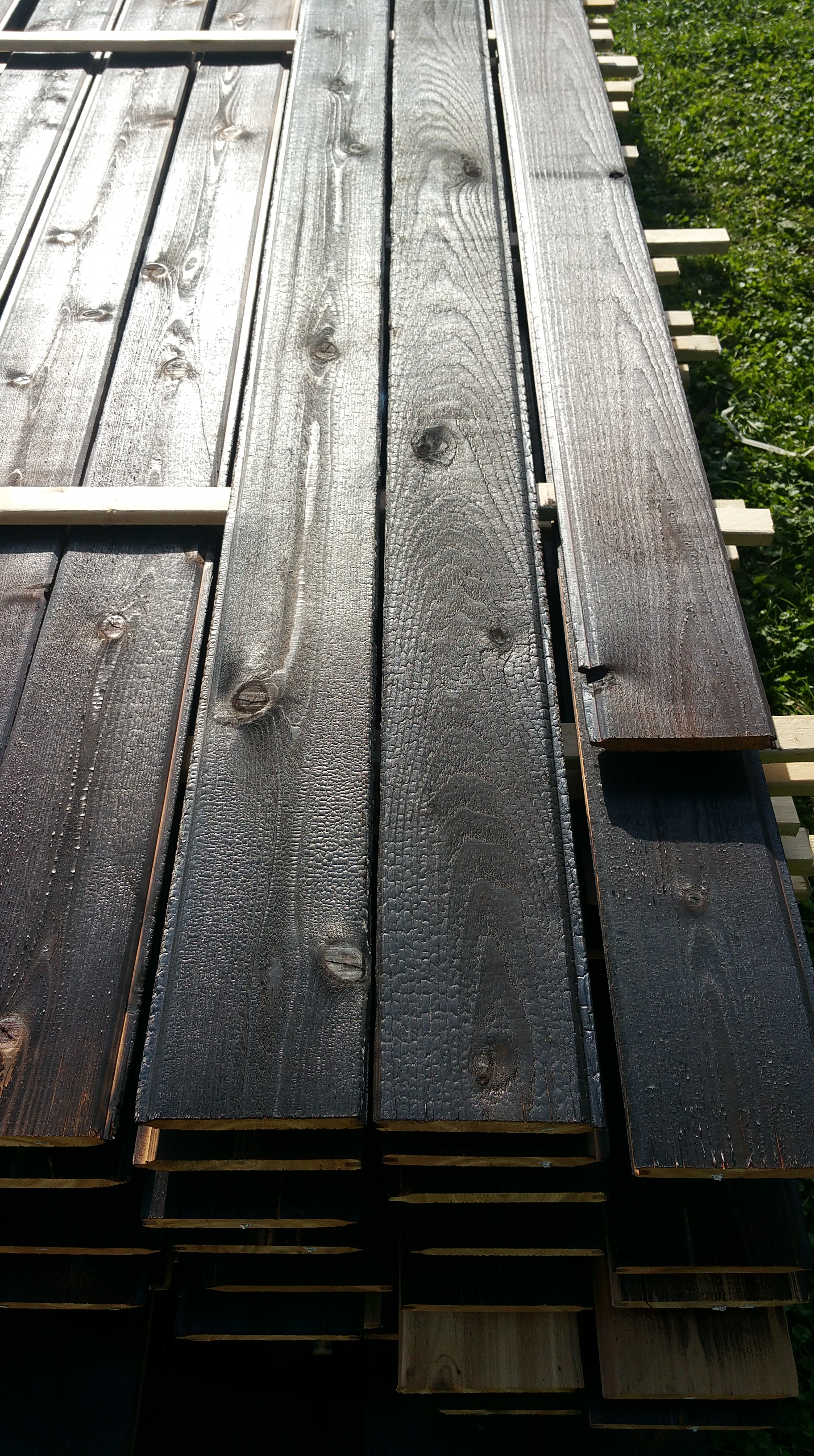
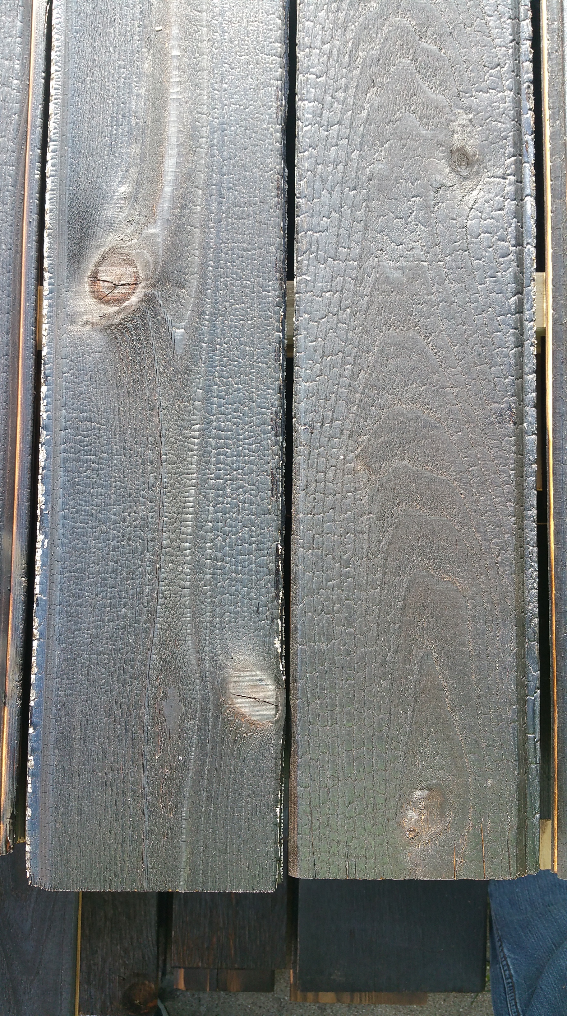
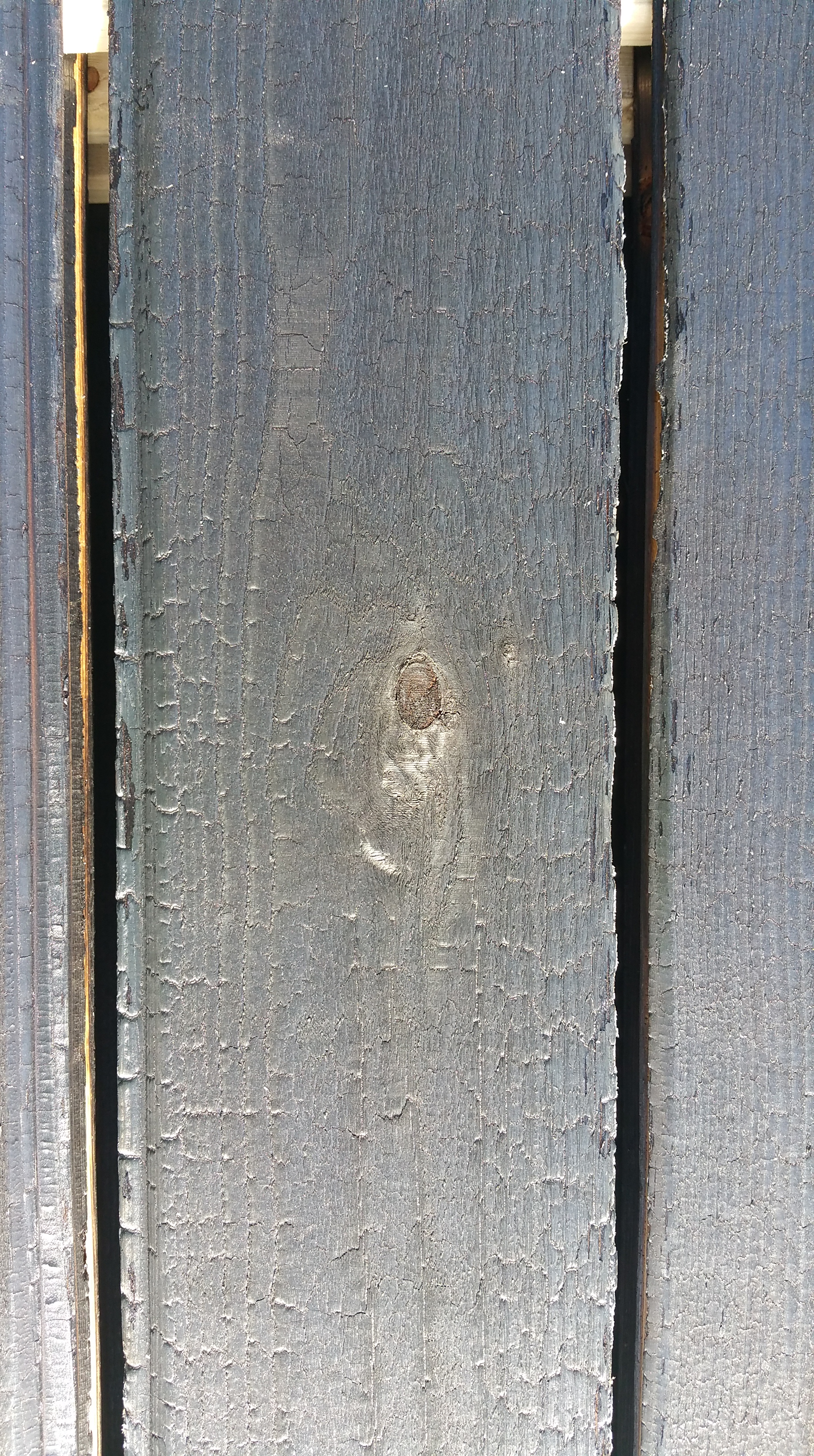
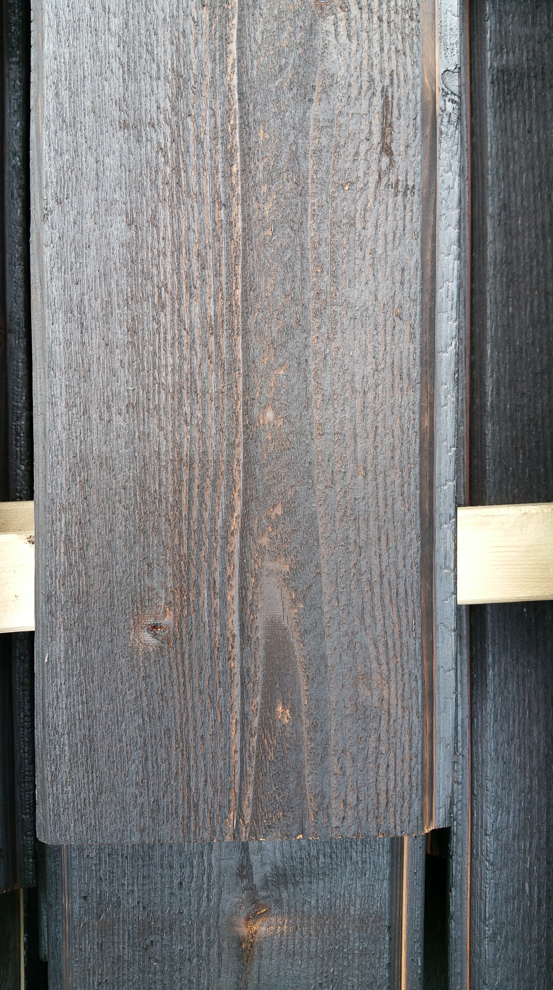
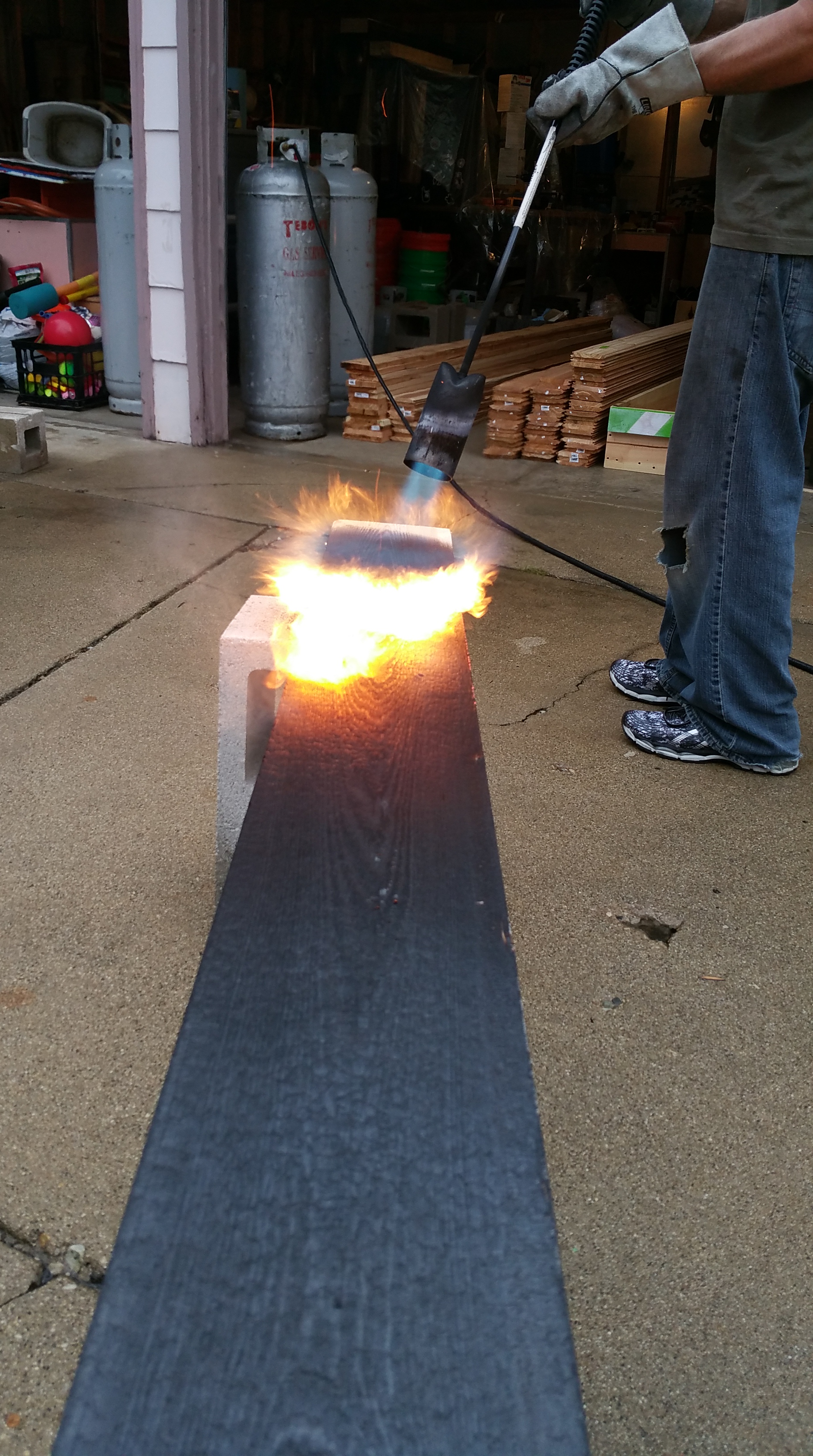
On the exterior this is achieved with a blend of black charred cedar, or shou sugi ban (aka yakisuki), and a restrained use of natural cedar highlights:
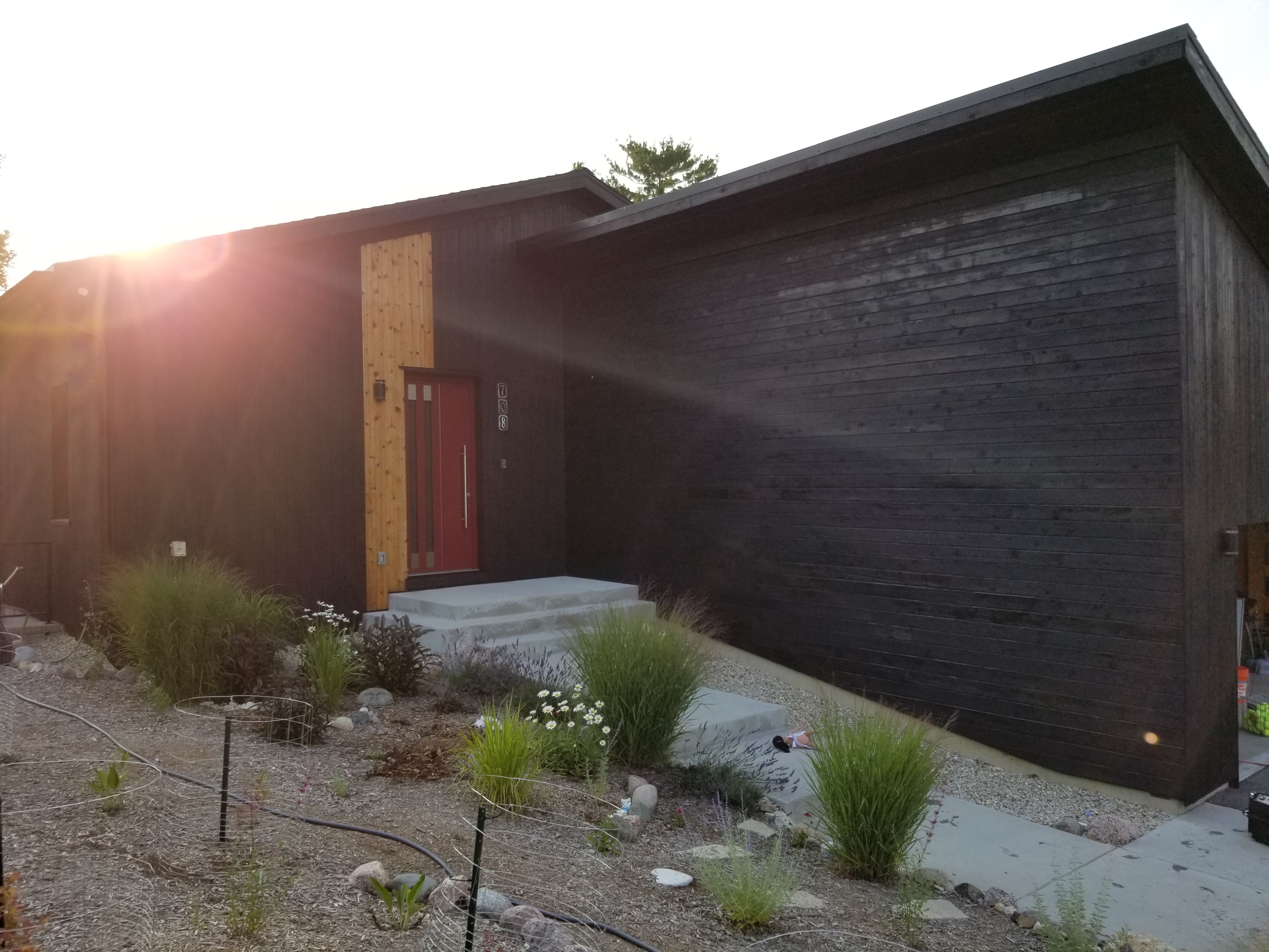
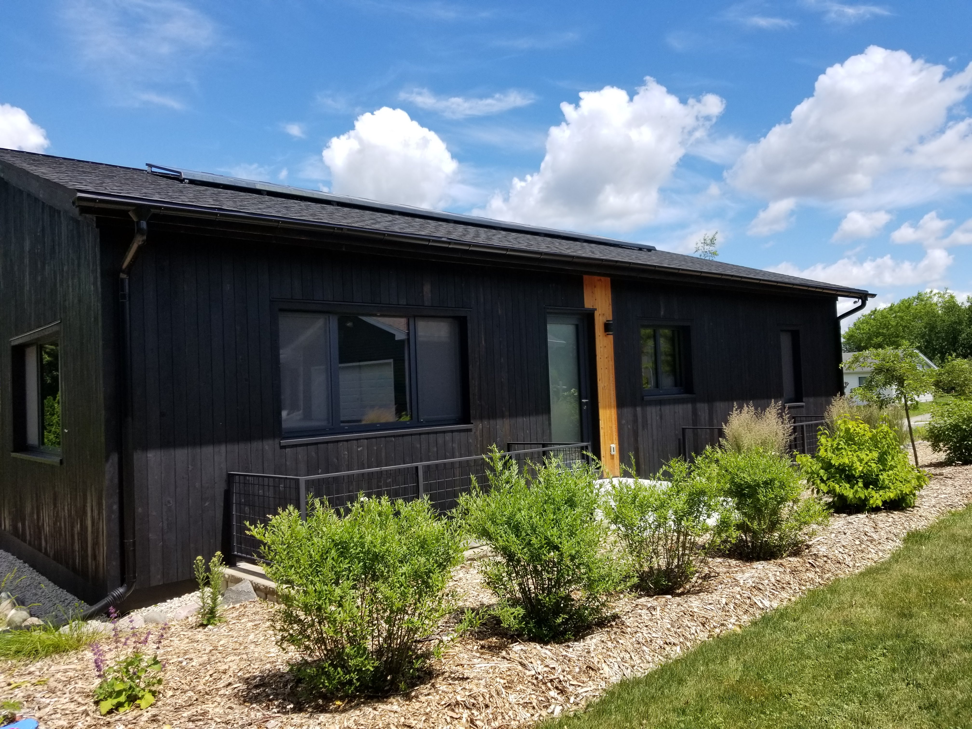
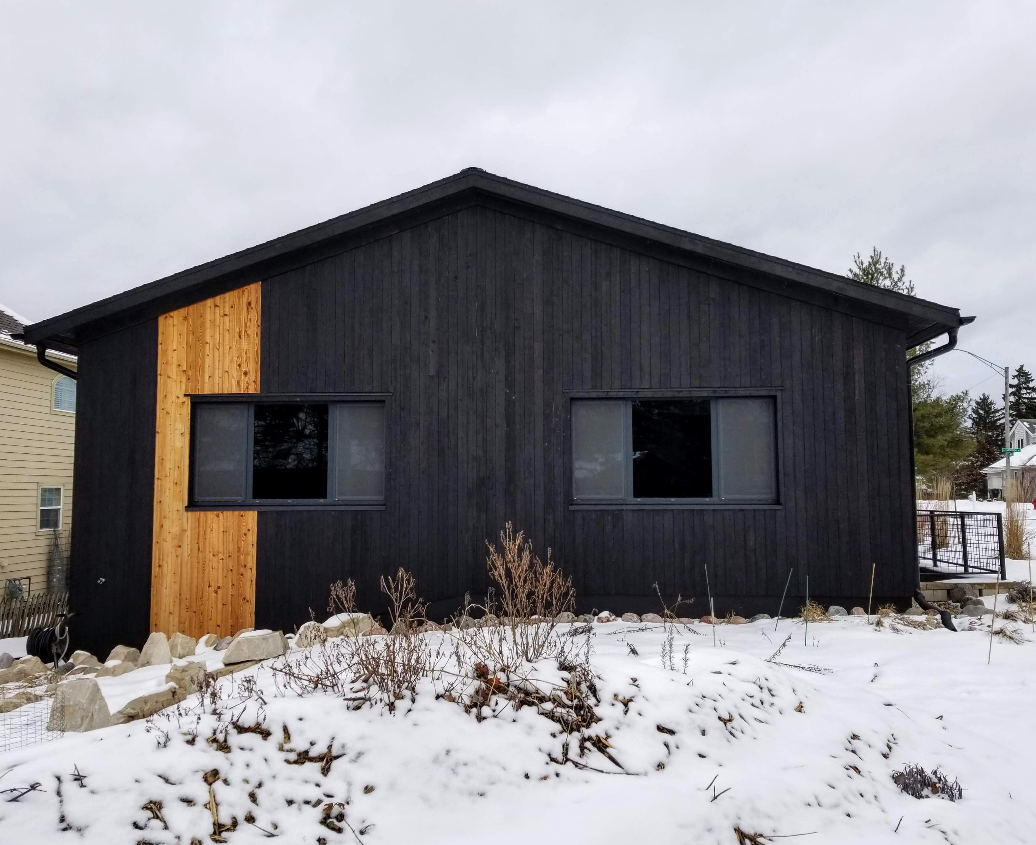
The rustic siding and overhangs are then complemented by the modern, sleek, metallic windows, doors, and even the gutters and downspouts. These visually heavy, and mostly dark, elements play well with the surrounding landscape: in summer, contrasting with the vibrant green vegetation and bold flower colors; in winter, our black box stands out in the surrounding white blanket of snow.


Heading indoors, we knew we wanted to experience the inverse of what we established on the exterior.
“… the balance we approve of in architecture… alludes to a state that, on a psychological level, we can describe as mental health or happiness. Like buildings, we, too, contain opposites which can be more or less successfully handled… we instinctively recognize that our well-being depends on our being able both to accommodate and to cancel out our polarities… Our attempts to harmonise our different aspects isn’t generally helped by the world around us, which tends to emphasise a range of awkward antitheses. Consider, for instance, the truisms which hold that one cannot be at the same time both funny and serious, democratic and refined, cosmopolitan and rural, practical and elegant, or masculine and delicate.
Balanced buildings beg to differ.”
— Alain de Botton, The Architecture of Happiness
Where the black siding absorbs sunlight, creating a brooding, deeply rooted in place black box, for the interior we wanted to make sure we flipped this dynamic, with a mostly neutral baseline, allowing us to then accent this bright and light foundation with vibrant pops of color. Where the exterior is dark and bold, we wanted the interior to be light-filled, warm, and inviting.


As a backdrop, we went with clean white ceilings and basic painted wood trim details. With light gray walls as a neutral canvas, it allowed us to play around with colors and textures, both for artwork and in terms of furniture or decorative objects. With this basic palette of colors and materials, we knew that the bold artwork that we wanted for our walls would really pop and have a long lasting visual vibrancy over the widest possible range of the color spectrum.
Going with basic painted white trim also meant we could contain costs while also keeping the main focus on decorative elements like flooring, wall art, and miscellaneous decorative objects.
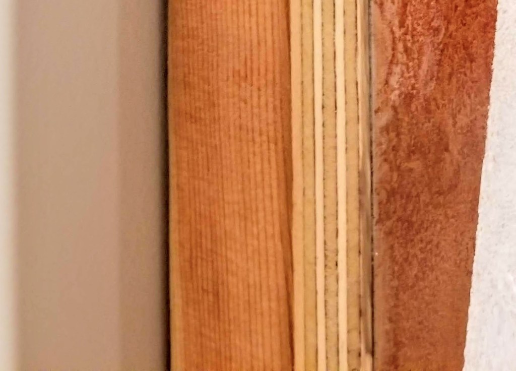
For the baseboard, we went with 1×6 poplar, which we had used previously in our last house:
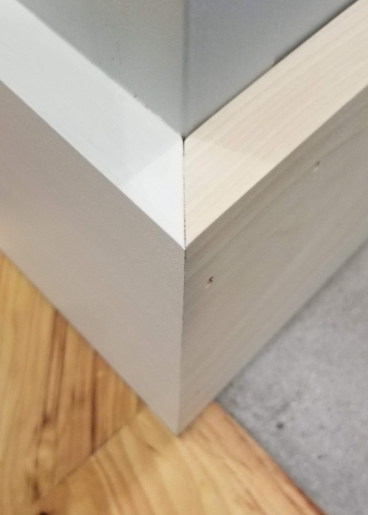
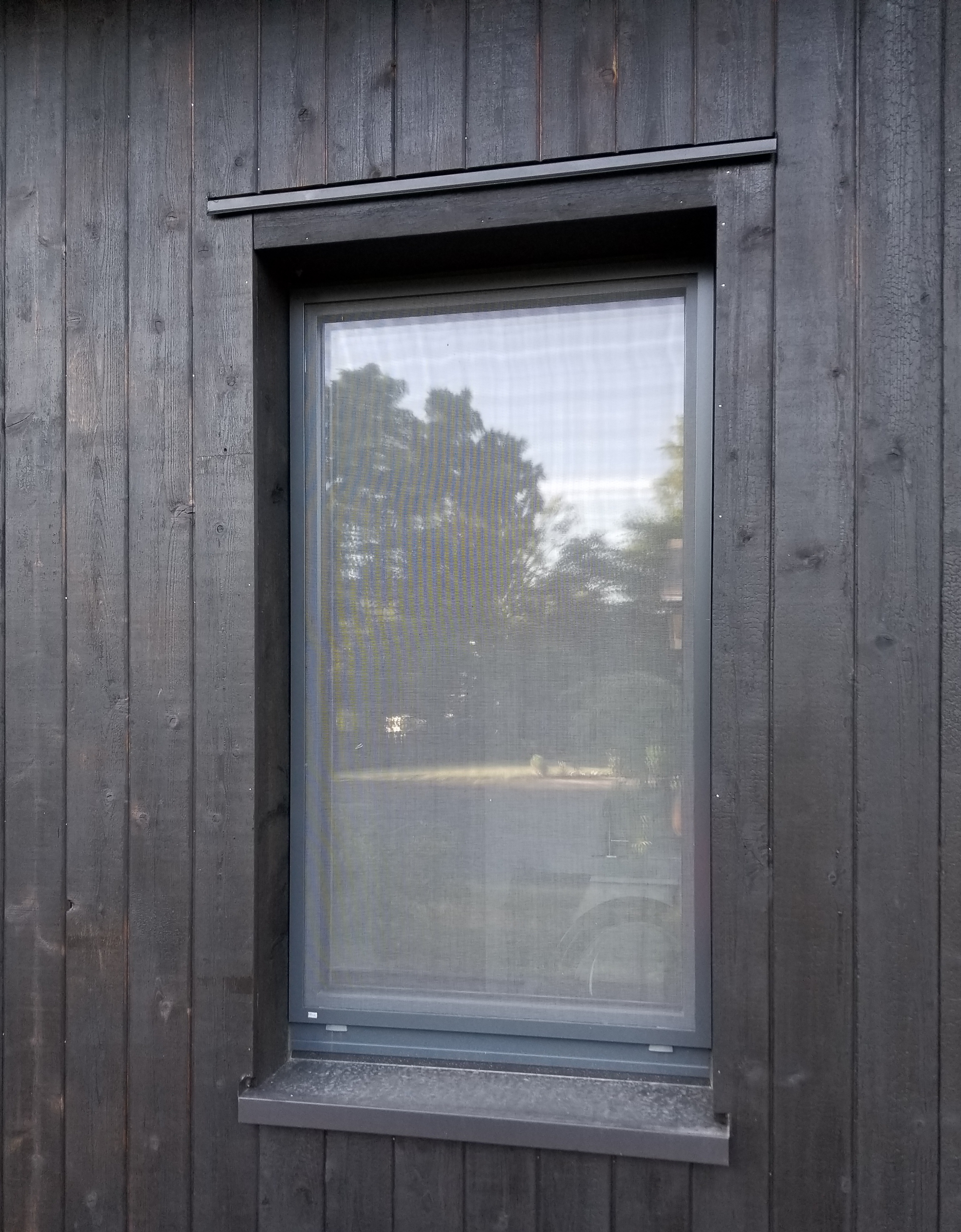
Around exterior doors and windows we chose to utilize drywall returns rather than more elaborate wood trim details. The exception was for our window stools. Here, we went with 8/4 poplar. The thicker material goes well with the chunky profile of our passive house doors and window sashes, particularly noticeable when the units are open.
Below, testing out a piece of the poplar stool in our Pantry-Laundry Room, trying to figure out how far beyond the window opening to go with the horns:

To create a more rustic, informal look, in addition to the thickness of the material, saw marks on the outside edge were mostly left unsanded. The face of each stool was given a gentle, rounded-over edge by hand, while being careful to sand — only minimally — on and around the surface of the saw marks.
Even though I was a little worried about not sanding this face sufficiently, it turned out that we ended up with a nice balance. In the right light, typically morning or afternoon raking sunlight, the saw marks are evident, even prominent, through the layers of primer and paint, offering up interesting shadow lines. At other times of the day, or under the glow of artificial light at night, these saw marks mostly disappear:
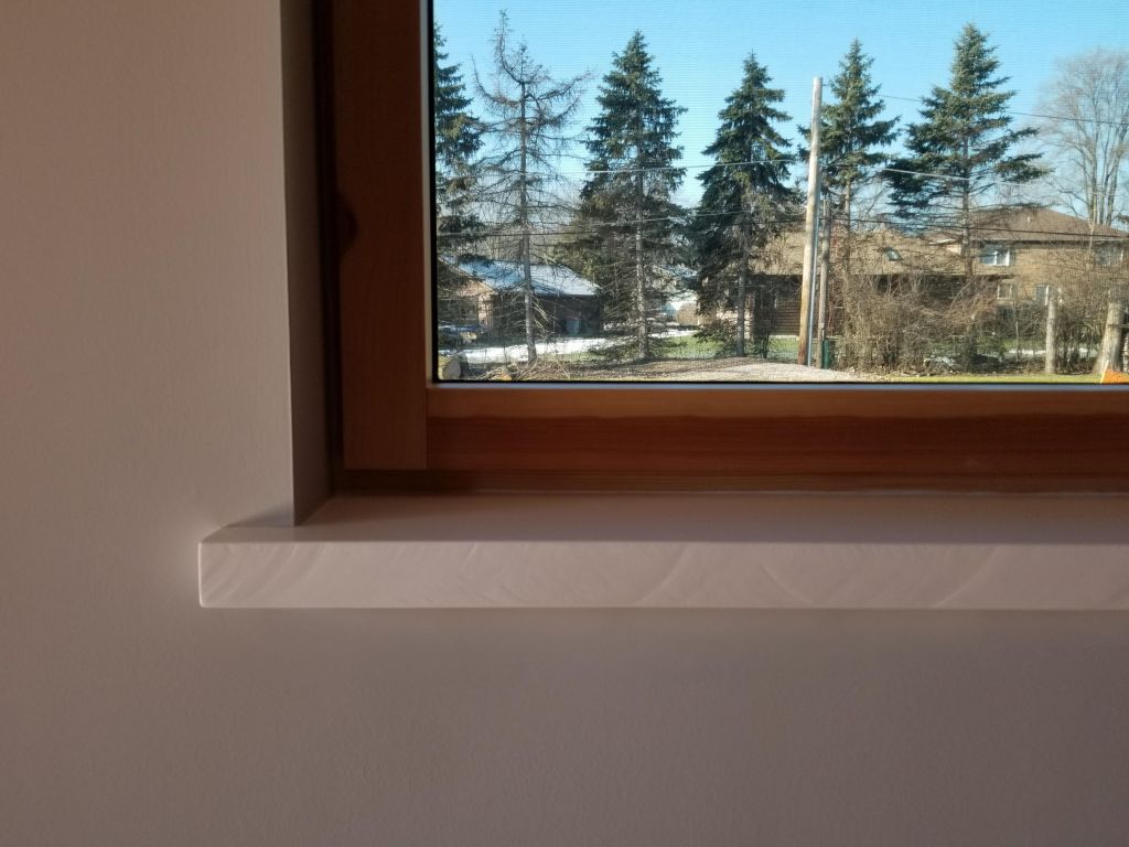
Opting to forego an apron trim piece below the stool we felt produced a simpler, cleaner look, although it did require some drywall patching below each rough window opening to more easily close the gap between stool and drywall with a high quality caulk.
We wanted the visual heft of the stools to stand on their own. Using any style of apron may have softened the look we were going for. The downside to a more minimal look, of course, is that there are fewer places to hide imperfections.
We really like the balance between the more formal white paint and the size and texture of the stool itself.
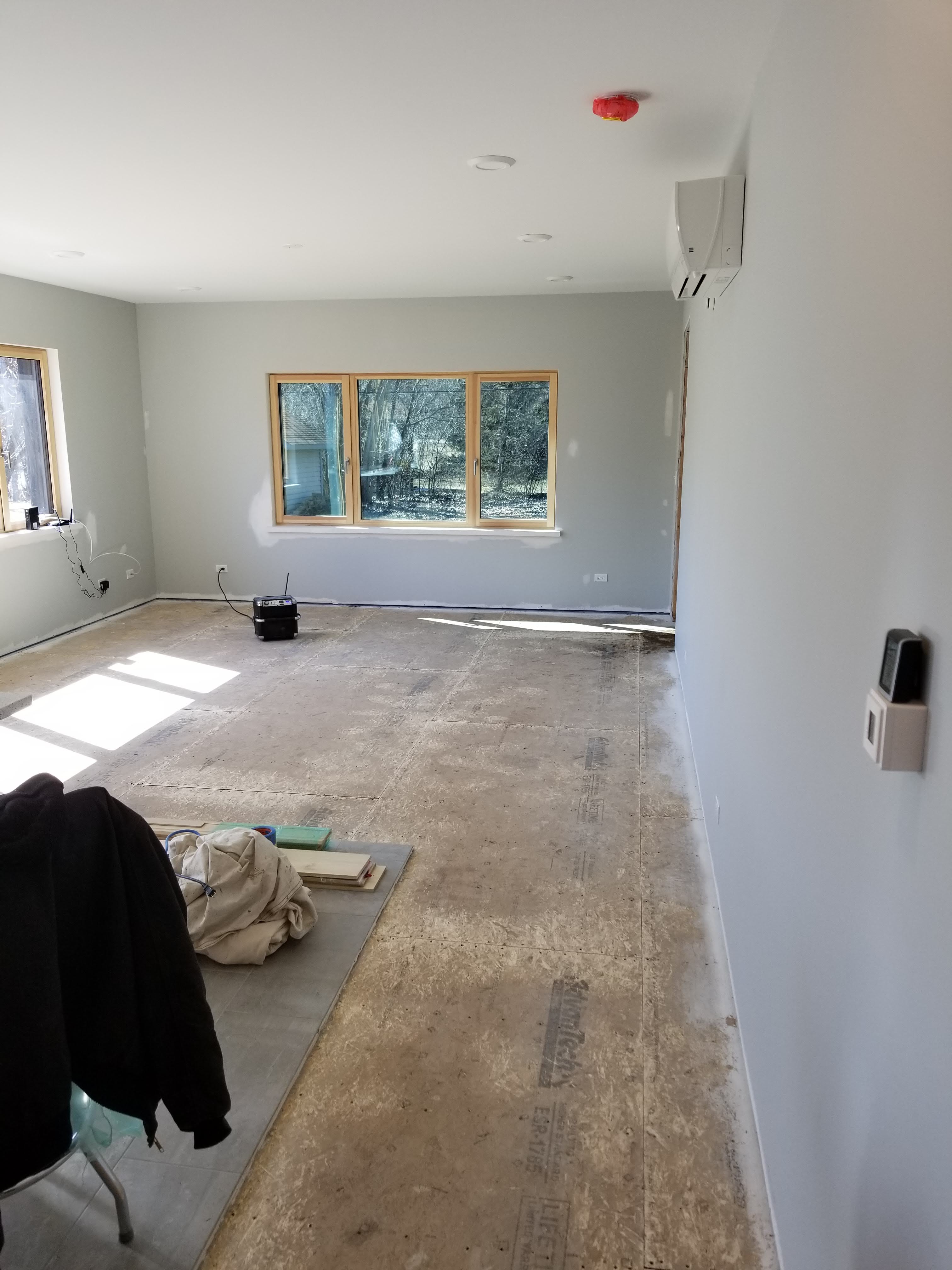
Main Bedroom
In the bedroom and bathroom we started with a white ceiling, white trim, and gray walls. Instead of using an accent wall, we opted for ‘blocks’ of color on two walls, on display upon entering the bedroom:
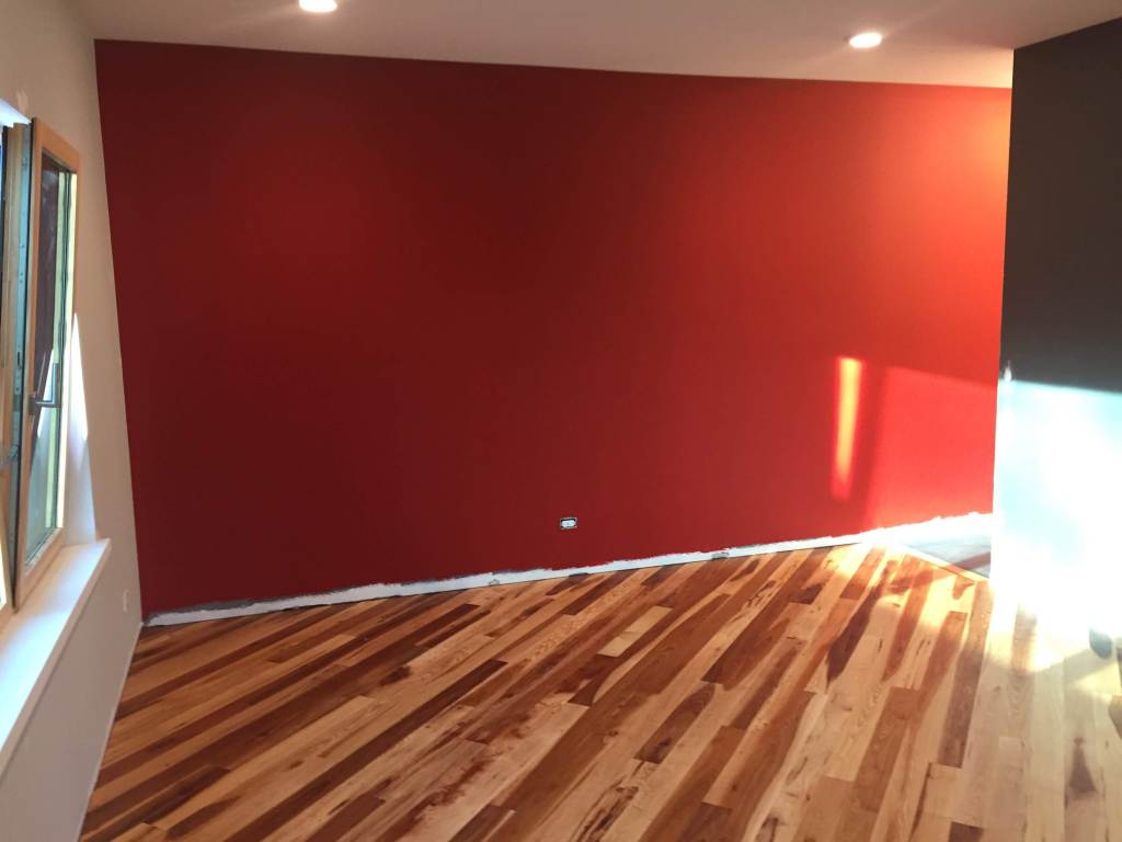
A dark, rich gray for the headboard wall is offset with a barn red for the long wall that connects the bedroom to the bathroom. To keep the space feeling as open as possible, we opted to go without doors for the bathroom or the walk-in closet. We realized this was an option based on our last home where these two doors were never used, remaining in the open position for the ten years we lived there.
Below, the point where bedroom meets bathroom, and where the richness of the color palette is fully realized:
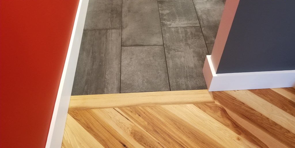
The combination of ‘weathered concrete’ porcelain tile with the warmth of the hickory mimics the contrast between dark, cool gray and rich red on the adjacent walls.
The same area, looking up towards the ceiling:
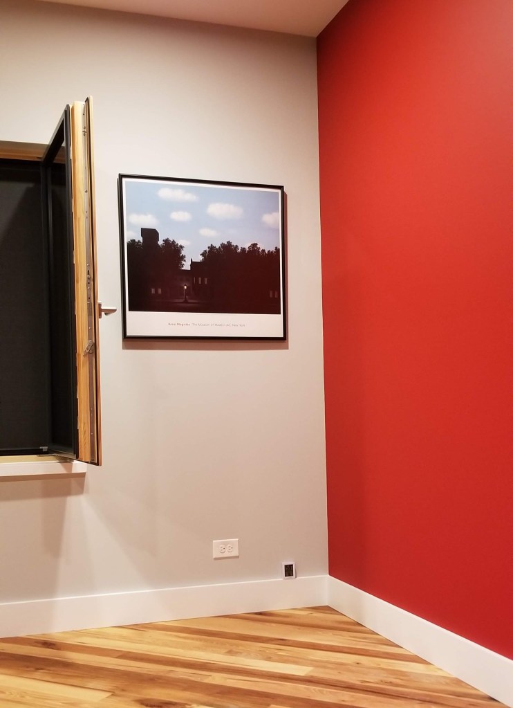
With the paint and trim complete, we could finally get some artwork on the walls. We decided to give away most of our wall art from our previous house to family and friends. This allowed us to personalize our new home, particularly since we were opting for a DIY-heavy approach. It also meant our daughter could be involved in anything new that we created.
Below, this framed reproduction of Magritte’s ‘Empire of Light‘ is one of the few items that carried over into our new house:

Note the thickness of the profile on the open window sash with the thickness of the previously mentioned window stool:
A significant percentage of our construction budget went to Passive House details like air sealing, insulation above building code minimums, an ERV, and high performance windows and doors, not to mention our solar panels. Consequently, when it came to interior design, we were happy to commit to a DIY approach:


Apart from any potential savings compared to items bought off-the-shelf, we also find it more fun and rewarding to come up with our own bespoke self-designed handmade items. We’ve also found that custom made items tend to endure and stick around far longer than mass produced items, regardless of their price tag (typically both in terms of durability and enduring affection).
“‘Decor’ and the conception of ‘interior design’ have spread so widely, that very often people forget their instinct for the things they really want to keep around them… people have begun to look outward, to others, and over their shoulders… and have replaced their natural instinctive decorations with the things which they believe will please and impress their visitors… [Decor] is most beautiful when it comes straight from your life — the things you care for, the things that tell your story.”
— Christopher Alexander, et al., A Pattern Language
For the bookend space to the left of our bedroom window we used a rust technique on some sheet metal. In a bath of white vinegar, hydrogen peroxide, and salt, we soaked each piece of metal until we achieved the heavily scarred surface we were aiming for:
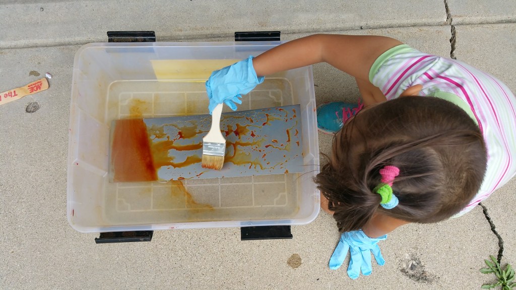
There is some latitude in controlling this chemical reaction as the metal rusts. Minimizing the time of exposure can allow some of the original bare metal color to remain. With a longer soak, and some brushing of the liquid repeatedly over the surface of the metal, a much deeper, all-encompassing level of damage can be achieved.
This sample, pictured below, shows a blend of rust and bare metal, prior to being sealed:
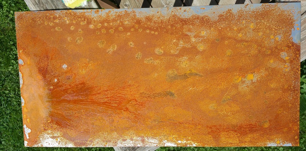
After the rusted steel sheets had a chance to dry, we used a low VOC sealer from AFM Safecoat to bind the rust and prevent any ongoing ‘dusting’ (similar to the strategy we employed using tung oil on our charred cedar).
The four individual panels were then mounted on a sheet of plywood. The plywood had been attached to 2×4’s, making it simple to hang the piece on the wall:

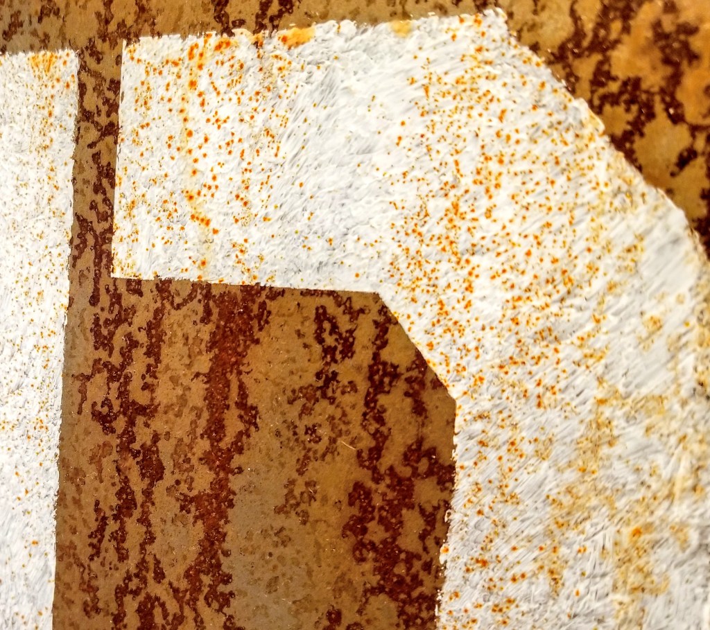
The white letters were painted on prior to the seal coat because I wanted some of the rust to bleed through the paint for a more weathered effect to match the level of rust:
To maximize the overall bare-bones look, the 2×4’s and plywood, clearly visible on the sides, was left fully exposed:
The phrase itself is from The Doors song ‘When the Music’s Over’, part of which has an environmental message that blends well with our rock ‘n’ roll theme.
With our blue porcelain frog sticking to the window header, our vignette with a nature theme is mostly complete, framing the view to our backyard, which, at this point, was still little more than a mulched moonscape.
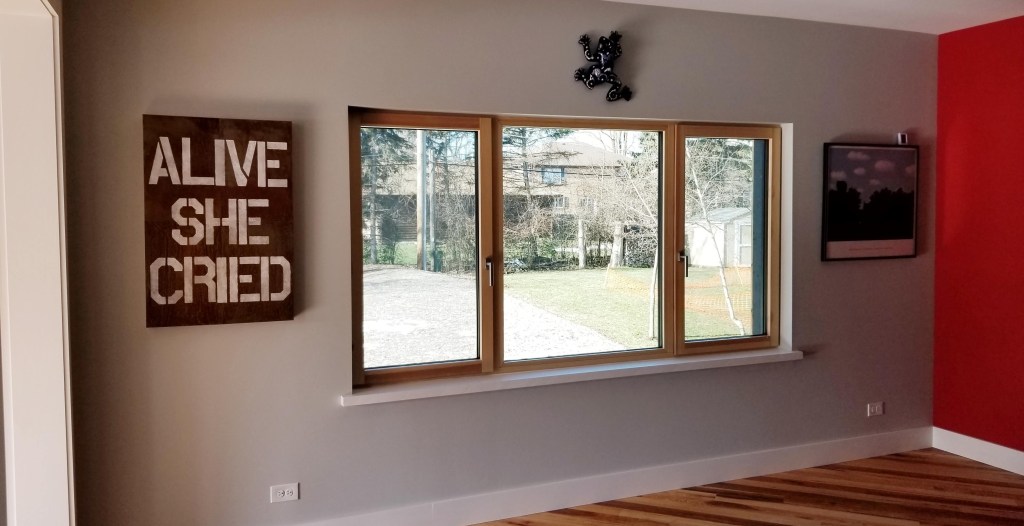
Mid-morning, in the photo above, with sun entering through the open doorway from the left (south).
The authors of A Pattern Language strongly advocate for east-facing main bedrooms:
“The sun warms you, increases the light, gently nudges you to wake up — but in a way that is so gentle, that you will still actually wake up at the moment which serves you best…”
— Christopher Alexander, et al., A Pattern Language
Below, the sun just before the winter solstice, almost reaching directly into the bedroom (just over 16′ from the south-facing windows). This was part of our passive solar strategy for the house:

Although our bedroom technically faces west, because of the size of our bedroom and family room windows (4.5′ x 9′), and the oversized door opening to the family room that faces south, we end up with a flood of morning light regardless. The intensity of the light is far less than direct east-facing, but the overall effect is similar. On paper this shouldn’t really work, but reality shows otherwise. Something to consider for those in the design stage of their own build.
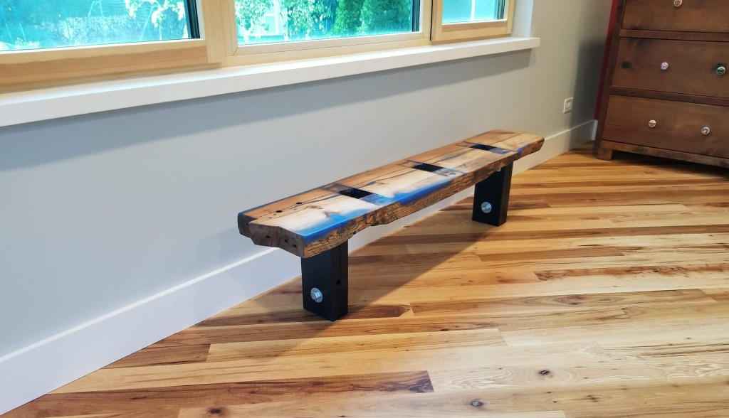
The next project for the bedroom was to add some seating below the window.
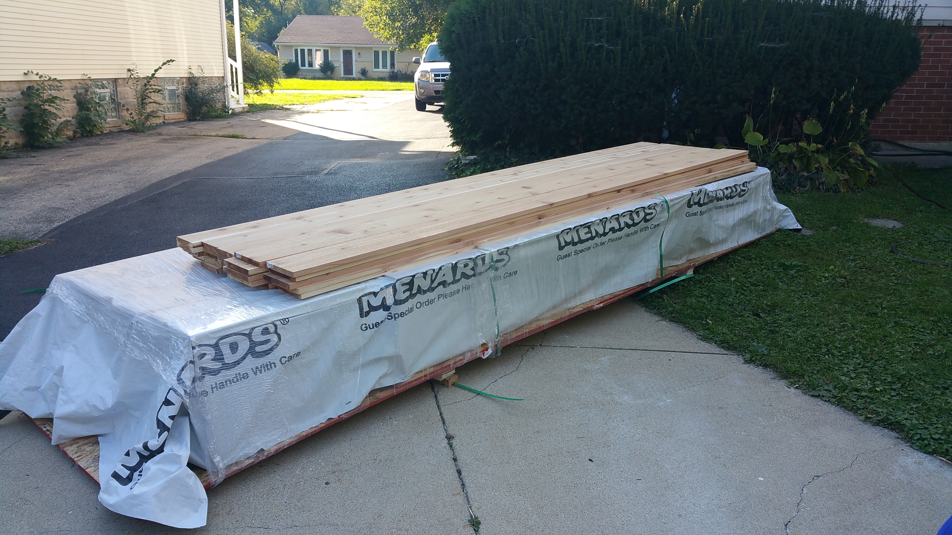
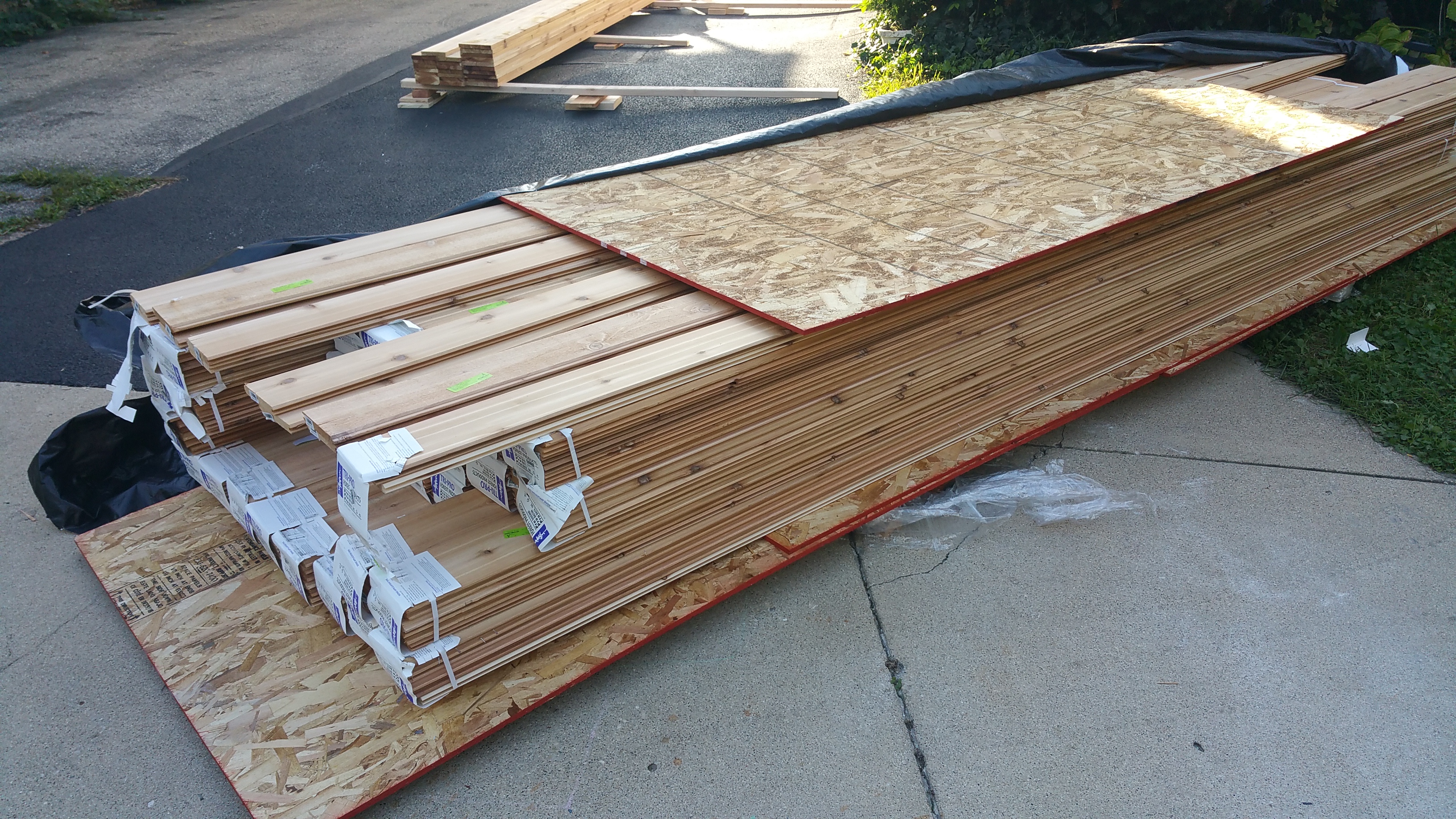
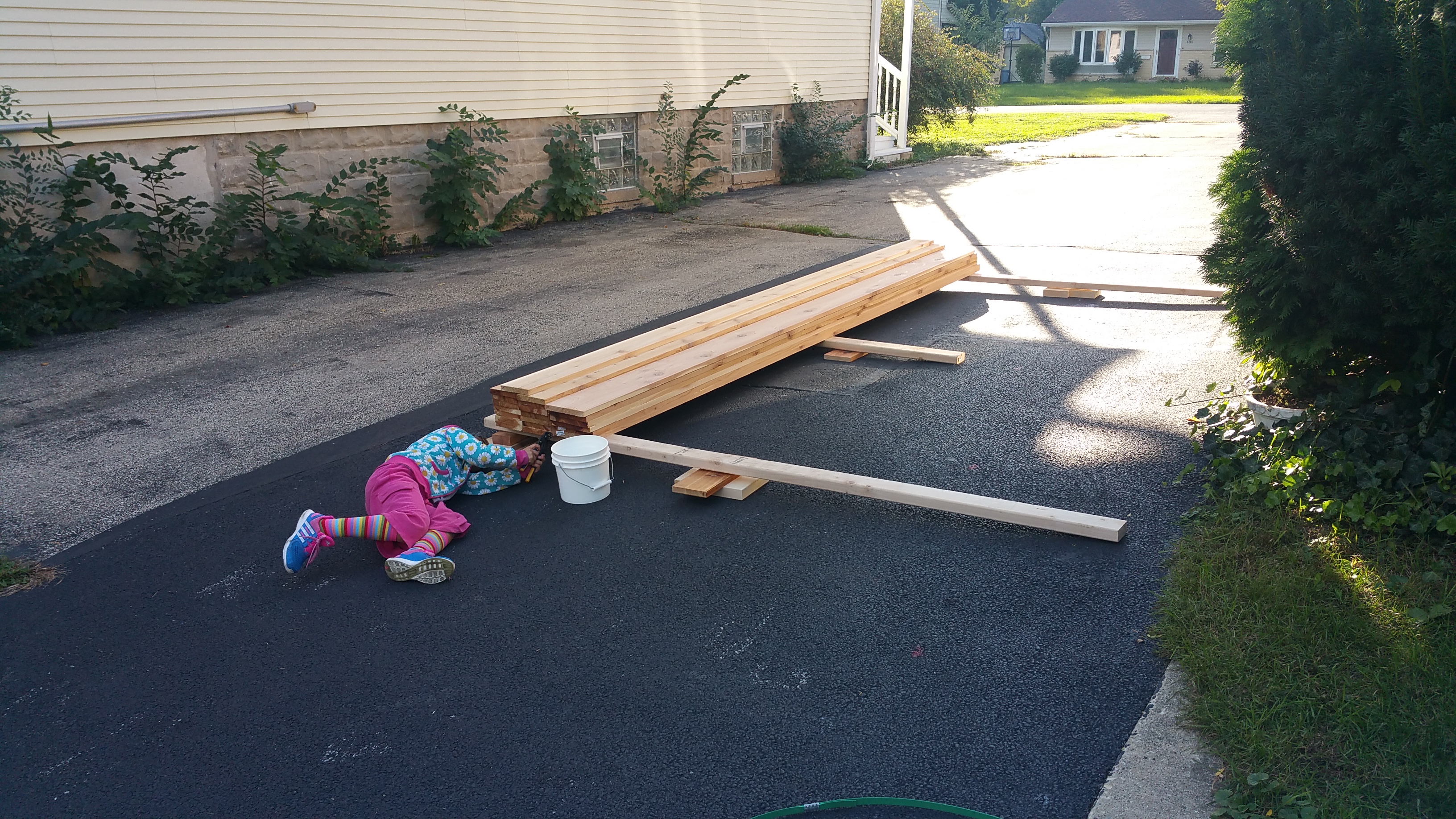
To get started, we picked up some reclaimed lumber from Meeghan, at her shop Great Lakes Yard.
The piece on the left, below, has been epoxied and sanded, ready for its final clear coat. The piece on the right, destined for the family room, is finished, waiting for legs to be attached.
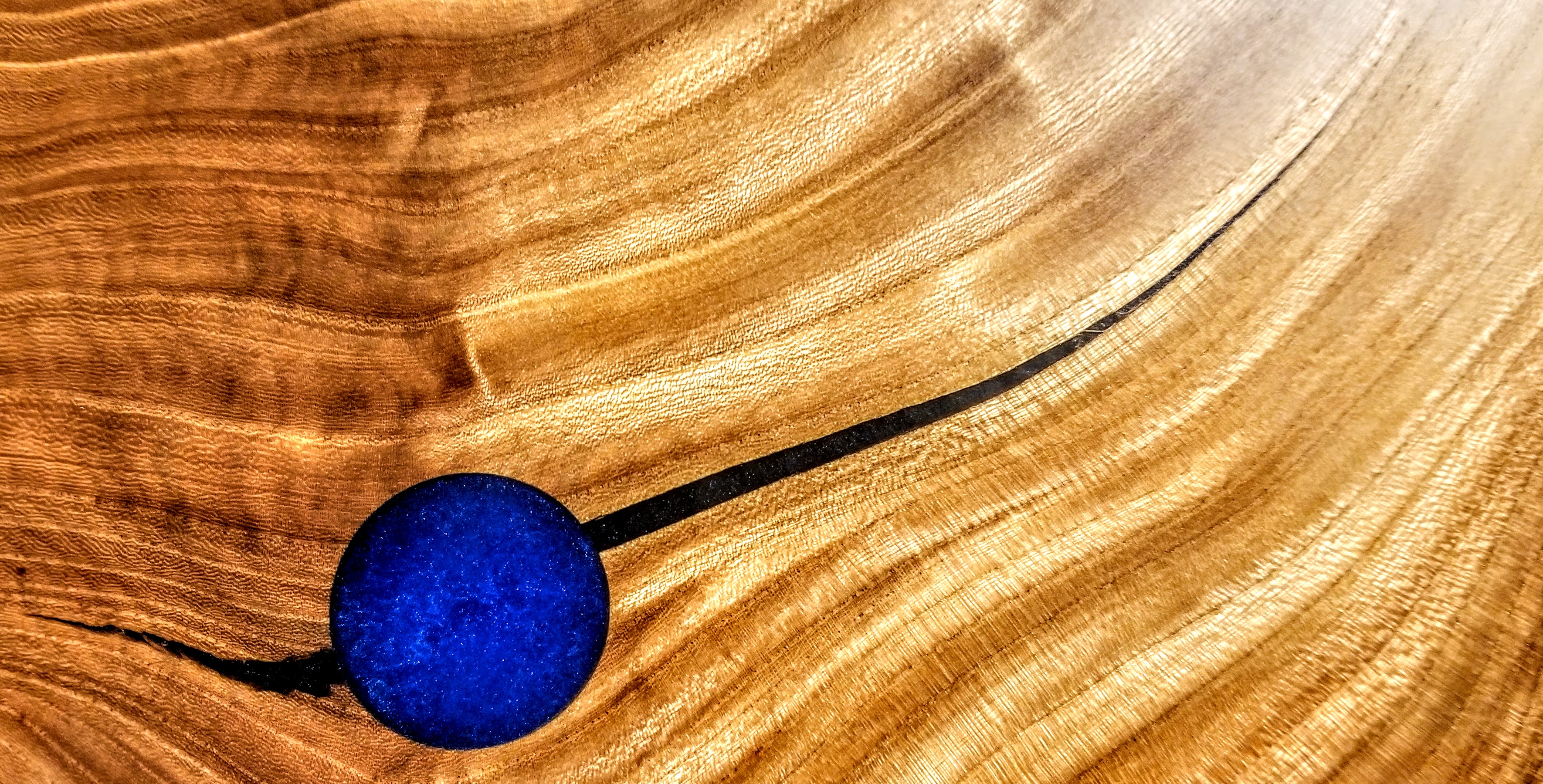
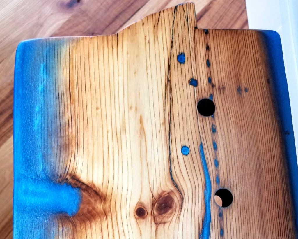
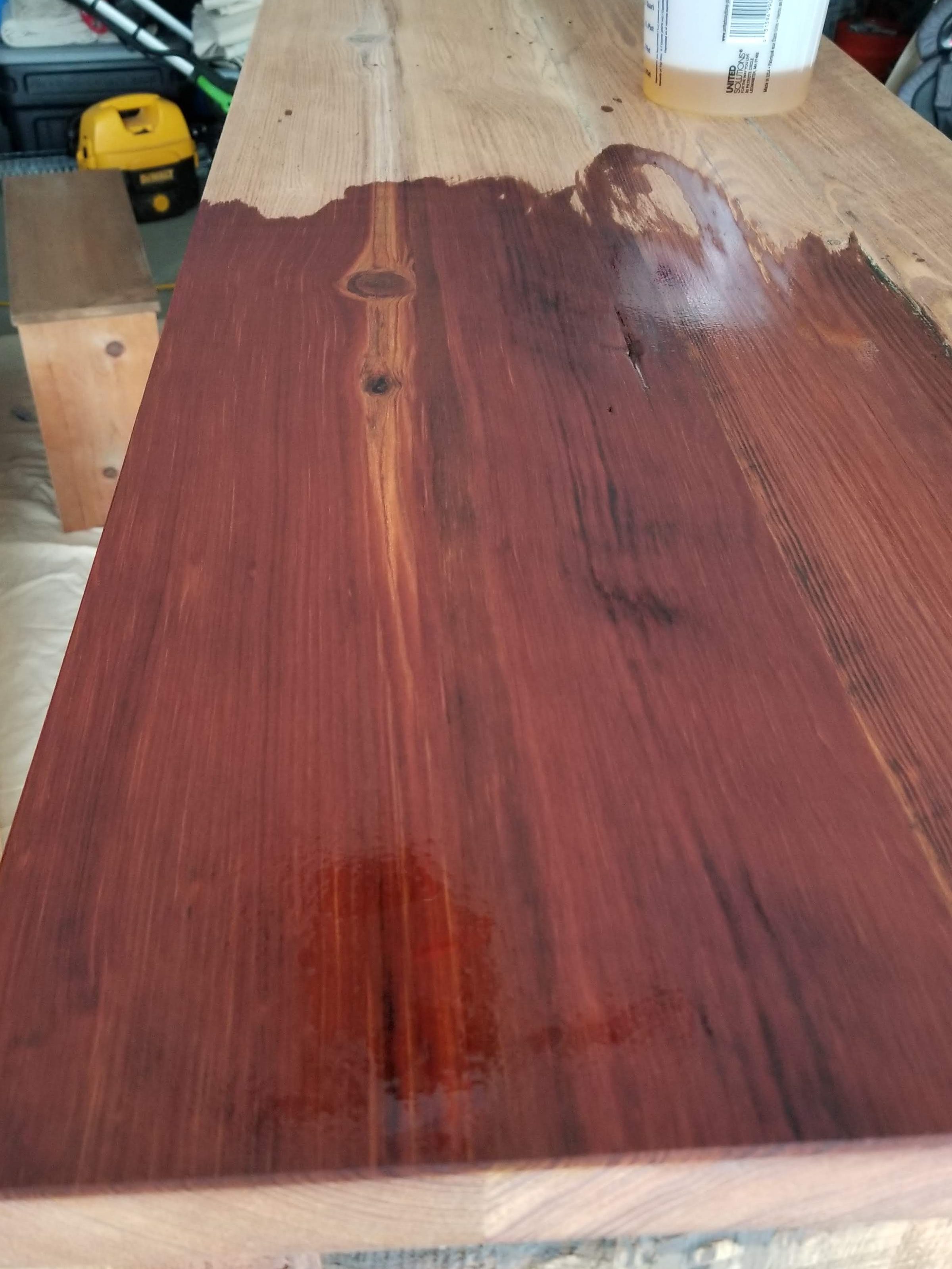
The epoxy was serving both decorative and structural functions. These pieces, particularly the one on the left, were in pretty bad shape in terms of structural integrity. The epoxy was filling cracks, crevices, and also allowed me to rebuild some of the badly damaged outside edges. We chose a blue metallic pigment since it offers an almost water-like iridescence.

Building up some of the outside edges not only added to the visual effect, it also helped stabilize what would’ve otherwise been a piece on the verge of falling apart. This section of wood was a structural framing component during its working life. I left some of the larger holes empty (these look like they were for conduit), while concentrating on the smaller voids. In addition, the mortise pockets benefited from some of the blue epoxy, giving these areas a look of pooling water while also making these spots easier to dust and keep clean:

The built-up outside edges have a nice shimmering water look to them:
Some doubled up 2×6’s painted black with some nice metal hardware completes the look. The original level of wear in the piece can be read in the front vertical face as it changes in thickness from one end to the other.
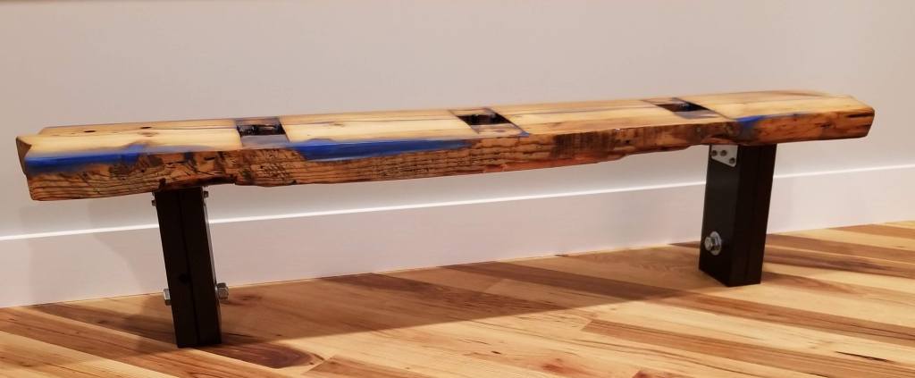
Having large windows in the bedroom makes a bench like this ideal for a quick sit to take in the evolving flow of life in the backyard as the seasons develop and change. The rest of the time it’s a structural framing member that has been transformed into what we hope is a deceptively unique decorative object:
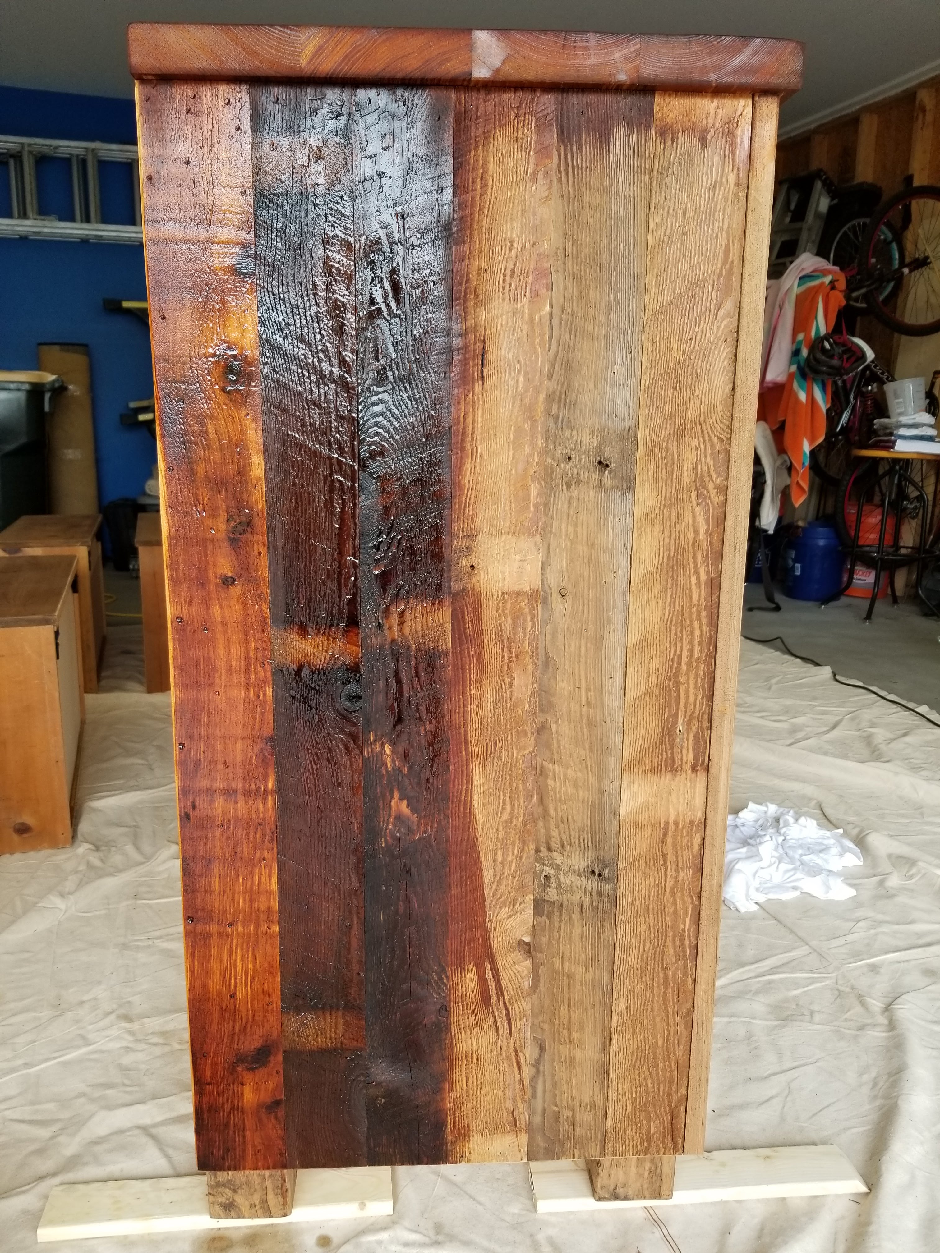
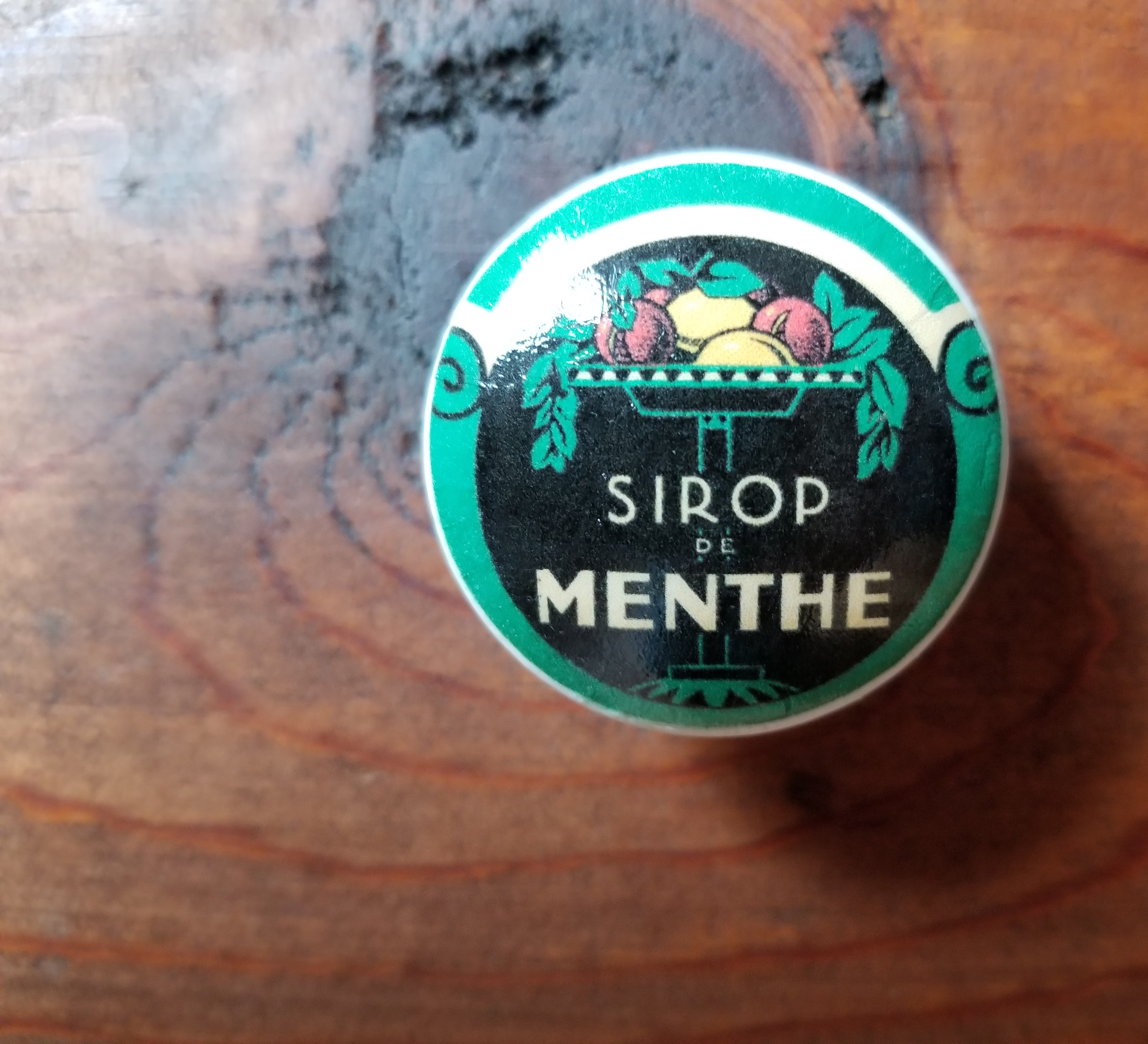
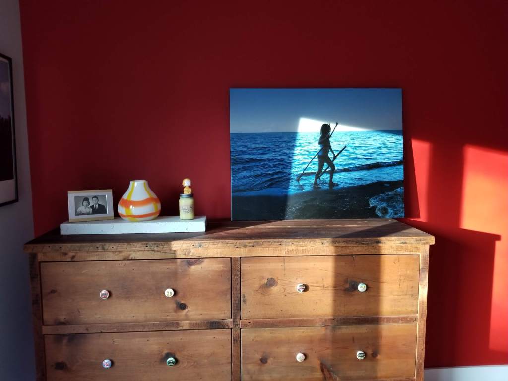
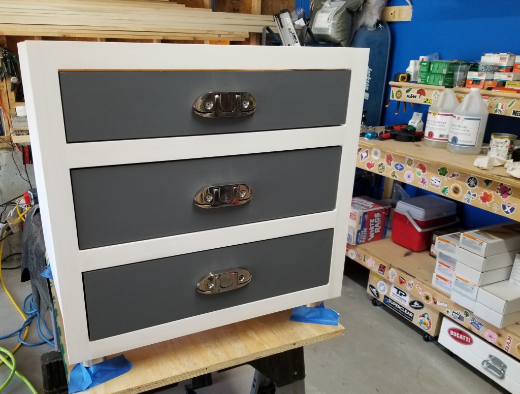
For our new dresser we decided to go full-on rustic with reclaimed wood and vintage fruit label drawer pulls. The warm wood tones help balance the fiery red accent wall while echoing the color variation in our hickory floors. The aged wood would also serve as a warm, neutral backdrop, helping to put emphasis on the pieces that would soon sit atop the dresser.

My daughter helped me apply tung oil to the ‘box’ and the drawers, giving the dresser a warm, natural matte finish. After a final sand and wipe down, the tung oil brings the old, dry looking wood grain back to life:
Whether it’s searching for interesting reclaimed items or just unique decor touches, I’ve had better luck looking online than with brick and mortar stores. After trying several locations in the Chicago area, as well as various shops when we’ve been out of town, I always come back to shopping online, largely because the pool of options is so much greater than at any one store. We’ve gotten lucky buying a couple of items locally, but the overwhelming majority of what we purchased came from online shops.
Although time consuming, browsing sources like Etsy almost always proved more fruitful in the end.
In the case of the drawer pulls, I found these vintage fruit label ones on Etsy:


Even when it comes to having items framed, we had better luck developing our own technique than using the more traditional frame (wood or metal) with glass approach.
We start by mounting the image to some smooth plywood that’s been previously sanded and dusted. We mount the image using a spray on adhesive. As the glue sets up, we do our best to squeegee out any air to ensure good contact between the plywood and the photo. Once the glue has fully dried, we do an epoxy pour, a flood coat, allowing it to spread over the entire surface, including falling over the edges.
With the initial pour allowed to dry for a couple of days, if a high-gloss finish isn’t ideal, I then sand the epoxy before applying a hardwax oil coating of Osmo Polyx, typically in a satin finish, although the matte finish makes for a nice, subtle velvet-like finish as well.
This technique is roughly the same deployed for river tables, or any project with wood, epoxy, or wood-epoxy combination:
In our case, to experiment with this technique we started small, with a Blondie and Pat Benatar concert poster, before moving on to much larger images:


The trickiest part is making absolutely sure the outside edges of the image are fully adhered to the plywood. If not, when the flood coat of epoxy is applied you risk having the image lift, which is virtually impossible to fix after the epoxy has been poured.
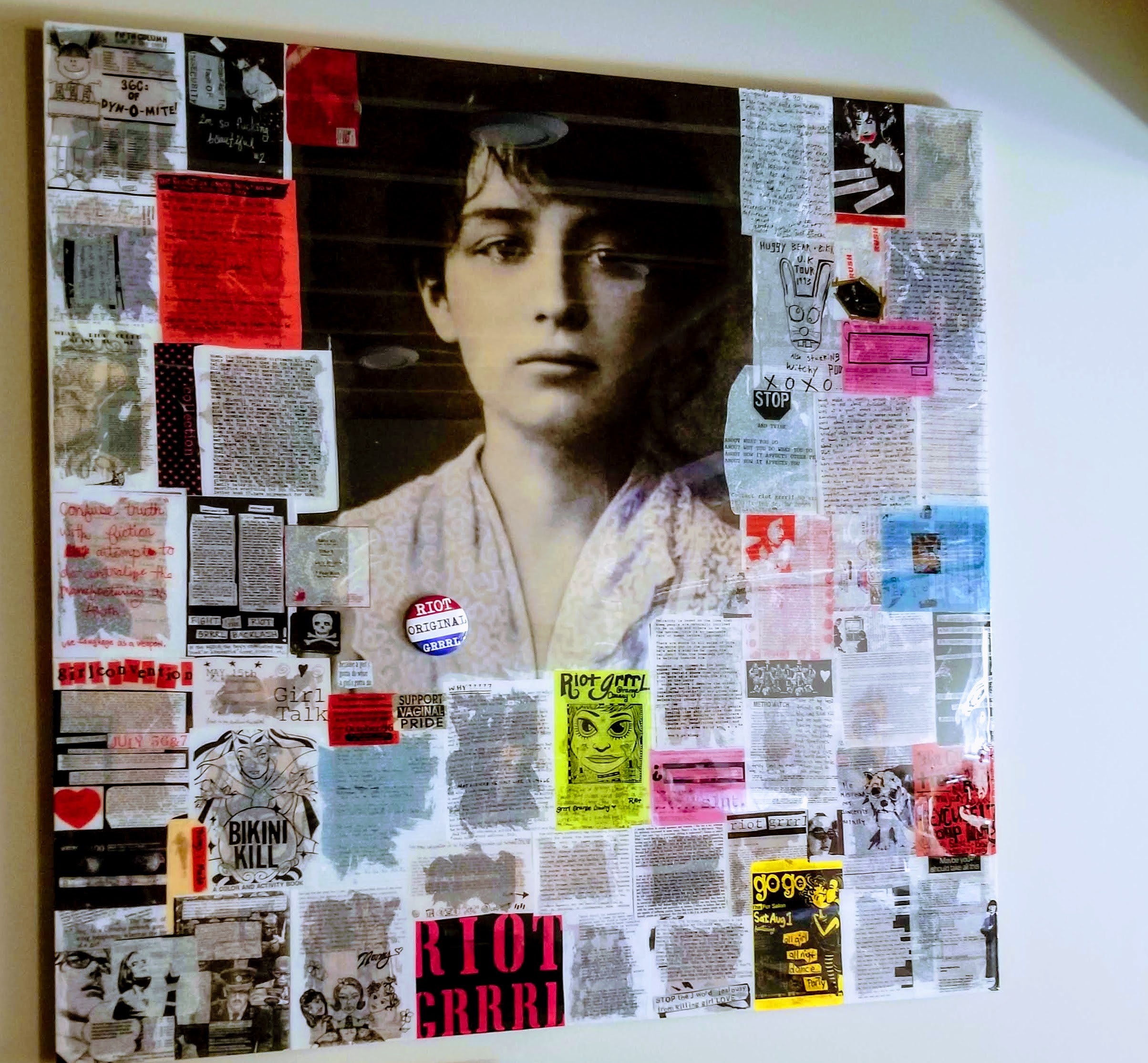
For our red accent wall I decided to use an image of our daughter playing on the Chicago lakefront at sunset. The rich blues in the failing light accentuate the water theme I was after:

In addition to the image, we added a slightly tongue in cheek family altar with a small slab of decorative white concrete as its base.
Below, afternoon sun breaking across the photo and the red accent wall:
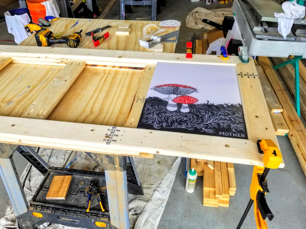
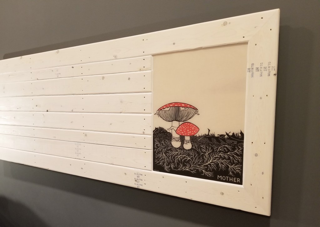
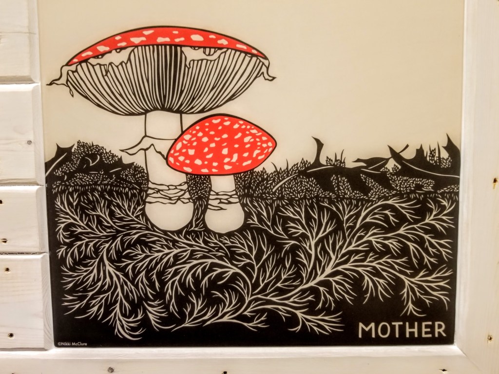
For our headboard wall we started with a print by Nikki McClure. We really enjoy the playful vibrancy in her work. The print was mounted and finished with epoxy and then the Osmo as outlined above.
With a base frame made of 1×4 furring strips, I attached the print and then surrounded it with additional 1×4 furring strips to create the finished surface:
Using the furring strips was in keeping with our Urban Rustic design goals, in this case utilizing underappreciated framing materials to show off their inherent beauty and utility in a new context.
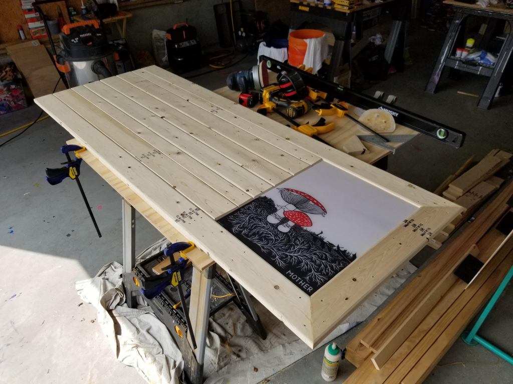
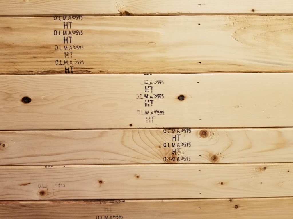
After completing a light sanding, trying to hold onto the grading stamps as much as possible, I then whitewashed the 1×4’s to complete the rustic look. The goal was a weathered look:
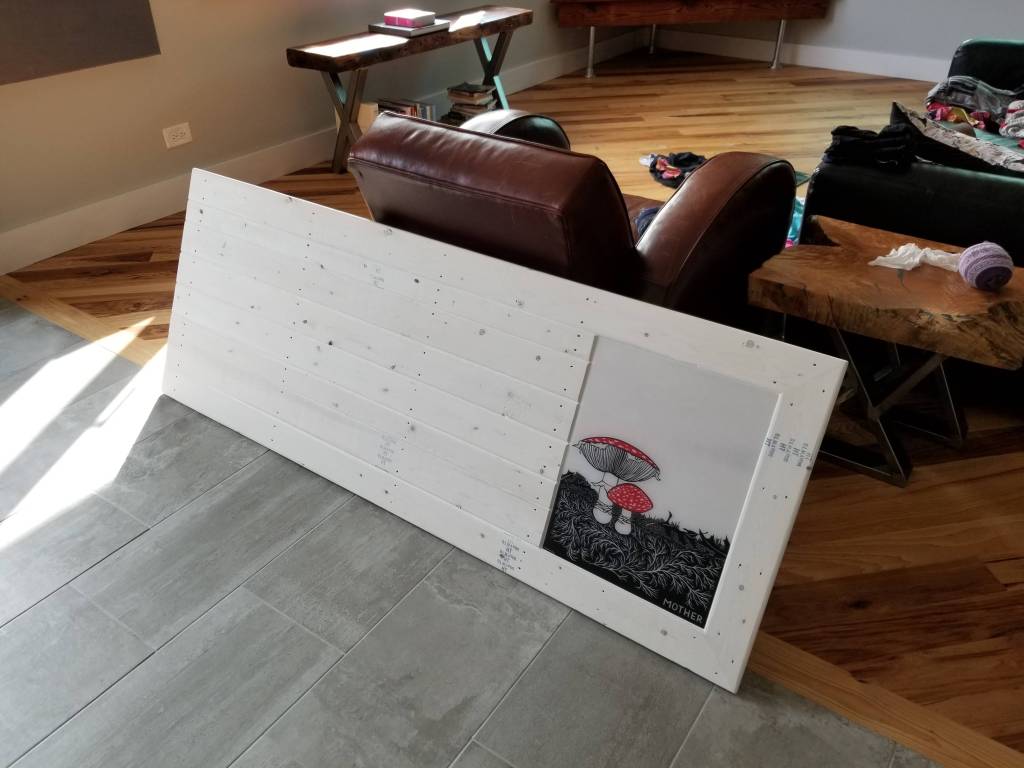
This was amplified by using the Osmo to seal-in the whitewash since it adds a slight amber, or yellowing, to the surface of the wood, increasing the aged effect. It was a relatively light whitewash application, which allowed some of the original wood color to come through the final finish:
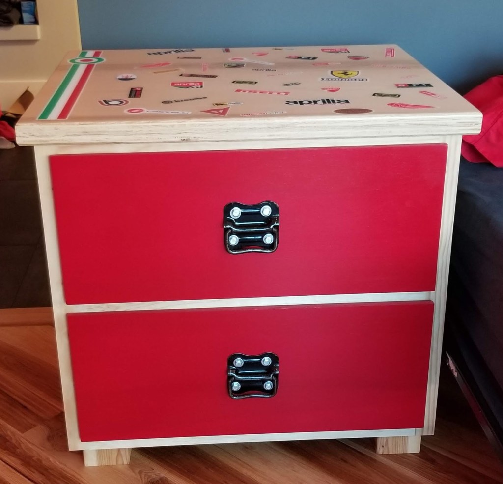
For my nightstand I started with 1/2″ Purebond plywood for the carcass. The dimensions are larger than what’s typical, but I wanted it to look short and hefty.
I made deep drawers, using Blum drawer slides to help support the weight of anything put in the drawers, especially books. We used them for our kitchen drawers and we love the smooth function and soft close function. They’re not the cheapest option, but their quality is hard to match.
I wrapped the carcass with 1×4 furring strips, just like the headboard piece, and then used 1/2″ plywood for the drawer fronts, painted a vibrant red to match our red accent wall. Both the carcass and the drawer fronts were sealed with the Osmo.

The black drawer pulls I found online. I didn’t try to refinish them, instead I just applied a couple coats of sealer to prevent further rusting. I then attached them to the drawer fronts with some lag bolts. This combination epitomizes the Urban Rustic aesthetic: sleek, modern red and shiny steel with rusted, worn and peeling hardware.

For the top I glued two sheets of 3/4″ Purebond plywood together for a chunkier look, using Timbermate putty to fill and smooth out the exposed edges.
With a slightly rounded over edge created using a router, it was time to have some fun applying stickers. Starting with a Vespa Italian roundel and striping, my daughter and I added various other famous high-performance Italian industrial design brands, partly inspired by the work of Bruno Munari.
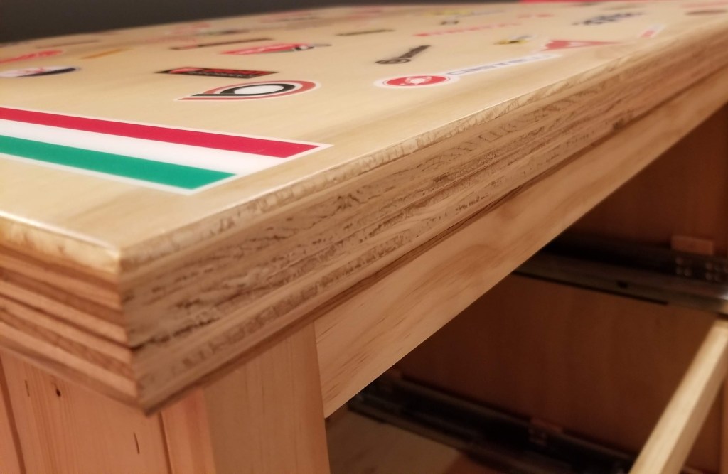
As with the wall art photos, first we did an epoxy flood coat before sanding and applying a final couple coats of Osmo satin, which produces a nice combination of hard-wearing with a subtle shine.
The stickers were a fun homage to high Italian industrial design:
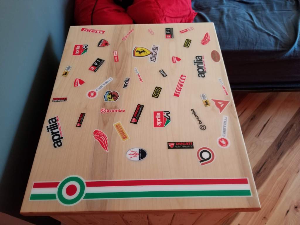
The little tank of a nightstand is a nice mix of urban and rustic elements:
For my wife’s nightstand I started with a mini river table.
With the mold complete, I could get the two pieces of walnut in position to better evaluate what would be the final look:
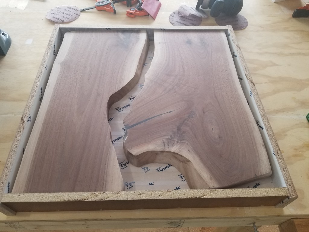
I thought about using a white metallic epoxy, but anytime I’ve used a white pigment with epoxy it’s always yellowed to one extreme or another over time (typically within the first year). Instead, I opted for a metallic black, which also had some metallic silver mixed in.
Opinions vary on the enduring charm of river tables, but it’s probably a safe bet that a more subdued pigment choice, like black, will have a better chance of being appreciated and loved well into the future.
Below, the black epoxy complete, and the planing mostly done:
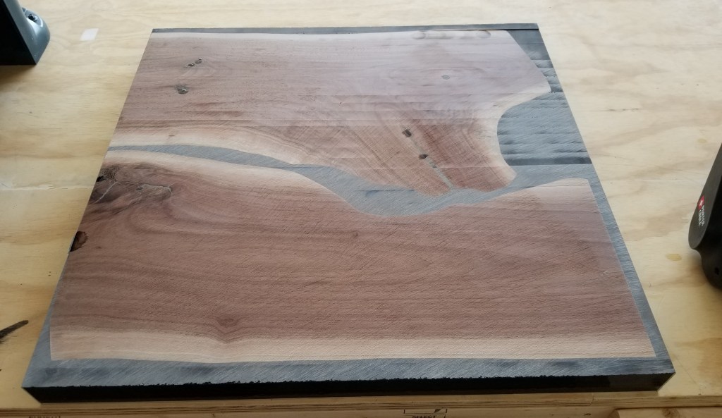
Below, after sanding, routing the edges, and an initial coat of Rubio Monocoat:
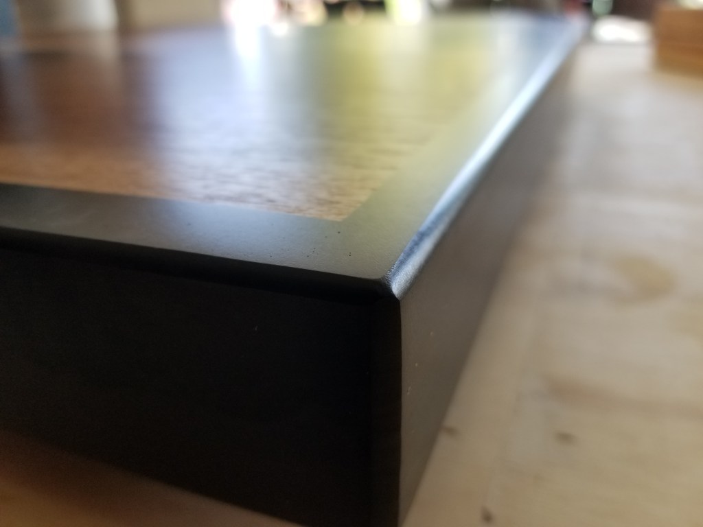
Below, after a second coat of Rubio has been done. Although it belies the name, I usually end up with better results after a light sand and a second coat of Rubio has been applied:
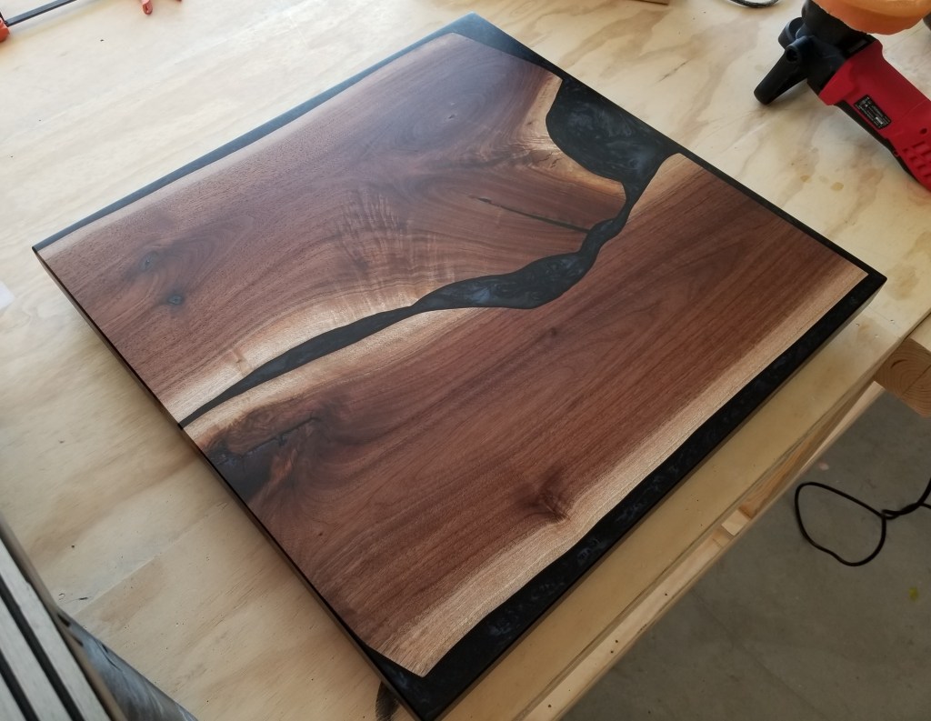
I’m hoping the variation in color tone doesn’t mellow too much with age. The stark contrast between light and dark woodgrain adds to the beauty of these pieces.
Close-up of the walnut surface:
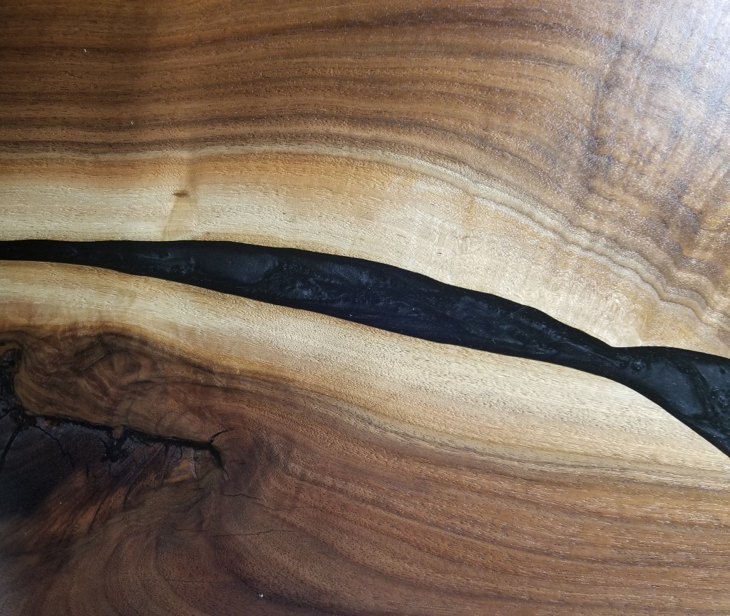
The wide color variation is incredibly beautiful. Moreover, the black epoxy adds to the wave effect visible in the woodgrain, reminiscent of flowing water.
For the body of the nightstand I used the Purebond plywood for the carcass, leaving it exposed as the final finish for the sides. In combination with the face frame, I opted for inset drawer fronts, painting them gray to match the headboard wall color. The pulls are actually dock cleats, offering a heavy-duty look for a component that’s usually more delicate in appearance.
Like the ‘Mother’ wall art piece, I used a whitewash finish on the face frame and the sides, sealed once again with Osmo. I used the Blum slides for the drawers.
Below, the nightstand complete:

Main Bathroom
Design for our bathroom started with our floating vanity, which is accented with a combination of charred cedar and lag bolts, and completed by the quartz counters and the porcelain vessel sinks. This combination reflects our Urban Rustic building blocks of wood-metal-stone.
In addition, along with the toilet paper holder, it gave us an opportunity to bring the charred cedar indoors. We would do this with several decorative elements throughout the main floor, using the charred cedar as an accent rather than as a main feature like it is on our exterior.
With oversized subway tile and red glass accents, the shower plays well with the more rustic and handmade items in the space.
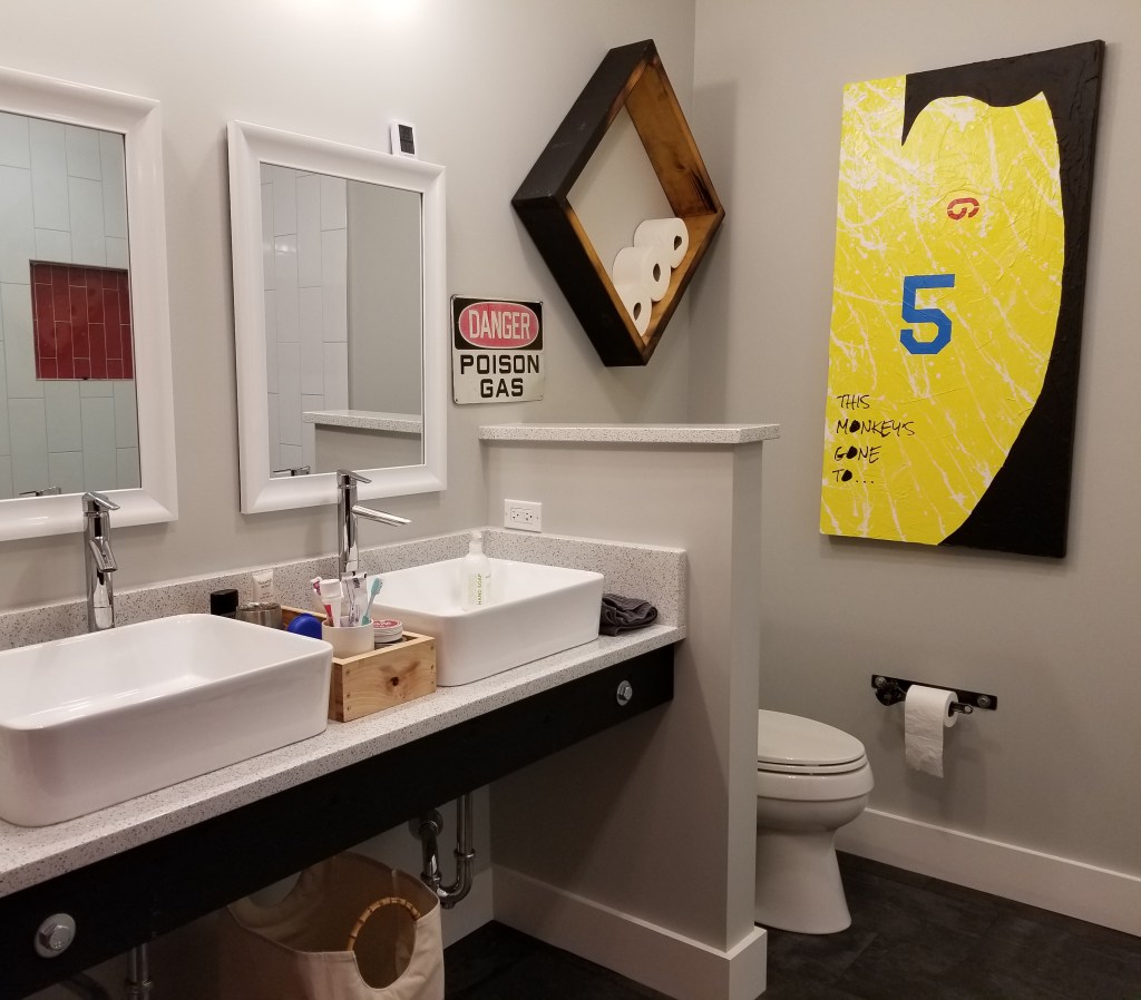
The bright yellow painting references lines from a Pixies song:
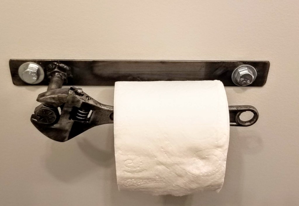
Struggling to find a unique toilet paper holder, I came across this one on Etsy: Wrench
This well-worn industrial sign adds a whimsical touch:

The toilet paper storage box works well in terms of function, and the charred finish adds some nice color and texture:

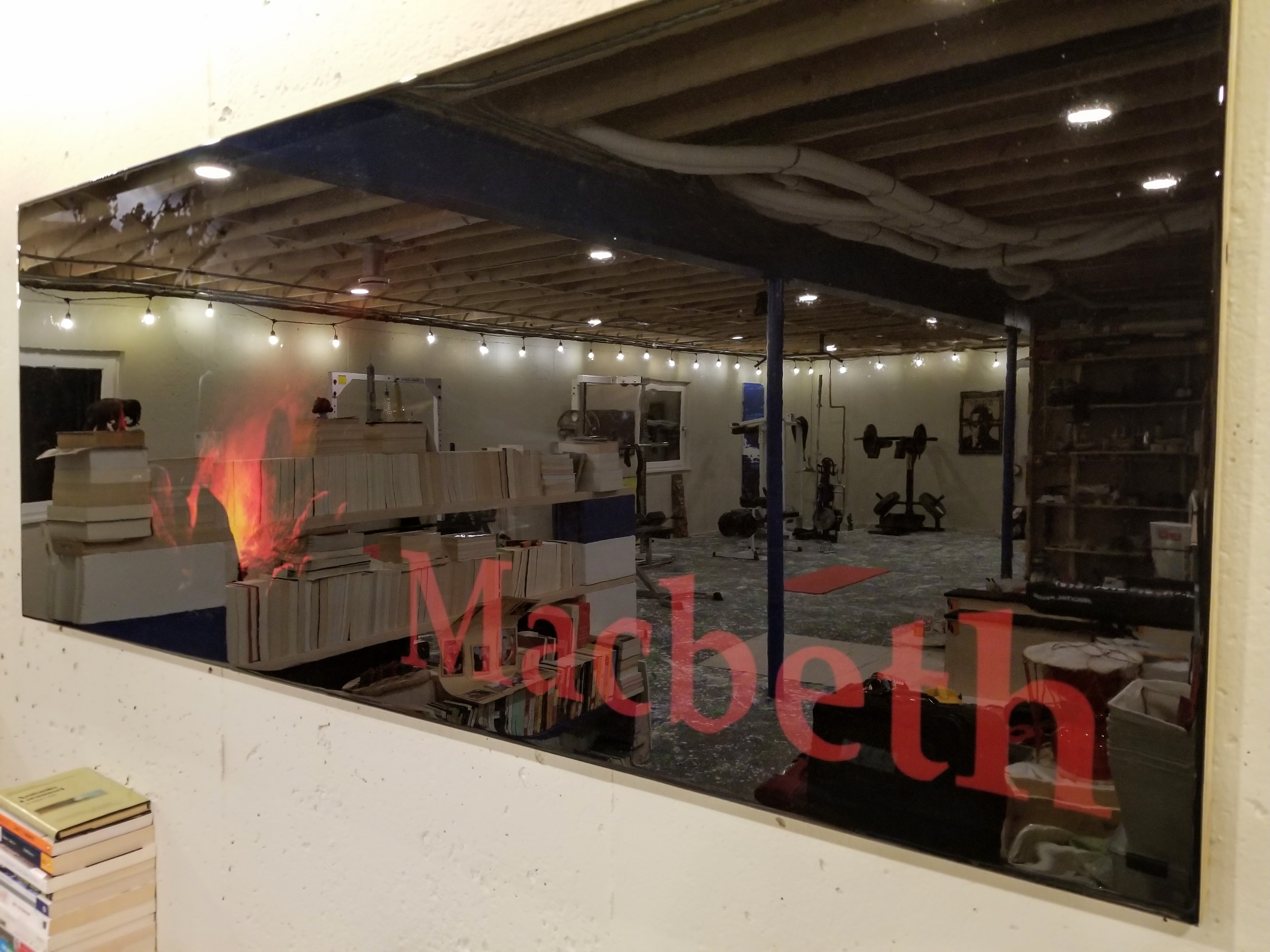
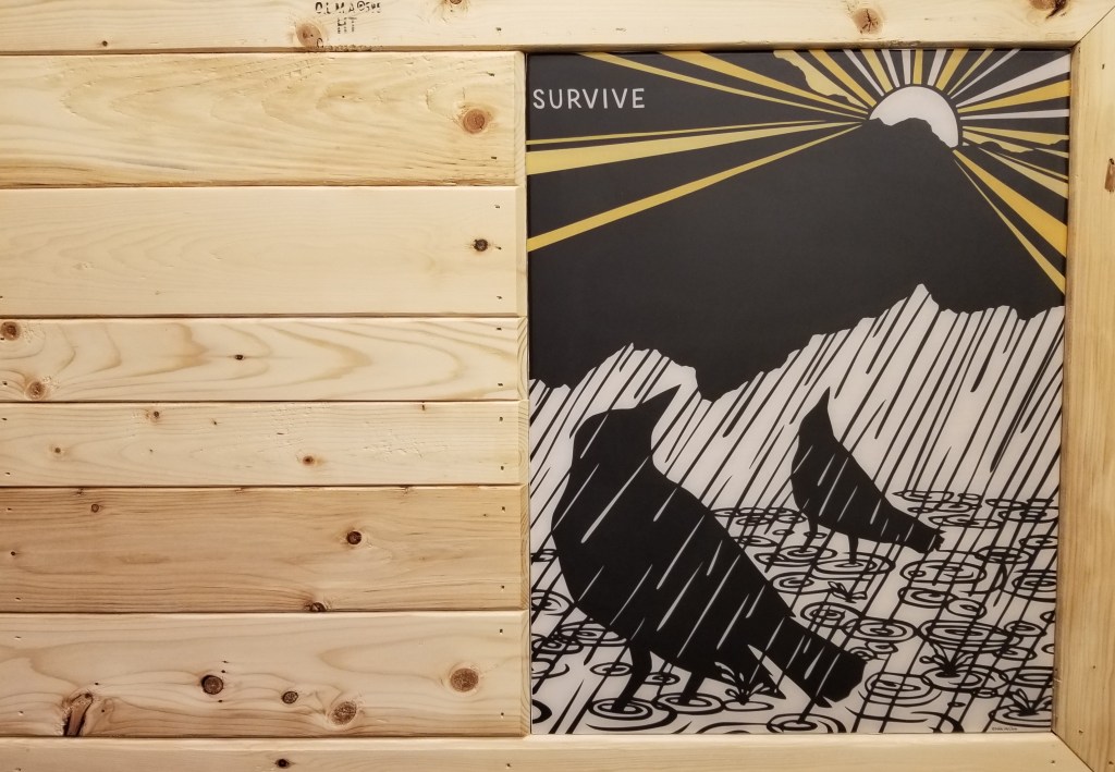
For the red accent wall I wanted a piece that would start in the bedroom and carry through to the bathroom, where only then it would reveal its dramatic punch.
It also makes for a nice companion piece to the ‘Mother’ headboard wall art:


As with the ‘Mother’ piece, I tried to hold onto the lumber stamps as much as possible. I also tried to select the individual pieces of 1×4 for their color, wood grain, and knot pattern. This was more important for this piece since it was left ‘natural’, with only a couple coats of Osmo for some protection and for a slight ambering effect. The natural tones of the wood and the inky black in the artwork make for a nice combination with the intensity of the red on the wall:

We picked up this second Nikki McClure print from Anthology in Madison, Wisconsin, a cute shop with a nice range of products. My wife and daughter, along with some extended family, love going here every time we’re in Madison.
Despite their many imperfections, the 1×4 furring strips make for a unique, rustic decorative touch. On a job site they don’t get much respect, typically kept hidden behind finished surfaces like siding in the case of a ventilated rainscreen.
It’s been fun devising ways to let them shine in their own right.
Sunlight from the west, entering the bathroom around midday:

In addition to the building science we incorporated into the structure of our build, collecting and executing the design elements for our interiors has made crafting and building our own home one of the most rewarding experiences of our lives.
“When the objects we use every day and the surroundings we live in have become in themselves a work of art, then we shall be able to say that we have achieved a balanced life.”
— Bruno Munari, Design as Art


You must be logged in to post a comment.