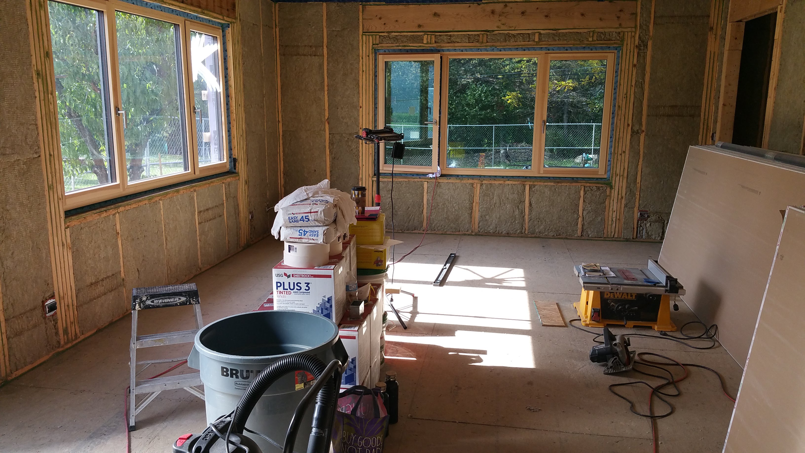
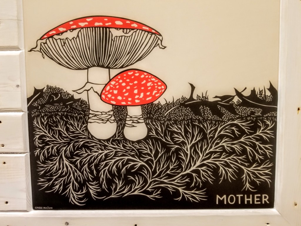
kimchi & kraut

Passive House + Net Zero Energy + Permaculture Yard

Category Archives: Interior Design

Urban Rustic: Second Bedroom and Bath

4

Bedroom Details

For my daughter’s bedroom, I wanted to do a couple of murals on the two largest opposing walls. The remaining walls would continue the neutral gray we would utilize throughout the main level.

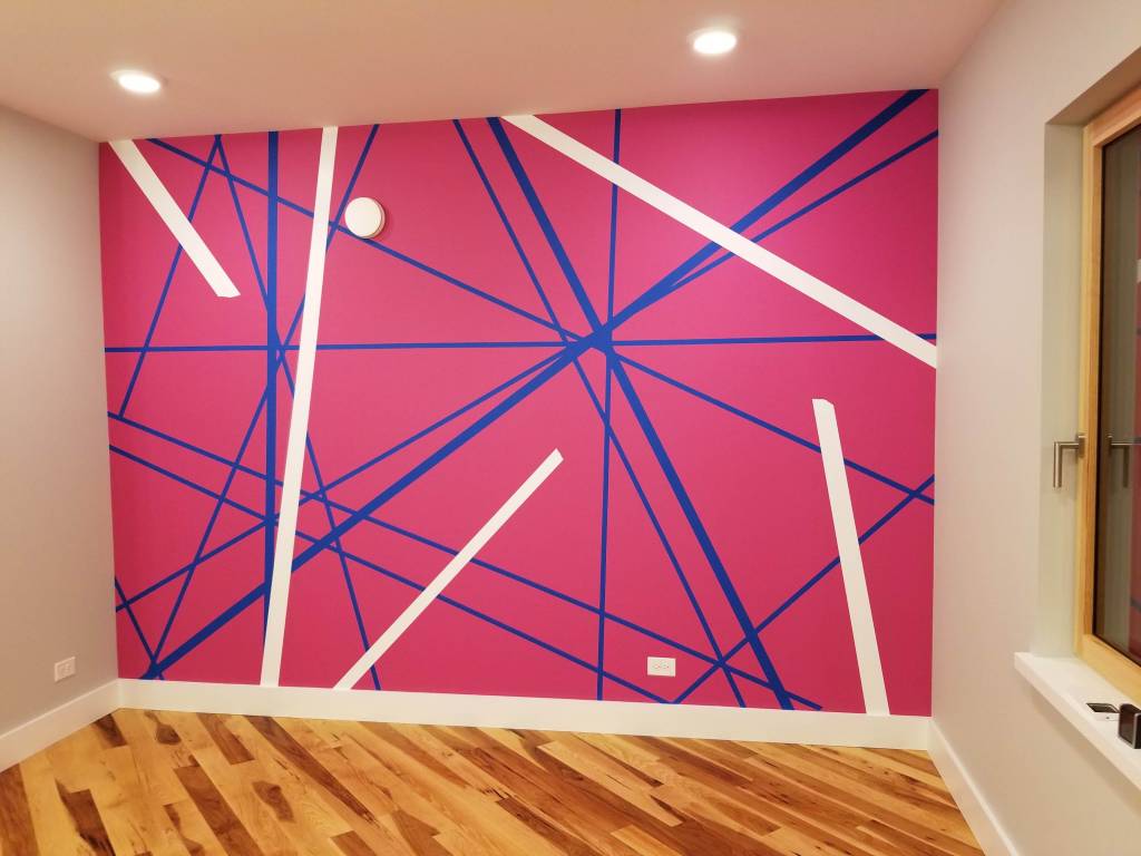
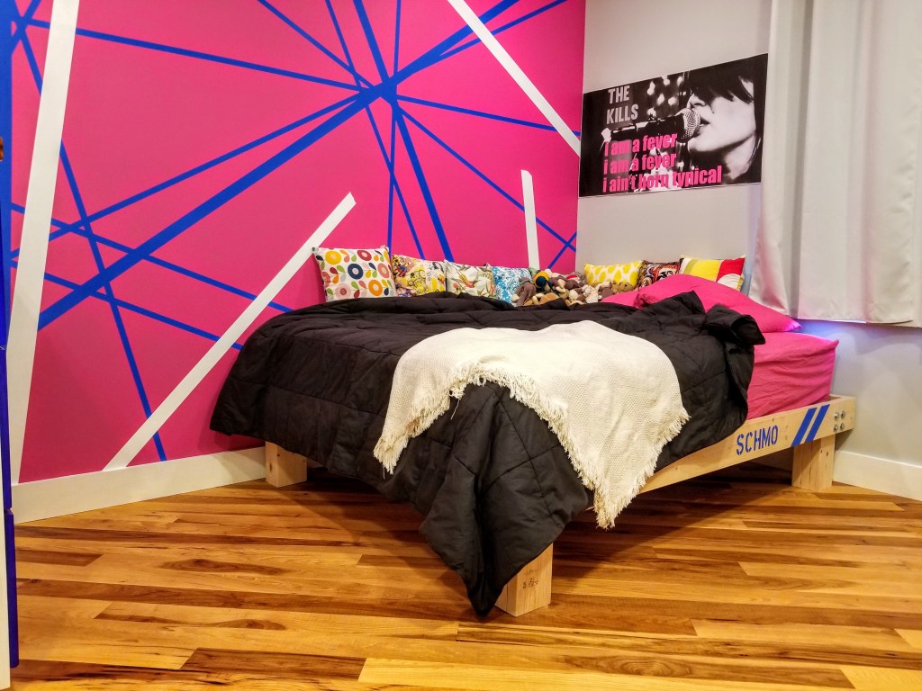
The first mural would be multi-colored, inspired by Eddie Van Halen’s Frankenstrat guitar:

Although I would change up some of the original colors, the overall layout would be roughly the same.

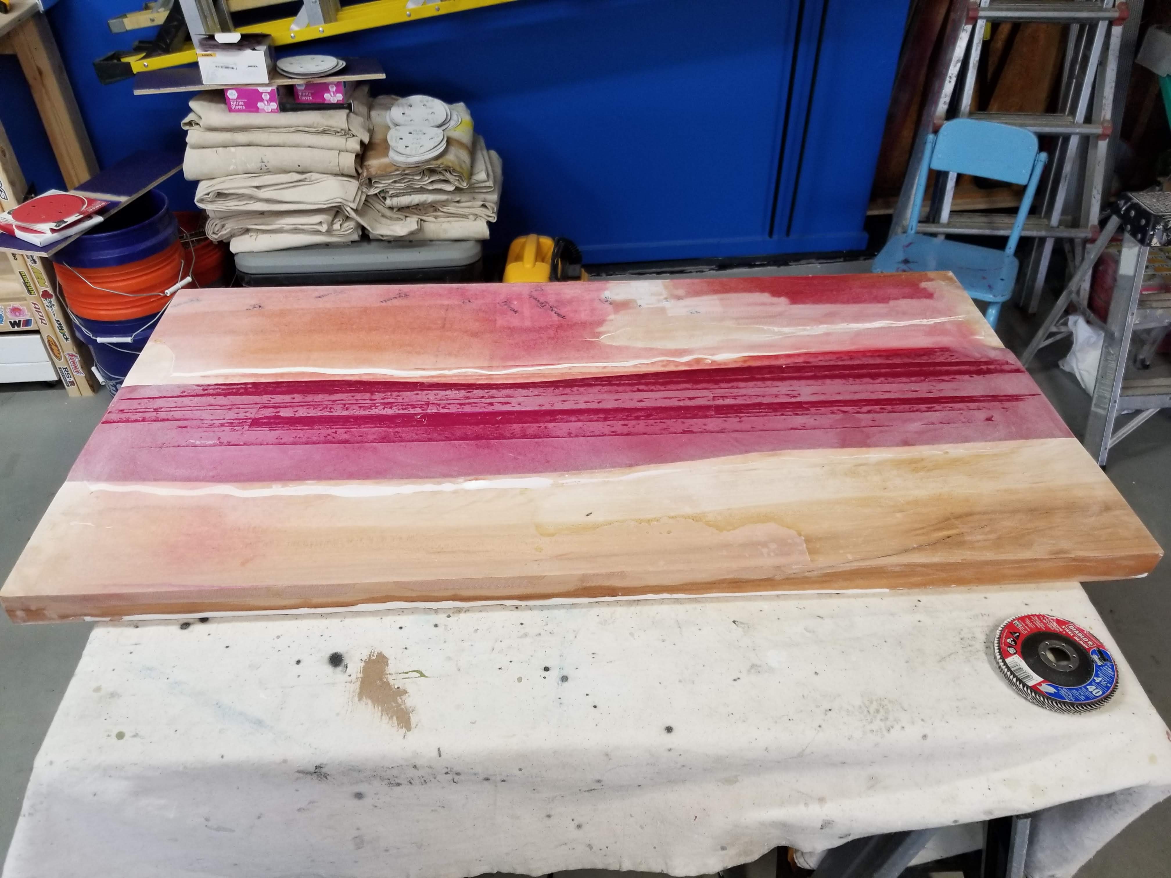
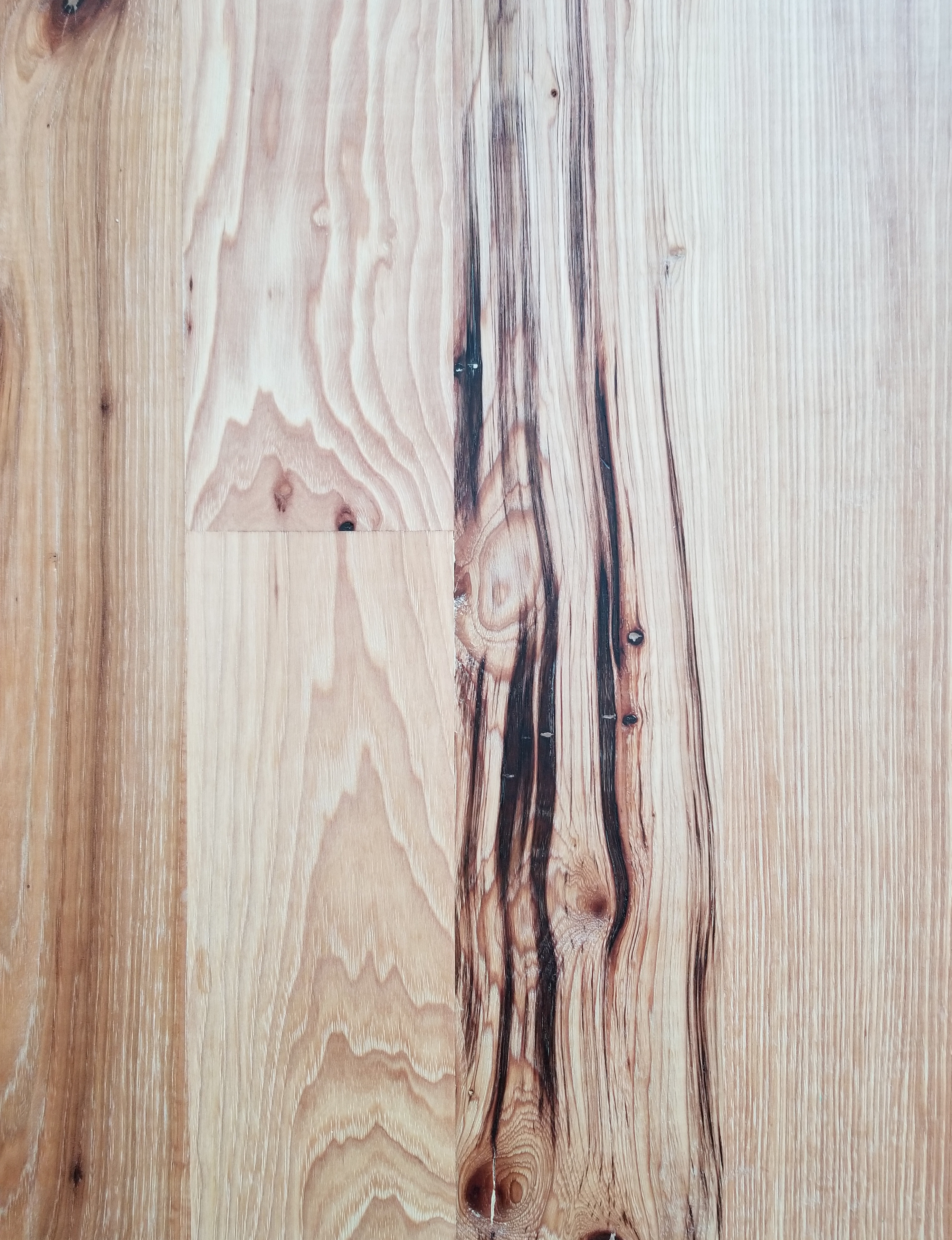
The mural started with a base coat of blue. Once this was dry, I applied painter’s tape to set up most of the striping that was based on the guitar:

With the tape in place, I could begin applying the finish coat of pink:

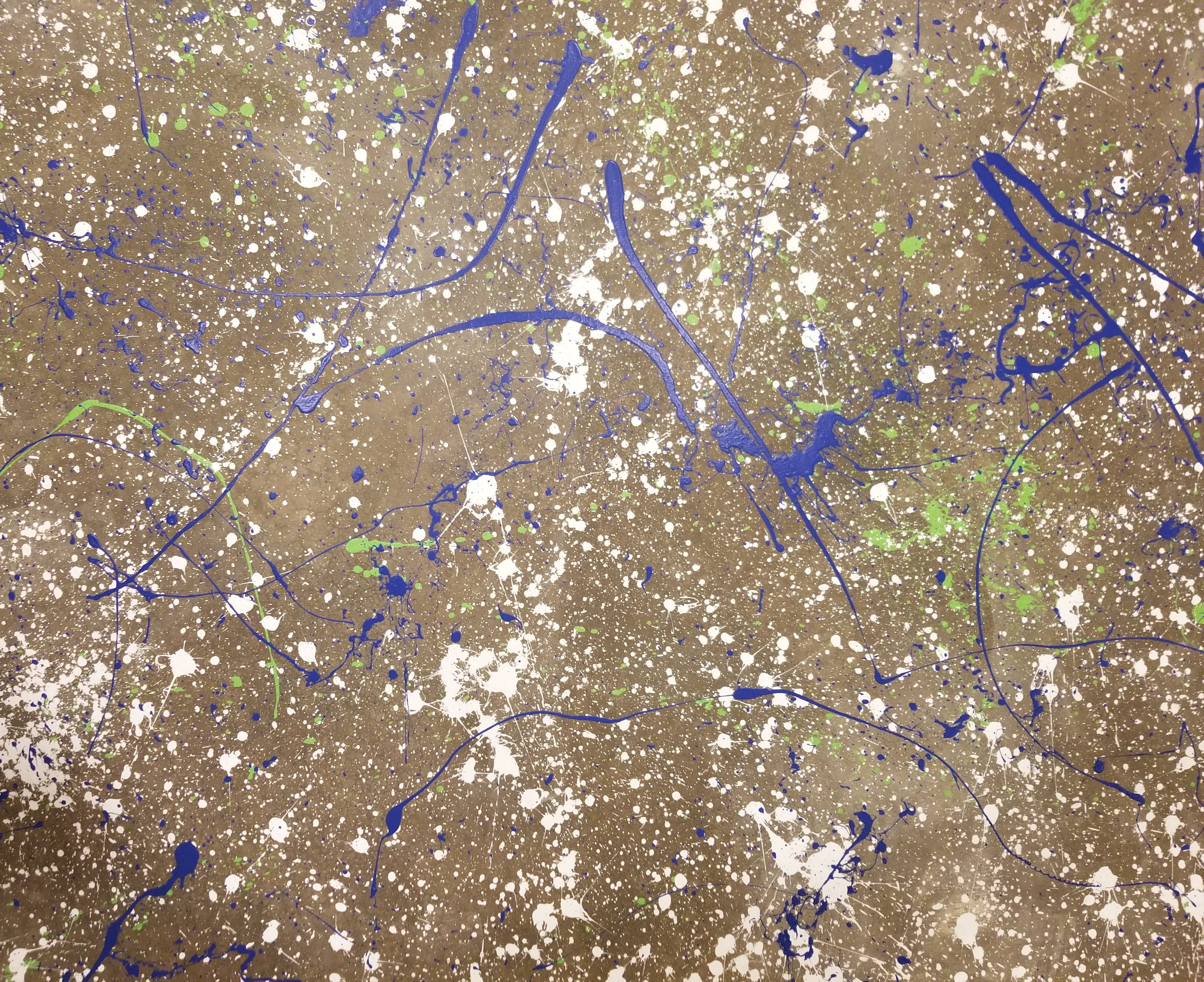
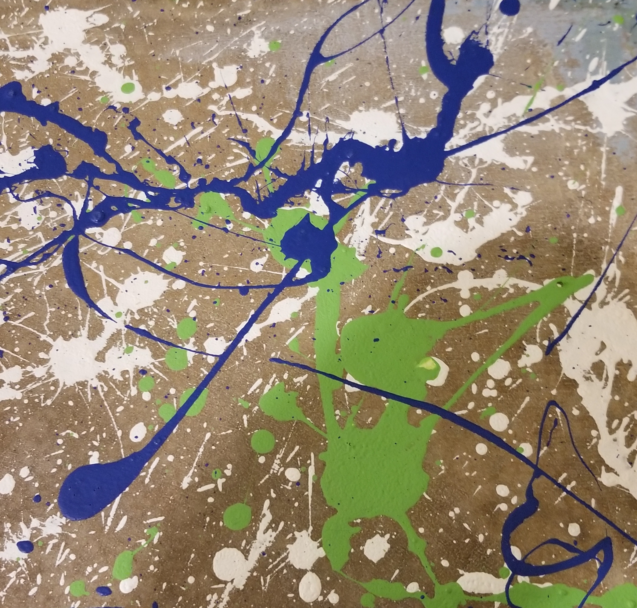
Once the two coats of pink were dry, I slowly pulled the painter’s tape to reveal the blue lines just below the surface:

The final step was setting up and painting the white stripes, including some ‘torn’ or ‘frayed’ ends:

The second mural would be a more subdued, but stark, black and white color combination.

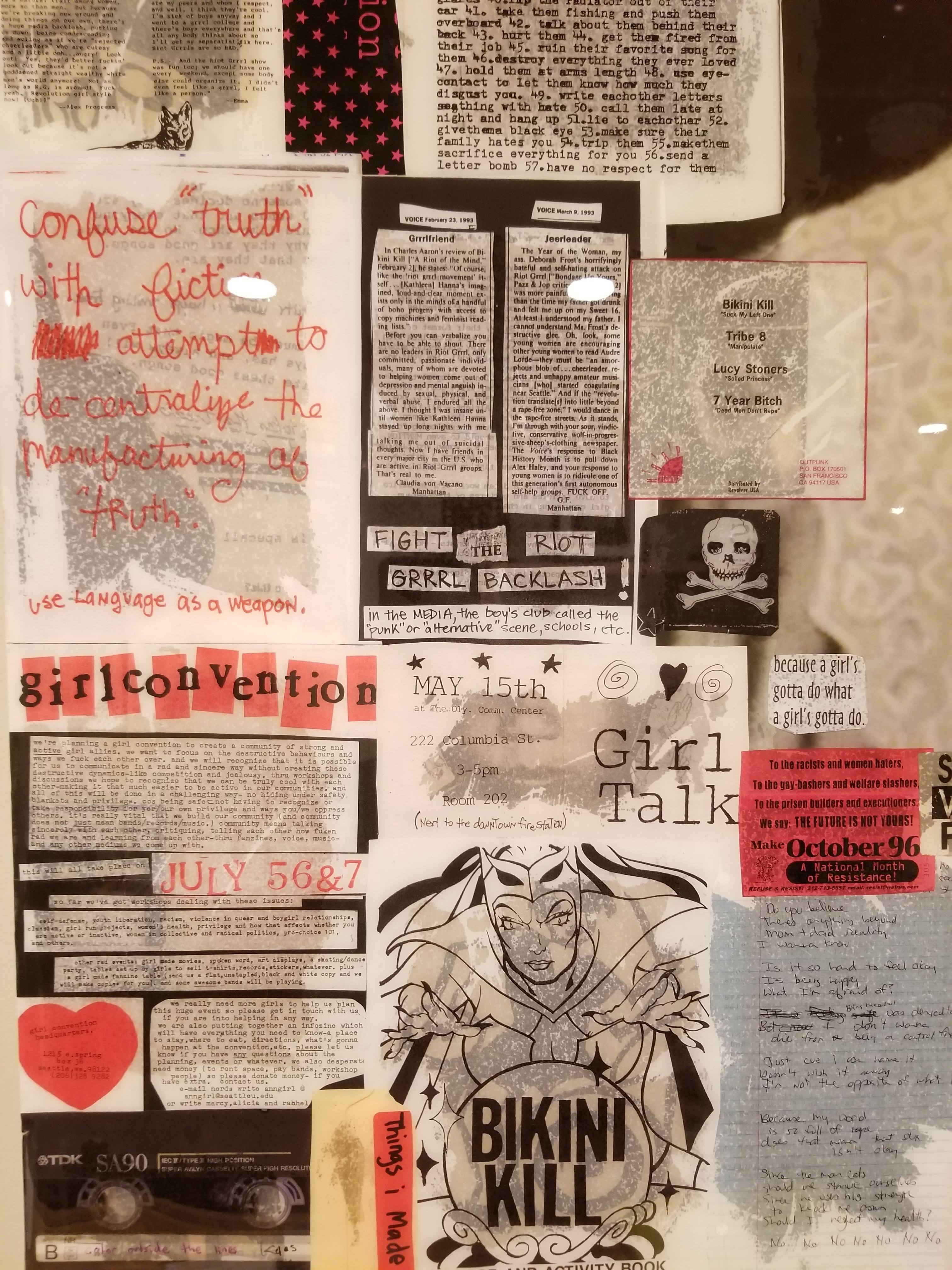
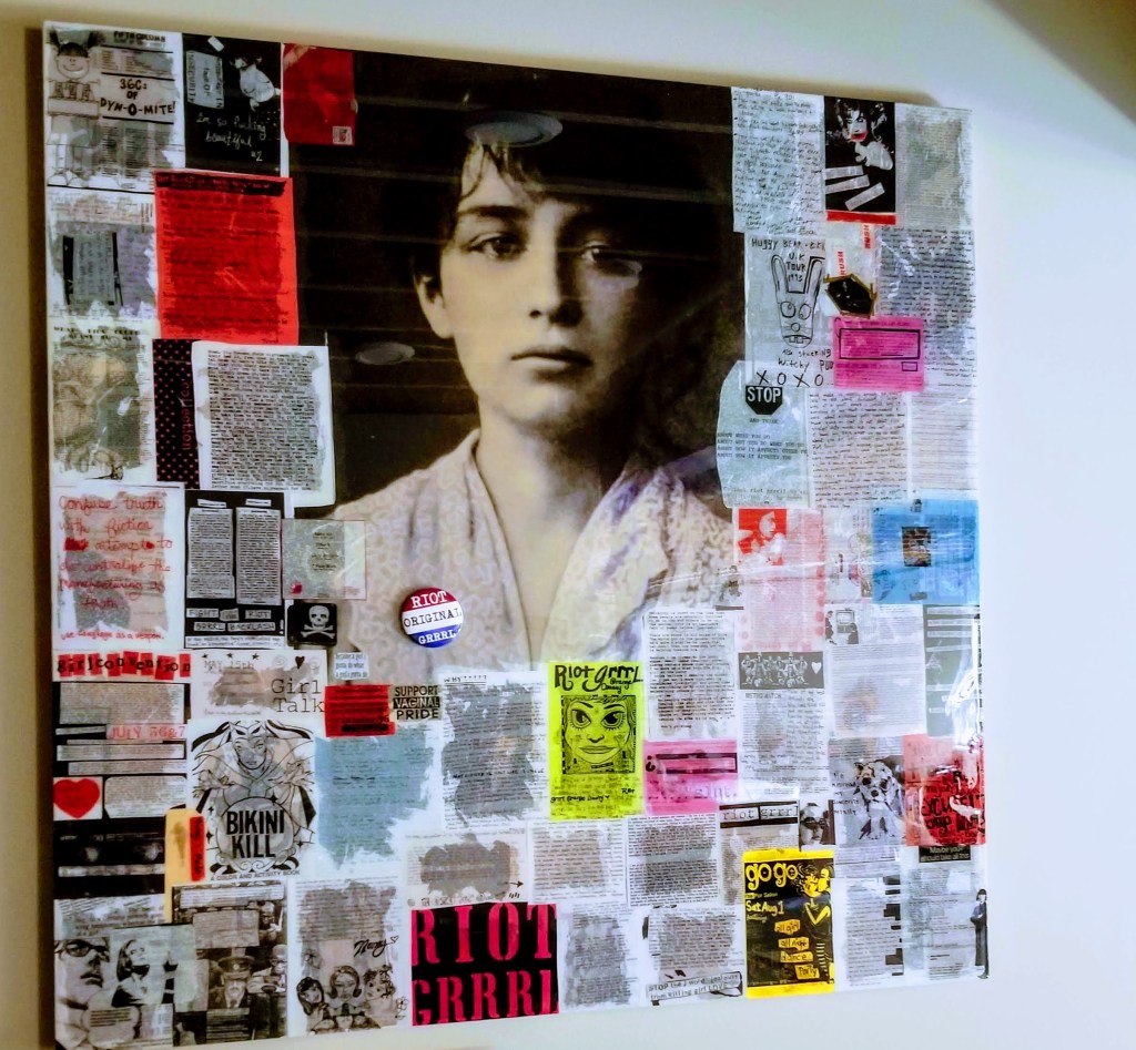
On this larger, opposing wall I wanted to try recontextualizing (i.e., appropriation) an iconic but infamous piece of graphic design. In this case, the World War II era Imperial Japanese flag (or Rising Sun flag), so it was important to undermine and invert the intent, or at least the associations, of the original design, rather than, for example, trying to undermine it with humor. In effect, steal some of the thunder inherent in the power of the original layout but for wildly different goals.

Much of the fascist iconography (in all its variations), while undeniably effective in terms of ‘branding‘ when it was on the rise during the WWII period, is also ripe for satire and deflation:

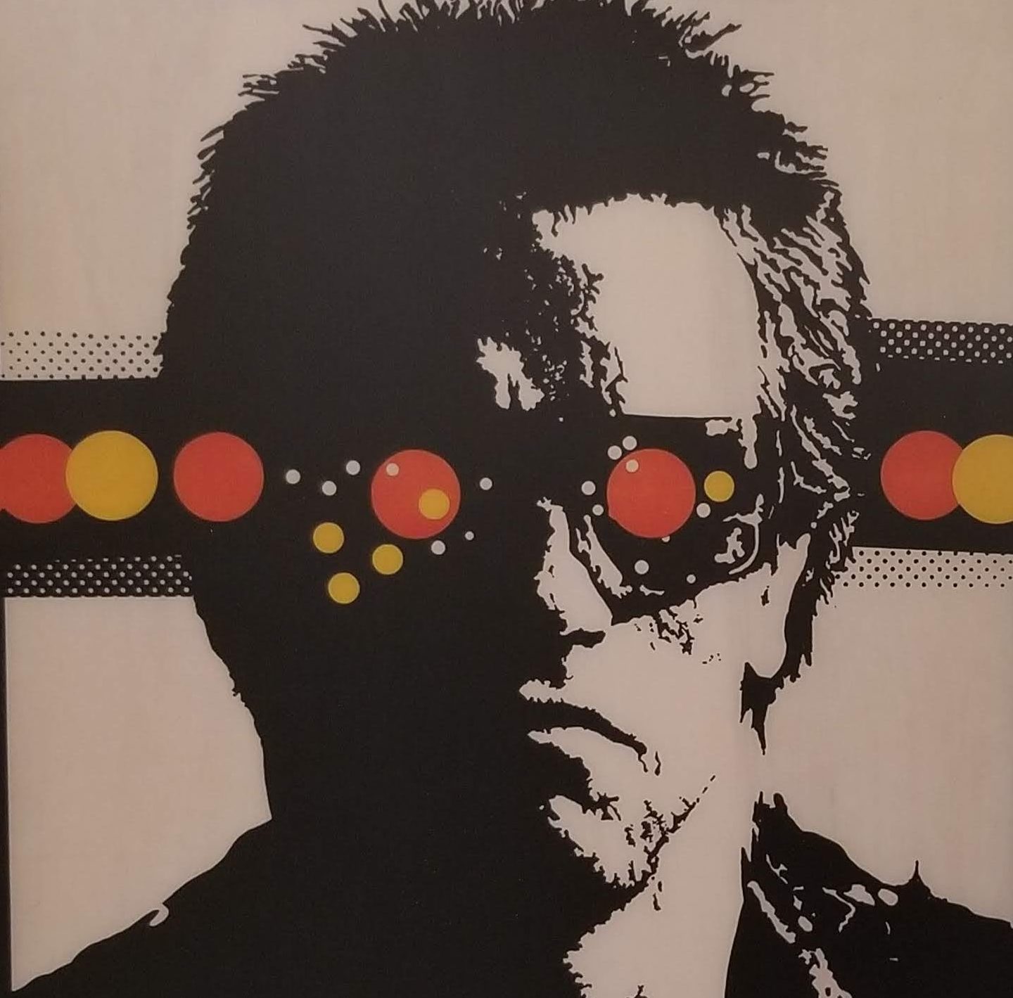
An American artist, Ron English, does an excellent job in this regard, similar to The Simpsons, when it comes to satirizing or ridiculing marketing and pop culture icons and logos:

Where the original Rising Sun flag personified a ‘might makes right’ ideology, one rooted in racist ideas about cultural superiority, I wanted to undermine this ‘logic’ without losing the visual impact of the original design.

Alongside Imperial Japan, Nazi Germany, of course, produced some of the most notorious symbols and imagery of the WWII era (the power of these symbols and images resonates to this day, showing up in some pretty unlikely places):

In terms of the Rising Sun flag, the power of the design begins and ends with the circle or disc at its center.

“If the square is bound up with man and his works, with architecture, harmonious structures, writing and so on, the circle is related to the divine.”

— Bruno Munari, Design as Art

In addition, the 16 equally sized bars or ‘sun rays’ in the original only strengthen the effect, encouraging our eye to land on and remain focused on the red disc.

“The eye is attracted by the dark disc and has no way of escaping. It has to tear itself away… The eye is in fact accustomed to making its escape at the points or corners of things, at the head of an arrow for example. A triangle offers three escape routes, a square offers four. A circle has no corners, and the eye is forced to go round and round in it until it tears itself away with an effort.”

— Bruno Munari, Design as Art

A twisted irony considering that this rising sun motif (traditionally a sign of hope, e.g., marking the end of bad times) is so strongly associated with the darkest period in Japanese history.

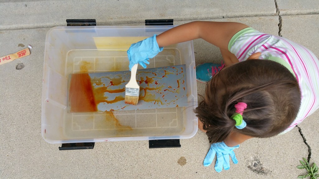
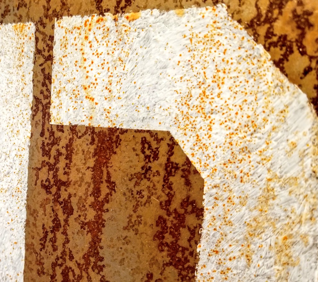
With a base coat of pure white, the black circle, after being laid out in pencil, was handpainted. When dry, I then laid out the black sun rays using blue painter’s tape to establish the exact thicknesses and angles:

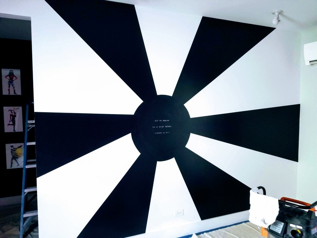
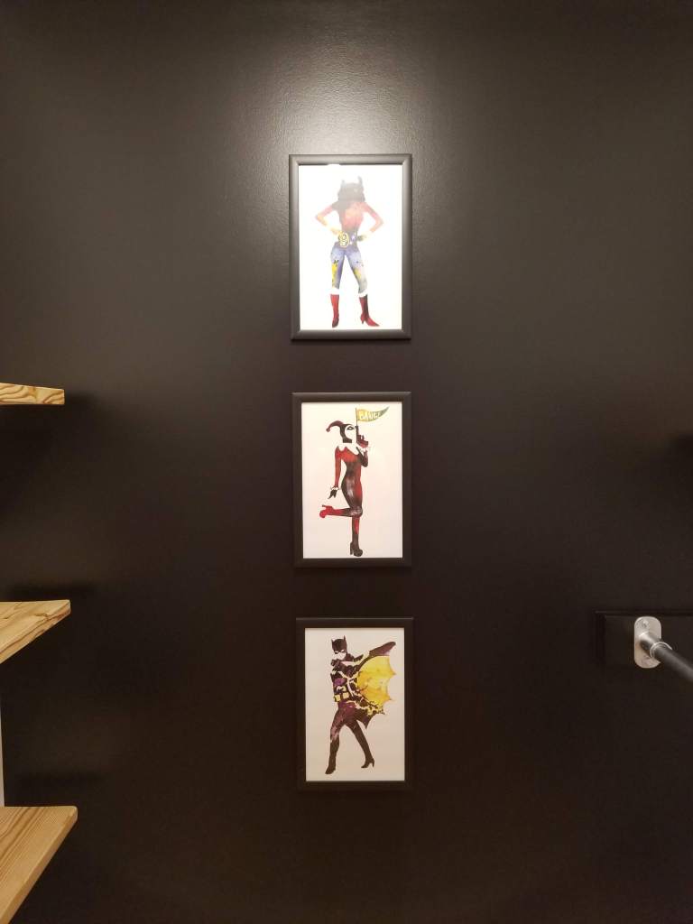
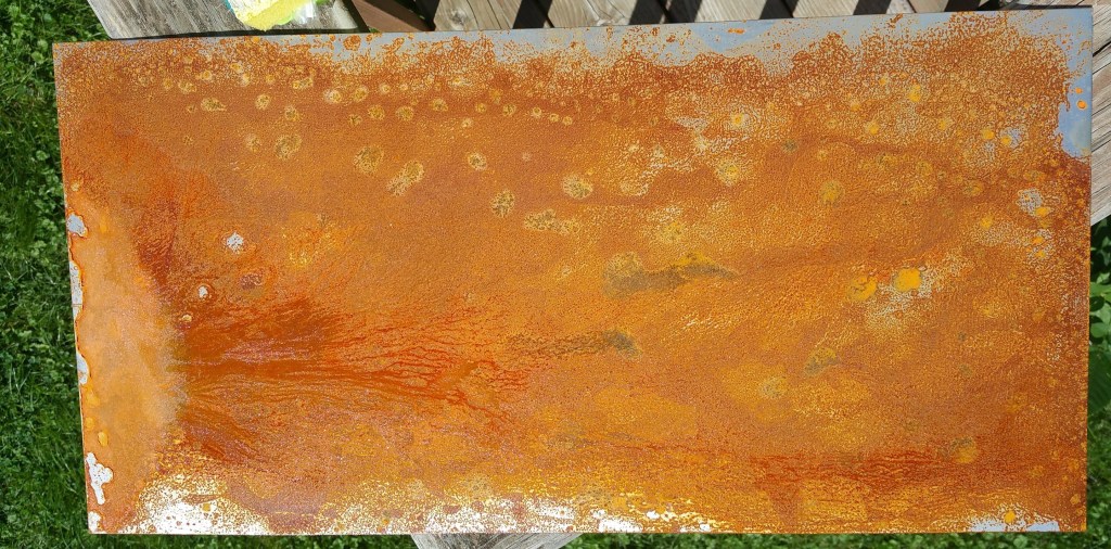
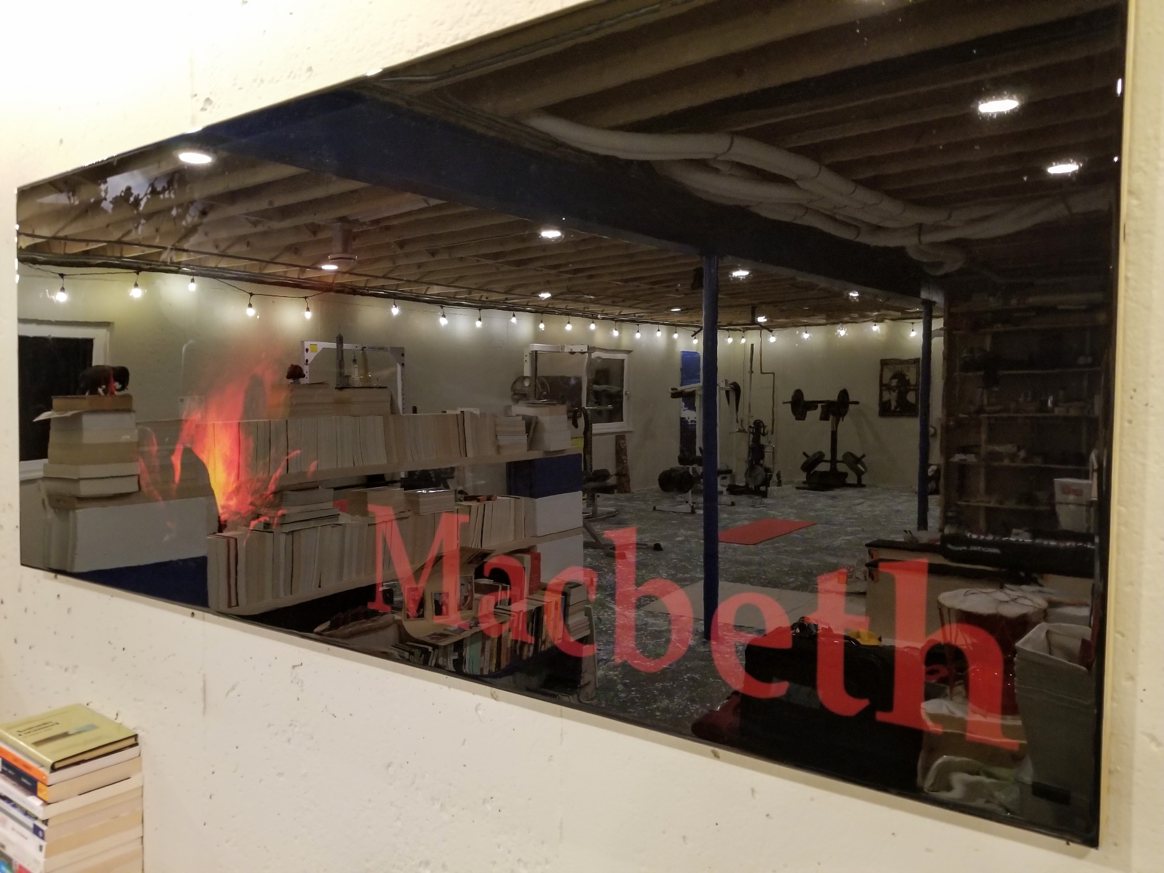
Instead of using the red and white combination, I chose to go with a more stark, even absolute, color combination of black and white (i.e., all of the colors combined with an absence of color). Additionally, I broke up the 16 ‘sun rays’ into only 12, while also playing around with their individual sizes, ensuring variation in the final layout. In a similar way, the intent was to reflect the difference between a square (fascist overtones, man-made) and a circle (divine, natural). Where the original 16 uniformly sized and spaced ‘sun rays’ suggest conformity and submission of the individual to a system of authority, rooted in strict hierarchy (e.g., the sun, like the Emperor, at the center of power), having fewer, thicker ‘sun rays’ in various sizes suggests not just imperfection but also playfulness, while hopefully retaining much of the power in the original design. Because of the wall layout, it also meant more variation in the length of the individual ‘rays’, particularly having one spill across the door opening to the walk-in closet, even ‘ending up’ on the back wall of the closet where it helps to set-off a framed series of portraits:

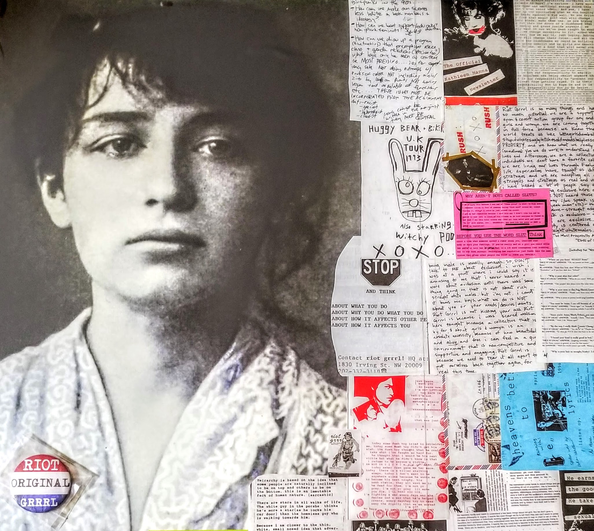
Since so much of the Fascist movement utilized language to achieve its aims, especially in the use of sloganeering and euphemisms, the black circle seemed the ideal spot for the placement of some poetic language. My daughter helped me stencil in a line over the ‘black sun’ from a Bruce Cockburn lyric, which is quoted in a U2 song:

Repeating the logic of the ‘imperfect’ sun rays, the layout of individual letters was intended to highlight their fragility — some opaque, some appearing slightly faded, running above and below an invisible line — as if struggling to stay on the wall.

Having a vivid mural near a doorway definitely makes for a strong visual statement:

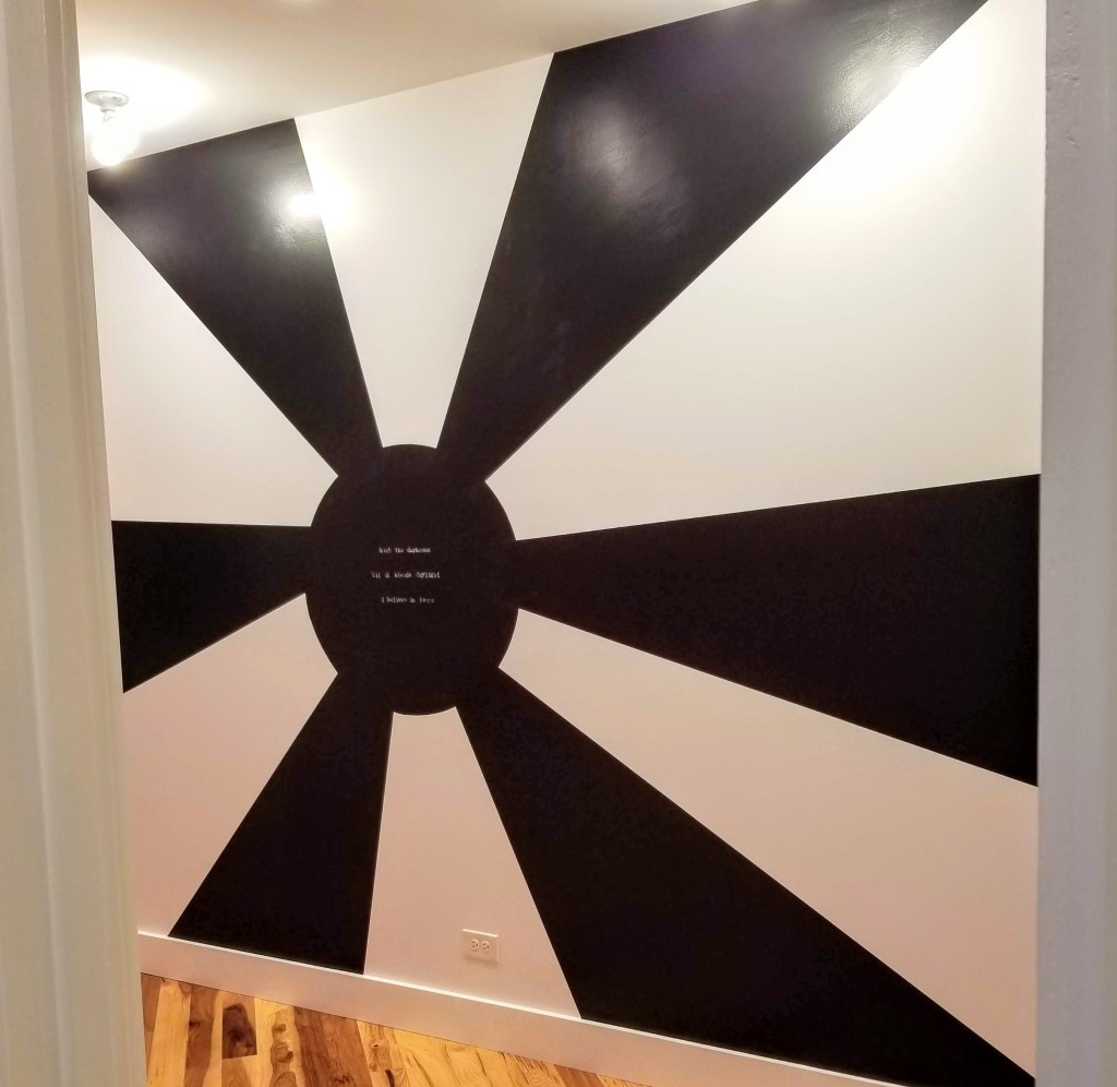
We let the black ‘spill over’ into the walk-in closet as an accent wall — a stark background for some framed superhero portraits:

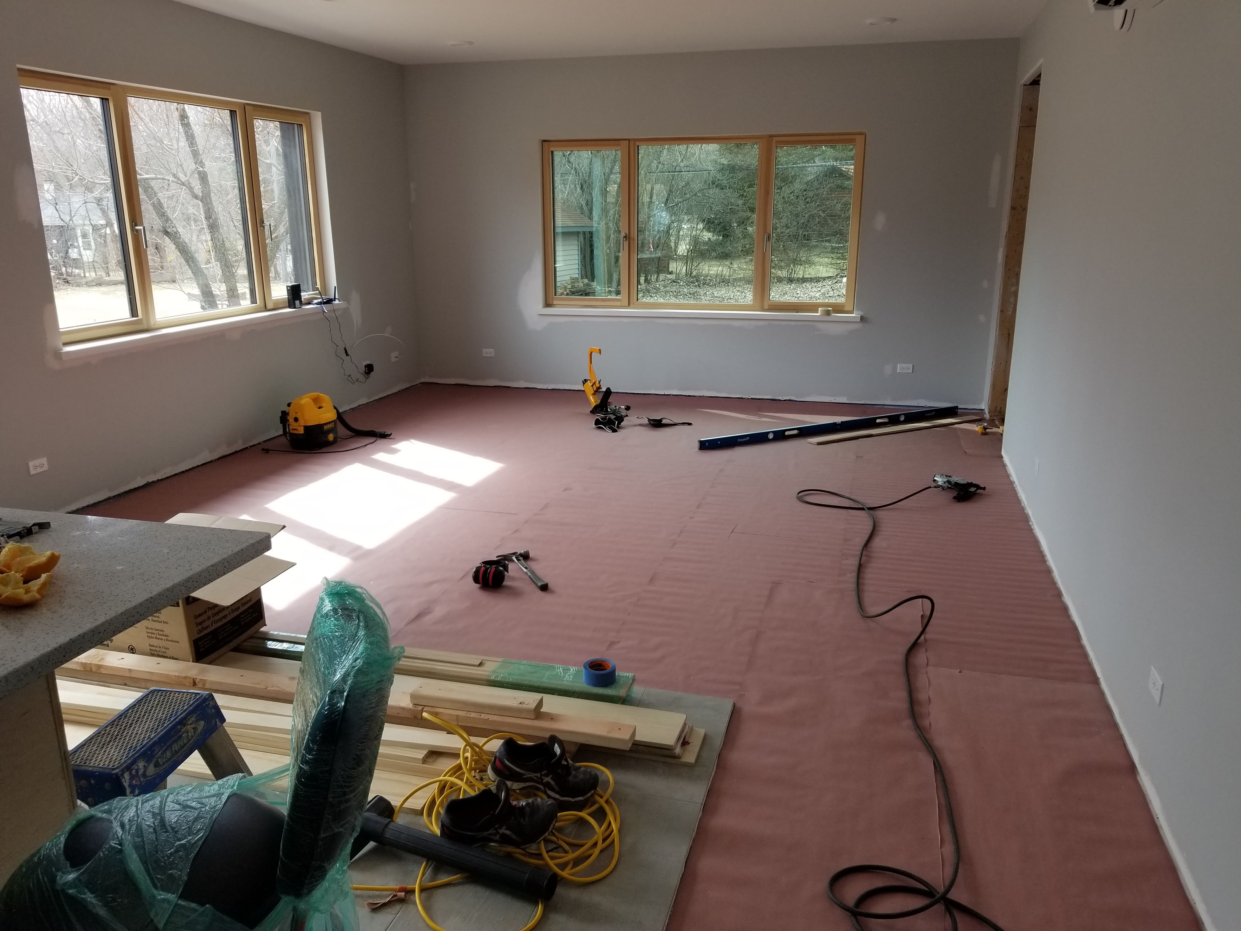
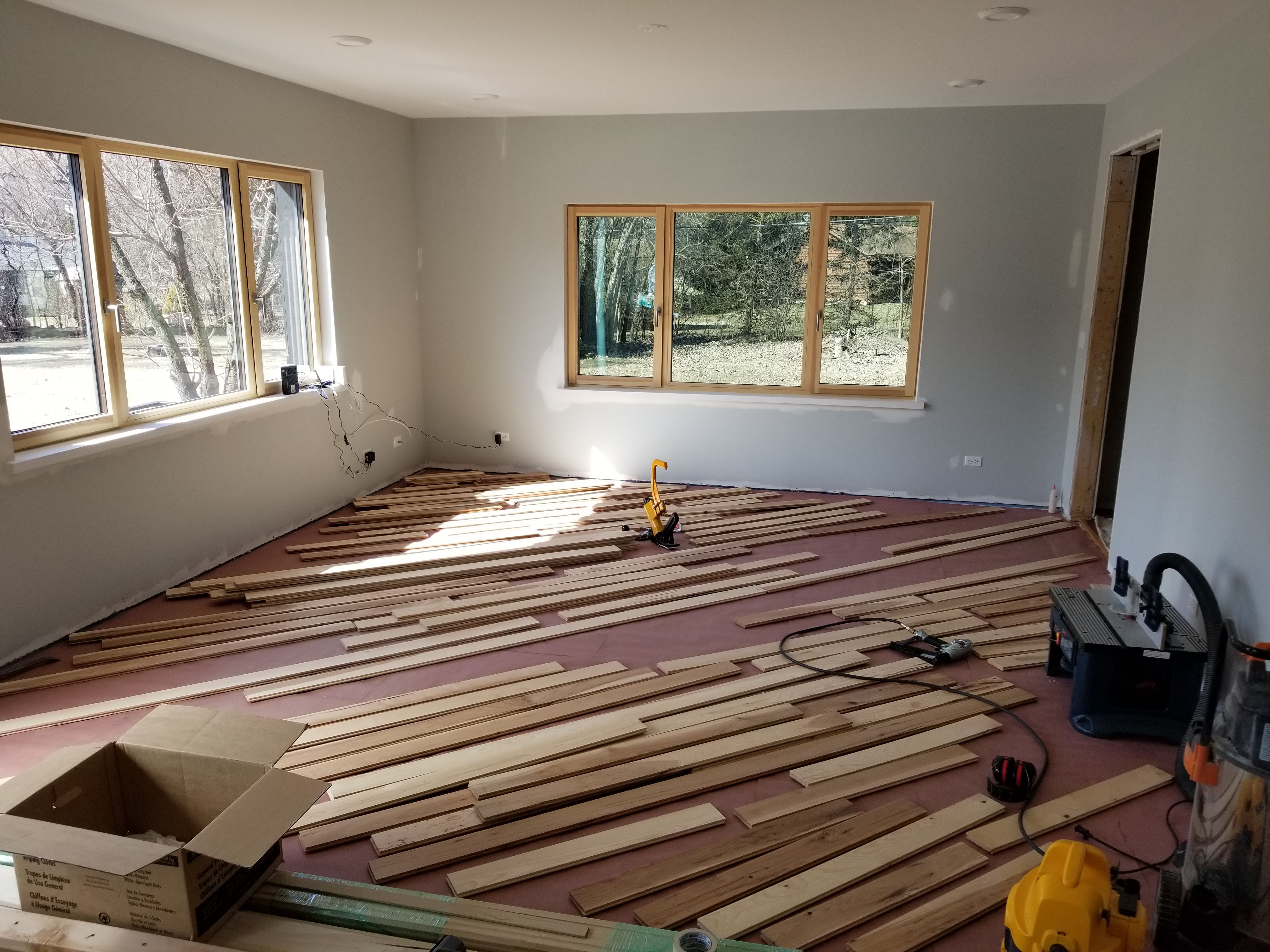
With the two murals complete, I could turn my attention to making some new furniture pieces, including a bedframe and a dresser.

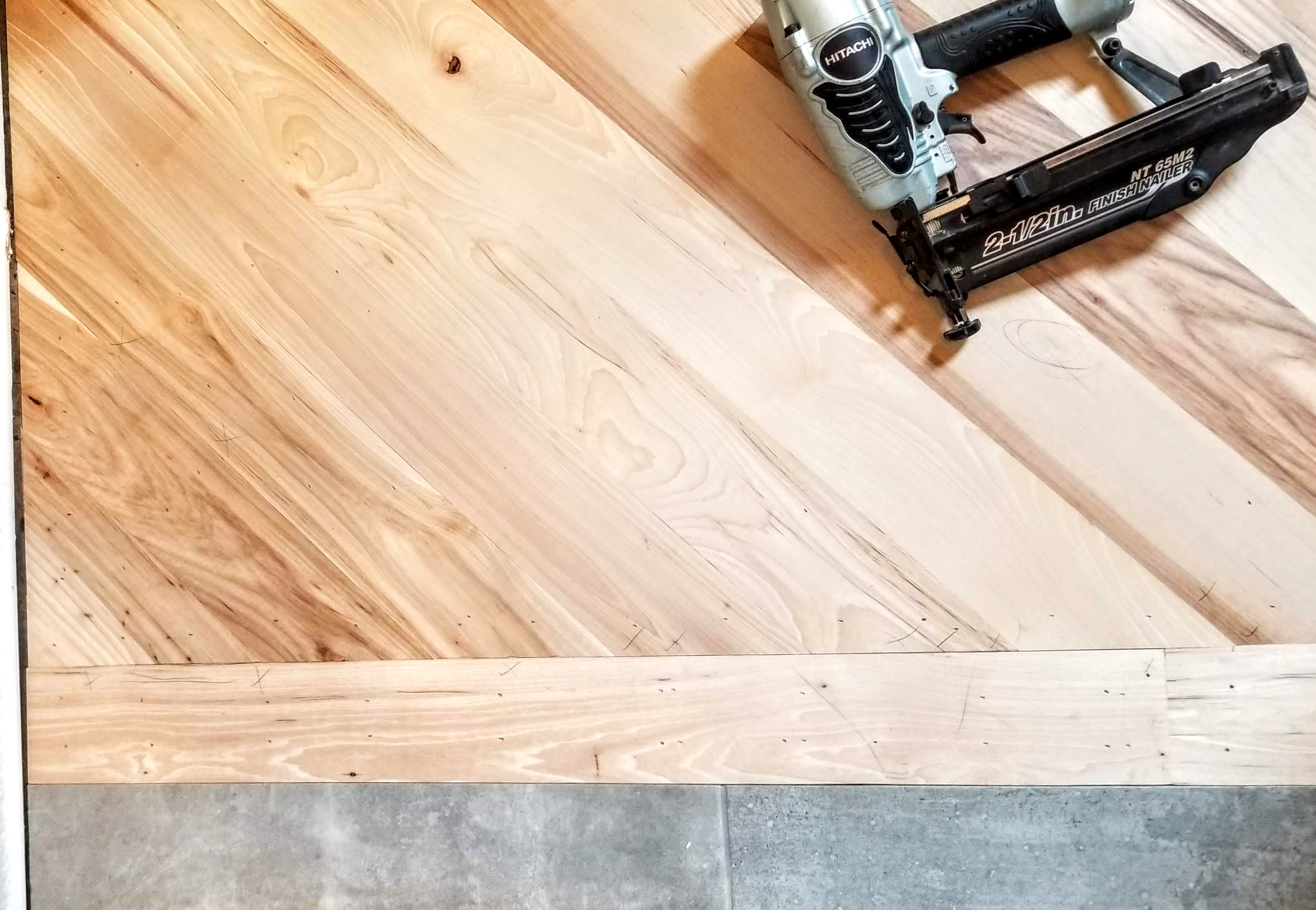
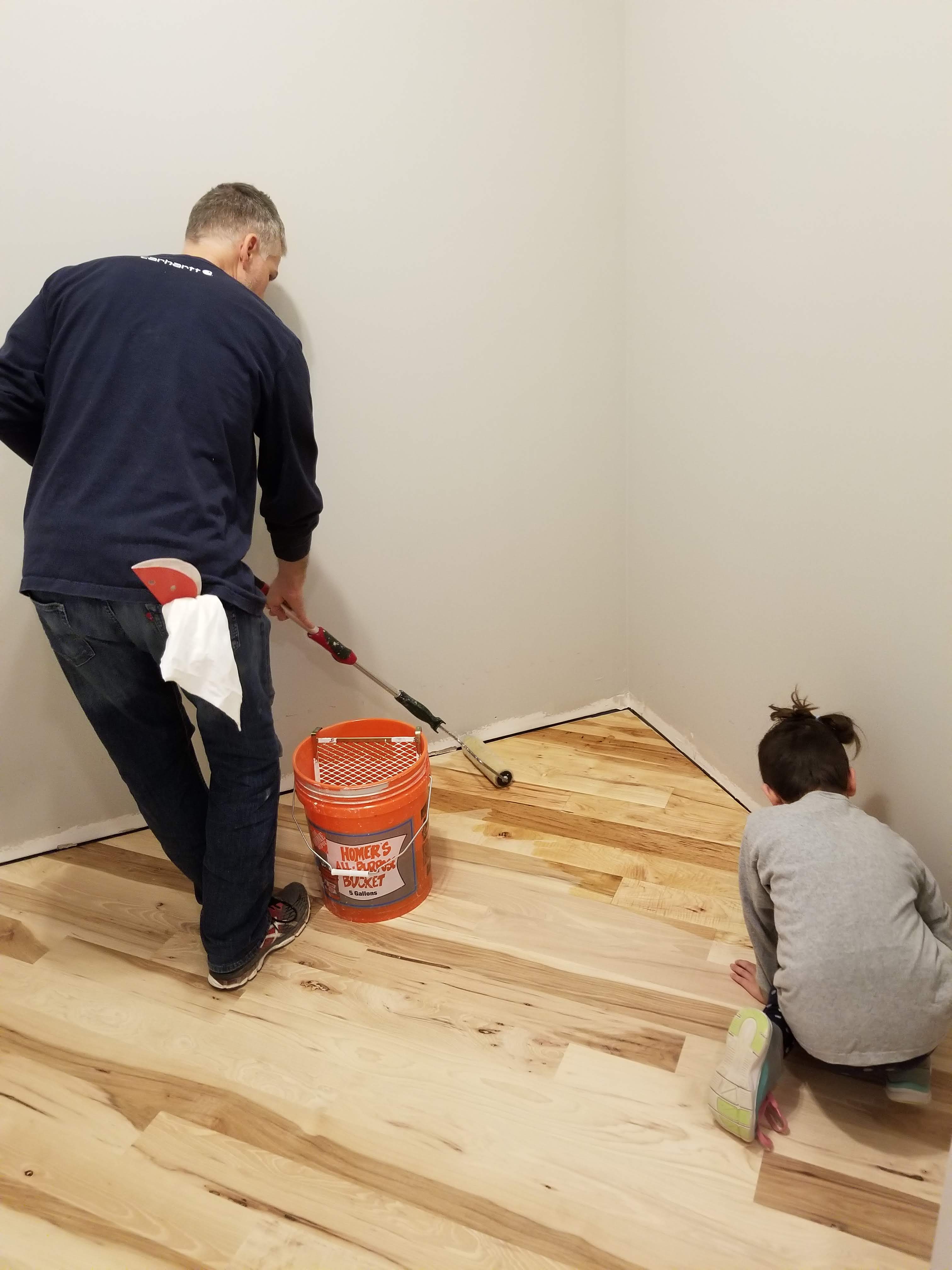
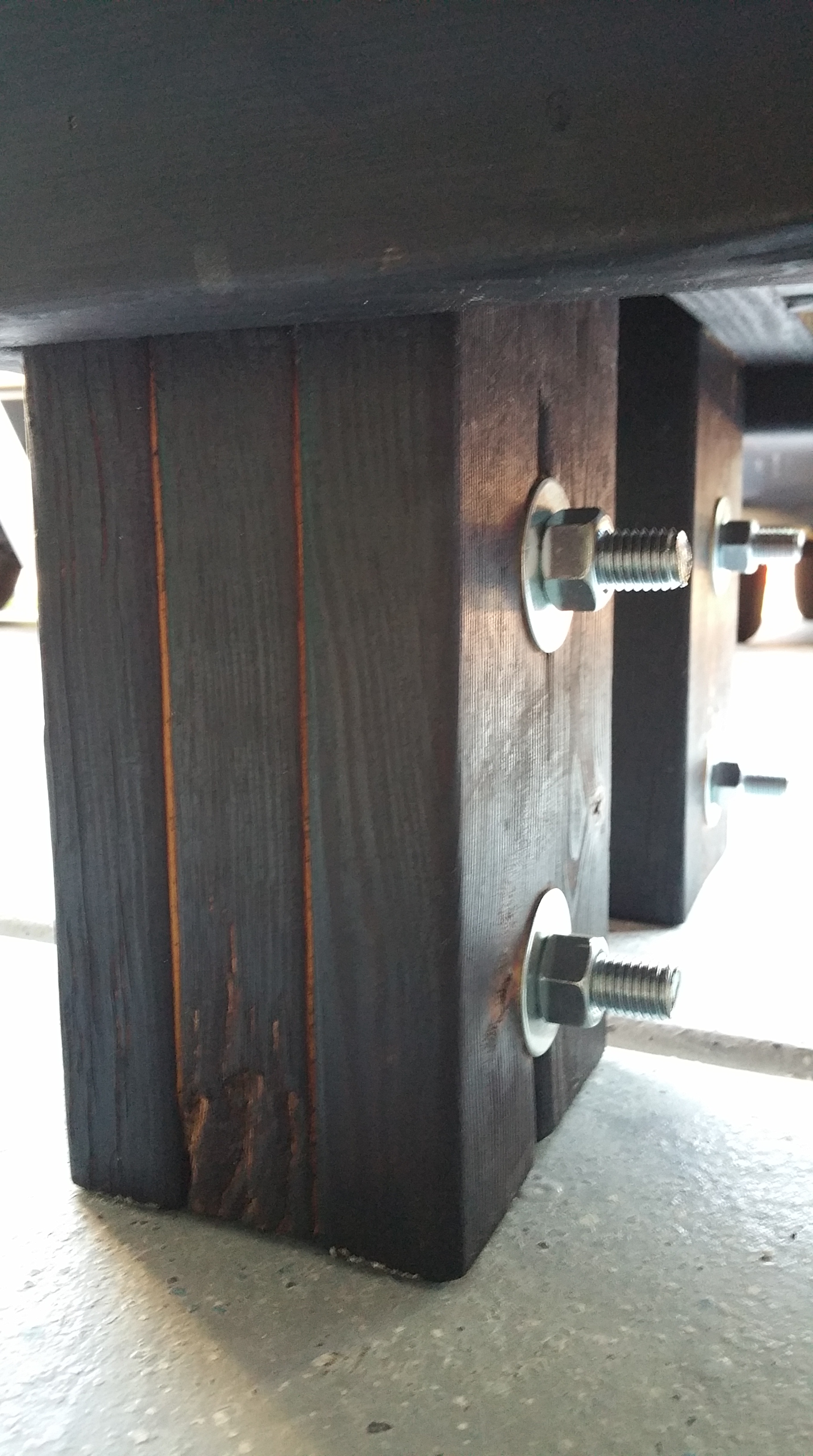
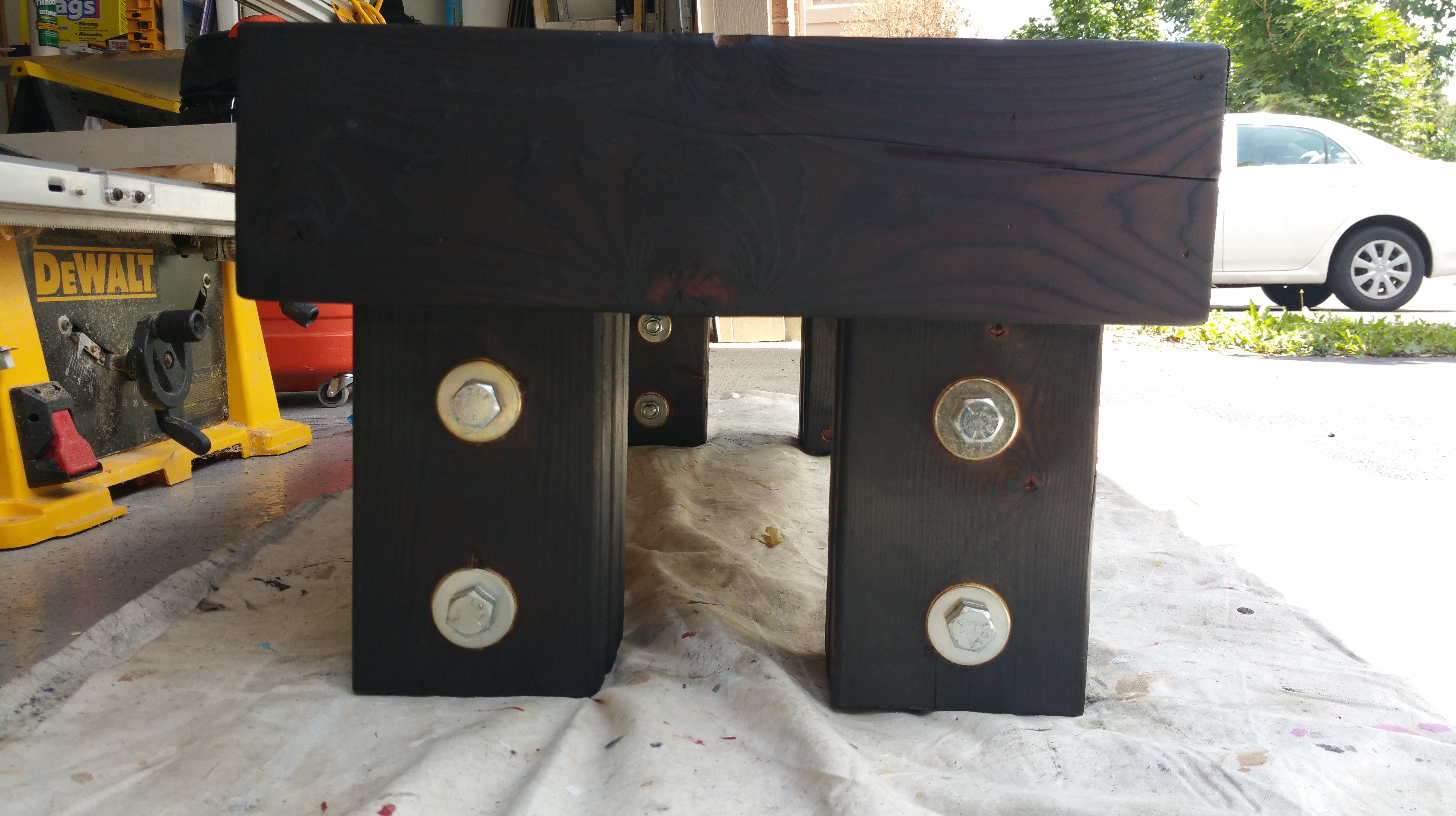
For the bedframe, I utilized framing members (sticking with our Urban Rustic theme), including 2×6’s, 2×4’s, and the 1×4 furring strips:

Keeping the wood natural, combined with lag bolts in the corners, I finished off the bed frame with some racing stripe hash marks and our daughter’s nickname stenciled on the side:

With the bed frame in place, I added a bunch of throw pillows with interesting designs or patterns along the two interior walls:

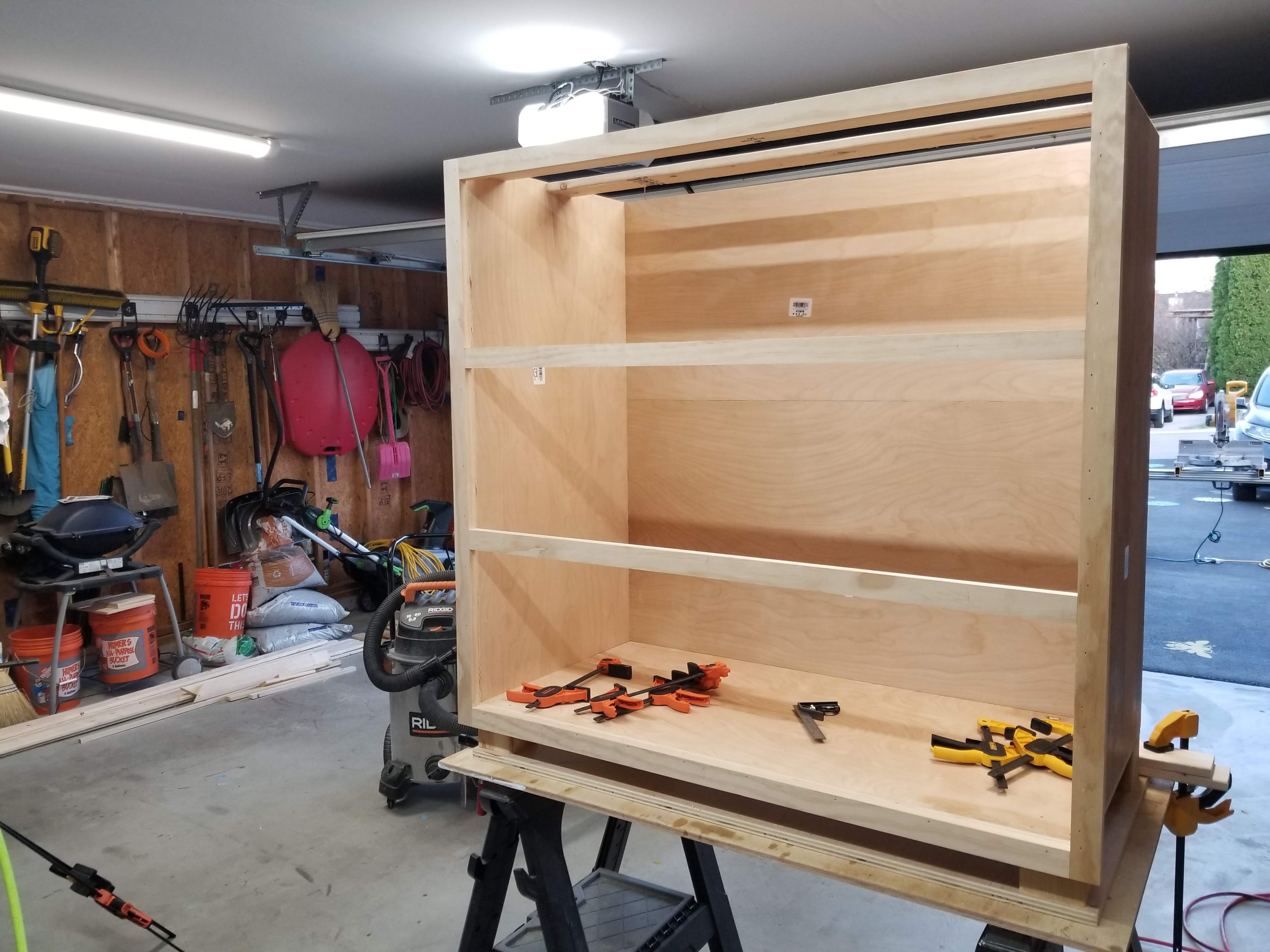
After our extended build, which included a few moves along the way, it was finally time to come up with at least a semi-permanent dresser for my daughter.

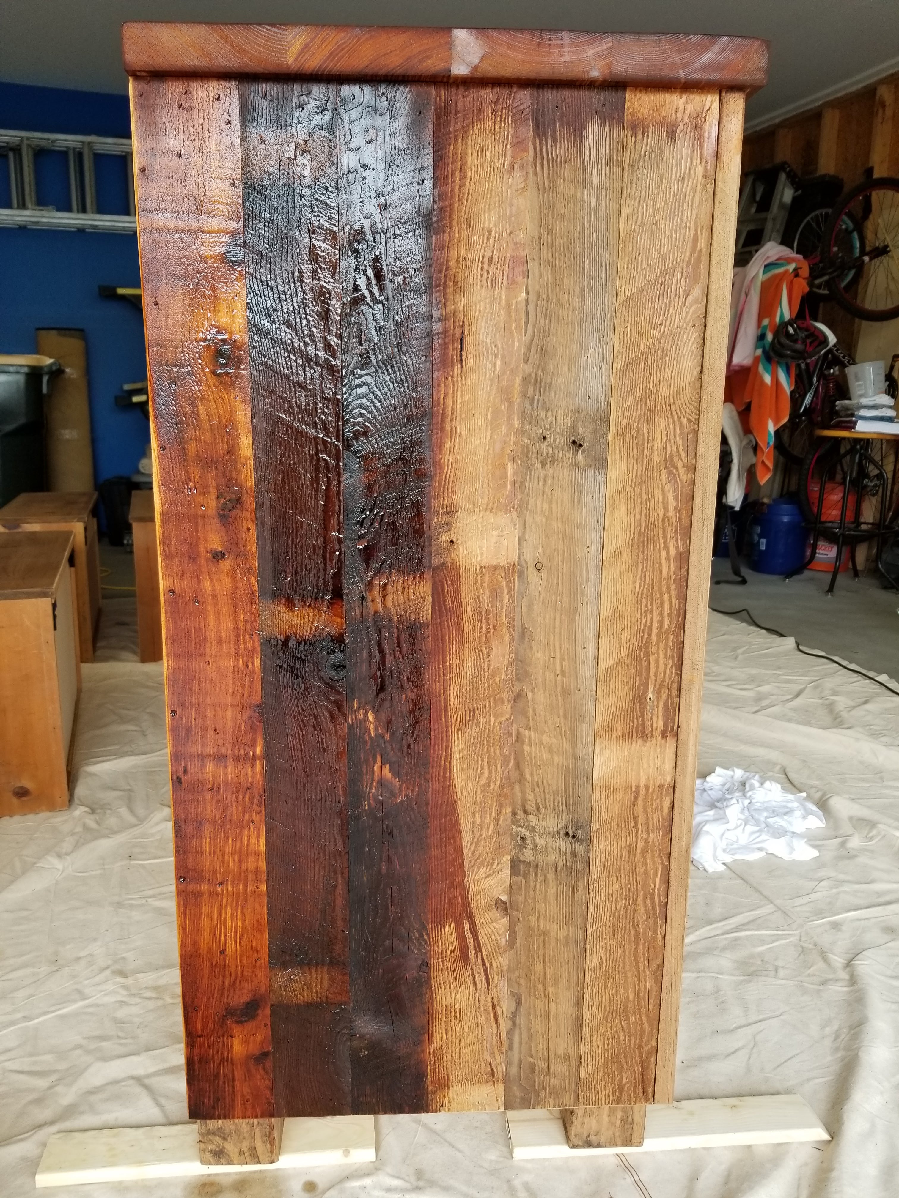
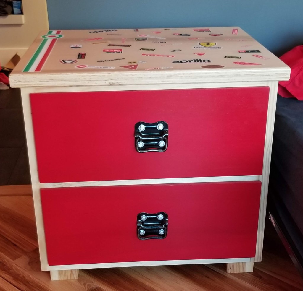
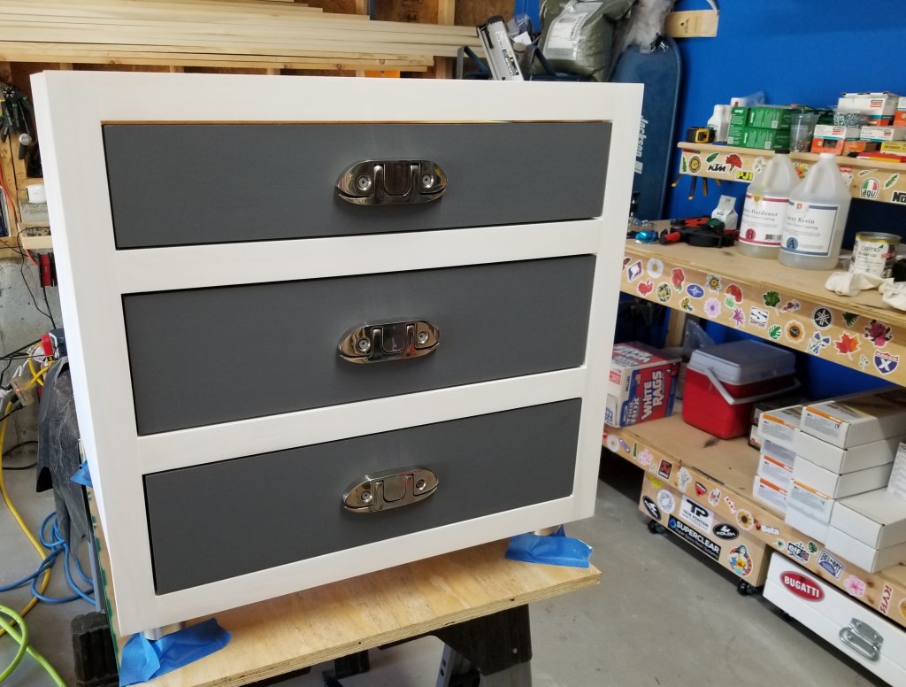
Wanting to keep things playful (as opposed to formal), it seemed like a good opportunity to do something over the top, for instance, using bold colors while having it be oversized in terms of its structure and footprint.

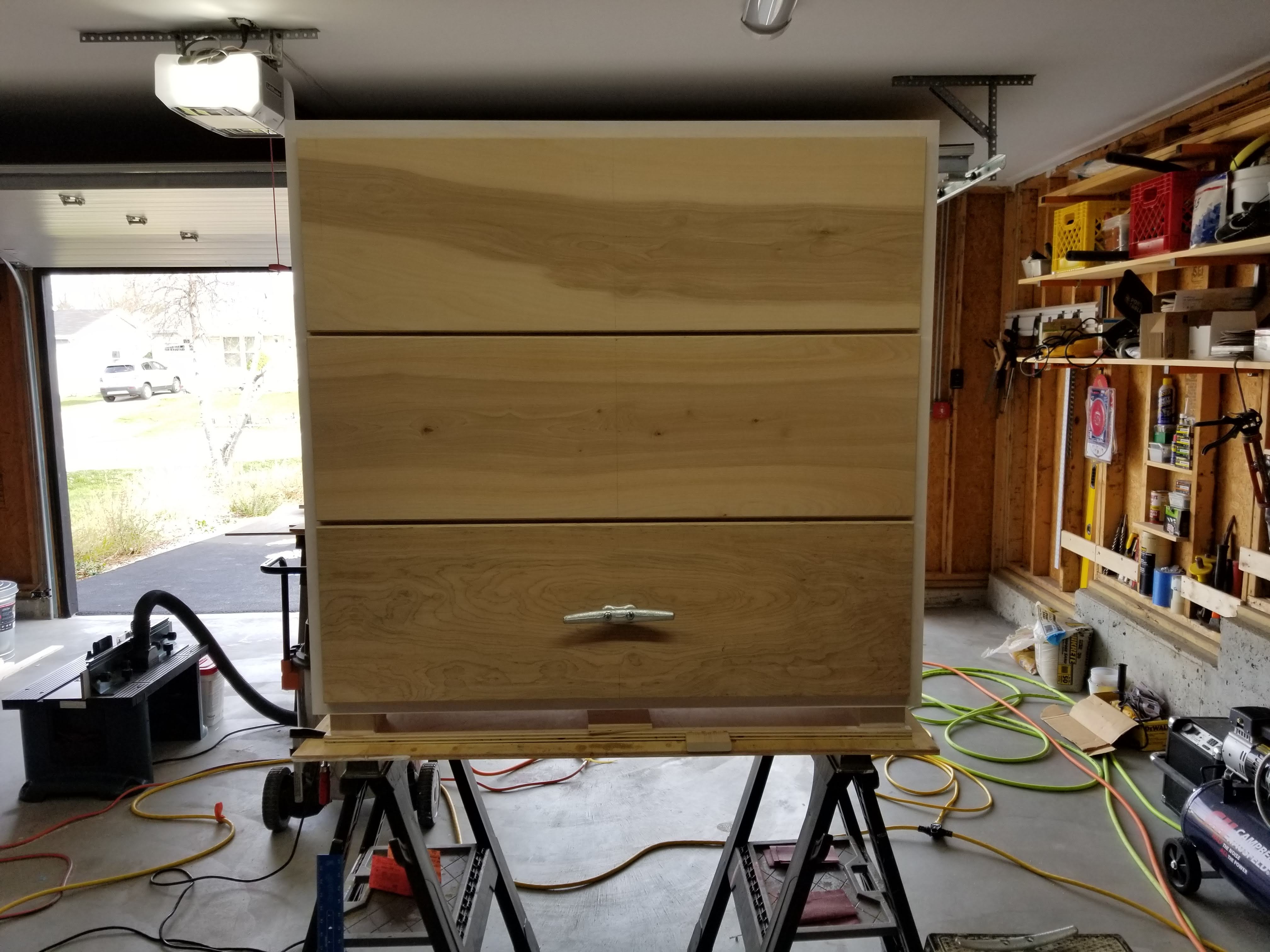
In the photos below, the initial carcass and then the drawers being put together. I decided to go with deep, overlay drawers to maximize the opportunity for storing bulky items like sweaters, hoodies, and jeans. I also just liked the proportions:

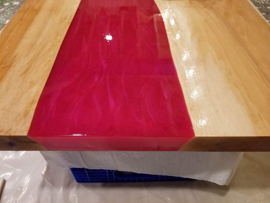
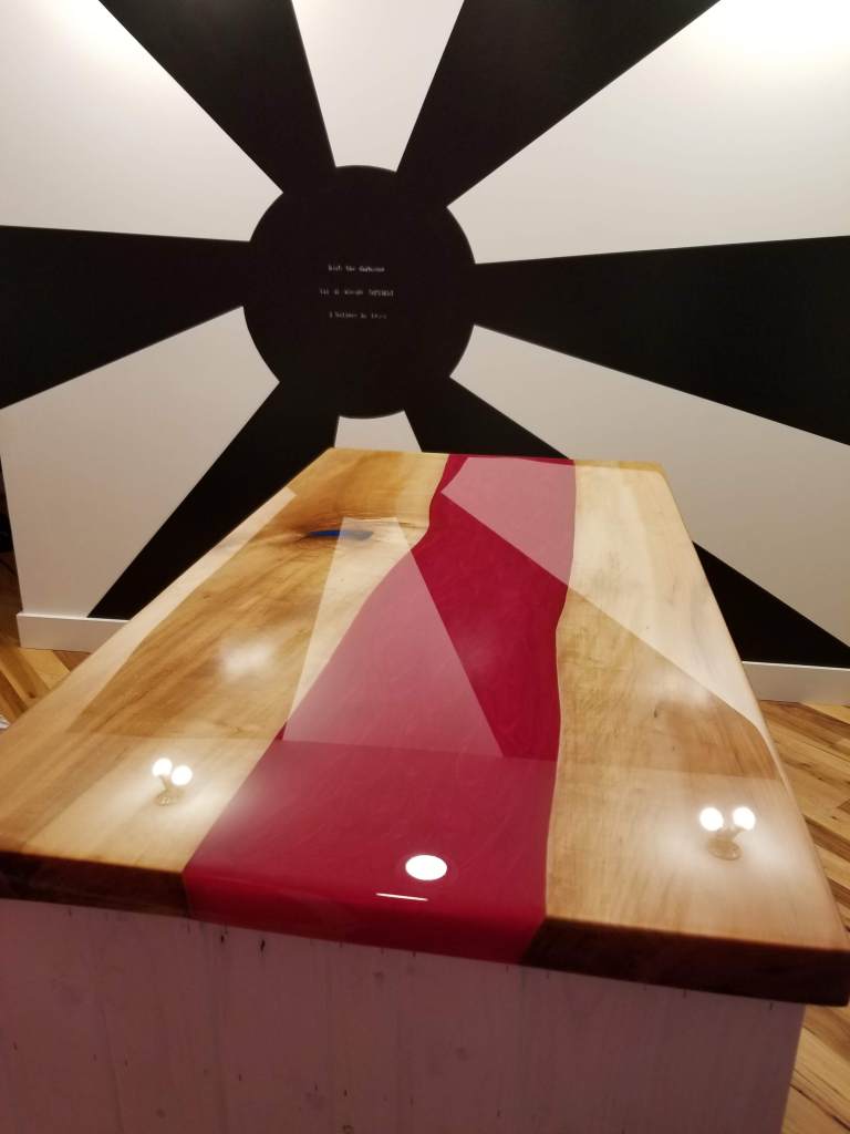
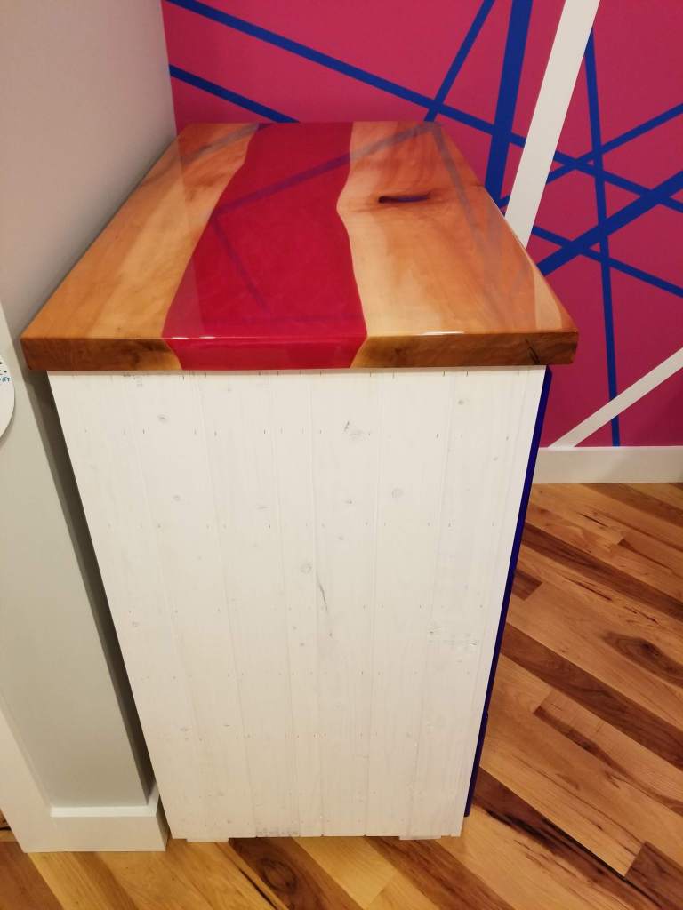
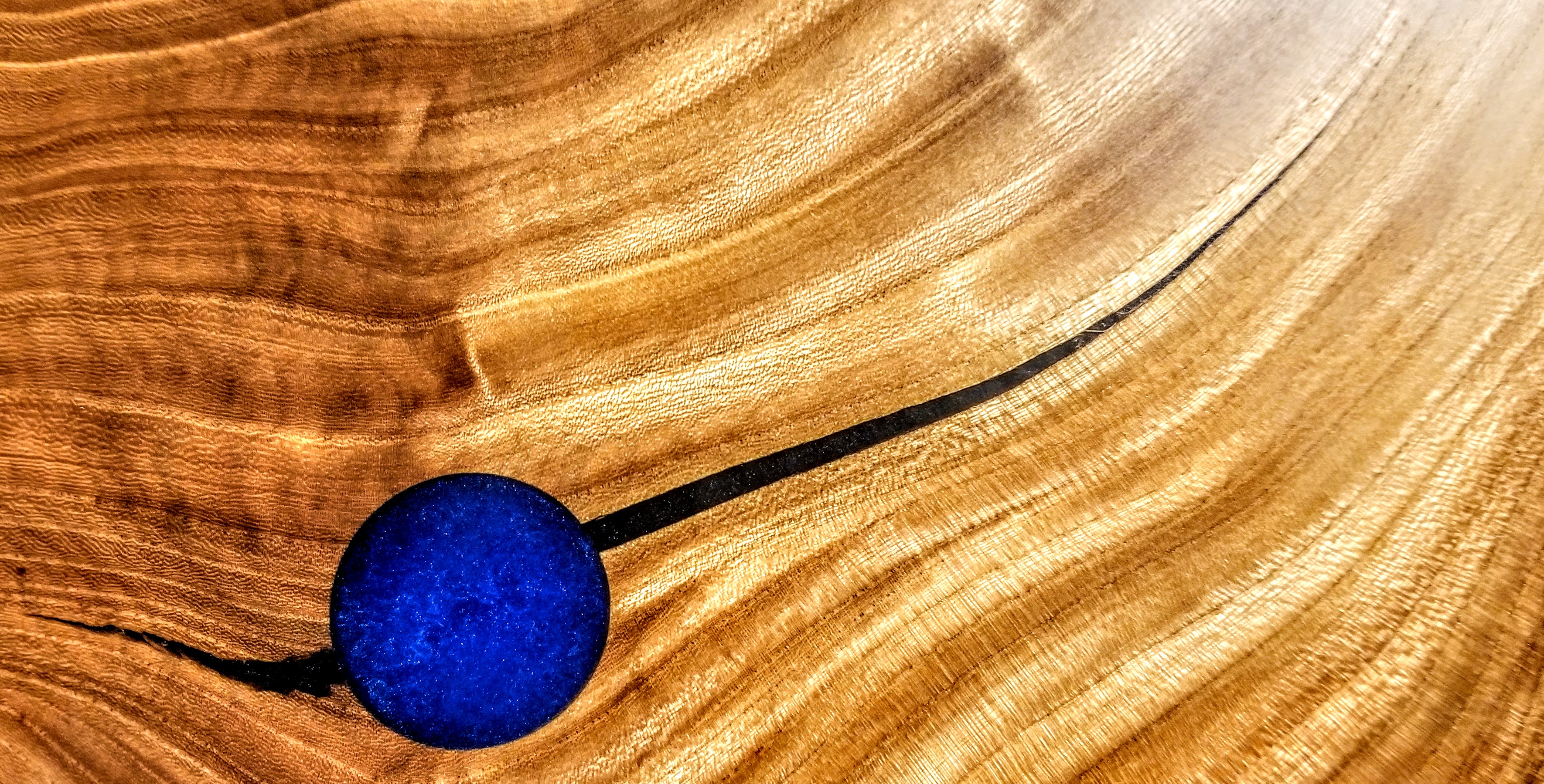
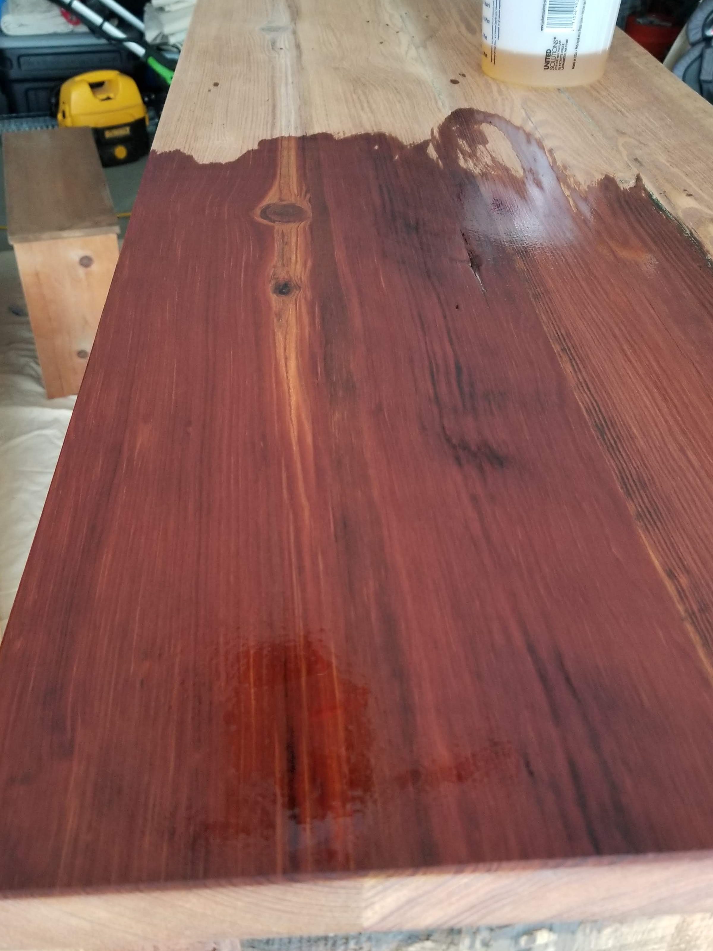
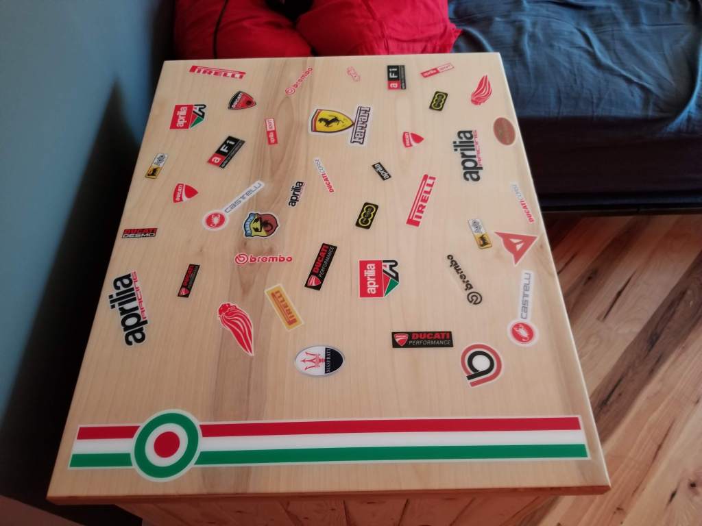
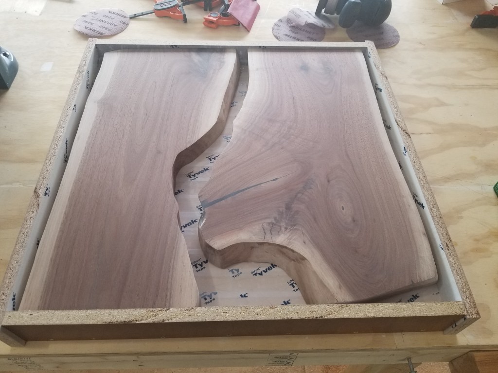
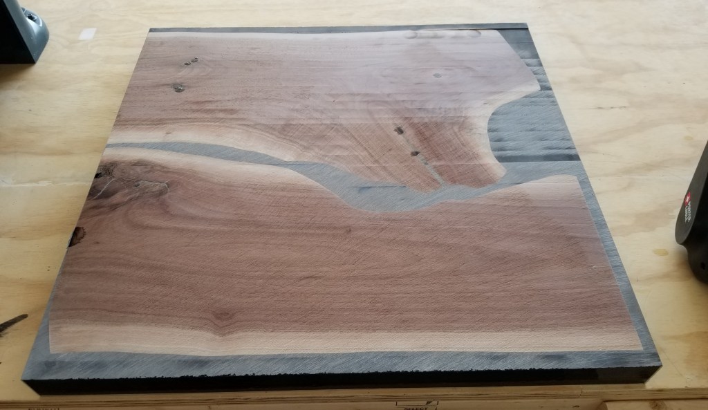
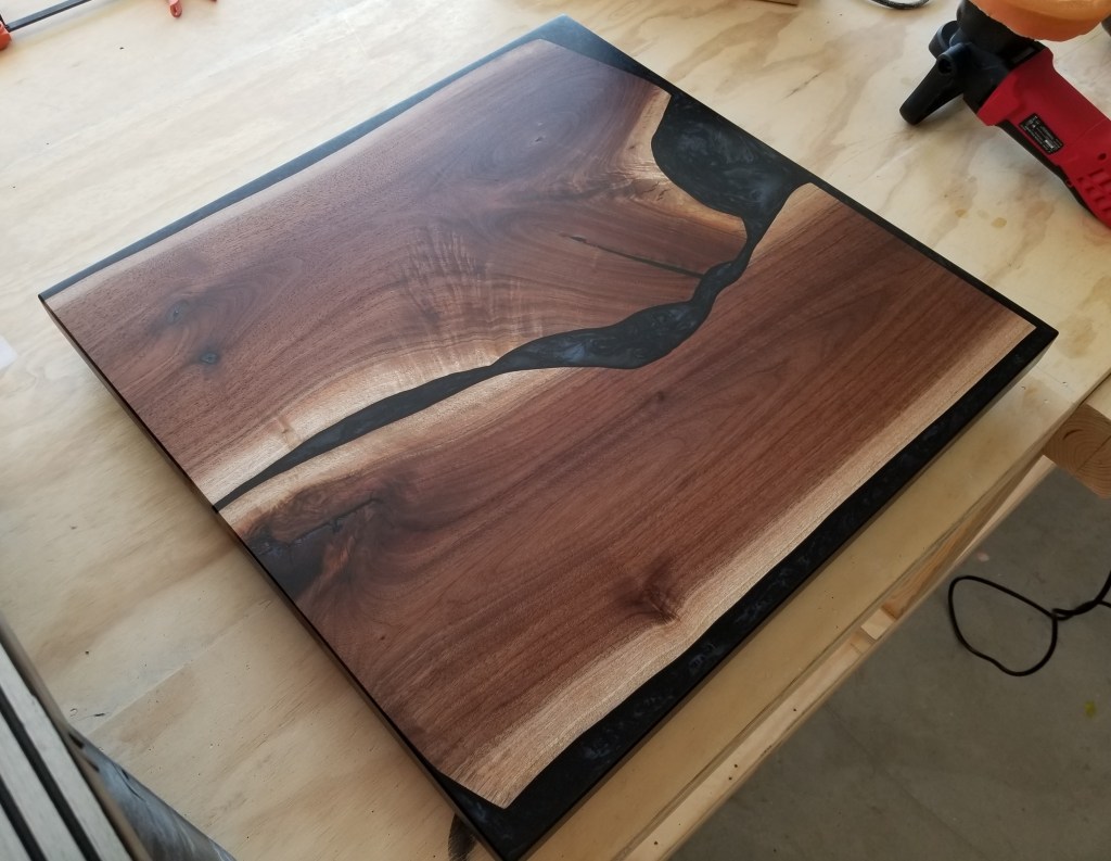
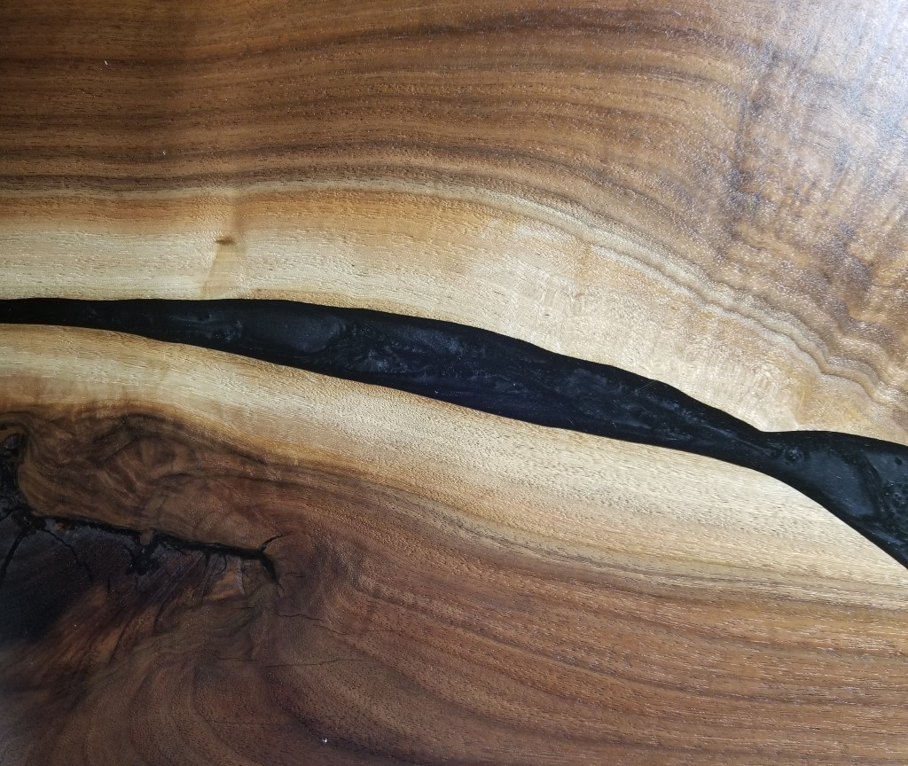
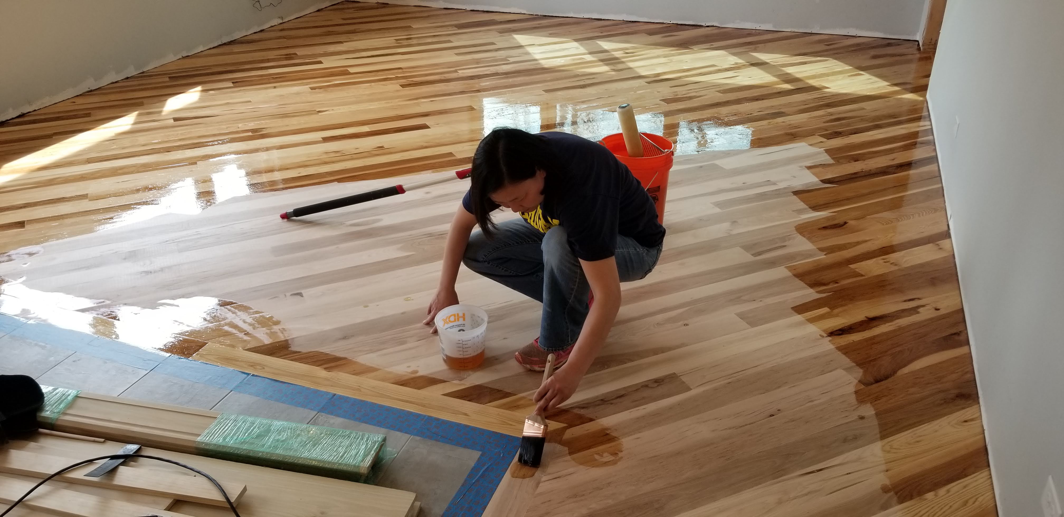
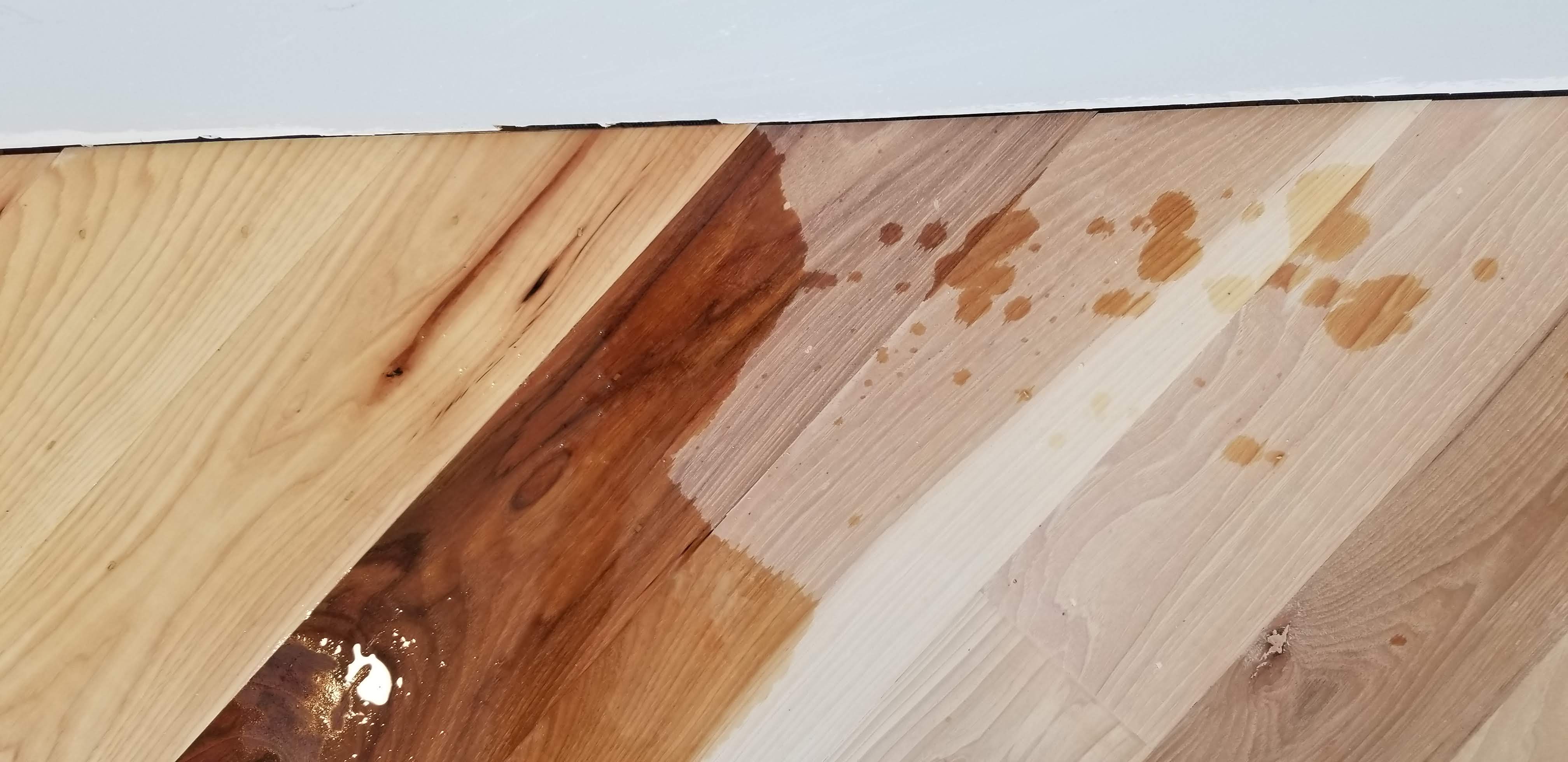
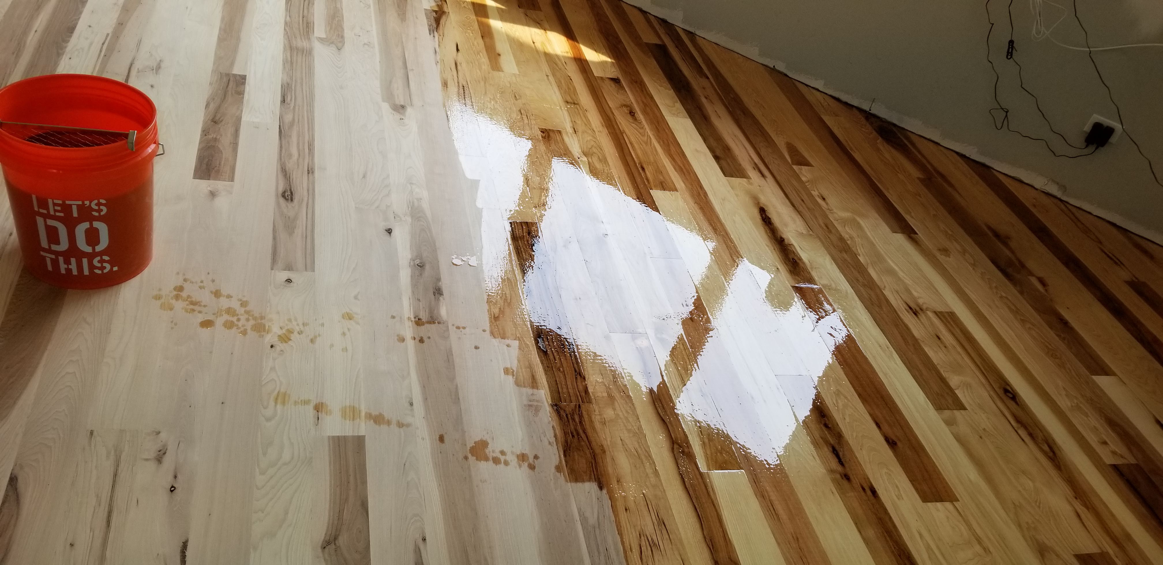
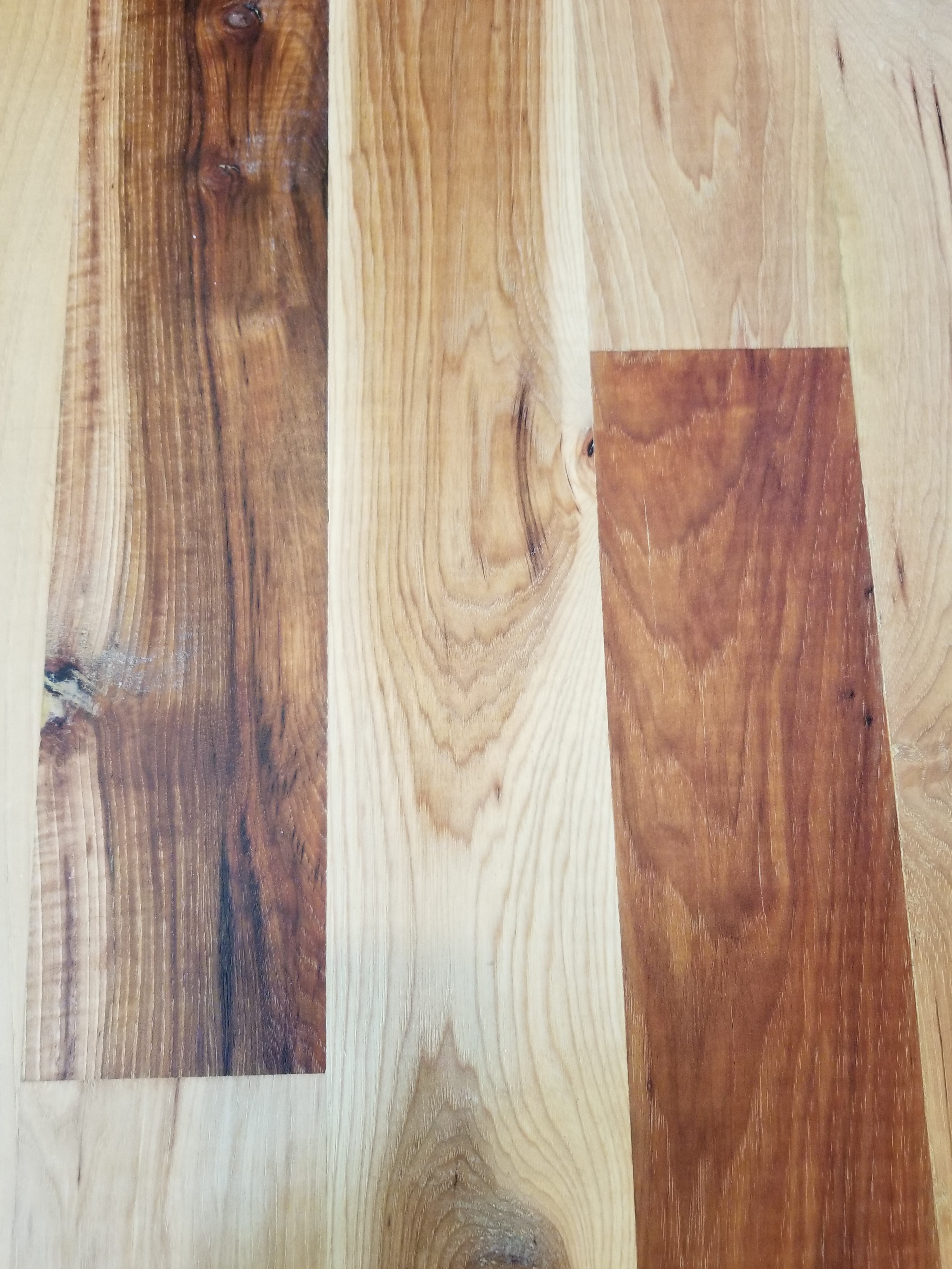
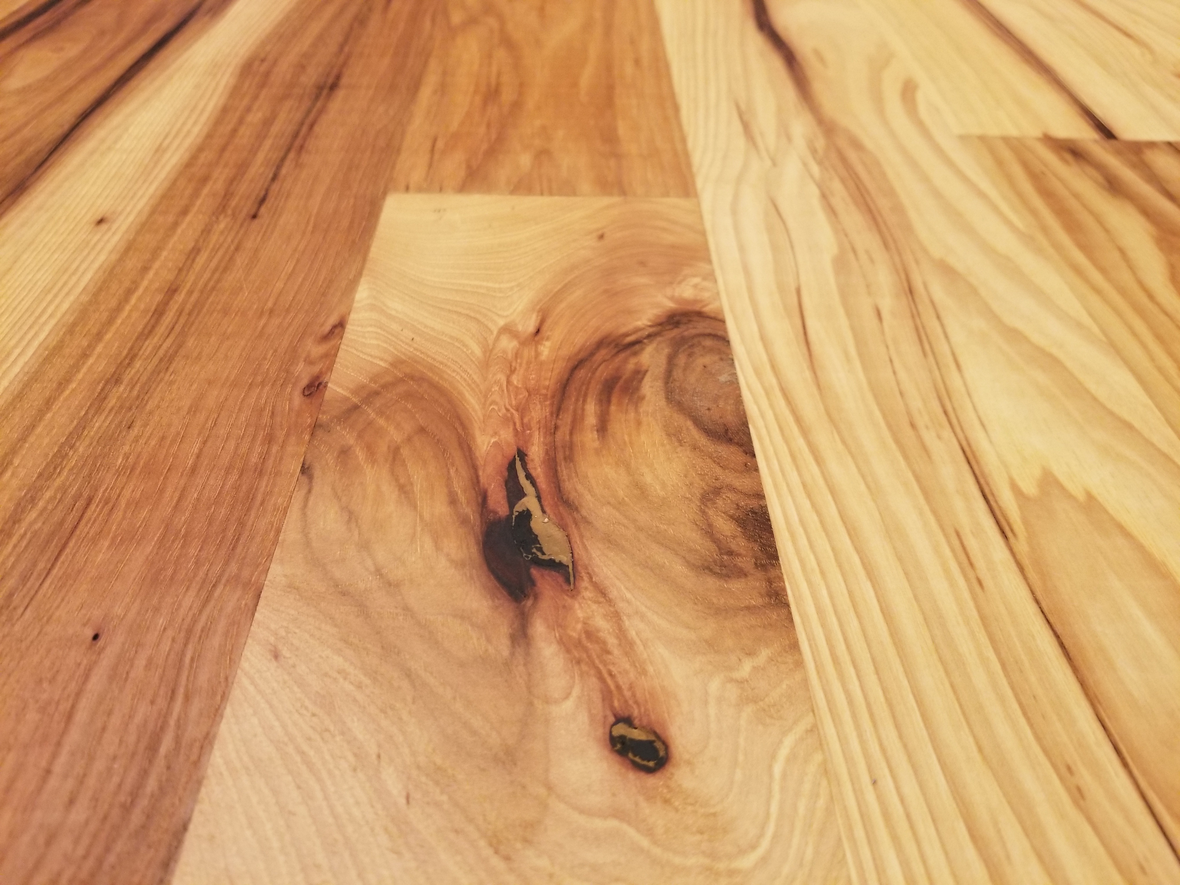
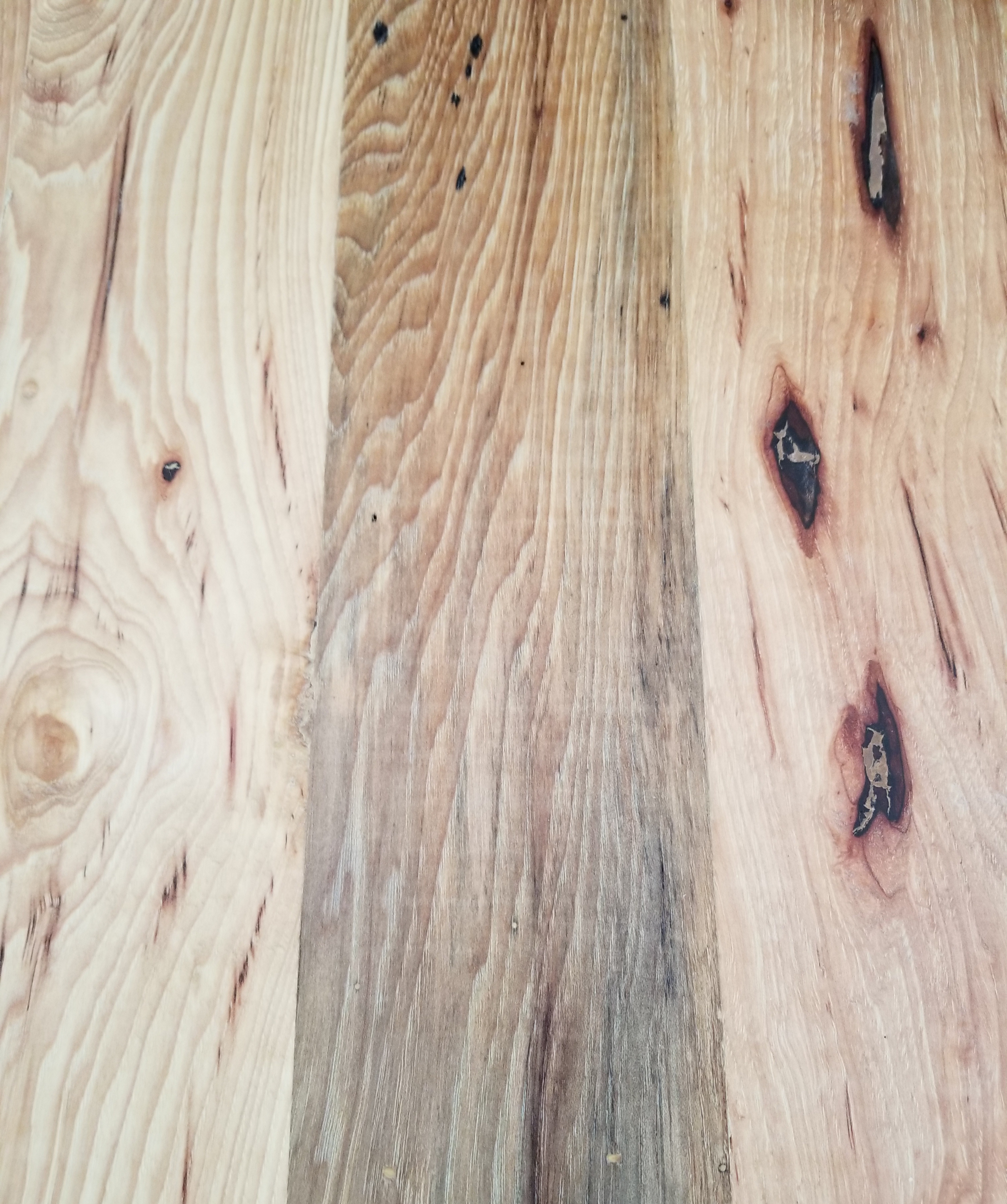
For the top, I found a couple pieces of mostly clear hickory, which was combined with a deep pour epoxy in a bright pink ‘river’ table top:

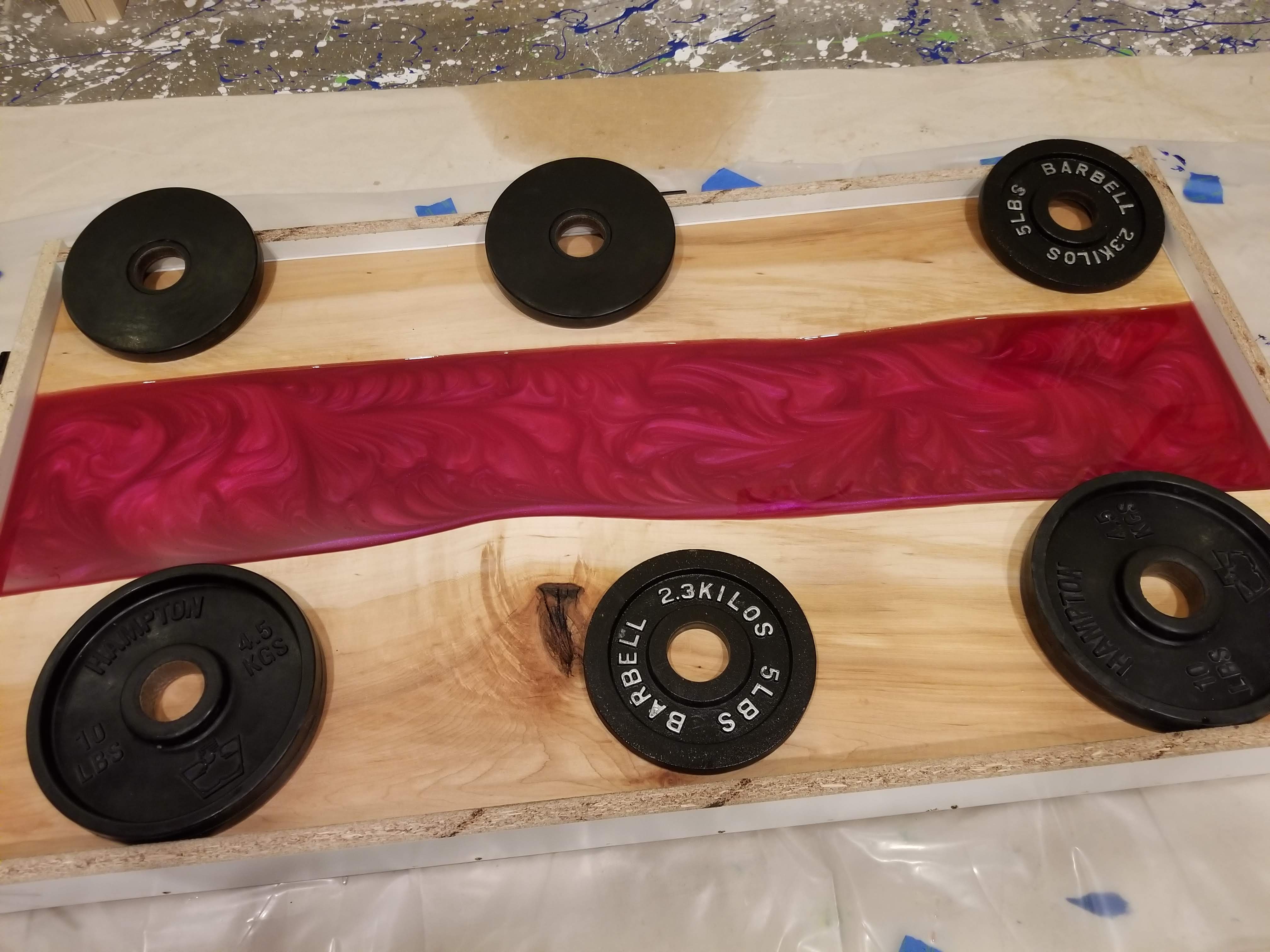
I tried to incorporate as many decorative swirls in the pink epoxy as possible, giving it a slight retro hot rod flame look:

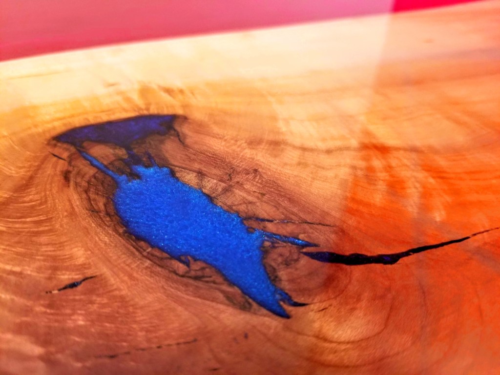
We kept a high gloss finish, which seemed in keeping with the child-like quality we were aiming for. In addition, although the hickory was mostly clear in terms of the wood grain, there was one large knot that allowed us to incorporate a couple of bright metallic blues:

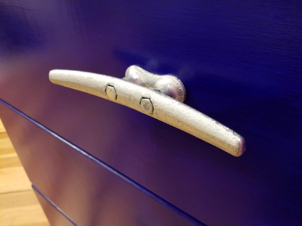
Oversized dock cleats were used for the drawer pulls, which are surprisingly ergonomic in terms of daily use:

The bright pink epoxy reminds me of hard candy like Jolly Rancher pieces with their preternatural shine:

The whitewashed 1×4 furring strips serve as a rustic visual counterpoint to the more over the top epoxy:

The blue on the drawer fronts consisted of a couple coats of thinned paint, which produced a nice water-like blue effect. The paint was then protected with a couple coats of Osmo Poly:

The pink, blue, and white of the dresser were also a nice visual echo of the Van Halen mural:

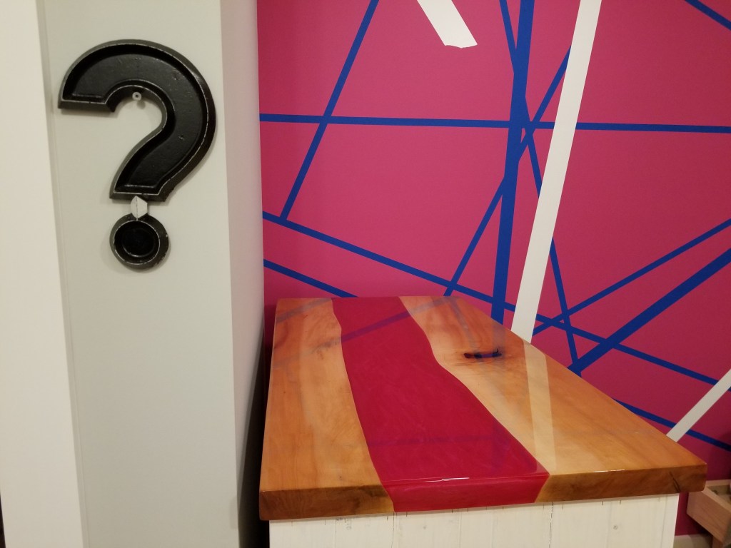
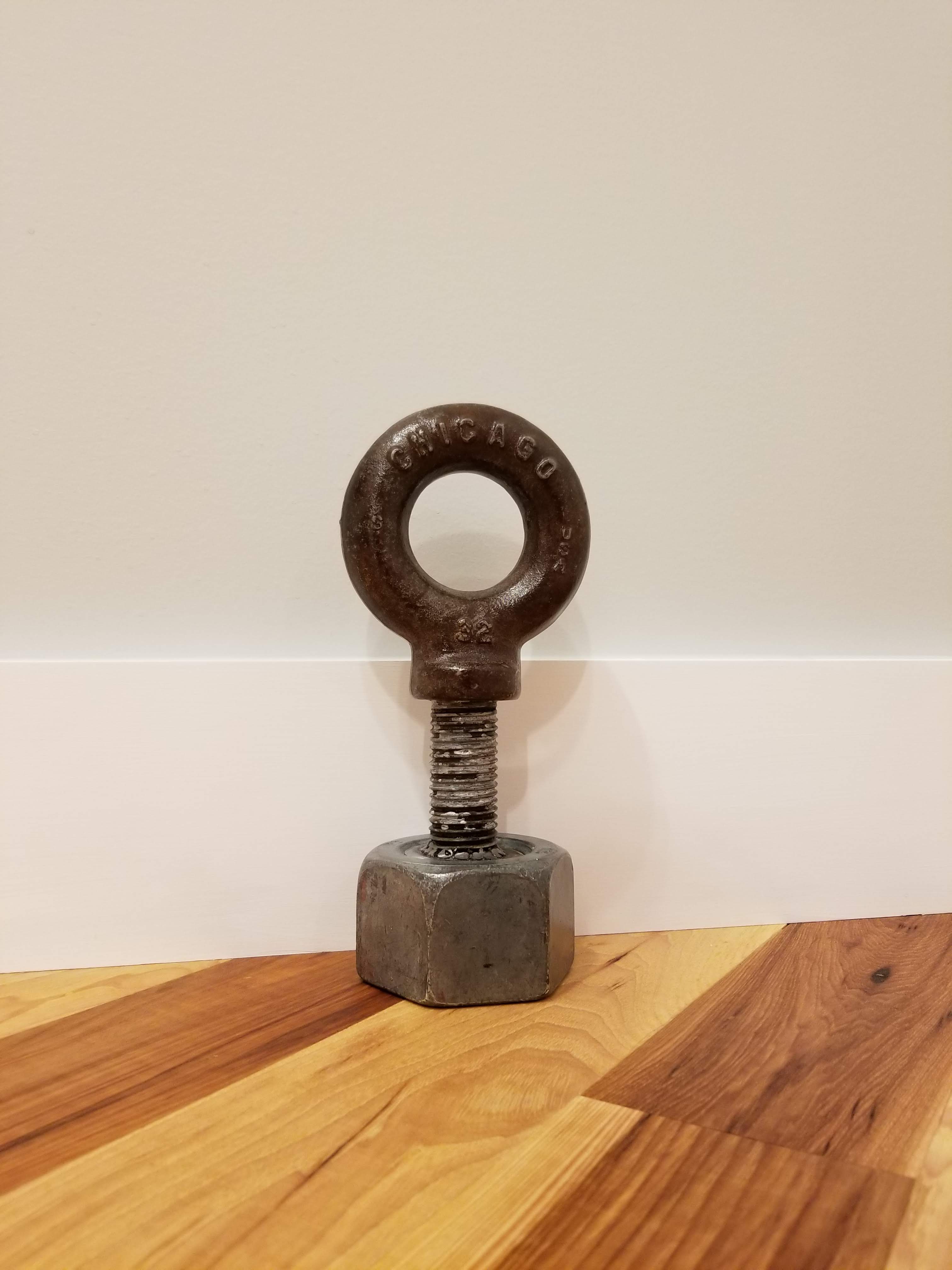
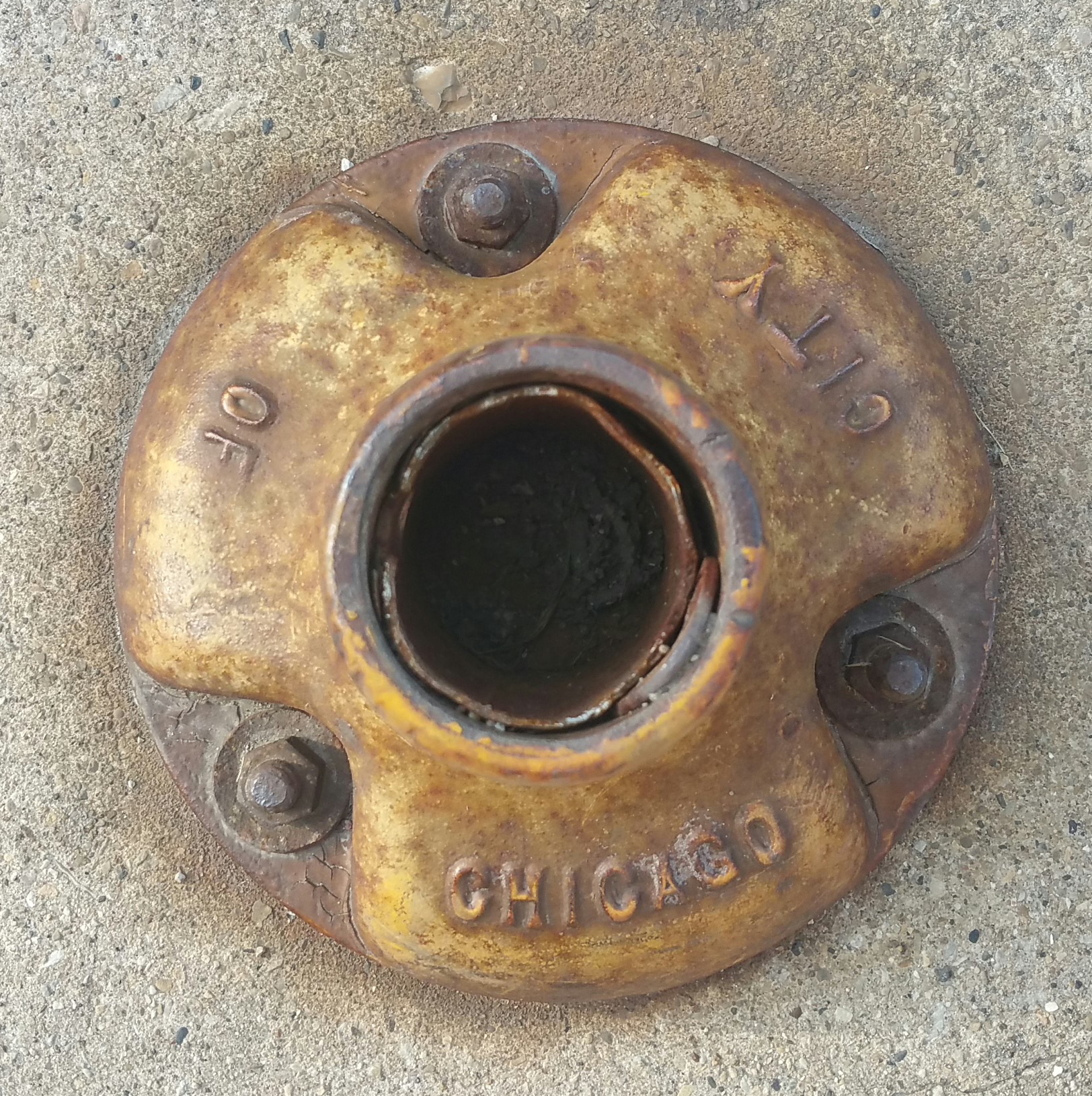
Some of my online Urban Rustic finds ended up in the bedroom, including the vintage theater marquee question mark (above), along with a ‘Chicago’ eye bolt welded to an oversized nut used as a doorstop:

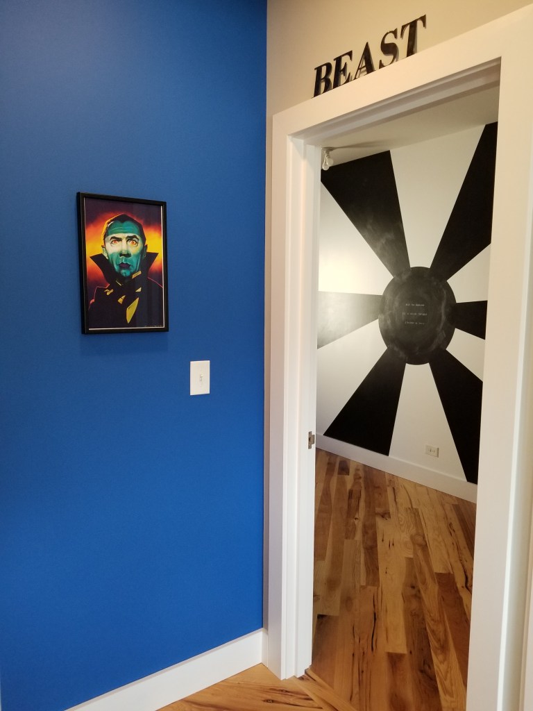
The bedroom door itself utilized some leftover 2×6’s from framing, pocket screwed together. The bright, vertical pink stripe continues the ‘racing stripe’ motif that began with the siding. The door handle matches our Roto window and door hardware. With only two real doors in the whole house, apart from our two exterior doors, it seemed like a nice touch to be able to maintain the same aesthetic throughout:

When the door is closed, the vertical stripe, especially next to the blue accent wall and the large, black barn door, makes for a bold, pleasing collection of design elements:

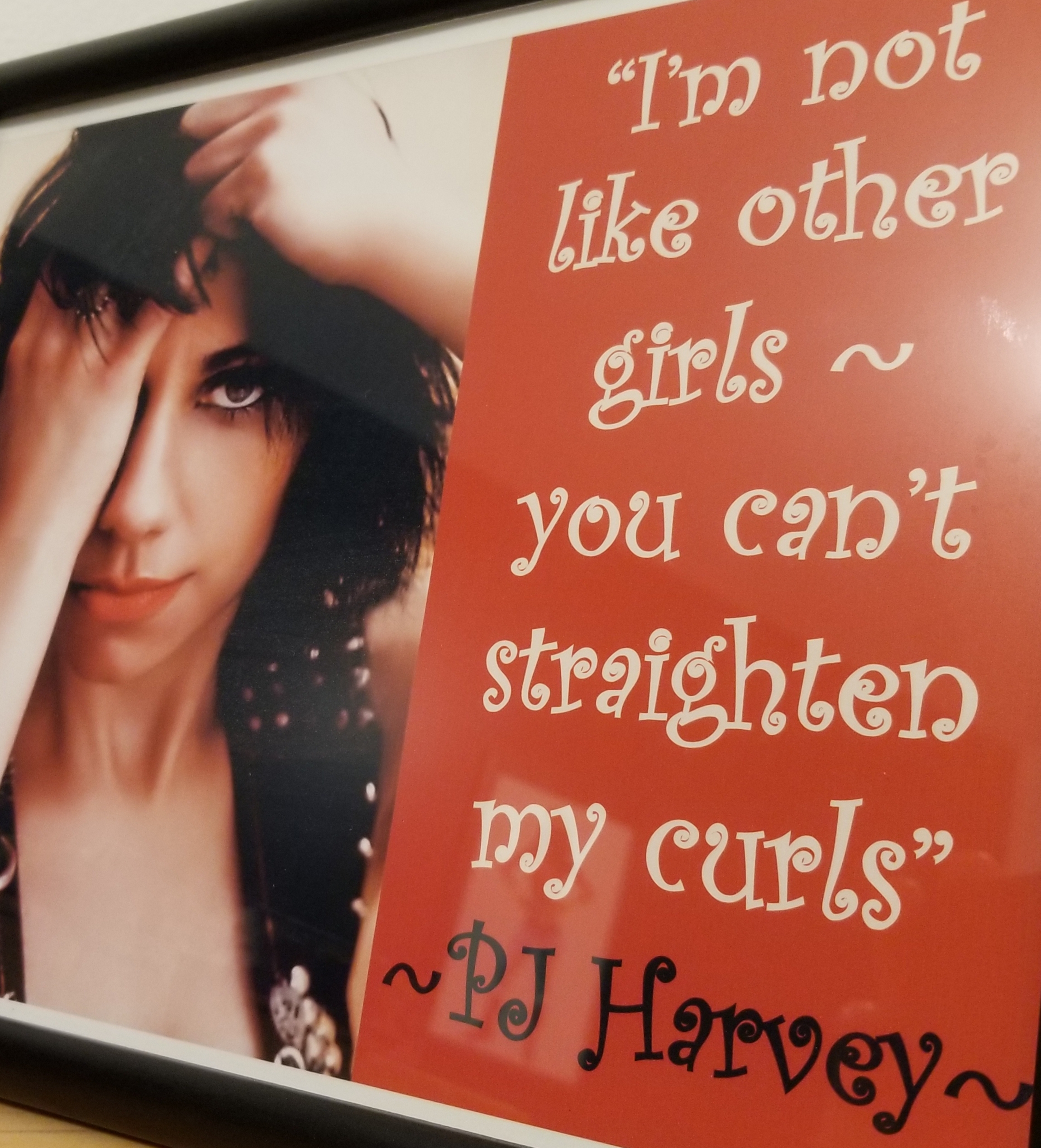
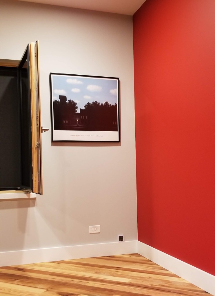
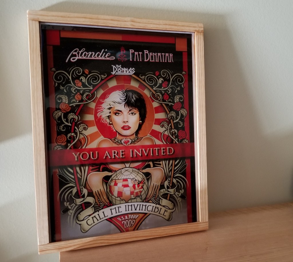
I also sprinkled in some smaller framed art pieces, combining visuals with text.

“It is far more fascinating to come into a room which is the living expression of a person, or a group of people, so that you can see their lives, their histories, their inclinations, displayed in manifest form around the walls, in the furniture, on the shelves. Beside such experience — and it is as ordinary as the grass — the artificial scene-making of ‘modern decor’ is totally bankrupt.”

Christopher Alexander, et al., A Pattern Language

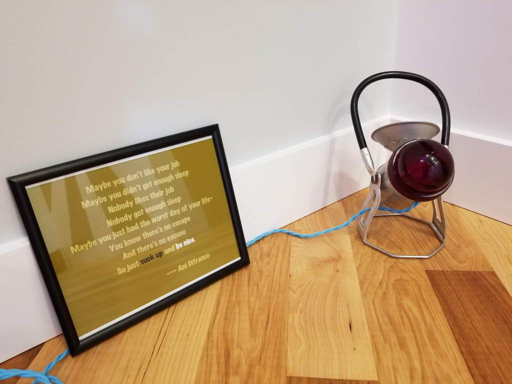
Below, a framed set of Ani Difranco lyrics is paired with a vintage railroad signaling light:

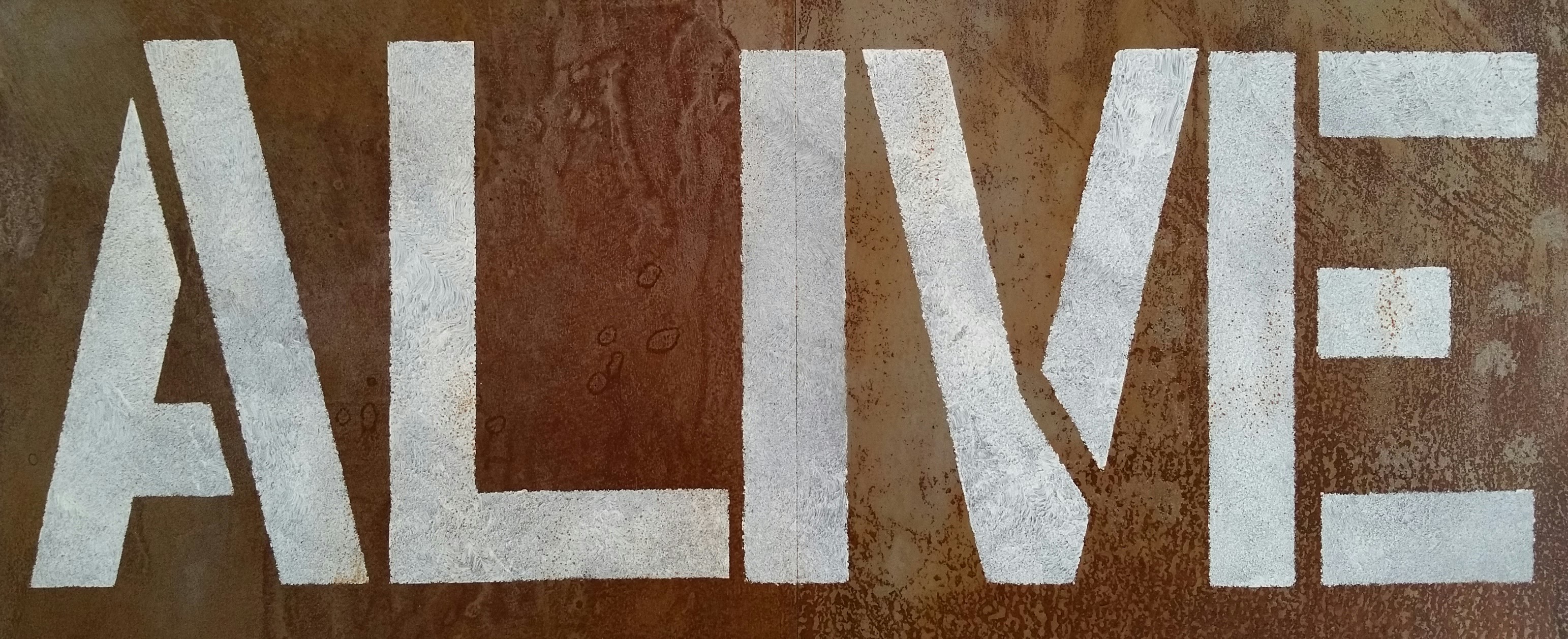
The black “LOVE” epoxy was added to the mix sometime later:

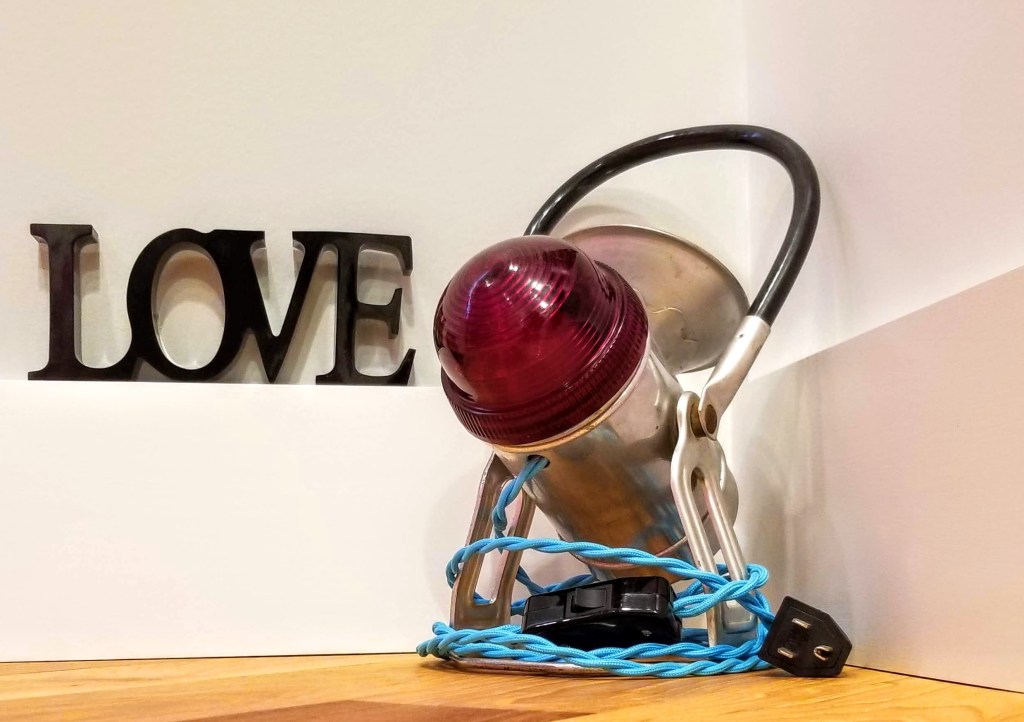
The black epoxy is a nod to an underrated Afghan Whigs album:

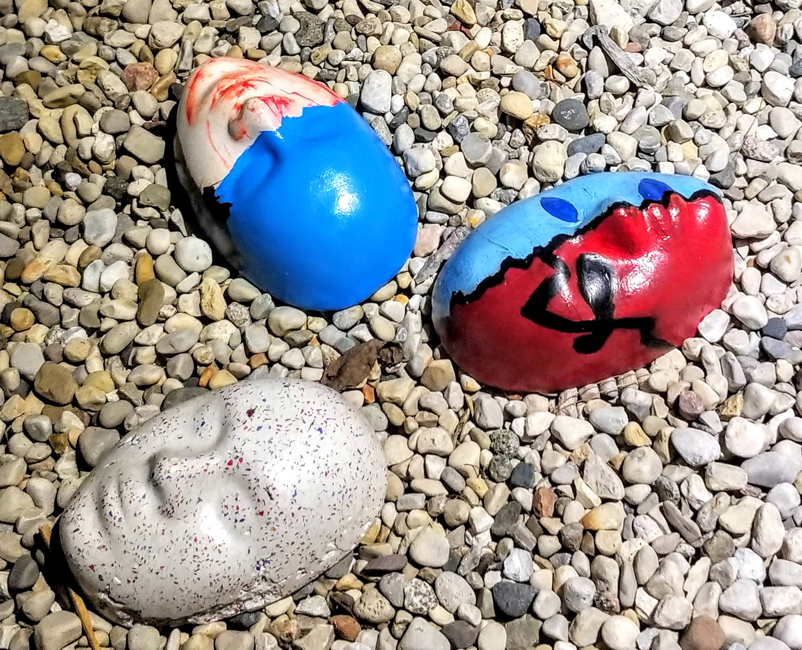
After letting my daughter create a painting using red, pink, and silver pigments, we dropped her blue-covered hand onto the canvas as a fun, messy way to mark the passage of time:

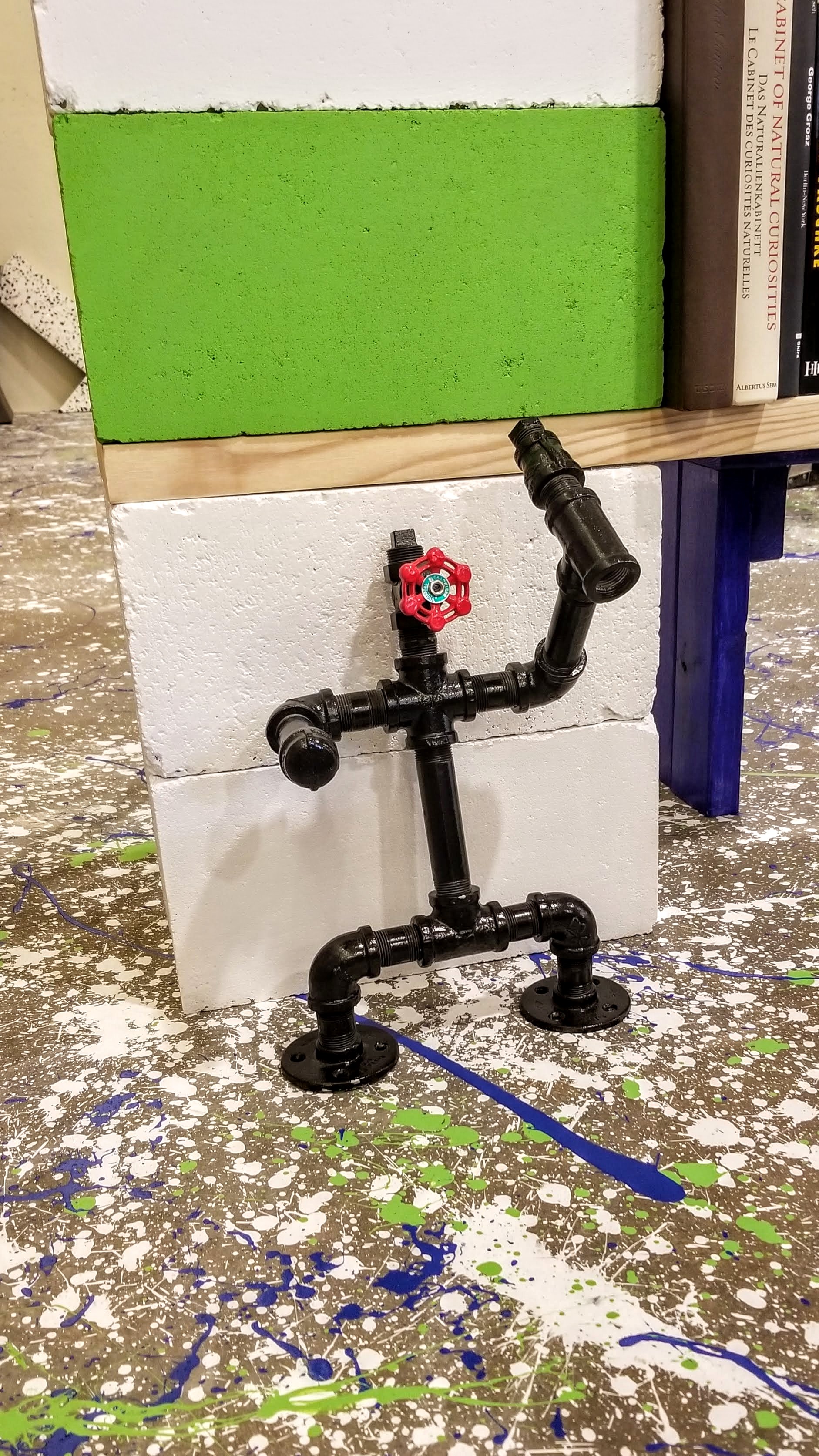
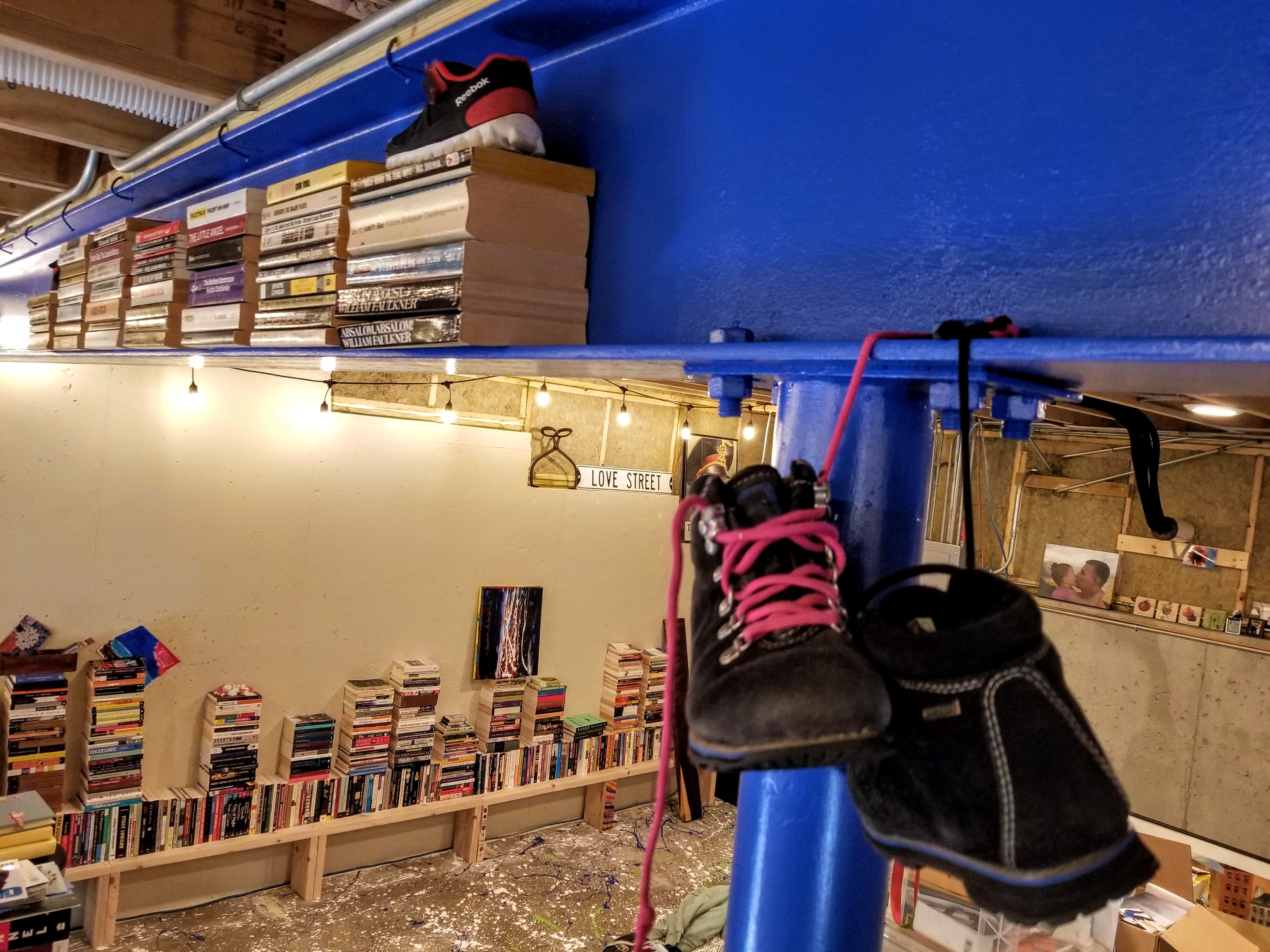
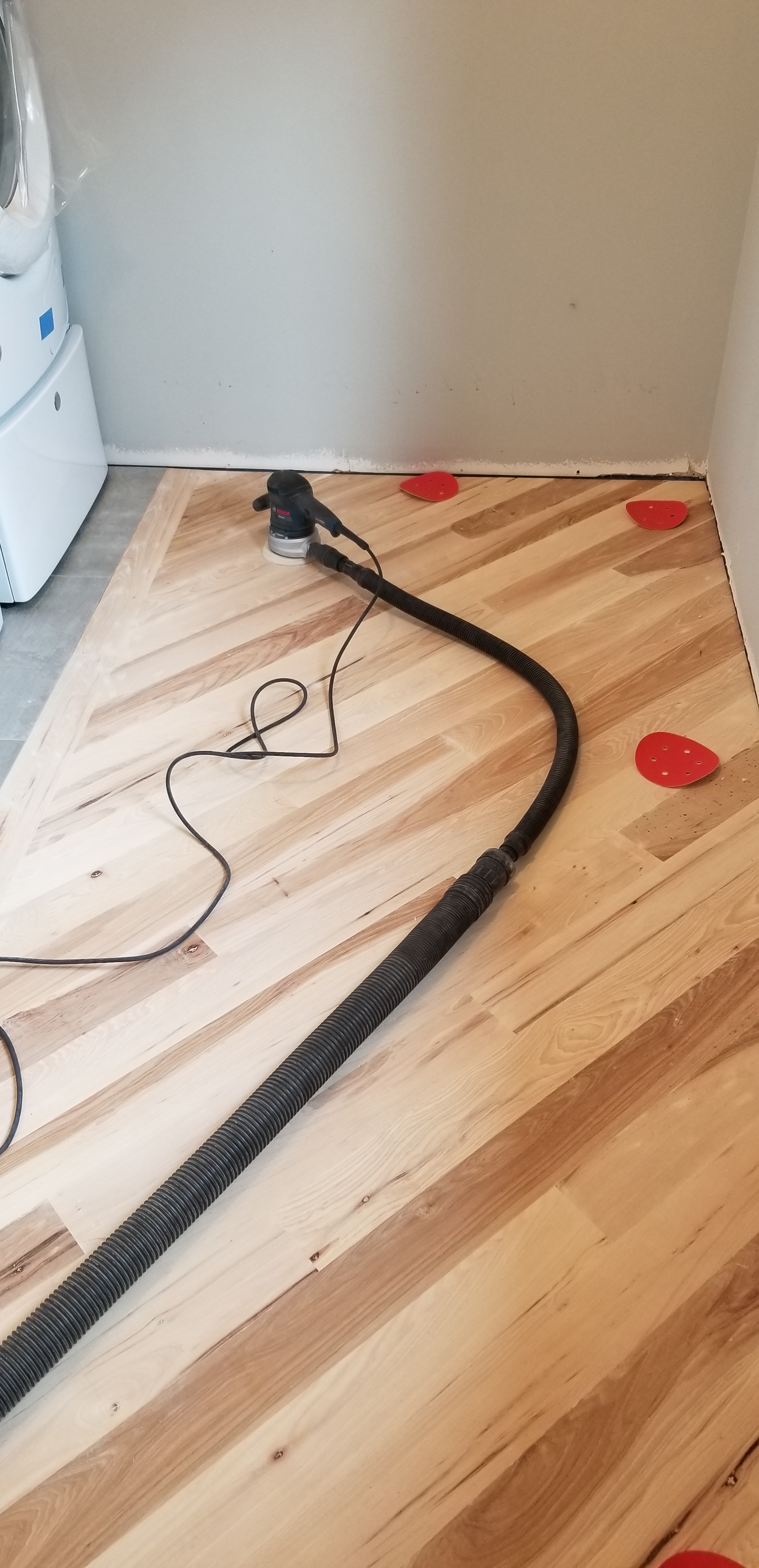
In the walk-in closet, for storage we went with a combination of 2×10’s and gas pipe for some open shelving. We would utilize this combination elsewhere on the main floor — including a linen closet, the pantry, and even in our kitchen. Sometimes we would use 2×8’s, depending on the items being stored on the open shelving:

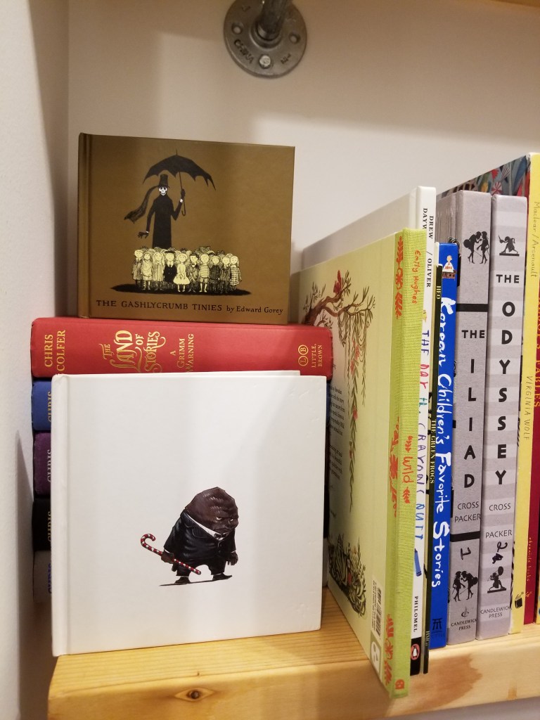
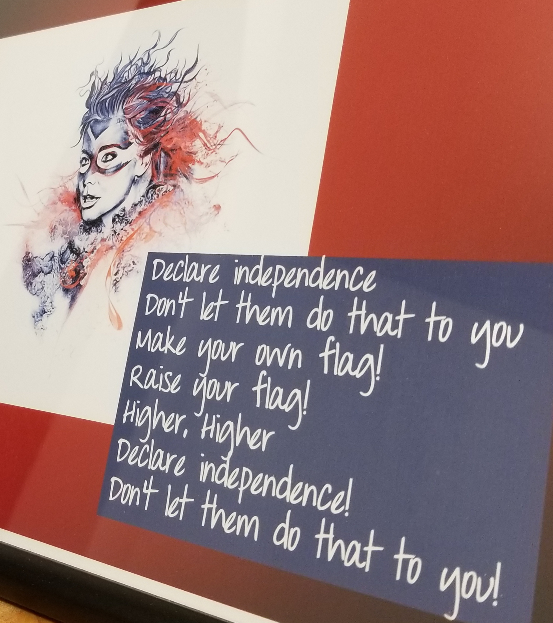
The open shelves were an excellent place to store books, board games, as well as a spot to sneak in some more artwork:

The Björk piece was inspired by this performance:

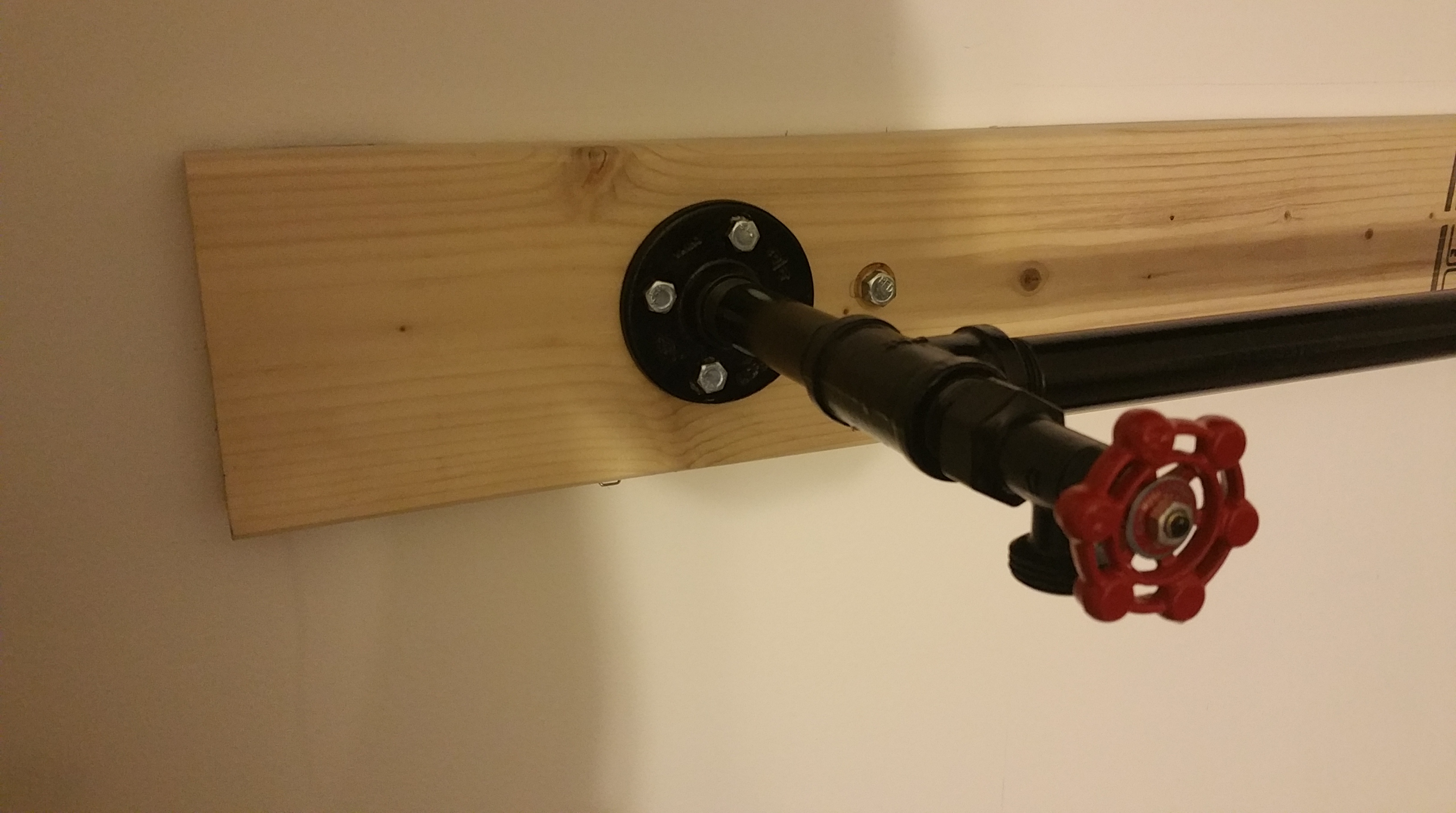
In order to use clothes hangers, I also added an industrial looking clothes bar:

To keep my daughter’s jewelry contained, but also easy to access, I made a storage spot out of a glove factory hand mold, painted black and mounted on a decorative concrete base. The base, made with Buddy Rhodes concrete, is accented with red decorative glass. While the top is polished, to bring out the shine in the glass, the bottom and outside edges were left raw to emphasize the difference in final finish.

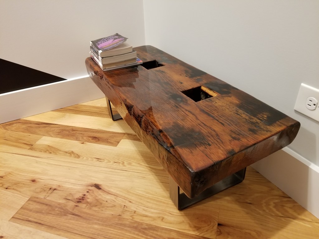
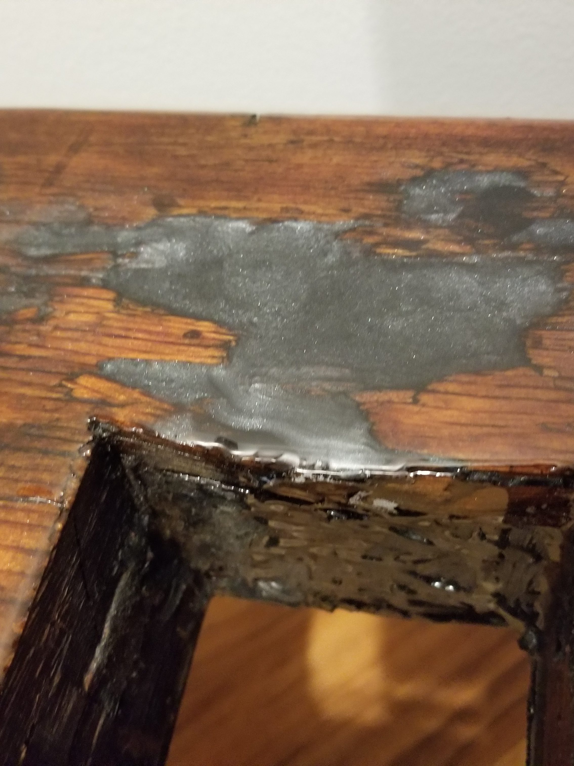
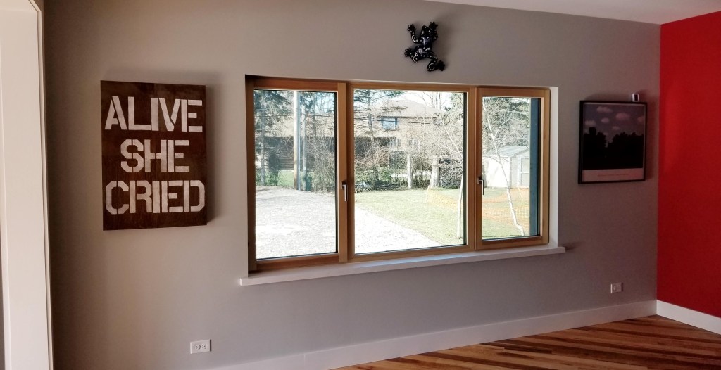
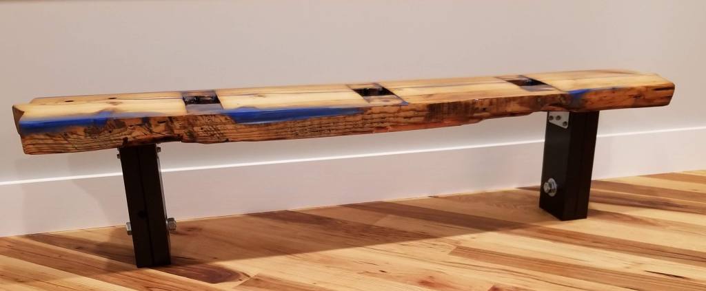
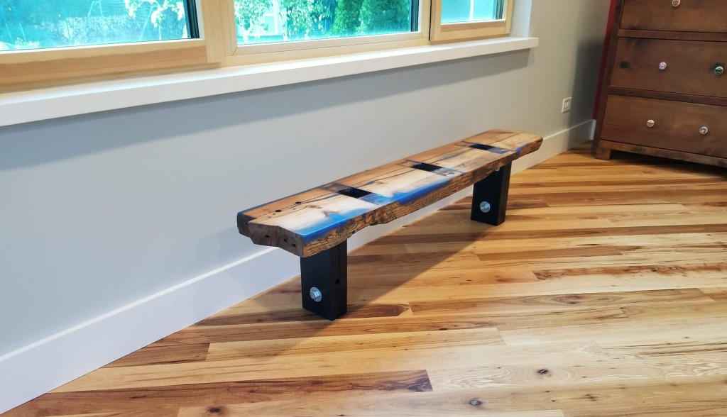
Using another piece picked up from Great Lakes Yard, I created a bench for just inside the bedroom. A convenient spot for books, homework, or the next day’s outfit. In an effort to hold onto its original roughness, much like the piece in our main bedroom, I only lightly sanded before patching nicks, gouges, and other damage with black and silver epoxy. Also matching the dresser top, a flood coat of clear epoxy is the final, durable high-gloss finish:

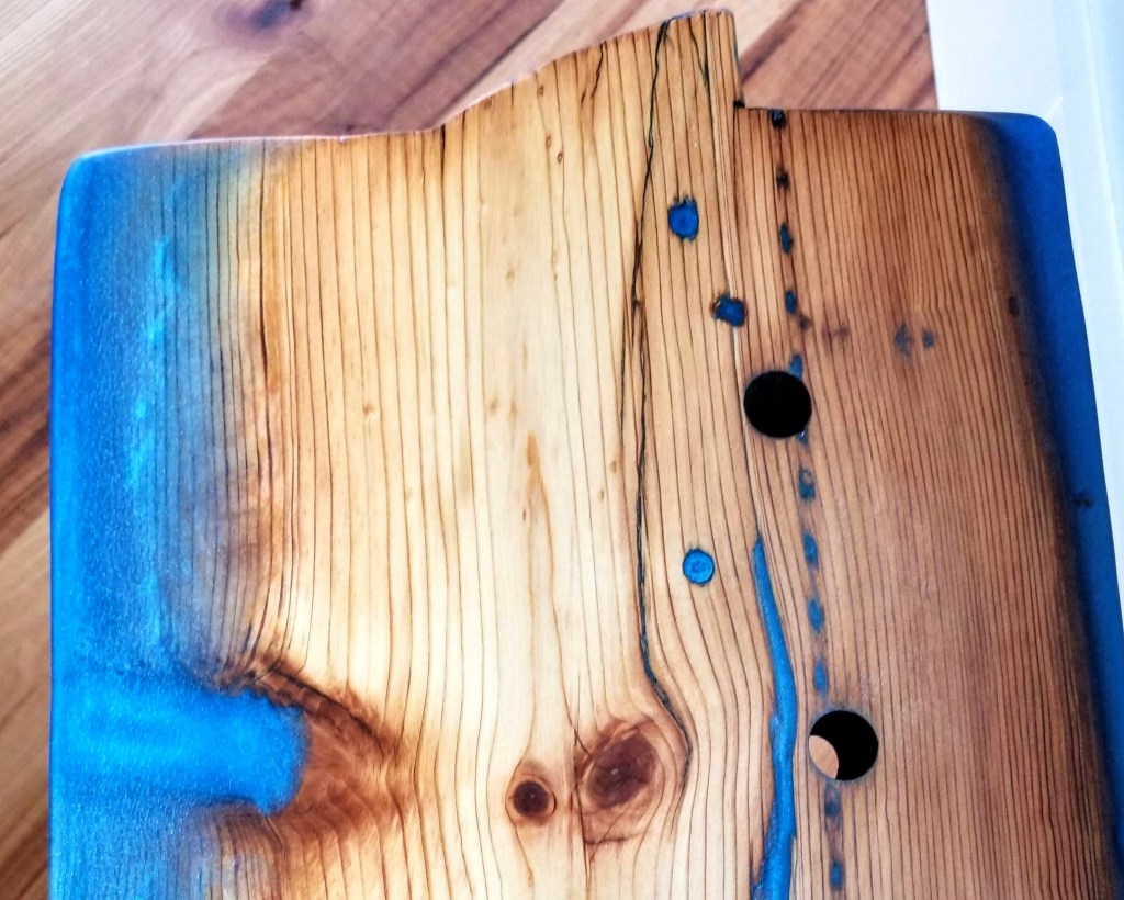
Close-up look at a damaged area, filled with metallic silver epoxy prior to the flood coat:
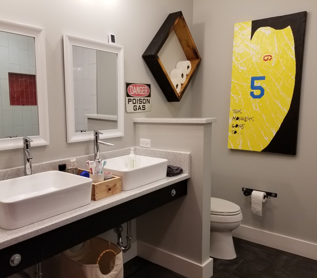
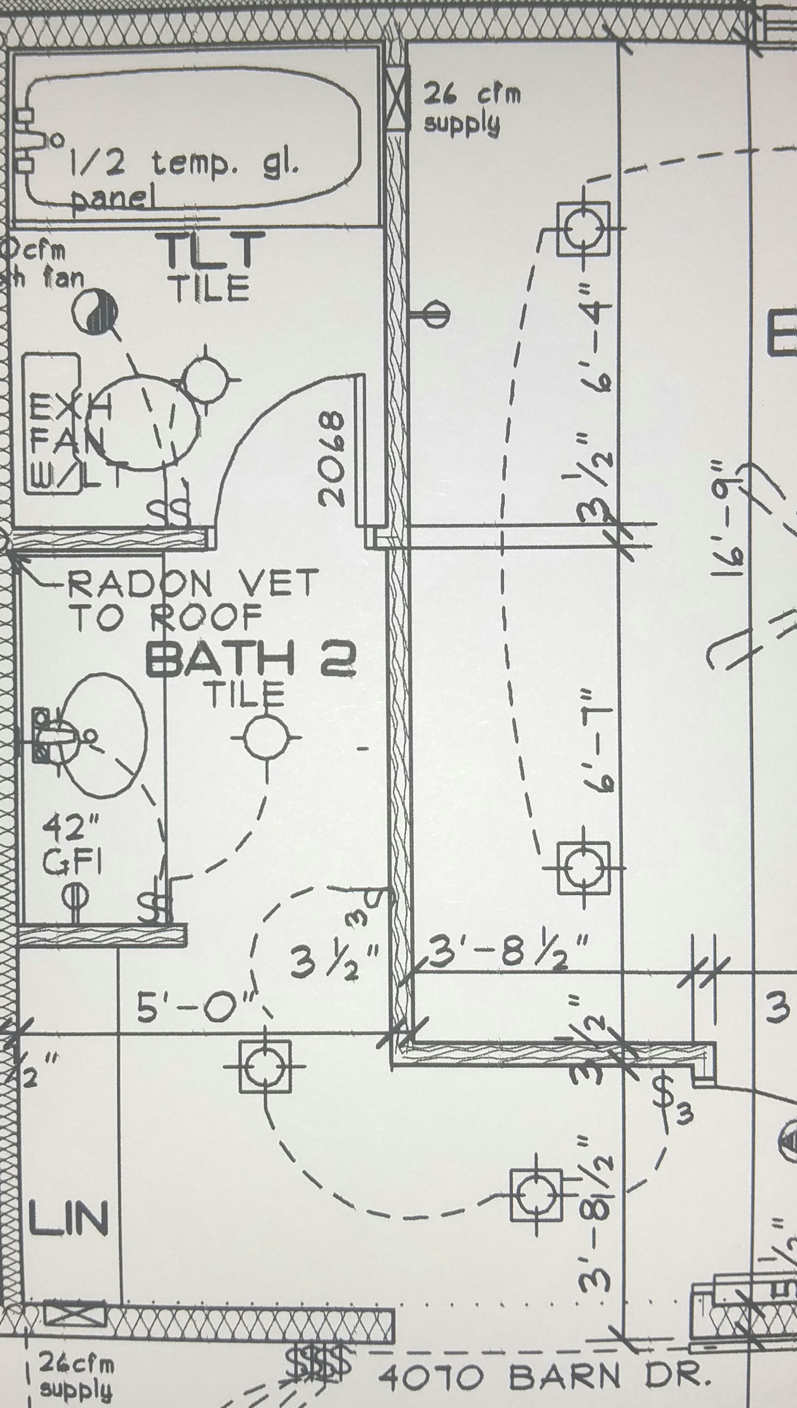
Bathroom Details

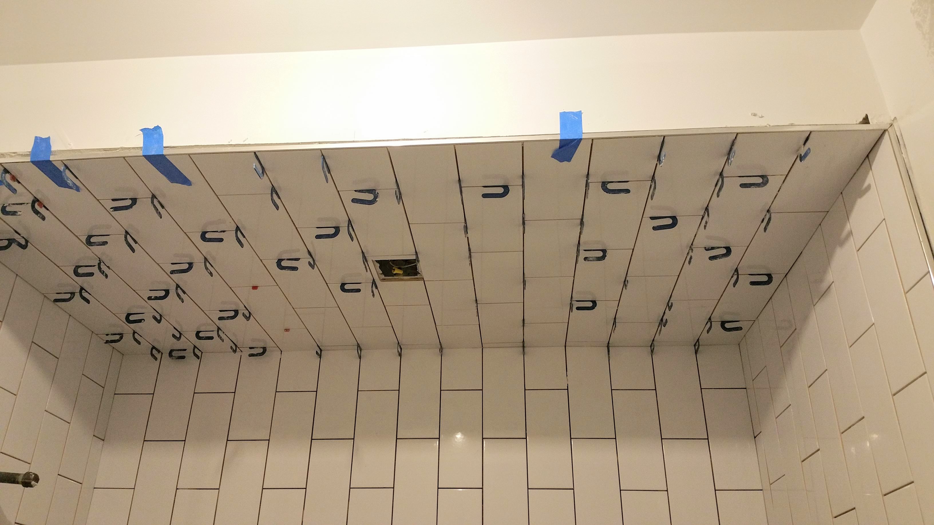
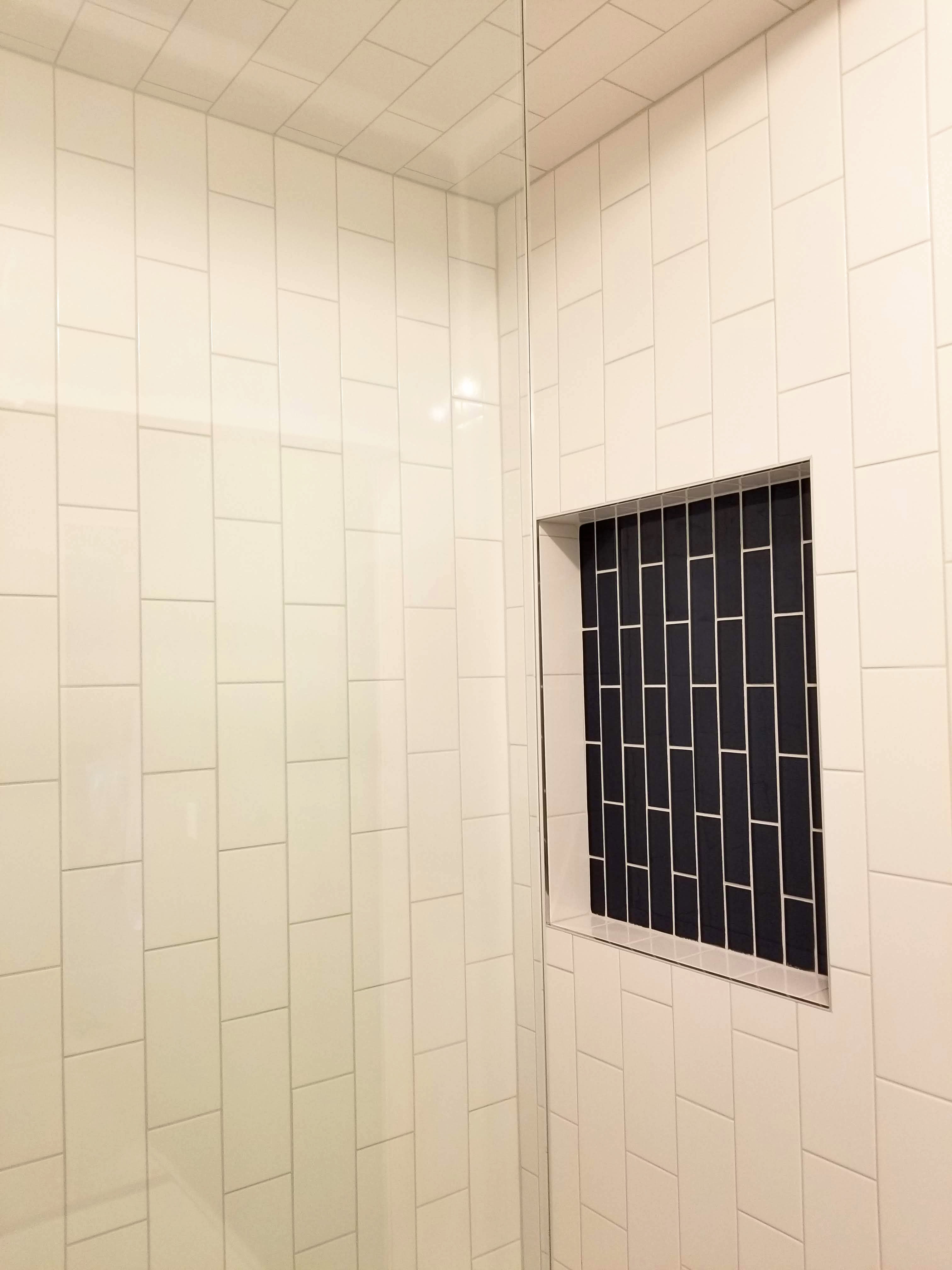
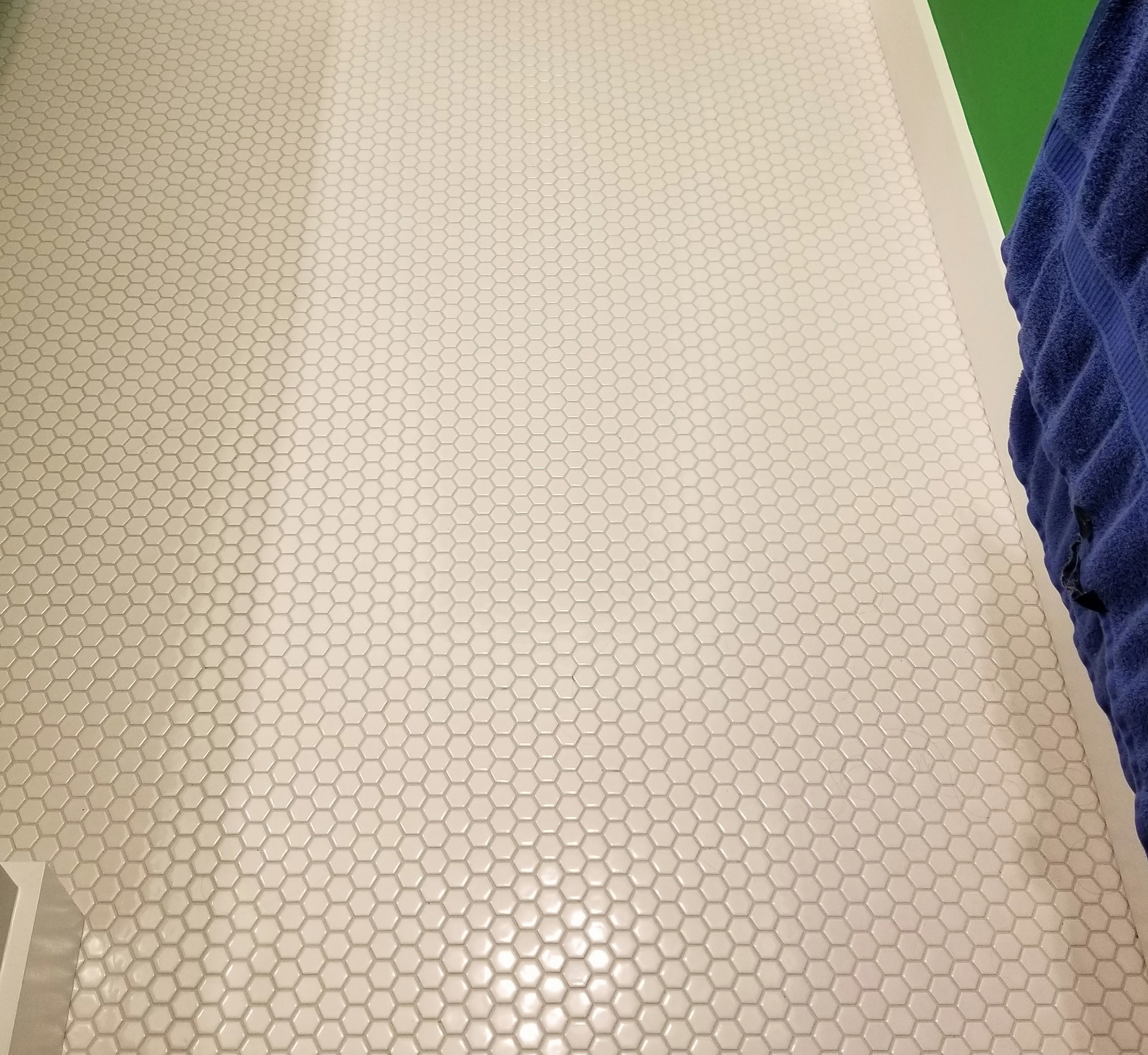
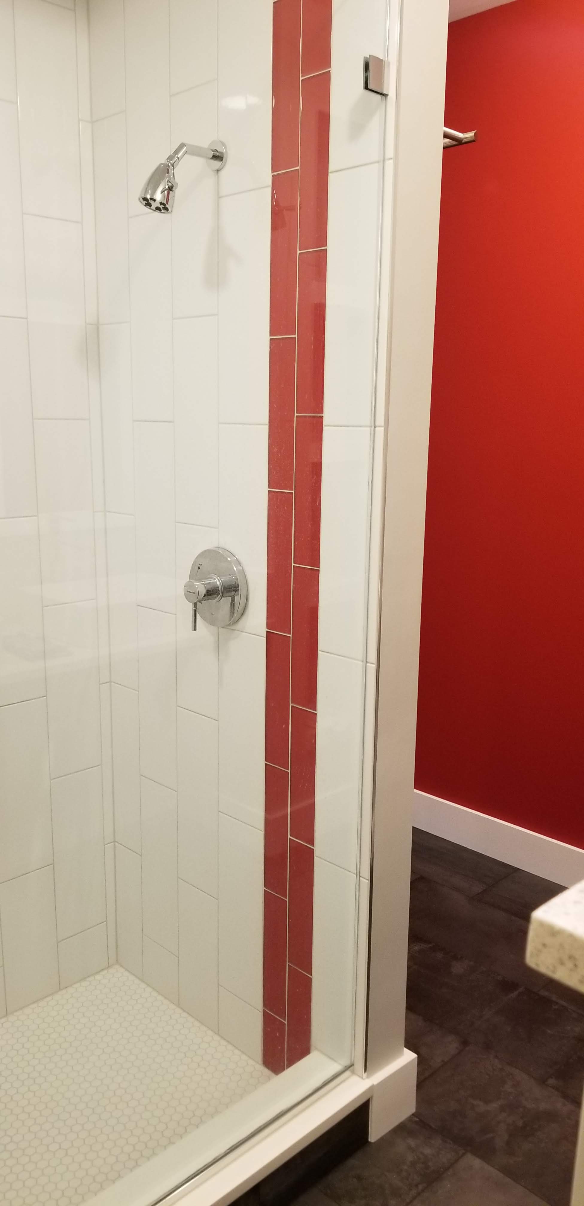
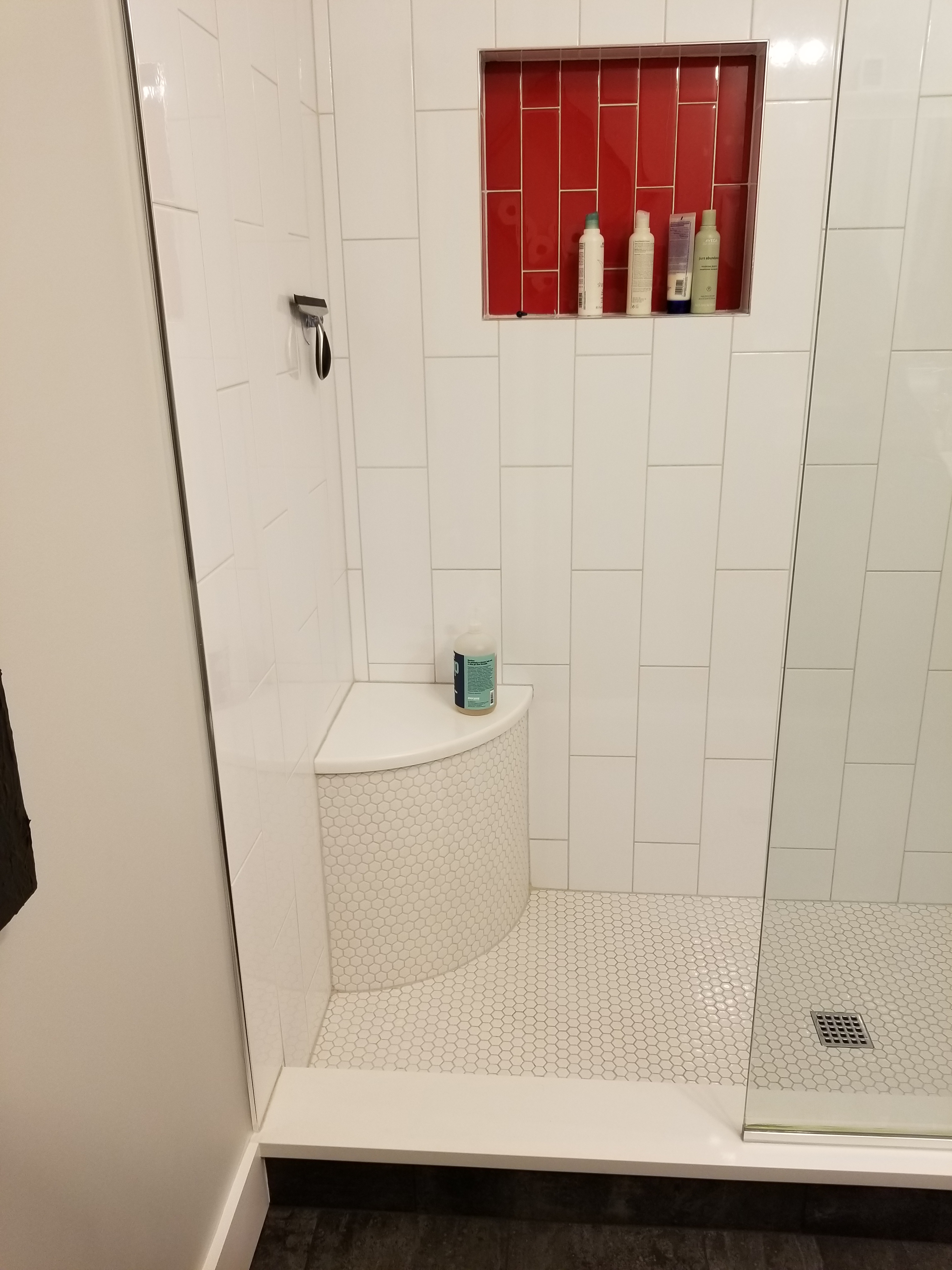
In this second bathroom, we opted for white hexagon tile for the floors, including inside the shower. For the shower walls, we used vertically oriented oversized white subway tile with blue glass accents.

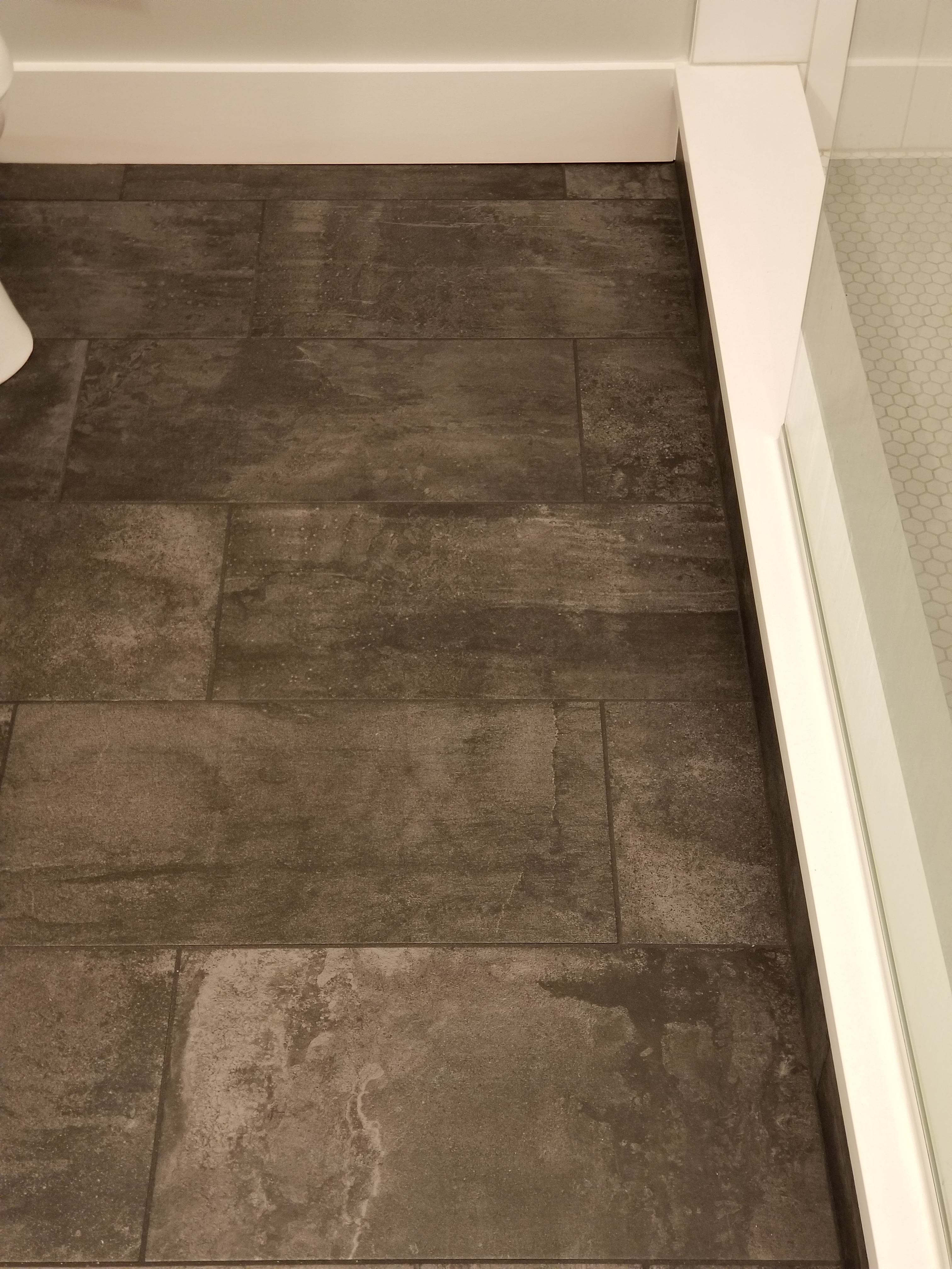
Matching the main bathroom, I repeated the use of our charred cedar with lag bolts and washers, combined with a vessel sink and our quartz countertops. With a vessel sink, the taller backsplash helps to keep excess water off the walls. We also continued with our 1×6 poplar base and 1×4 poplar door casing here in the bathroom area.

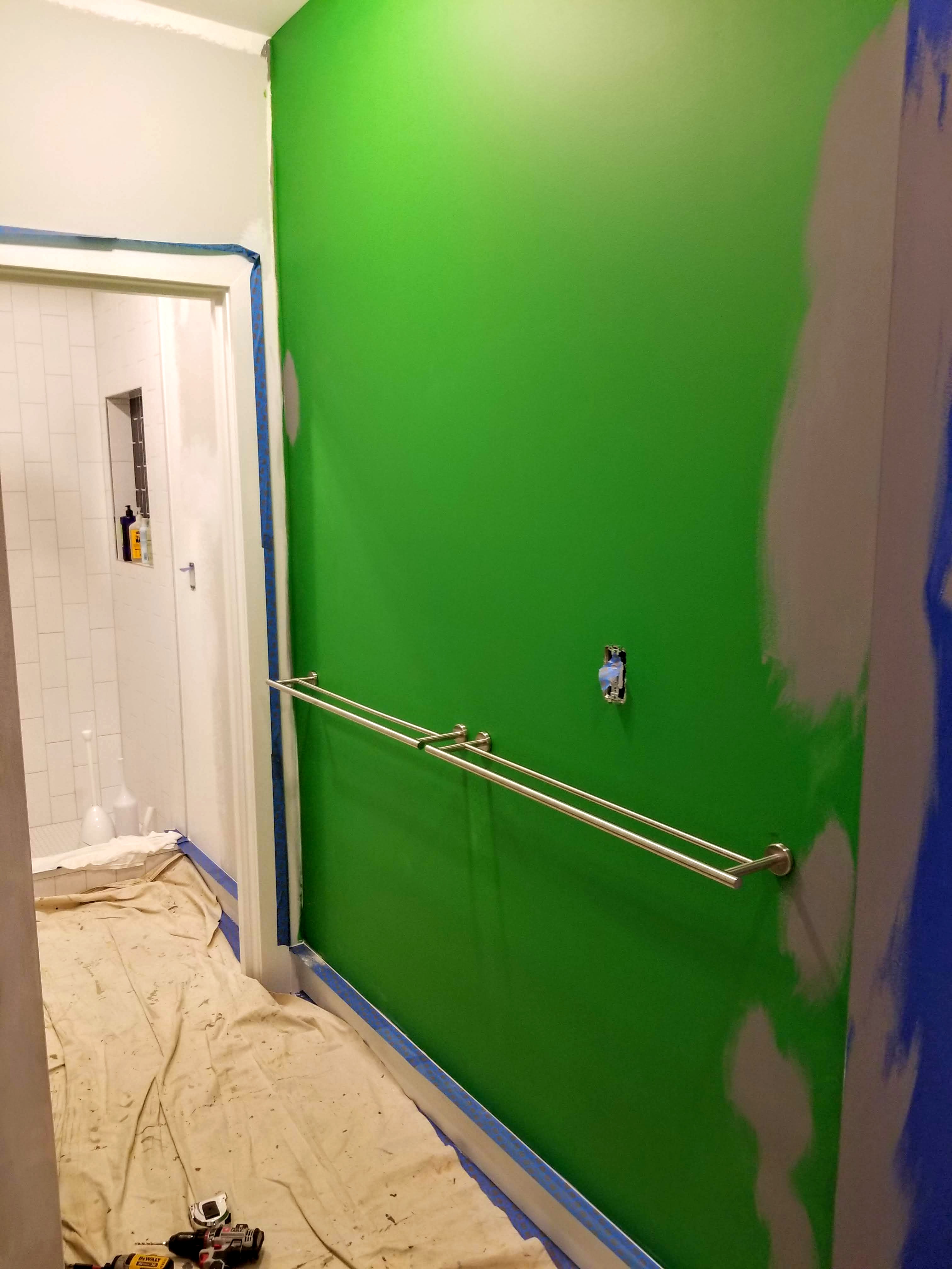
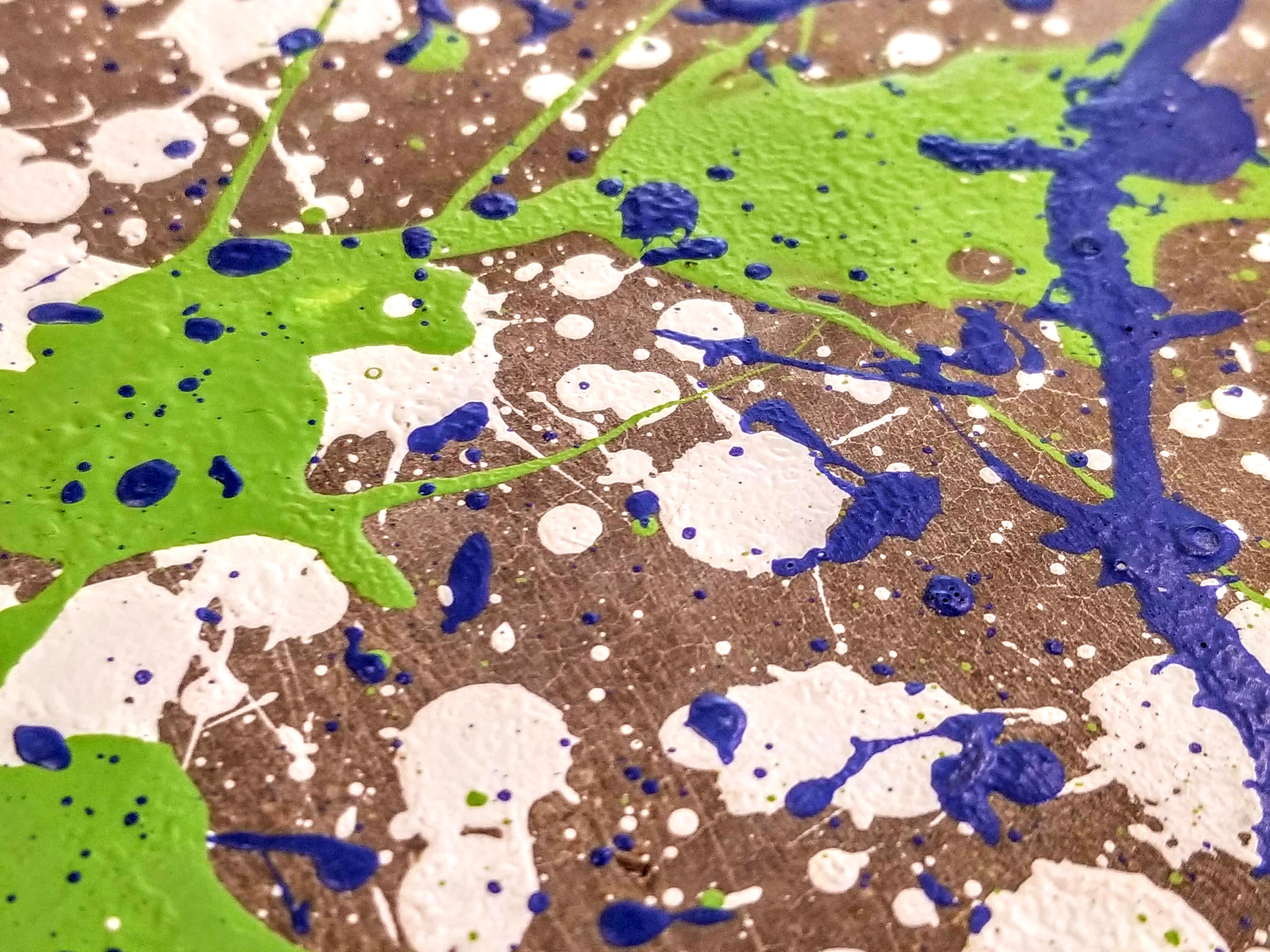
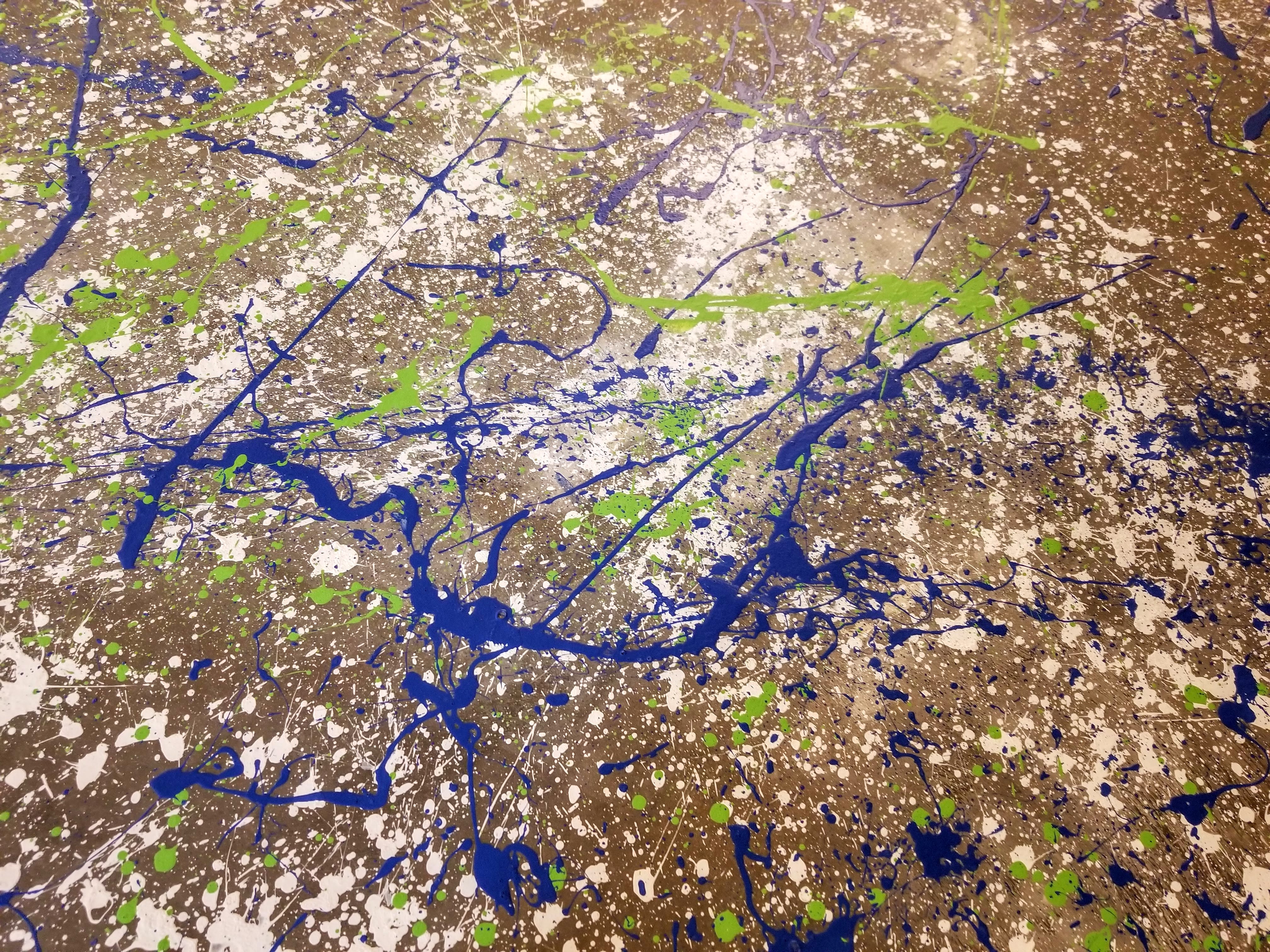
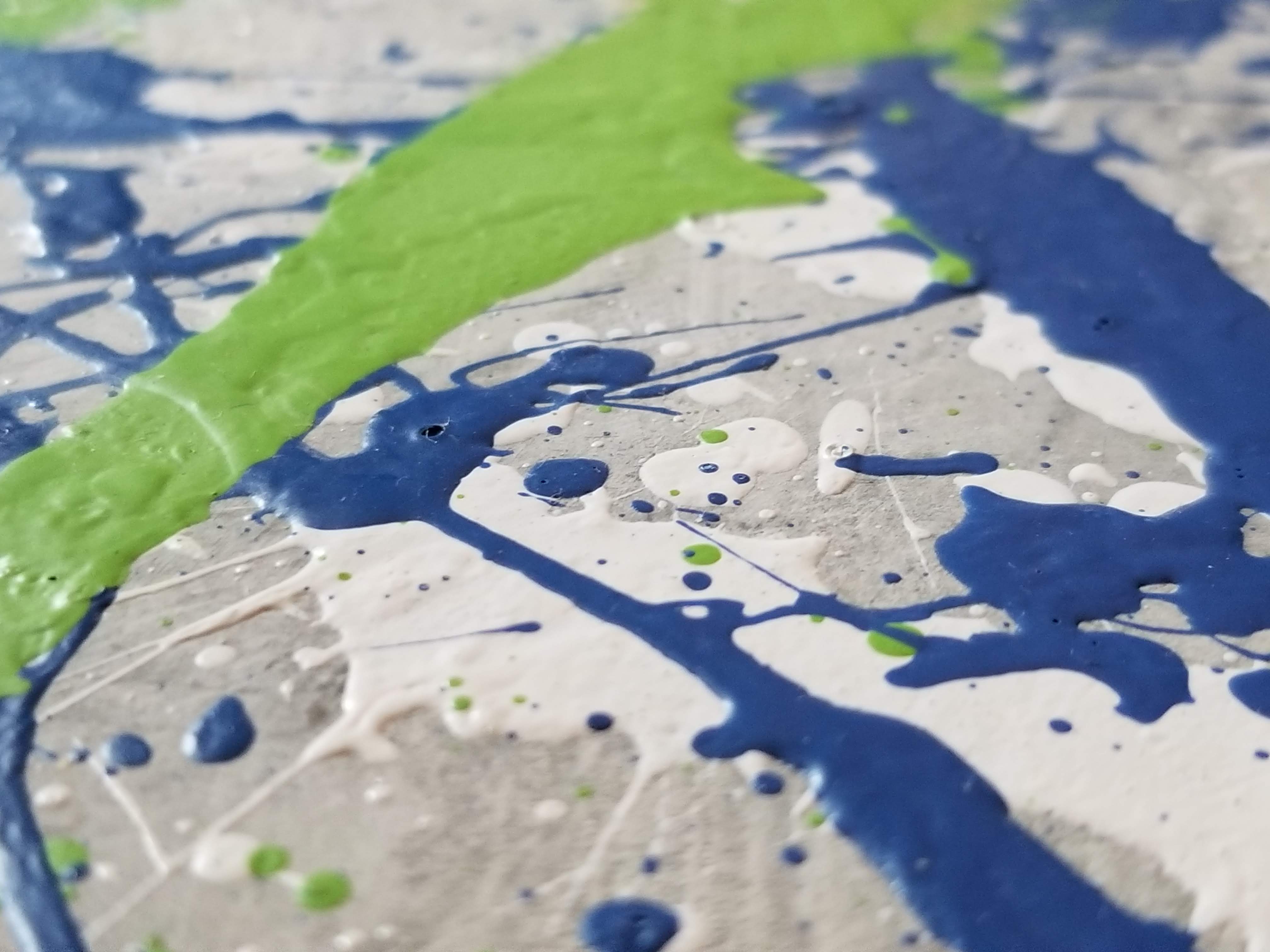
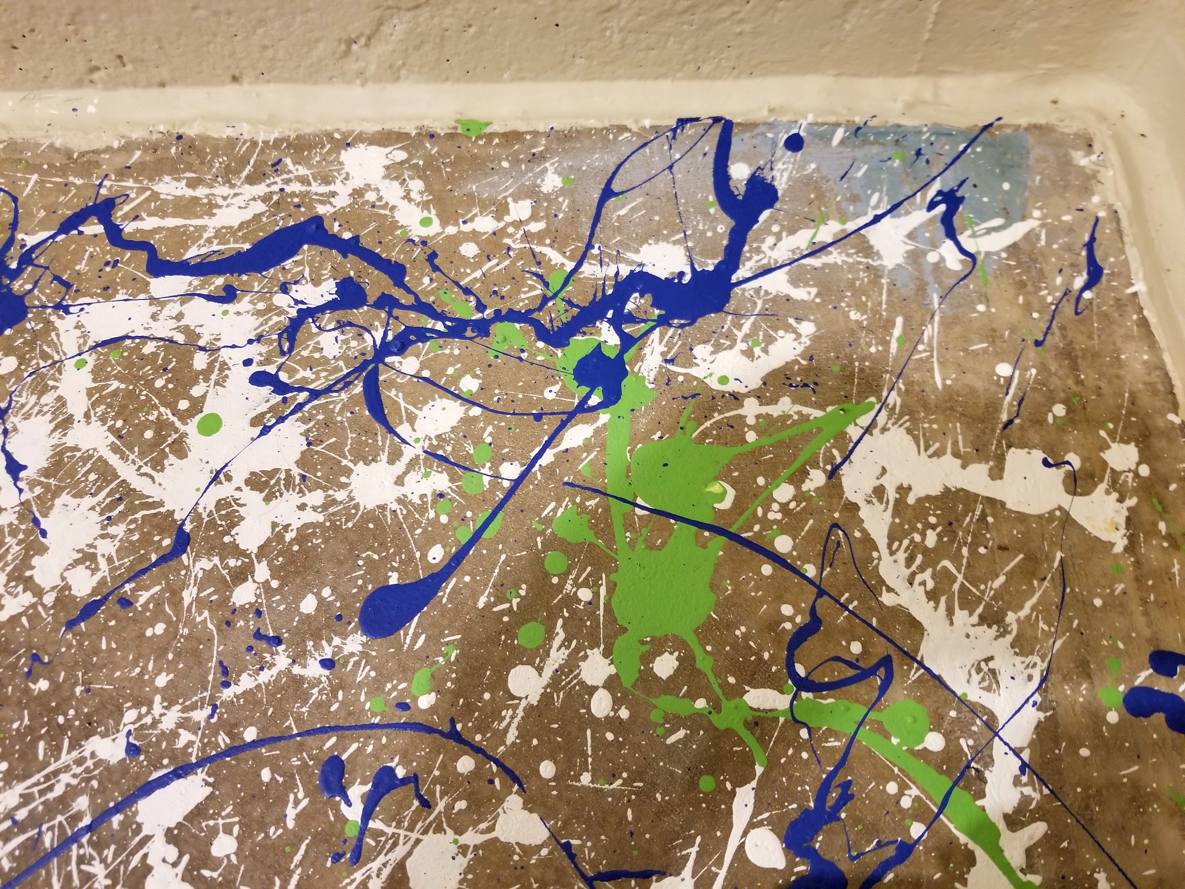
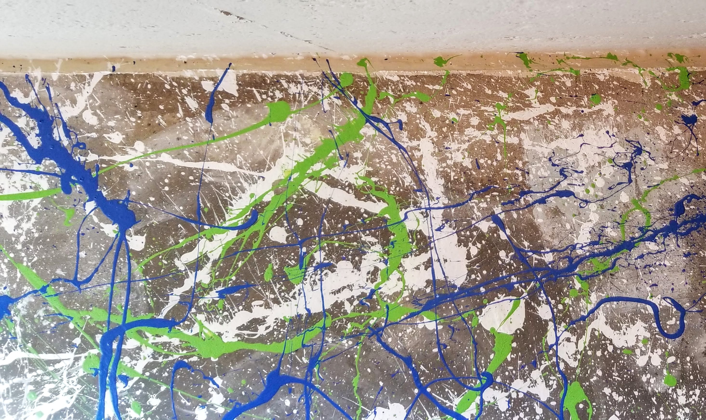
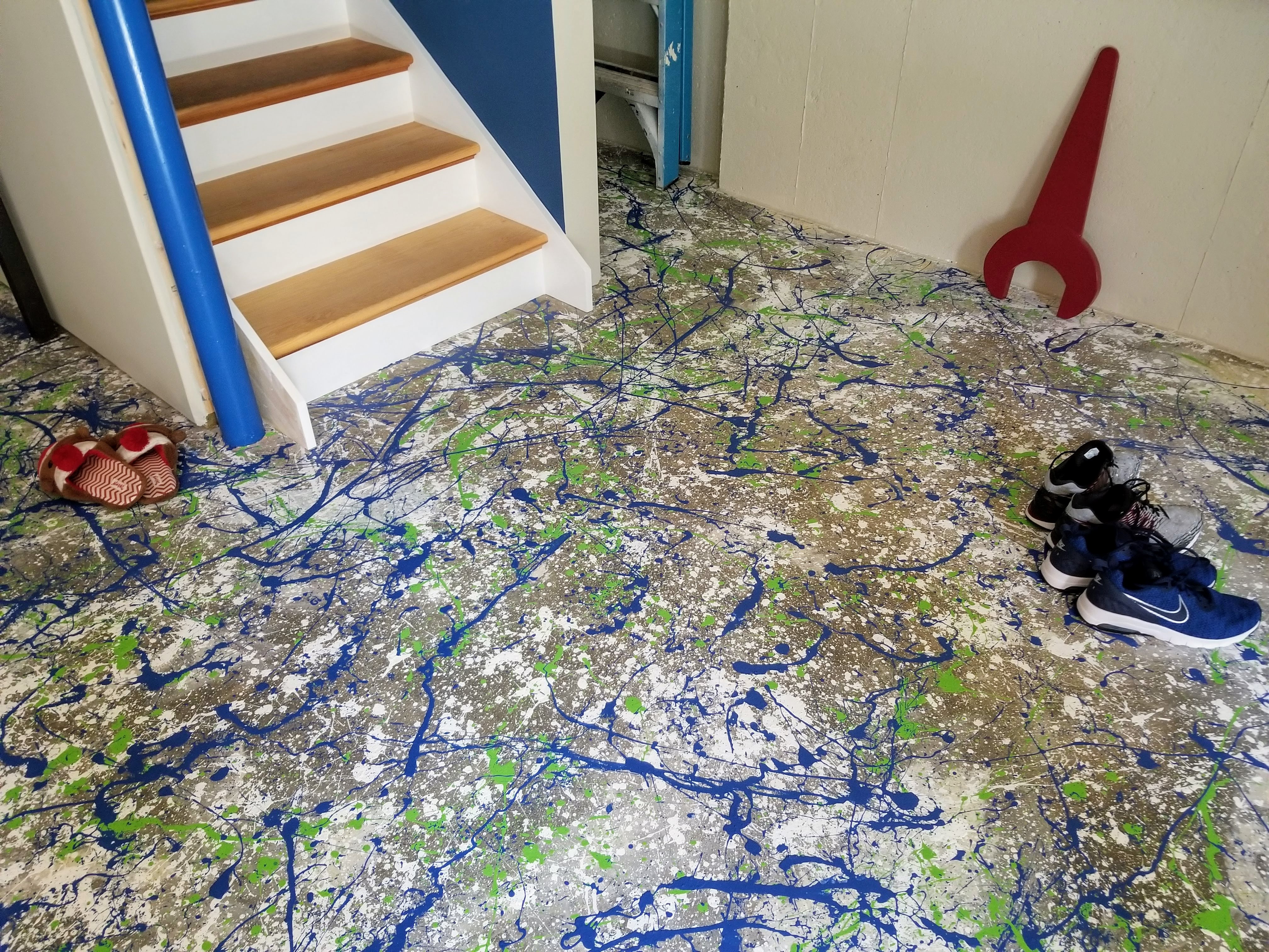
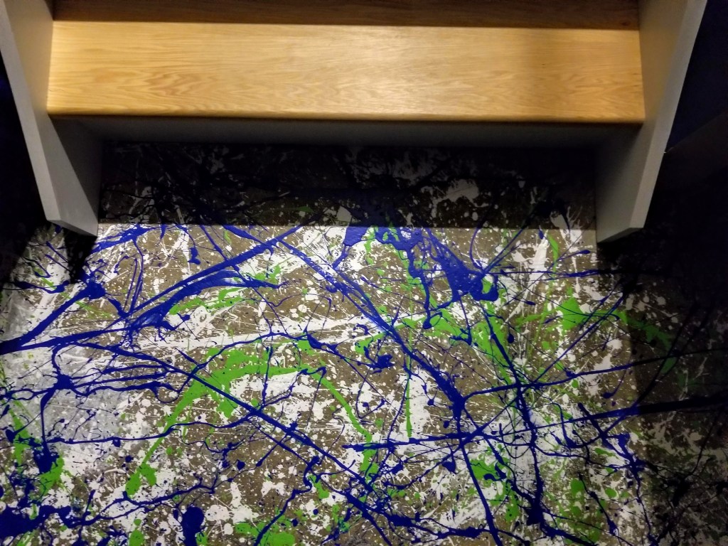
The bathroom starts with our base gray color for most of the walls — except for two walls, one directly in the bathroom; the second, making the transition to the bedroom. Here, our basement floor combination of blue and green shows up again:

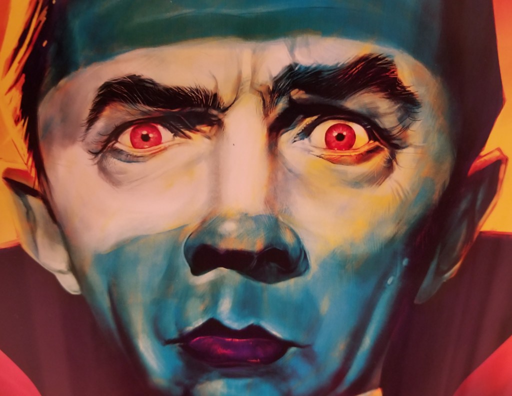
Heading into the bathroom area from the main living area (kitchen and family room), our monster theme begins with a portrait of Dracula, based on the original Bela Lugosi portrayal (the joke here with the monster theme is that nothing good happens in bathrooms — the sights, the smells, the shaving, the plucking, the scrubbing, etc.).

Instead of relying on vintage, original posters, or even stills from these classic movies, I opted for portraits that had a more modern take on these iconic creatures. It also marked a fun transition, incorporating one of my daughter’s nicknames, from bathroom to bedroom:

It’s a whimsical, detailed portrait of one of the great movie monsters:

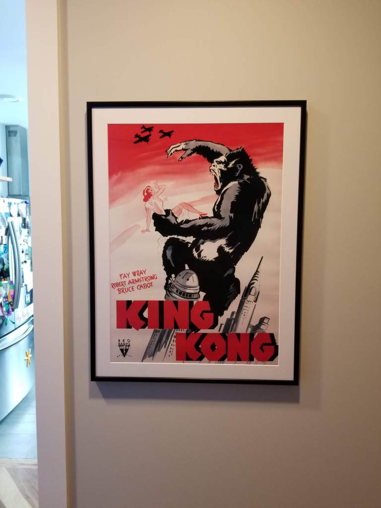
I love the vivid pinks and reds in this King Kong poster:

Above and behind the toilet seemed an ideal, menacing perch for Lon Chaney Jr.’s Wolfman:

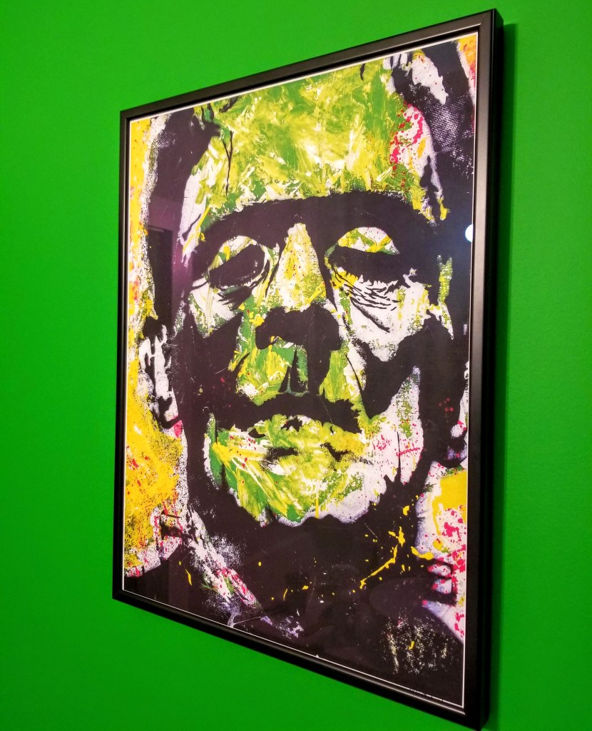
This modern, graffiti-inspired take on Boris Karloff’s iconic Frankenstein’s monster is rich in colorful details:

An added touch was positioning him on the green accent wall so that he’s clearly visible in the mirror above the sink, which, with its delicate butterflies, hints at the tragic lakeside scene with the little girl and her flowers from the classic James Whale movie:

For those at the sink who take notice, the monster is watching their every move:

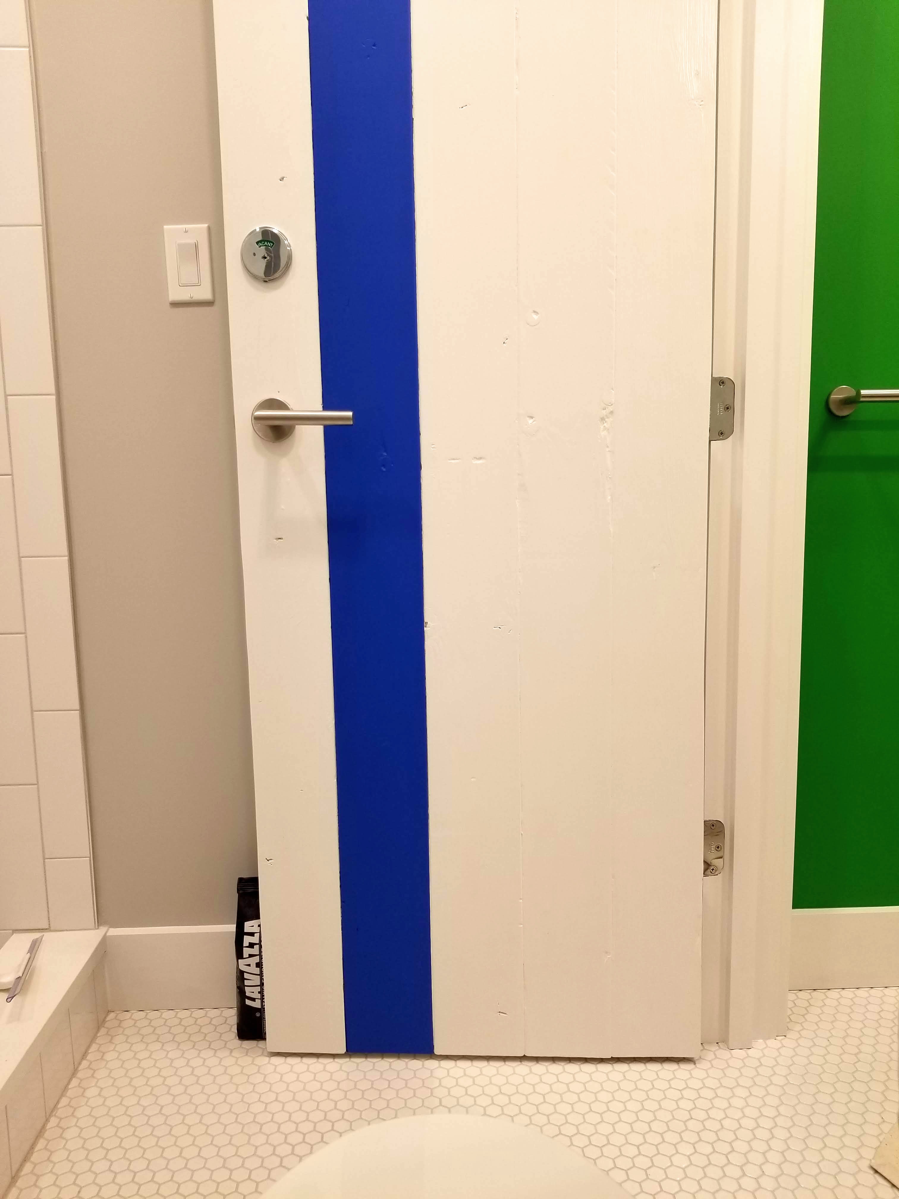
For the bathroom door, I repeated the bedroom door’s use of 2×6’s, pocket screwed together, painted white, with a racing stripe. I also used the same door handle, once again mimicking the Roto hardware on our windows and doors, while also adding a cute, but also highly functional, Schlage VACANT/ IN USE deadbolt lock:

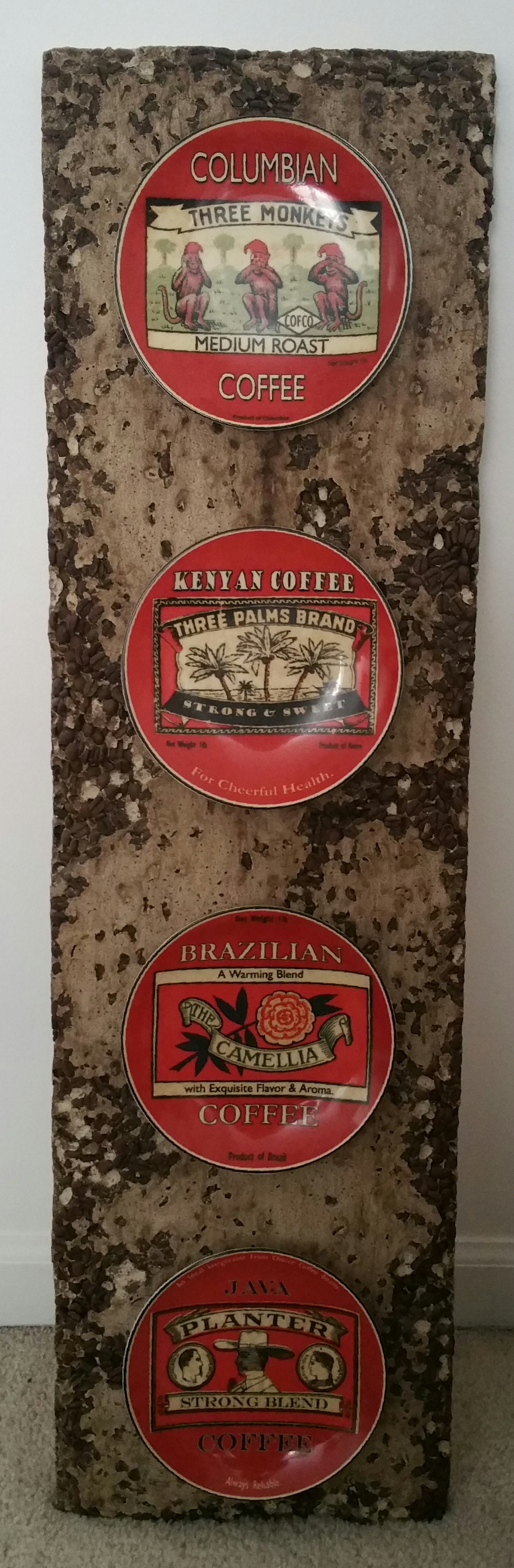
When we were collecting design elements for our house in the pre-construction phase back in 2015, these were just starting to show up in restaurant bathrooms in our area. They seemed equally useful in a residential setting:

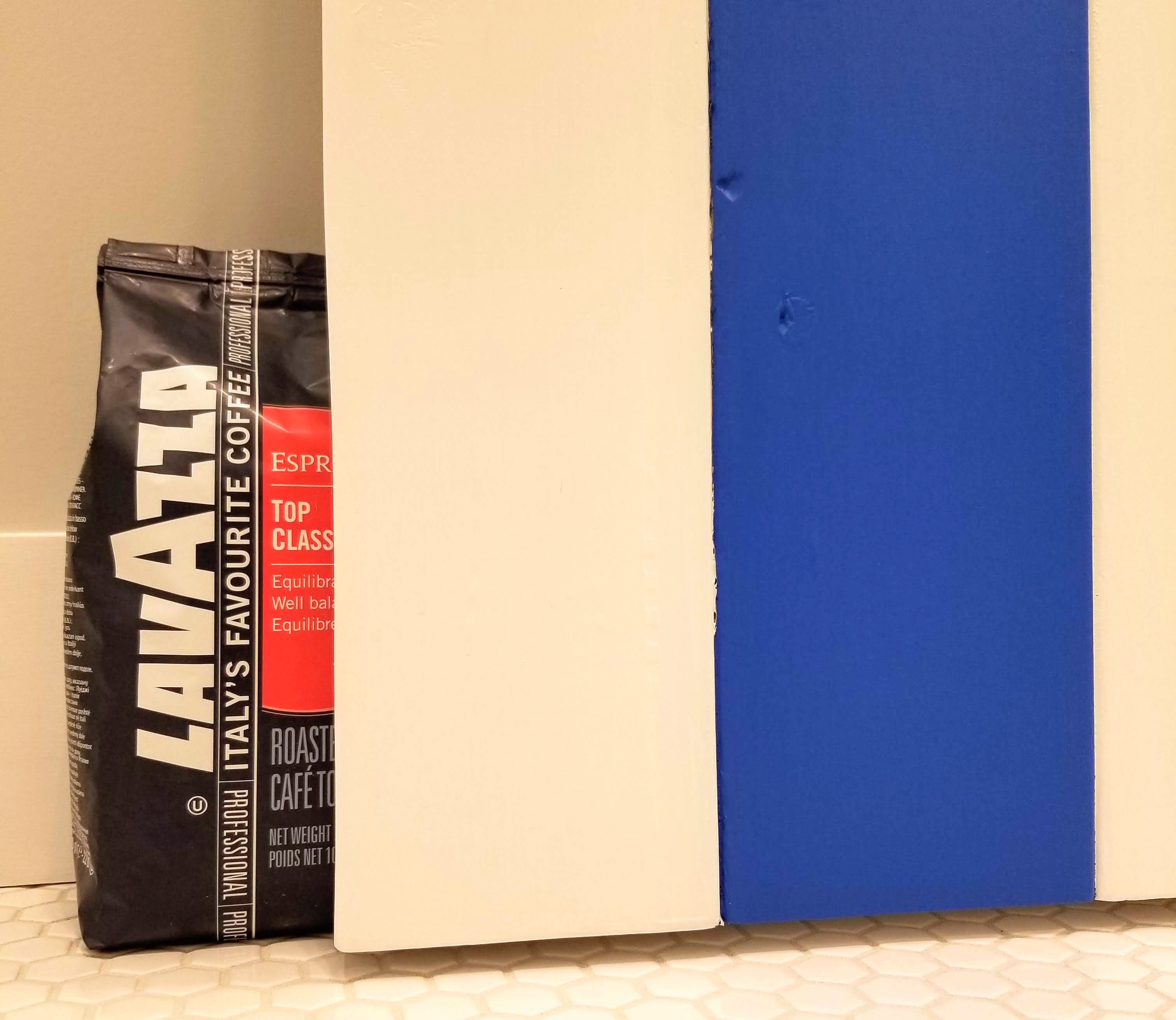
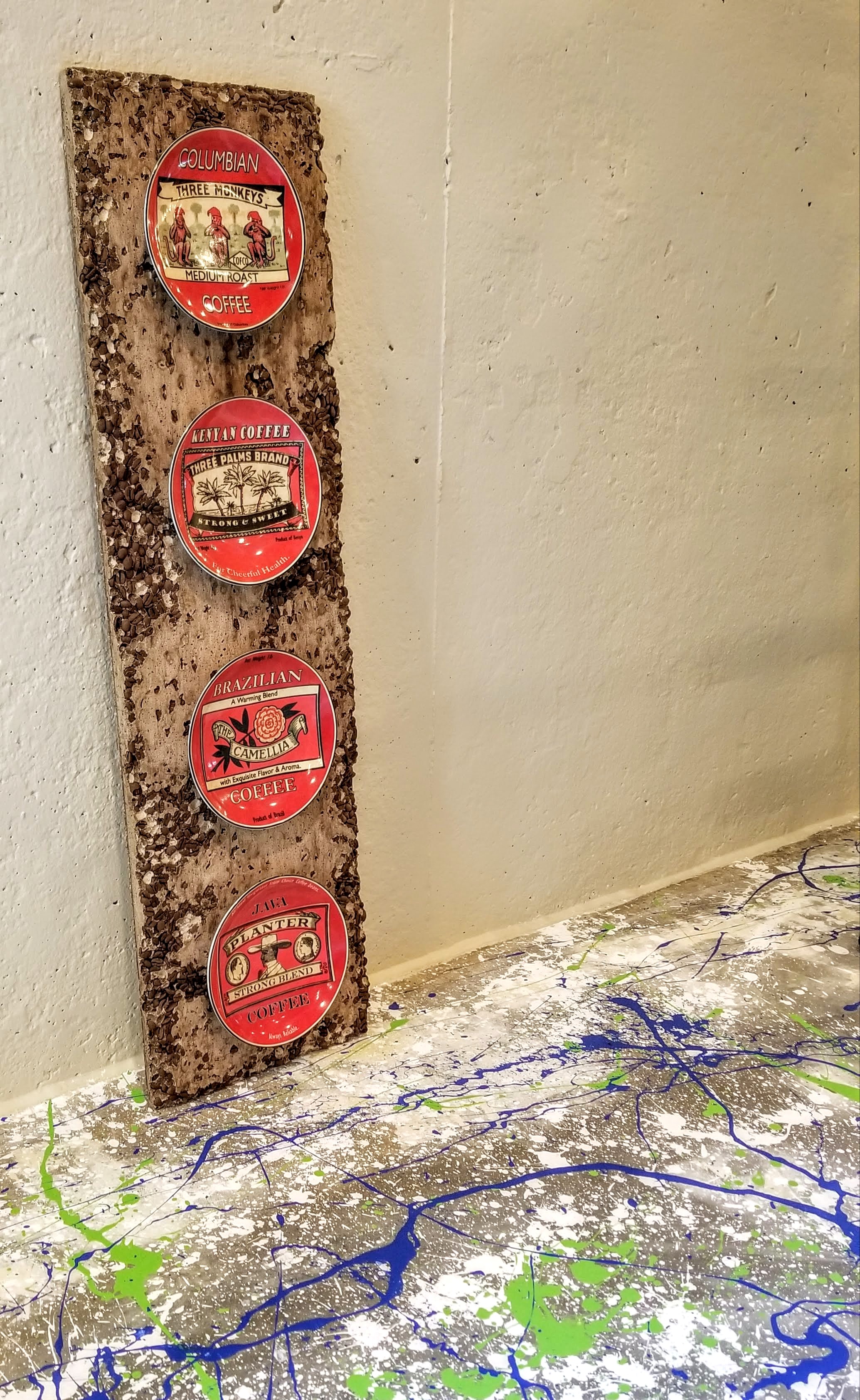
Instead of using a screwed-on door stop attached to the baseboard, the bottom of the door, or even the floor, this colorful bag of coffee does the same job admirably with a nice pop of color:

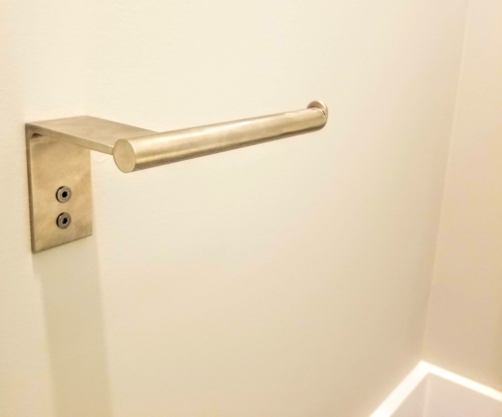
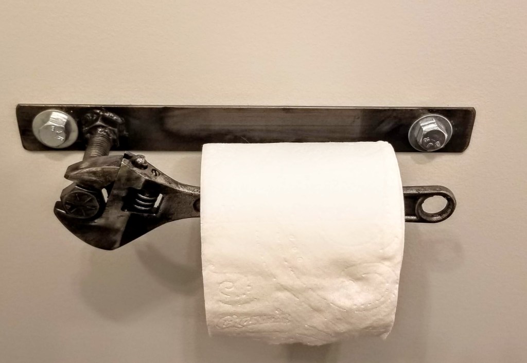
For a toilet paper holder, I opted again for a custom-made option — pared down, sleek, and functional:

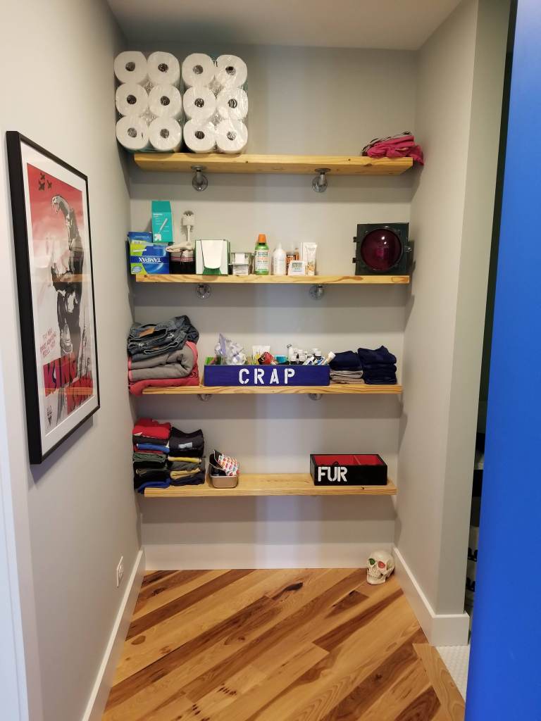
Exiting the kitchen, on the way to the bathroom, reveals a linen closet area. Here, I again opted for open shelving, with 2×10’s and gas pipe. The advantage of the open shelving is always knowing what you have and when to order or buy more. The downside, of course, is that there’s no place to hide from dust and clutter if things are allowed to get out of hand.

The ‘Crap’ and ‘Fur’ decorative boxes help contain the worst clutter-prone items — miscellaneous medicines, first-aid products, and hair care tools:

One final monster, just to the left of the bathroom sink, started with an Ed Hardy poster (n.b., Art for Life is a beautifully illustrated overview of his work in tattoos and on canvas):

His ‘Surf or Die’ piece captures the energy and playfulness I was after with our monster theme:

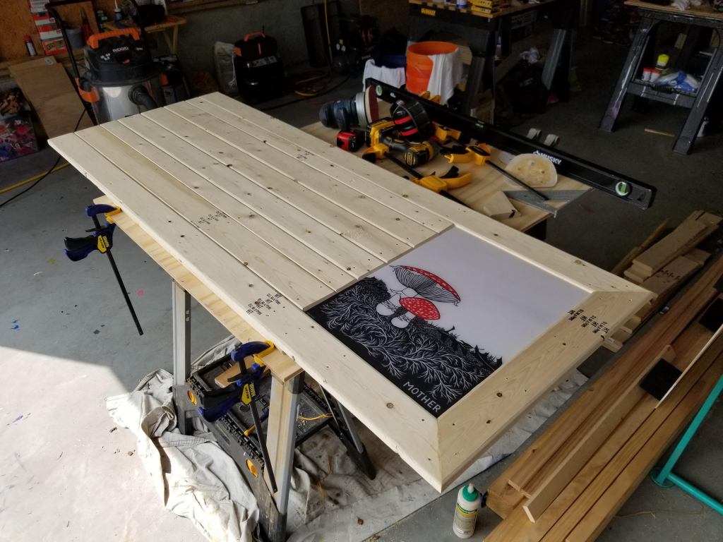
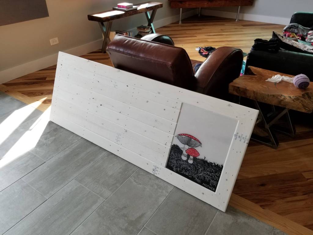
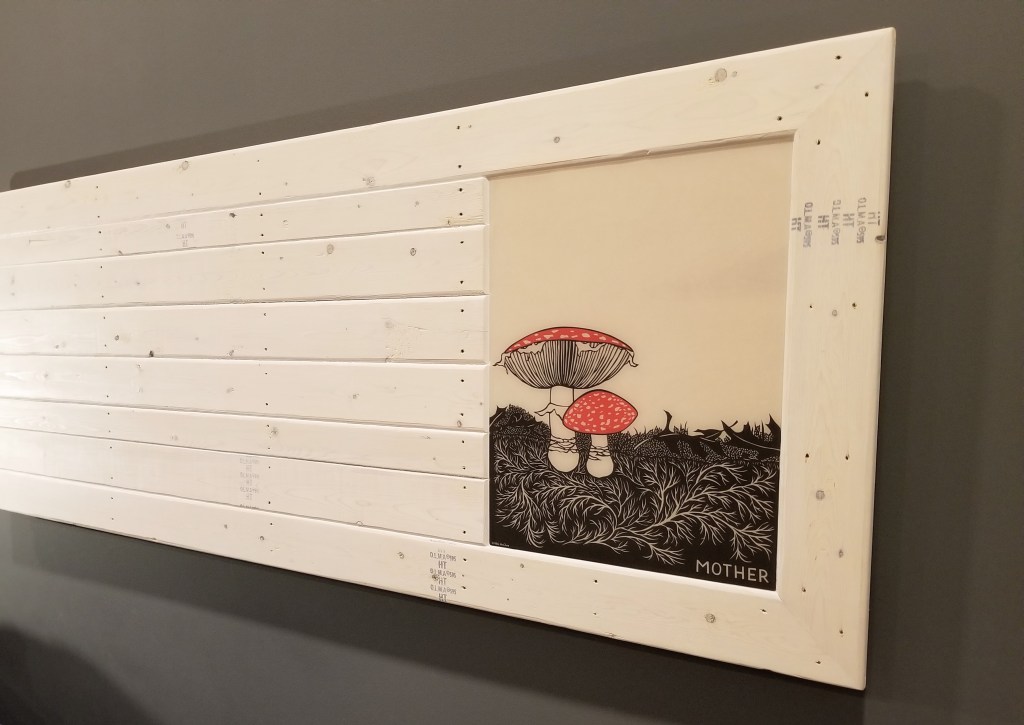
Using the same finishing process as the artwork in our main bedroom and in our basement, I mounted the image first on plywood before later doing an epoxy flood coat.

“… what we call a home is merely any place that succeeds in making more consistently available to us the important truths which the wider world ignores, or which our distracted and irresolute selves have trouble holding on to.

As we write, so we build: to keep a record of what matters to us.”

— Alain de Botton, The Architecture of Happiness

Since it’s so close to water at the sink (and things like toothpaste spray), I decided to leave it with a high gloss finish for easy clean-up:

In addition to the colors in Hardy’s painting complementing the colorful butterflies surrounding the mirror, the painting itself is a nice surprise for first-time visitors as they exit the bathroom.

Urban Rustic: Main Bedroom and Bathroom

0

Design Elements

To create a warm, inviting bedroom and bathroom we knew we wanted to incorporate the same basic Urban Rustic design elements that we intended to use throughout the house. At their most basic level, these elements include wood, metal, and concrete (or stone). These show up at the largest scale in our hickory wood floors, our ‘stained’ concrete porcelain tiles, and our quartz countertops (kitchen and bathrooms). On a much smaller scale, these elements show up in variety of decorative objects that we have carefully curated, placing them throughout the house.

The overarching goal was a mix of sleek and modern with aged but beautifully worn. Whether for the exterior or the interior, the visual cues were rooted in a motif of early 20th century artisan workshop and small farmhouse.

“Successful modern reinterpretations of traditional architectural styles move us not only at an aesthetic level. They show us how we, too, might straddle eras and countries, holding on to our own precedents and regions while drawing on the modern and the universal… Without patronising the history they profess to love, they show us how we, too, might carry the valuable parts of the past and the local into a restless global future… [succeeding] in succumbing neither to nostalgia nor to amnesia.”

— Alain de Botton, The Architecture of Happiness

On the exterior this is achieved with a blend of black charred cedar, or shou sugi ban (aka yakisuki), and a restrained use of natural cedar highlights:

The rustic siding and overhangs are then complemented by the modern, sleek, metallic windows, doors, and even the gutters and downspouts. These visually heavy, and mostly dark, elements play well with the surrounding landscape: in summer, contrasting with the vibrant green vegetation and bold flower colors; in winter, our black box stands out in the surrounding white blanket of snow.

Heading indoors, we knew we wanted to experience the inverse of what we established on the exterior.

“… the balance we approve of in architecture… alludes to a state that, on a psychological level, we can describe as mental health or happiness. Like buildings, we, too, contain opposites which can be more or less successfully handled… we instinctively recognize that our well-being depends on our being able both to accommodate and to cancel out our polarities… Our attempts to harmonise our different aspects isn’t generally helped by the world around us, which tends to emphasise a range of awkward antitheses. Consider, for instance, the truisms which hold that one cannot be at the same time both funny and serious, democratic and refined, cosmopolitan and rural, practical and elegant, or masculine and delicate.

Balanced buildings beg to differ.”

— Alain de Botton, The Architecture of Happiness

Where the black siding absorbs sunlight, creating a brooding, deeply rooted in place black box, for the interior we wanted to make sure we flipped this dynamic, with a mostly neutral baseline, allowing us to then accent this bright and light foundation with vibrant pops of color. Where the exterior is dark and bold, we wanted the interior to be light-filled, warm, and inviting.

As a backdrop, we went with clean white ceilings and basic painted wood trim details. With light gray walls as a neutral canvas, it allowed us to play around with colors and textures, both for artwork and in terms of furniture or decorative objects. With this basic palette of colors and materials, we knew that the bold artwork that we wanted for our walls would really pop and have a long lasting visual vibrancy over the widest possible range of the color spectrum.

Going with basic painted white trim also meant we could contain costs while also keeping the main focus on decorative elements like flooring, wall art, and miscellaneous decorative objects.

For the baseboard, we went with 1×6 poplar, which we had used previously in our last house:

Around exterior doors and windows we chose to utilize drywall returns rather than more elaborate wood trim details. The exception was for our window stools. Here, we went with 8/4 poplar. The thicker material goes well with the chunky profile of our passive house doors and window sashes, particularly noticeable when the units are open.

Below, testing out a piece of the poplar stool in our Pantry-Laundry Room, trying to figure out how far beyond the window opening to go with the horns:

To create a more rustic, informal look, in addition to the thickness of the material, saw marks on the outside edge were mostly left unsanded. The face of each stool was given a gentle, rounded-over edge by hand, while being careful to sand — only minimally — on and around the surface of the saw marks.

Even though I was a little worried about not sanding this face sufficiently, it turned out that we ended up with a nice balance. In the right light, typically morning or afternoon raking sunlight, the saw marks are evident, even prominent, through the layers of primer and paint, offering up interesting shadow lines. At other times of the day, or under the glow of artificial light at night, these saw marks mostly disappear:

Opting to forego an apron trim piece below the stool we felt produced a simpler, cleaner look, although it did require some drywall patching below each rough window opening to more easily close the gap between stool and drywall with a high quality caulk.

We wanted the visual heft of the stools to stand on their own. Using any style of apron may have softened the look we were going for. The downside to a more minimal look, of course, is that there are fewer places to hide imperfections.

We really like the balance between the more formal white paint and the size and texture of the stool itself.

Main Bedroom

In the bedroom and bathroom we started with a white ceiling, white trim, and gray walls. Instead of using an accent wall, we opted for ‘blocks’ of color on two walls, on display upon entering the bedroom:

A dark, rich gray for the headboard wall is offset with a barn red for the long wall that connects the bedroom to the bathroom. To keep the space feeling as open as possible, we opted to go without doors for the bathroom or the walk-in closet. We realized this was an option based on our last home where these two doors were never used, remaining in the open position for the ten years we lived there.

Below, the point where bedroom meets bathroom, and where the richness of the color palette is fully realized:

The combination of ‘weathered concrete’ porcelain tile with the warmth of the hickory mimics the contrast between dark, cool gray and rich red on the adjacent walls.

The same area, looking up towards the ceiling:

With the paint and trim complete, we could finally get some artwork on the walls. We decided to give away most of our wall art from our previous house to family and friends. This allowed us to personalize our new home, particularly since we were opting for a DIY-heavy approach. It also meant our daughter could be involved in anything new that we created.

Below, this framed reproduction of Magritte’s ‘Empire of Light‘ is one of the few items that carried over into our new house:

Note the thickness of the profile on the open window sash with the thickness of the previously mentioned window stool:

A significant percentage of our construction budget went to Passive House details like air sealing, insulation above building code minimums, an ERV, and high performance windows and doors, not to mention our solar panels. Consequently, when it came to interior design, we were happy to commit to a DIY approach:

Apart from any potential savings compared to items bought off-the-shelf, we also find it more fun and rewarding to come up with our own bespoke self-designed handmade items. We’ve also found that custom made items tend to endure and stick around far longer than mass produced items, regardless of their price tag (typically both in terms of durability and enduring affection).

“‘Decor’ and the conception of ‘interior design’ have spread so widely, that very often people forget their instinct for the things they really want to keep around them… people have begun to look outward, to others, and over their shoulders… and have replaced their natural instinctive decorations with the things which they believe will please and impress their visitors… [Decor] is most beautiful when it comes straight from your life — the things you care for, the things that tell your story.”

— Christopher Alexander, et al., A Pattern Language

For the bookend space to the left of our bedroom window we used a rust technique on some sheet metal. In a bath of white vinegar, hydrogen peroxide, and salt, we soaked each piece of metal until we achieved the heavily scarred surface we were aiming for:

There is some latitude in controlling this chemical reaction as the metal rusts. Minimizing the time of exposure can allow some of the original bare metal color to remain. With a longer soak, and some brushing of the liquid repeatedly over the surface of the metal, a much deeper, all-encompassing level of damage can be achieved.

This sample, pictured below, shows a blend of rust and bare metal, prior to being sealed:

After the rusted steel sheets had a chance to dry, we used a low VOC sealer from AFM Safecoat to bind the rust and prevent any ongoing ‘dusting’ (similar to the strategy we employed using tung oil on our charred cedar).

The four individual panels were then mounted on a sheet of plywood. The plywood had been attached to 2×4’s, making it simple to hang the piece on the wall:

The white letters were painted on prior to the seal coat because I wanted some of the rust to bleed through the paint for a more weathered effect to match the level of rust:

To maximize the overall bare-bones look, the 2×4’s and plywood, clearly visible on the sides, was left fully exposed:

The phrase itself is from The Doors song ‘When the Music’s Over’, part of which has an environmental message that blends well with our rock ‘n’ roll theme.

With our blue porcelain frog sticking to the window header, our vignette with a nature theme is mostly complete, framing the view to our backyard, which, at this point, was still little more than a mulched moonscape.

Mid-morning, in the photo above, with sun entering through the open doorway from the left (south).

The authors of A Pattern Language strongly advocate for east-facing main bedrooms:

“The sun warms you, increases the light, gently nudges you to wake up — but in a way that is so gentle, that you will still actually wake up at the moment which serves you best…”

— Christopher Alexander, et al., A Pattern Language

Below, the sun just before the winter solstice, almost reaching directly into the bedroom (just over 16′ from the south-facing windows). This was part of our passive solar strategy for the house:

Although our bedroom technically faces west, because of the size of our bedroom and family room windows (4.5′ x 9′), and the oversized door opening to the family room that faces south, we end up with a flood of morning light regardless. The intensity of the light is far less than direct east-facing, but the overall effect is similar. On paper this shouldn’t really work, but reality shows otherwise. Something to consider for those in the design stage of their own build.

The next project for the bedroom was to add some seating below the window.

To get started, we picked up some reclaimed lumber from Meeghan, at her shop Great Lakes Yard.

The piece on the left, below, has been epoxied and sanded, ready for its final clear coat. The piece on the right, destined for the family room, is finished, waiting for legs to be attached.

The epoxy was serving both decorative and structural functions. These pieces, particularly the one on the left, were in pretty bad shape in terms of structural integrity. The epoxy was filling cracks, crevices, and also allowed me to rebuild some of the badly damaged outside edges. We chose a blue metallic pigment since it offers an almost water-like iridescence.

Building up some of the outside edges not only added to the visual effect, it also helped stabilize what would’ve otherwise been a piece on the verge of falling apart. This section of wood was a structural framing component during its working life. I left some of the larger holes empty (these look like they were for conduit), while concentrating on the smaller voids. In addition, the mortise pockets benefited from some of the blue epoxy, giving these areas a look of pooling water while also making these spots easier to dust and keep clean:

The built-up outside edges have a nice shimmering water look to them:

Some doubled up 2×6’s painted black with some nice metal hardware completes the look. The original level of wear in the piece can be read in the front vertical face as it changes in thickness from one end to the other.

Having large windows in the bedroom makes a bench like this ideal for a quick sit to take in the evolving flow of life in the backyard as the seasons develop and change. The rest of the time it’s a structural framing member that has been transformed into what we hope is a deceptively unique decorative object:

For our new dresser we decided to go full-on rustic with reclaimed wood and vintage fruit label drawer pulls. The warm wood tones help balance the fiery red accent wall while echoing the color variation in our hickory floors. The aged wood would also serve as a warm, neutral backdrop, helping to put emphasis on the pieces that would soon sit atop the dresser.

My daughter helped me apply tung oil to the ‘box’ and the drawers, giving the dresser a warm, natural matte finish. After a final sand and wipe down, the tung oil brings the old, dry looking wood grain back to life:

Whether it’s searching for interesting reclaimed items or just unique decor touches, I’ve had better luck looking online than with brick and mortar stores. After trying several locations in the Chicago area, as well as various shops when we’ve been out of town, I always come back to shopping online, largely because the pool of options is so much greater than at any one store. We’ve gotten lucky buying a couple of items locally, but the overwhelming majority of what we purchased came from online shops.

Although time consuming, browsing sources like Etsy almost always proved more fruitful in the end.

In the case of the drawer pulls, I found these vintage fruit label ones on Etsy:

Even when it comes to having items framed, we had better luck developing our own technique than using the more traditional frame (wood or metal) with glass approach.

We start by mounting the image to some smooth plywood that’s been previously sanded and dusted. We mount the image using a spray on adhesive. As the glue sets up, we do our best to squeegee out any air to ensure good contact between the plywood and the photo. Once the glue has fully dried, we do an epoxy pour, a flood coat, allowing it to spread over the entire surface, including falling over the edges.

With the initial pour allowed to dry for a couple of days, if a high-gloss finish isn’t ideal, I then sand the epoxy before applying a hardwax oil coating of Osmo Polyx, typically in a satin finish, although the matte finish makes for a nice, subtle velvet-like finish as well.

This technique is roughly the same deployed for river tables, or any project with wood, epoxy, or wood-epoxy combination:

In our case, to experiment with this technique we started small, with a Blondie and Pat Benatar concert poster, before moving on to much larger images:

The trickiest part is making absolutely sure the outside edges of the image are fully adhered to the plywood. If not, when the flood coat of epoxy is applied you risk having the image lift, which is virtually impossible to fix after the epoxy has been poured.

For our red accent wall I decided to use an image of our daughter playing on the Chicago lakefront at sunset. The rich blues in the failing light accentuate the water theme I was after:

In addition to the image, we added a slightly tongue in cheek family altar with a small slab of decorative white concrete as its base.

Below, afternoon sun breaking across the photo and the red accent wall:

For our headboard wall we started with a print by Nikki McClure. We really enjoy the playful vibrancy in her work. The print was mounted and finished with epoxy and then the Osmo as outlined above.

With a base frame made of 1×4 furring strips, I attached the print and then surrounded it with additional 1×4 furring strips to create the finished surface:

Using the furring strips was in keeping with our Urban Rustic design goals, in this case utilizing underappreciated framing materials to show off their inherent beauty and utility in a new context.

After completing a light sanding, trying to hold onto the grading stamps as much as possible, I then whitewashed the 1×4’s to complete the rustic look. The goal was a weathered look:

This was amplified by using the Osmo to seal-in the whitewash since it adds a slight amber, or yellowing, to the surface of the wood, increasing the aged effect. It was a relatively light whitewash application, which allowed some of the original wood color to come through the final finish:

For my nightstand I started with 1/2″ Purebond plywood for the carcass. The dimensions are larger than what’s typical, but I wanted it to look short and hefty.

I made deep drawers, using Blum drawer slides to help support the weight of anything put in the drawers, especially books. We used them for our kitchen drawers and we love the smooth function and soft close function. They’re not the cheapest option, but their quality is hard to match.

I wrapped the carcass with 1×4 furring strips, just like the headboard piece, and then used 1/2″ plywood for the drawer fronts, painted a vibrant red to match our red accent wall. Both the carcass and the drawer fronts were sealed with the Osmo.

The black drawer pulls I found online. I didn’t try to refinish them, instead I just applied a couple coats of sealer to prevent further rusting. I then attached them to the drawer fronts with some lag bolts. This combination epitomizes the Urban Rustic aesthetic: sleek, modern red and shiny steel with rusted, worn and peeling hardware.

For the top I glued two sheets of 3/4″ Purebond plywood together for a chunkier look, using Timbermate putty to fill and smooth out the exposed edges.

With a slightly rounded over edge created using a router, it was time to have some fun applying stickers. Starting with a Vespa Italian roundel and striping, my daughter and I added various other famous high-performance Italian industrial design brands, partly inspired by the work of Bruno Munari.

As with the wall art photos, first we did an epoxy flood coat before sanding and applying a final couple coats of Osmo satin, which produces a nice combination of hard-wearing with a subtle shine.

The stickers were a fun homage to high Italian industrial design:

The little tank of a nightstand is a nice mix of urban and rustic elements:

For my wife’s nightstand I started with a mini river table.

With the mold complete, I could get the two pieces of walnut in position to better evaluate what would be the final look:

I thought about using a white metallic epoxy, but anytime I’ve used a white pigment with epoxy it’s always yellowed to one extreme or another over time (typically within the first year). Instead, I opted for a metallic black, which also had some metallic silver mixed in.

Opinions vary on the enduring charm of river tables, but it’s probably a safe bet that a more subdued pigment choice, like black, will have a better chance of being appreciated and loved well into the future.

Below, the black epoxy complete, and the planing mostly done:

Below, after sanding, routing the edges, and an initial coat of Rubio Monocoat:

Below, after a second coat of Rubio has been done. Although it belies the name, I usually end up with better results after a light sand and a second coat of Rubio has been applied:

I’m hoping the variation in color tone doesn’t mellow too much with age. The stark contrast between light and dark woodgrain adds to the beauty of these pieces.

Close-up of the walnut surface:

The wide color variation is incredibly beautiful. Moreover, the black epoxy adds to the wave effect visible in the woodgrain, reminiscent of flowing water.

For the body of the nightstand I used the Purebond plywood for the carcass, leaving it exposed as the final finish for the sides. In combination with the face frame, I opted for inset drawer fronts, painting them gray to match the headboard wall color. The pulls are actually dock cleats, offering a heavy-duty look for a component that’s usually more delicate in appearance.

Like the ‘Mother’ wall art piece, I used a whitewash finish on the face frame and the sides, sealed once again with Osmo. I used the Blum slides for the drawers.

Below, the nightstand complete:

Main Bathroom

Design for our bathroom started with our floating vanity, which is accented with a combination of charred cedar and lag bolts, and completed by the quartz counters and the porcelain vessel sinks. This combination reflects our Urban Rustic building blocks of wood-metal-stone.

In addition, along with the toilet paper holder, it gave us an opportunity to bring the charred cedar indoors. We would do this with several decorative elements throughout the main floor, using the charred cedar as an accent rather than as a main feature like it is on our exterior.

With oversized subway tile and red glass accents, the shower plays well with the more rustic and handmade items in the space.

The bright yellow painting references lines from a Pixies song:

Struggling to find a unique toilet paper holder, I came across this one on Etsy: Wrench

This well-worn industrial sign adds a whimsical touch:

The toilet paper storage box works well in terms of function, and the charred finish adds some nice color and texture:

For the red accent wall I wanted a piece that would start in the bedroom and carry through to the bathroom, where only then it would reveal its dramatic punch.

It also makes for a nice companion piece to the ‘Mother’ headboard wall art:

As with the ‘Mother’ piece, I tried to hold onto the lumber stamps as much as possible. I also tried to select the individual pieces of 1×4 for their color, wood grain, and knot pattern. This was more important for this piece since it was left ‘natural’, with only a couple coats of Osmo for some protection and for a slight ambering effect. The natural tones of the wood and the inky black in the artwork make for a nice combination with the intensity of the red on the wall:

We picked up this second Nikki McClure print from Anthology in Madison, Wisconsin, a cute shop with a nice range of products. My wife and daughter, along with some extended family, love going here every time we’re in Madison.

Despite their many imperfections, the 1×4 furring strips make for a unique, rustic decorative touch. On a job site they don’t get much respect, typically kept hidden behind finished surfaces like siding in the case of a ventilated rainscreen.

It’s been fun devising ways to let them shine in their own right.

Sunlight from the west, entering the bathroom around midday:

In addition to the building science we incorporated into the structure of our build, collecting and executing the design elements for our interiors has made crafting and building our own home one of the most rewarding experiences of our lives.

“When the objects we use every day and the surroundings we live in have become in themselves a work of art, then we shall be able to say that we have achieved a balanced life.”

— Bruno Munari, Design as Art

Flooring: Basement Paint Splatter

0

The Original Plan

We didn’t want to spend a lot of money on basement flooring, so we knew we wanted to keep things simple, especially since we weren’t going for a high-end look for the space. The basement is mostly unfinished, at least by traditional standards. We use the space mainly for working out, reading, office work, some smaller arts and crafts projects, and we’ve created a few small areas for miscellaneous storage.

Whatever we came up with had to be durable, if only to avoid having to replace any flooring should the basement ever have a problem with water (e.g. from a failed sump pump or a leaky hot water tank).

The plan initially was to just seal the floor with tung oil, much like we did for our wood floors. I thought if I used a slurry mix to patch some surface imperfections in the concrete beforehand that it might produce a pleasant mottled look across the entire floor once it was finished with the tung oil.

Unfortunately, once this patching was done, it quickly became apparent that the look was just messy, if not just boring and forgettable. Even tinting the slurry mix to various shades of blue and green didn’t seem to help at all.

base after patches b4 tung
Basement slab ready for tung oil finish.

With the patching complete, I went ahead and did the tung oil application just to get rid of the constant concrete dust on the surface of the basement floor.

base b4 after tung
Tung oil just applied on the left, darkening the concrete as it seals it.

I applied it the same way I did for the hardwood flooring on the main level. I also broke it up into sections, using the preformed contraction joints in the concrete slab as a guide.

base section w: tung
Tung oil applied, waiting for it to soak in before applying it again to any ‘dry’ spots.

I knew I’d have several months while other projects were being finished upstairs to figure out another solution.

close-up corner base tung

An even closer view after the tung oil has been applied:

base tung oil
Concrete mostly dry; ready to wipe down any excess tung oil remaining on the surface.

Jackson Pollock as Inspiration

After almost a year had passed, and with much of the work on the first floor finally complete, it was time to come back and finish up the basement floor.

My first thought was to use the painting techniques of Jackson Pollock as an inspiration.

After looking through online photo galleries of his work and watching some videos, I realized I’d forgotten just how layered much of his work is.

It was while researching his work that I also came across an East Coast (mainly New York?) beach house tradition of splatter painting floors, done mainly, it seems, to hide the sand and mess brought in from the beach, all while giving the floors some added durability.

We decided we’d try to mimic some of Pollock’s technique, but do it in lighter layers so more of the tung oiled concrete could show through.

Since it was too cold at the time to have Green Building Supply ship me all of the paint required, we decided to take a trip to Madison, Wisconsin for the weekend to pick up the remainder of what I needed from Premier Paint and Wallpaper.

Premier is a really nice family-owned independent paint store with a wide variety of brands and products. The paint stores around us are exclusively national chains like Sherwin Williams, Benjamin Moore, or PPG. When you walk into these stores you definitely feel the difference compared to a mom and pop operation.

Premier mixed up what we needed, and we were off to enjoy the rest of our weekend in Madison where there’s always something to do outdoors, and there’s no shortage of great restaurants, like Sal’s Tomato Pies:

sal's

In terms of colors for our splatter technique, we decided to stick with the blue we had used for the basement steel beam and columns, along with white as a neutral color, while finishing with a bright green to liven things up a bit. This combination mimics the iconic color scheme used by Kawasaki motorcycles:

With the walls prepped to prevent overspray from the splatter hitting them, my daughter and I started to experiment in the back corner of the basement with the white color first. We felt like the white color would be the best option as our base coat color, complementing the now tung oil darkened color of the concrete.

base walls prepped
Practicing our technique first with the white concrete paint.

We also took our time to experiment with the other colors, figuring out exactly how we wanted the paint to fall on the concrete — either in droplets or in long, stringy patterns.

experimenting w: each color
Testing out the blue and green paint colors.

Based on this first section, we felt like we could go fairly heavy with the white and still have some of the darker tones of the concrete underneath come through the final finish. In each section we first started with the white to establish a base coat to work off of for the subsequent applications of the blue and then green.

base white going down
This section is ready for the blue and green.

We then played around with how much blue and green we wanted to finish up with on top of the white and the darker concrete underneath.

experimenting more blue
Experimenting with how much blue and green we should use.

Here’s one of the first completed areas around a steel post or lally column:

basement pole
It was exciting to see the colors finally come together to such vivid effect.

A second view of a completed area, this time out in the middle of the floor:

base 3 colors done

As we finished up a section, we would start to sort through the remaining moving boxes and put together each space more permanently. It was also a good opportunity to further purge anything still in boxes that we didn’t end up needing in our new home.

For one area of books we used the traditional set-up of cinder blocks and wood shelves, but we added some character by taking the time to paint the blocks using the floor colors. We also turned the blocks on their side to hide their empty centers. I had seen this technique used in a YouTube video as a way to dress up this type of shelving normally associated with a college dorm room or one’s first apartment:

It definitely added some time to the project as each block required a couple coats of paint, but it was a nice way for my daughter and I to have some more fun with color, too.

This section of books on cinder blocks helps to close off and define this sitting and reading area from the storage and arts and crafts area behind it.

base setting up space
Getting a section of the basement mostly put together.

We were pleasantly surprised by the wide variety of looks, textures, and playful randomness in the overall pattern of the paint splatter.

another view cinder
A closer view of the painted cinder blocks.

It’s definitely unpredictable to a great degree, but with practice it did become easier to control, and we did develop a feel for how we wanted each area to end up looking.

blk lgt cinder
An even closer view of the cinder blocks, including an unfinished gas pipe ‘robot’ light.
getting white base coat down
Establishing the white base coat in another section before adding the blue and green.

Here are several close-ups showing some of the texture created by the splattered paint, whether as drops or longer, stringy ropes.

splatterd
splattera
splatterc

A wider shot showing the layering of the three colors, with the darkened concrete and some of the slurry patches still visible underneath.

splattere

We weren’t afraid to leave some areas with a lighter application of paint. The mix of light and heavier areas of coverage helps to give the floor visual interest, and it hopefully emphasizes the human element involved in the final look of the finish.

basement spatter close up
An area with lighter coats of paint.

Once the white paint was applied, we would let it dry overnight. The next day we would come back and apply the blue.

base flr lgt bg
Close-up view of a lighter area with the dark concrete still visible underneath.

Since each color would have areas of fairly heavy coverage, after the white was down we always applied the blue and green coats in our socks to avoid even the possibility of our shoes pulling up any areas of uncured paint.

basement spatter in sunlight

Most of the photos show the colors in daylight, with the sun coming through the two basement windows, but we’re equally happy with how the floor looks under artificial light at night.

blue strings
The floor finish under ceiling lights at night.

We typically gave the blue 24 hours to dry as well, although there were a couple of times where we waited only about 6-8 hours before starting the green. With less paint on the floor, it seemed to take the blue less time to sufficiently dry.

The goal was to apply less paint with each change in color. We definitely wanted the white to remain the main background color, with the blue and the green acting as pops of accent color.

base 3 colors done

When the floors had only been sealed with the tung oil, although it solved the concrete dust issue, it did make several areas slippery smooth. Because the paint splatter hits the concrete in various thicknesses, the slightly uneven texture this produces helps make the final finish slip resistant. Even with this high build in some spots it’s never been a problem; instead, this texture is pleasant both underfoot or even to the touch.

I was a little worried about the thicker areas of paint drying and curing properly, but apart from some bubbles that popped as the paint dried, and some areas where the paint film shows some wrinkling on the surface, we had no issues in this regard.

wide shot base spatter

In addition to being slip resistant, it was also a relatively inexpensive finish to create, requiring just 3 gallons of white, 2 gallons of blue, and a single gallon of the green. This was in addition to the initial tung oil and citrus solvent (around 4-5 gallons of each) that we had applied to first seal the concrete. For slightly less than a dollar a square foot, the paint splatter technique produces a unique, one of a kind floor finish.

And the choice of colors is limited only by one’s imagination. We even contemplated adding some stencils that could’ve incorporated numbers, letters or words, or even distinct shapes. Instead, we decided to keep things simple and stick with just the splatter pattern. Nevertheless, there’s no reason not to explore all of these options before settling on a final design.

spatter cu texture
Extreme close-up view of the final finish.

One other key advantage to the paint splatter is that if any part of the floor were to see damage, whether from abrasion or moisture pushing the paint off the concrete, it would be relatively easy to repair with some additional paint applied using the same process.

This would not be the case had we used a single color, cut and rolled the typical way, across the entire basement floor. Any damage, even in a small area, with a single color tends to look horrible, and it would be difficult to correct it without leaving a ‘crater’ look in the area that had peeled and then been repaired.

base paint cans
The products we used for each color of paint splatter.

Premier couldn’t mix the blue in the Safecoat product, so we had to use the Fixall enamel instead. Even though it has more VOC’s than the Safecoat, within a couple of days any noticeable smell had dissipated. It probably helps that the total square footage of blue applied is fairly small.

outside corner
Back corner of the basement office.

At outside walls we ended up letting the paint hit the Air Dam that’s covering the gap between the slab and the foundation wall (there’s rigid foam below this gap acting as a thermal break between the slab and foundation wall).

another outside corner
An outside corner.

Since it was somewhat random how the paint hit this gap, some spots were hit heavily, while most just saw a slight smattering of color in this area.

basement spatter near fdn wall

There were only a couple of spots where the paint splatter managed to get behind or beyond the paper we had taped on the walls to protect them. For those spots it was easy to go back and touch them up with a small brush of wall paint.

spatter at outside wall

In terms of technique, we used paint stirring sticks to apply each color. Depending on the effect we wanted, how we worked our wrist determined the pattern of the paint. For example, if we loaded up the stick with a lot of paint, or even just a little, and we flicked the stick hard — like you would using a fly swatter — you could get a lot of drips and ‘dots’ over the floor. With a lot of paint on the stick you ended up with heavy droplets and spray. With less paint, you still had drops and a spray effect, but the coverage was much lighter over the tung oiled concrete.

This worked great for applying the white base coat when we were trying to get a lot of color on the floor all at once, and at different rates of coverage.

For the blue and the green we again loaded up the stick heavily with paint, but with very little movement of the wrist — just with a slow and deliberate arm motion — we let the paint fall off the stick using slowly undulating half-circles, figure eights, and wave motions.

The photo below shows a corner of the basement office with just the slurry patches and the tung oiled finish. With the walls protected, we could begin laying down the three colors of paint splatter.

office before splatter
Corner of basement office ready for paint splatter.

Here’s the same area after the three colors of paint splatter have been applied:

base closet
Corner of the basement office complete.

And here’s the main area of the basement office as we were finishing up:

basement office complete

And here’s the foot of the basement stairs:

foot of stairs

The final finish is definitely playful and whimsical, bringing a lot of life to the floor through the use of bright, bold splashes of color. With a combination of toned-down colors, I can imagine this splatter technique working even in a space that’s been more traditionally designed and decorated.

apei
Reading and hang out area finally complete.

By staying neutral with the wall color, and by leaving the ceiling unfinished, it keeps the visual emphasis on the floor and the bright blue of the structural beam.

Here’s another view of the reading area:

apeii

A close-up of the floor, along with the concrete lightbulb:

floor w: concrete lightbulb

We managed to sneak in some extra storage by placing smaller books on the steel beam:

beam books

We also added pops of red accents in the basement, something we would continue on the main floor of the house:

red wrench
Found this oversized wrench online.
red lantern
My mom contributed this antique kerosene lantern for use as one of our red accents.
oil burner
This light switch cover seemed nicely ironic for an all-electric home. It also fits in well with our Urban Rustic design scheme.

This chair was our only splurge on new furniture in the house —- an episode of Comedians in Cars Getting Coffee ended with Jerry Seinfeld and Jim Carrey enjoying a good spin:

spun cu

Undoubtedly, a ridiculously expensive chunk of plastic, but worth every penny if you go by the giggles-per-person of those trying it out for the first time:

A revealing test to see if your inner child is still alive and kicking.

redcoffeebrgt
Plates on a decorative piece of concrete. Real coffee beans were embedded in the bottom of the form to create this look, along with dark tung oil applied to the white concrete.

Eventually I’ll get more artwork up on the currently mostly bare concrete walls — it should really help to tie the room together:

big lebowski
Found this poster online.

The paint splatter and tung oil finish has been in place for over a year now. It’s holding up well, even under the friction from the Spun chair wobbling around, or the office chairs and workout bench being slid across the floor.

blue glass arrow
Blue glass embedded in white concrete arrow.

The only thing I would do differently is probably try and find a concrete sealer that’s less expensive than the tung oil and citrus solvent combination.

chinesebeauty1
Chinese ‘beauty’.

Using a different product would require testing it in a small area first for adhesion — both the sealer over the bare concrete and, once the sealer is cured, to make sure that the concrete paint fully adheres to the sealer without any issues. It would take some time to establish this definitively, but well worth the effort in order to avoid any potential issues with peeling paint.

hulk go green

A collection of the wall art we eventually completed:

For more info on the artwork, go here:

Urban Rustic: Main Bedroom and Bath

Dressing up the Basement

Apart from its relatively easy application and excellent durability, we love the floor finish because it was so much fun to create. While it’s definitely not a formal looking finish, it is a project the whole family could be involved in, regardless of age or ability.

And we would gladly do it again if given the chance. We can’t recommend it enough if you’re looking for a fairly inexpensive way to finish a floor in a unique way.

Flooring: Tile

7

Porcelain Tile

We chose porcelain tile mainly for its durability, plus we found a collection of tile that mimics aged concrete, which we felt would work really well with our Urban Rustic theme for the house.

The Iris US Ecocrete collection allowed us to use two different colors while maintaining a consistent overall look through the house. For example, in the kitchen, entry, and utility room we went with the Sage color; a nice mix of green, gray, and even some spots of very dark green or black. For the master bath we went with the Weathered Black since we were going to have some red accents and we wanted to play with color a little bit.

The Ecocrete tiles are also Greenguard certified, and they have a slightly rough surface texture to help prevent slips or falls.

For tile underlayment, Wonderboard Lite was our base.

wonderboard

For thinset and grout, Mapei products were used, readily available from Floor and Decor.

Mapei thinset bags

For our shower walls, we used a newer system from USG, their Durock Glass-Mat backerboard. For the floors we used their pre-sloped shower tray system.

The shower kit also came with all the drain components.

shower drain cover

Colors and Textures

In the photo below, all of our tile selections are laid out in preparation for deciding on grout colors.

The porcelain hexagon tile was used on the floor of our second bathroom, in addition to the floor of each shower. These were the only areas where we didn’t use the Ecocrete tiles.

The blue glass accent tile was used in our second bathroom shower, while the red glass was used in our master bath shower.

The white subway tile was used in both showers for the ceilings and the walls.

tile grout selections

Tile almost complete in the kitchen:

kitchen tile being installed

Tile started in the master bathroom:

mbath floor tile going down

For the two showers we decided to orient the slightly larger than traditional subway tile in a vertical pattern, a subtle repetition of the strong vertical lines of our charred cedar siding.

In the second bathroom shower we used a 4″ x 10″ subway tile, while in the master shower we went even larger using tile that measured 6″ x 17″.

2nd shower tile going in

We kept the glass accent tile to a minimum, utilizing it inside each niche and next to the shower head and valve.

2nd shower niche going in
Blue glass going inside the niche.

Using a frameless fixed panel of glass without a door keeps each shower more open and easier to access. It also means one less thing to have to clean, maintain, or eventually replace.

By covering the curb with a towel before turning on the water, very little water escapes to splash on the nearby baseboard or drywall. A small price to pay, we feel, in order to keep the shower area more open.

In terms of size, the second bathroom shower measures 3′ wide and 5 1/2′ long, while the master shower is slightly larger at 3′ x 5′ 10″. Both spaces are very comfortable to shower in.

2nd shower done

We chose to tile the ceiling of each shower since, in our experience at least, drywall doesn’t tend to hold up very well in this area, instead flaking or peeling off over time. By combining the tiled ceilings with their lower height than the room, visually we like how it makes clear that the shower area is its own dedicated space.

2nd shower niche done
The blue glass almost looks black until you step into the shower.

We liked the look of the traditional hexagon pattern, plus it feels nice underfoot, both in the showers and on the floor of the second bathroom.

2nd bath floor

Finished main bathroom shower with glass panel:

master shower done

In both showers we used a Speakman shower head and valve. They’re reasonably priced, and they have a good reputation for durability. We had seen them used in hotels on a couple of vacations prior to our build. We were surprised by their quality, especially for a brand we had never previously heard of before.

All of our plumbing fixtures, including these shower heads, are Water Sense certified in order to keep our total water usage to a minimum, while also hopefully reducing our annual water bill.

Although I’ve read complaints from users online about their dissatisfaction with a lower flow shower head — some even going so far as to remove the flow restrictor inside the head in order to increase the flow of water — we couldn’t be happier with our shower heads, faucets, and toilets. So far, at least, we’ve had zero issues with any of these Water Sense certified fixtures.

Main bathroom niche with red glass accent:

master bath niche
The seat is nice to have, not for sitting though, mainly for holding shampoo and soap, and a nice spot to put a towel for drying off.

Main bathroom floor in the weathered black tile:

master bath floor

A second view of the black tile as it meets up with the hickory flooring in the main bedroom:

2nd master bath tile

The tile in the entry area as it meets up with the hickory wood flooring:

entry tile

The hickory meeting up with the kitchen tile:

kitchen family rm corner finished

With all of our flooring complete on the main floor, the only area left to finish up was our basement floor. I’ll discuss the decorative finish we came up with for the concrete slab in the next blog post.

Flooring: 3/4″ Hardwood

4

Hardwood vs. Carpet

In our previous home we made the decision not to use any carpet. Not only did we prefer the look of combining tile (for wet areas) with hardwood (living areas and bedrooms), we also knew these surfaces would be easier to keep clean than carpeting. Although I grew up in two homes that both had mostly wall-to-wall carpeting, it was only after having to rip up several rooms of carpet that I realized just how much dirt and general detritus gets trapped below the surface.

There does seem to be an element of generational change (some would argue even social class) involved in this choice between carpet and hardwood. For example, my parents, who grew up on farms in the 1940’s without carpet, were shocked that we preferred hardwood flooring since having wall-to-wall carpeting was a big deal for them when they moved to Chicago in the late 1950’s. To them, hardwood flooring signified the outdated past while carpeting was the future.

Having lived with both, I don’t think I’d ever choose to go back to carpet. In addition to being much more visually interesting, I find hardwood flooring not just easier to keep clean but much easier to fix or repair should damage occur.

Which species of wood?

For our last house we went with pre-finished 3/4″ x 5 1/4″ wide plank Australian Cypress. Even though we loved the look of the Australian Cypress, it was more expensive than other species and it seemed to dent more easily than its Janka hardness score would suggest.

Oak is, by far, the most popular wood species for flooring, seen in countless stain color variations, but we wanted to try something with more natural color variation from one board to another.

For our new home we knew we still wanted to go with only hardwood and tile, even though there are now more eco-friendly and sustainable carpet options. We also knew we’d have to utilize a low or no VOC finish for the wood flooring in order to maintain a high level of indoor air quality.

Another option to consider is engineered vs. 3/4″ solid hardwood flooring. Because of the additional wear layer, and because I’d previously worked with a solid hardwood in my last house, we opted for the 3/4″ solid.

Also, since we went with a prefinished hardwood last time, this time we decided to try a traditional install, meaning sanded and finished in place.

The only real gripe we had with the pre-finished flooring in our last house was the beveled edge between boards, creating grooves that can trap dirt. Also, we felt it was slightly less visually appealing than a traditionally finished floor. Nevertheless, we would consider pre-finished flooring to be a viable option, especially if you’re having to work under severe time constraints and you need a room or whole house completed quickly.

3/4″ x 4″ Hickory

After considering various wood species, we settled on Hickory since it can look similar to the Australian Cypress, while its Janka hardness score is slightly higher, giving us some added durability. It’s also harvested and shipped from within the US, so it cuts down on shipping costs and total embodied carbon emissions.

Looking around locally, including our local Floor & Decor, I could only find manufacturers who packaged their flooring in boxes of shorter boards (the longest boards typically in the 4′-7′ range). Using shorter boards tends to produce a choppy look, reminiscent of a brick running bond pattern.

Online the options seemed much better, although shipping costs had to be factored in. It was also difficult to find the color variation we were after since much of the Hickory that’s available would be classified as clear or select (NWFA). In the end, we used Countryplank, ordering their Old Growth Hickory in random lengths (2′-10′).

After initially receiving someone else’s order in an entirely different species, Mark from Countryplank quickly took care of the problem and got my correct flooring to me the following week. Once it showed up on site, the boys were back to help me carry it in the house — as always, many thanks to them for helping us out with the grunt work.

unloading wood flooring
Smitty and Ricky helping us unload the truck.

Of course when the flooring was being delivered it turned out to be one of the coldest days of the year with plenty of snow around. Thankfully, with the guys helping us, it went pretty quick.

Installation

Before installing the Australian Cypress in my last house, I used a book from Don Bollinger as a helpful how-to guide. The book came with a video companion, which I’ve since lost, but much of the footage has shown up on YouTube:

And there are many other helpful videos available as well:

After clearing a room of tools and other construction related items, I set to work prepping the Advantech subfloor.

family rm b4 wood floor
Setting up to prep the family room subfloor.

Although the Advantech is said to resist moisture better than other OSB or plywood subflooring, because of the delay in construction after firing our pair of GC’s, the sheets of Advantech saw more exposure from the weather than is ideal.

Nevertheless, apart from having to grind and sand down some edges that had expanded due to moisture, the Advantech held up incredibly well. In addition, since the framers used nails to fasten it to the floor joists I went through each room adding decking screws to help stiffen the floor even more.

Once this was done, I was able to put down some red rosin paper. In my last house I had used 15# roofing felt, but since it’s embedded with asphalt I decided, for the sake of indoor air quality, that the red rosin paper was the better option. Rather than using it to control moisture, it’s mainly helpful in keeping a neater workspace as the flooring goes down.

mbr red rosin
Red rosin paper going down in the master bedroom.

With all of the red rosin paper down, it was time to bring in the tools and to start arranging piles of wood flooring based on length and color. As I unwrapped each pile of boards I went looking for the longest and darkest boards, making sure to have them nearby as I tried to use the longest boards first, and then be selective about how to place the darkest and most attractive pieces. When all the rooms were complete, I wanted the leftovers to be mostly shorter and lighter colored pieces.

family rm prepped 4 wood
Family room prepped for hardwood flooring.

The only other major decision before beginning to install the flooring was orientation. Most homes utilize the longest wall in a space as a guide, installing the wood parallel to this wall. Ideally this would also mean the flooring runs straight from the front door entry area to the back of the house in bowling alley fashion. This assumes the floor joists are perpendicular to the direction of the wood flooring. In our last home, and in our current Passive House, we could have oriented the hardwood flooring in this ‘straight’ pattern, but after trying and loving a diagonal pattern in our last home we knew we wanted to stick with this angled pattern. The only significant downside to the diagonal pattern is additional cuts are necessary so, therefore, more wood is required.

family rm wood going down
Arranging pieces before getting started.

The use of spline pieces, or split tongue, was helpful when making a change of direction, or establishing the border where the hardwood flooring met the tile in the kitchen, utility room, entry, and bathrooms.

kitchen outside corner w: router
Finishing up the family room. Note the shorter pieces of spline on the tile, and the router used to make a connection between the main pieces and the wood border next to the kitchen tile.

When I needed to create a groove I used a groove bit with the Bosch router before gluing and installing a section of spline. This was especially helpful where the wood met up with tile and I needed to first create a border piece.

First, using a table saw I would cut off the tongue side of the board, facing this side towards the tile. Now with the groove side exposed I could cut to length the piece I needed to butt up against this border piece against the tile. Once it was cut to length I could use the router to make a groove on the end that would be in contact with the border. With the border piece and the field piece now having grooves it was easy to add the spline in between, making for a tight, durable connection between these two pieces with some wood glue.

family rm mostly done
Done with the family room and ready to head towards the front door.

The diagonal pattern also means that the flooring nailer runs out of room before you get to the wall because of the angle involved. For these last few inches I utilized a trim nail gun, shooting into the tongue and face nailing a couple of nails at the outside edge. Even though these nails are significantly weaker than the flooring nails, we haven’t experienced any gapping or other issues at the perimeter of our walls. This may be due to the fact that we don’t see wide swings in the levels of indoor humidity (typically the house stays within 30-55% relative humidity; most of the year hovering around 40%) because of the air tightness and high levels of insulation required of a Passive House.

It probably also explains the lack of floor squeaks. When there are wide swings in outdoor humidity we sometimes get a couple of ‘pops’ from the wood flooring itself, but we’ve never had an issue with the floor joists/Advantech connection squeaking. In our last home, a conventionally built tract home, similar changes in humidity made our wood floors sound like they were in a hundred year old farmhouse, popping with almost every step until the humidity and the wood itself had a chance to stabilize.

One of the best tool purchases for the entire build was this Powernail ‘persuader’. Whether at walls, or out in the field, this tool works exceptionally well at closing unsightly gaps that would otherwise need to be filled with wood filler.

powernail persuader
The Powernail ensured a much tighter floor installation.

And the Powernail was an excellent guide for identifying bad boards — if it couldn’t close gaps on a particular board, it meant that board shouldn’t be used.

For spots or areas that would need some extra attention during sanding, I marked these with a pencil, either with an X or a circle.

marks for xtra sanding
Spots requiring careful sanding marked with X’s or circles.

Before sanding I also went around applying wood filler to all of the nail holes, any voids in the many knots, and to any remaining gaps between boards (mostly where the ends butt together). For the deepest voids in the knots I made two passes with the wood filler, sanding in between coats. In the end this produced a much smoother finish.

I found the Timbermate brand online, and was pleasantly surprised at how easy it was to work with and how well it’s performed over time. I started out with half a dozen different colors, but eventually narrowed this down to just two colors: Beech/Pine and Chestnut. In effect, these two colors spanned the wide variation in color from light to darker boards.

Although it claims to be zero VOC, it does have a distinct and slightly funky smell as it comes out of the jar. This odor completely disappeared once it was sanded down and the floors were sealed with tung oil. The Timbermate is also very easy to sand smooth.

wood putty for floors

Sanding the Floors

Thankfully, the flooring didn’t require a lot of sanding, nowhere near the amount typical in strip oak flooring. Overall, the flooring did seem to be precision milled and I ended up with very few completely unusable boards.

not much sanding
This was about as bad as it got. Most boards came together much better than this.

I could’ve rented a traditional floor sander and edger, but after reading about Festool’s orbital sander and then a similar sander from Bosch, I decided to try the Bosch out and see what it could do. I started in a smaller room, my daughter’s bedroom, just to see how long it would take to do a room-sized amount of sanding. Starting with 40 grit for the worst areas, I slowly worked my way through increasing grits, ending at 150 for a smooth finish ready for tung oil.

Since I was able to work through the various grits in just over an hour, I decided to keep using the Bosch sander for the duration of our project. Again, if I was sanding conventional oak strip flooring purchased from a big box store, I definitely would’ve rented the normal sander/edger combo.

bosch sander
Bosch orbital sander.

Since I was installing and finishing room by room (we had a lot of construction ‘stuff’ to maneuver around, but that we wanted to keep onsite), renting the equipment, in addition to being more expensive, would’ve meant a lot of back and forth between home and the tool rental center. Also, once the flooring was done, I still owned an excellent sander. It’s easily the best sander — palm or orbital — I’ve ever owned. The lack of vibration compared to comparable sanders makes working with the Bosch a real pleasure.

bosch sander ready to go
Utility room ready to be sanded.

Hooked up to a shop vac with a HEPA filter, the sanding dust was kept to a bare minimum, making the house pleasant to work in, regardless of the amount of sanding just completed.

Just before starting the wood floors my Fein shop vacuum died on me. I picked up a Ridgid brand vacuum from Home Depot mainly because it was the quickest option, fully expecting to be disappointed by its performance. To my surprise, it worked even better than the Fein vacuum and at a much lower price point.

rigid vacuum
I was surprised how well this Ridgid vacuum effectively contained the sanding dust.

Once the floors had been sanded down, it was finally time to start finishing with tung oil.

wood entry tile
Front entry transitioning to hardwood flooring.

Finishing the Floors with Tung Oil

Before we started the tung oil we made sure to tape edges where the wood met tile, mainly to keep clean-up to a minimum, but to also protect the grout from being darkened by the tung oil.

wood tile tape b4 tung
Utility room ready for tung oil.

Real Milk Paint, the company I purchased the tung oil from, has an excellent how-to video on doing wood floors:

We used close to a 50/50 mix of tung oil and citrus solvent, with just slightly more citrus solvent added to encourage deeper penetration of the tung oil.

My ‘helpers’ enjoyed doing the first coat with me in each room since there was such a dramatic color change as the tung oil initially went down. The tung oil really makes the grain and all the color variation in the wood really come to life.

First, we brushed in from the perimeter edges several inches, before rolling the rest of the floor with a lambswool roller connected to a paint stick. We were careful to not get too far ahead of the roller with the cutting in, hoping to avoid any ‘flashing’ that could show up where these areas meet up once the floor was completely dry.

family rm 1st coat
Anita brushing in the edges before rolling out the remainder of the floor.

It was always exciting to watch this dramatic transition from light and dusty to amber, dark, and stunning.

starting in br closet tung
Beast helping me start in her bedroom closet.
tung oiling s's br
Making our way across her bedroom floor.

Close-up of the hickory as the tung oil is applied:

dry tung
Dramatic change in color as the tung oil is applied.

Making progress across the family room floor:

dry tung family rm
First coat of tung oil going down in the family room.

Once the floor had a full coat of tung oil applied, we waited about 45 minutes before looking for areas where the oil had completely soaked in — this was especially pronounced around the many knots in the wood.

kitchen wet stay wet
Family room coated with tung oil.

After waiting an additional 45 minutes, we hit these ‘dry’ spots again. Once another 45 minutes were up we then wiped down the floors with cotton rags, available in 20 pound boxes from a local paint store.

s's br just tung oiled
Floor rolled, waiting for the tung oil to soak in.

Typically the floors were completely dry within 24 hours, but sometimes we waited one more day before repeating the same process a second and final time.

br entry after tung
Following morning after first application of tung oil.

After two separate days of applying the tung oil in this way, the floor was finally finished and I was ready to move on to the next room.

s's br after tung
2nd bedroom ready for baseboard.

It does take quite a few rags to wipe the floors down properly. It’s also worth noting that we were extremely careful once we were done to dispose of the rags responsibly in order to avoid a fire from the oil-soaked rags — a more common occurrence than most people realize.

final wipe down in mbr
Anita doing a final wipe down in the master bedroom.

In fact, when we thought we were done wiping, we’d go back one last time, walking the floor with rags under our shoes to get the last bit of tung oil that was inevitably still oozing up out of the hickory.

kitchen family rm after 1st ct tung
Family room ready for second day of tung oil application.

Here’s a close-up after the first coat color change next to the kitchen tile. We really like the contrast between the warmth of the wood and the cool gray of the tile:

kitchen wood connection after tung
Family room meets kitchen tile.

We also used this tung oil process on our basement stairs, which had hickory treads, along with a landing covered in hickory installed diagonally like the rest of the flooring.

Paul, from Signature Stairs, was the salesperson for our basement stairs. He made measuring and ordering what we wanted very easy, and he even took the time to stop by right after the stairs were installed and immediately took care of a minor touch-up for us. We’ve been extremely happy with the stairs. In fact, they were so well built we’ve yet to have even a single squeak, which, when compared to our last home, is extremely impressive.

base stair steps after tung

Because of the amount of variation in the wood, it was a lot of fun playing around with how best to show off the darker pieces. I always tried to keep in mind where furniture would end up, saving the most dramatic pieces for those areas that would remain out in the open and highly visible.

mbr b4 tung
Main bedroom ready to be sanded.

And it was always exciting to see the transformation from unfinished to very rich looking as the colors in the wood popped after the application of the tung oil:

mbr after tung
Main bedroom after tung oil.

We really love the color variation from one board to another. The range of colors and textures in the grain is stunningly beautiful. Visually the floors run the gamut from what looks like pine, walnut, tropical hardwood, oak, maple, birdseye maple, some boards with insect damage and staining, to of course clear hickory.

“There are trees with gnarly barks and unique shapes that represent some of nature’s most engaging sculptures, for they are the perfection of imperfection.”

— Andrew Juniper, Wabi Sabi: The Japanese Art of Impermanence

This wide variety of colors and textures celebrates the full breadth of what the wood has to offer (as opposed to just clear grade), and it nicely adds to our overall Urban Rustic and wabi-sabi design aesthetic for the house.

Here are some close-ups of individual boards showing this wide variation in looks:

tropical
Some of the darker boards look like walnut.
orange w: insect
A few boards had this insect or worm hole damage, including some attractive streaking.
lighter almost pine
Waves reminiscent of end grain Douglas fir.
light w: staining
There were several boards with this dark streaking over a much lighter background, as if the wood had been exposed to fire.
brown light red
The darker colors ranged from this walnut brown (at left) to a much redder, almost exotic tropical hardwood color (on the right).
lightest
The darker pieces were nicely balanced by many other lighter, more natural toned boards.
close-up knot w: staining
Even the knots themselves can be quite dramatic in terms of colors and smoky looking swirls.
beetle pine
There were even a couple of boards that look very much like beetle kill pine.

The orientation of the flooring was installed going with the main direction of foot traffic so that it feels like you’re almost always moving with the pattern in the floor rather than against it. In order to maintain this feeling throughout the house, it required changing direction in a couple of areas, for instance, where the kitchen and family room transition to the bedrooms. In these areas I used a transition piece in the door jamb of each bedroom to mark the change in direction.

mbr cu floor color variation
Main bedroom complete. Ready to change direction into the family room.

When the flooring changes direction it makes for a dramatic visual accent as the contrasting angles meet up. Below is the same area shown above, now with the family room flooring installed (but unfinished) next to the tung oiled main bedroom flooring:

family rm mbr wd flr meet
Change in direction from the family room (on the left) to the main bedroom (on the right).

Living with Oil-finished Hardwood Flooring

The tung oil finish is definitely softer and more prone to damage when it is first put down than a floor covered in a clear coat would be. After move-in day, I definitely noticed some scuff marks but no major damage. Since then, the tung oil finish has been holding up well.

Granted, we take our shoes off when entering the house, which definitely helps to keep dust and dirt under control, particularly the grit that can scratch wood floors. It also helps that we keep all food and drink in the kitchen. But this would’ve also held true had we gone with a clear coat finish on the wood, so there was no change in our behavior required from our last house to this one.

There’s only been a couple of times that a significant scratch or dent required getting out the Timbermate wood filler, the orbital sander, and the tung oil. In these cases, it was much easier to repair these relatively small spots than it otherwise would’ve been had the same damage occurred under a clear coat.

Overall, the main advantage a natural oil finish has over any clear coat is the amount of texture in the wood grain that’s allowed to come through (especially when viewed on an angle), combined with a matte finish, so the wood tends to look much more natural and warmer looking than it would if covered by multiple coats of clear finish.

mbr bath wood transition
Transition between the main bathroom and bedroom.

Nevertheless, I don’t think I would use an oil finish if we had a large dog, or if we preferred to keep our shoes on all the time. Under those circumstances, I’m guessing you’d have to commit to an annual spot sanding and tung oil application, at least in high traffic areas, to keep up with the damage so that it didn’t become too unsightly.

Hickory meeting kitchen tile.

Whether using a natural oil finish, or a more common clear coat, it’s worth exploring the options, including coming up with a few sample boards just to make sure you’ll be happy with the final look. A website like Green Building Supply is especially helpful in this regard, as they offer several brands of each kind of finish in low or no VOC products.

finished floor variation

It’s also worth noting that the initial wide contrast between the lightest and darkest boards has mellowed over time, so although the contrast is still evident it’s not quite as dramatic as it once was when the tung oil was first applied. Even so, we’re extremely happy with how our wood floors have turned out, and we have no regrets in terms of our choice of wood species or the use of an oil finish.

Dressing up the Basement: Steel Beam and Concrete Walls

4

Plan for the Basement

With the Zehnder and the Mitsubishi systems installed, I had some time to kill waiting for the siding guys to start, and for my first blower door test to take place, so I moved on to painting my structural steel beam and the exposed concrete walls in the basement.

Apart from a couple of walls for my wife’s office that would eventually be drywalled and painted, and a decorative finish for the concrete floor, these were going to be some of the limited finished surfaces in the basement.

We’re glad we decided to leave the basement ceiling unfinished. In doing so, not only did it mean a more straightforward installation process for mechanicals, it also means if any issues develop in the future we’ll have easy access to identify and solve any problems.

I debated whether or not to spray the basement ceiling — the floor joists and the underside of the sub flooring — but decided that the color change (some shade of gray? black?) wasn’t worth the effort.

Although obviously not to everyone’s taste, we like the unfinished look of the ceiling, especially when combined with the texture of the painted concrete walls and our painted steel beam (not to mention the eventual decorative finish for our concrete floor slab — I’ll go through the details in a future blog post since it was applied much later in the build).

Steel Beam

For the beam, I first used a wire brush and some sandpaper to remove any loose and flaking rust. Using a Sherwin Williams primer, their All-Surface Primer tinted gray, I applied a heavy, uniform coat to help prevent the return of any rust in the future (keeping humidity in the basement under control should help a lot in this regard).

beam w: primer and rusty red
After wire brushing off loose rust, priming the beam in preparation for paint.

After priming, I then applied two coats of a Safecoat product, their semi-gloss in Patriot Blue.

Safecoat semi-gloss Patriot Blue for steel beam
Patriot Blue for the steel beam.

If I could do it over, I think I’d use Safecoat primers and paints for almost all of the interior surfaces. For the sake of convenience, since they have stores near me, I mainly used Benjamin Moore’s Aura Matte and Satin for walls and trim, and ended up mostly disappointed with their performance — hiding is pretty mediocre, flashing when you try to do spot touch-ups, and over-priced for the level of quality. Benjamin Moore does a great job with their marketing materials and with the look of their labels, I just wish the same level of thought and attention to detail went into the quality of their finishes.

Safecoat is available at various stores in the US, but unless you want a stock white, tinting may happen at Safecoat headquarters before shipping to individual stores, so there can be a wait involved (check with your local supplier for details).

I had good luck ordering from Green Building Supply in Iowa. After ordering online, the products are shipped directly to the job site or your home. This gives you access to high quality No or Low VOC products that, at least in my case, are otherwise currently unavailable in local hardware or paint stores.

Unfortunately, they can’t ship during cold spells, since the paint could freeze and be ruined. When it was cold and I needed product, I found Premier Paint and Wallpaper just outside of downtown Madison, Wisconsin (about a 2 hour drive for us). They’re a family-owned shop, and it shows. They have a nice selection of Safe Coat products. In fact, their wide range of products from various brands is impressive, and the people who work there are really helpful and just easy to work with. Unfortunately, I haven’t found a similar paint store in my area. Around me, Benjamin Moore (aka JC Licht), Sherwin Williams, and Pittsburgh Paint stores dominate the market. The smaller mom-and-pop stores, for the most part, don’t really exist anymore, which is a shame.

beam w: primer and paint
Paint going over the primer.

The Safecoat products that I’ve used typically have some odor, but what little smell they do have tends to dissipate rather quickly (this is particularly noticeable if you change back to a more conventional coating with more VOCs that may take weeks before its distinct odor finally disappears).

painted beam w: zehnder and hpump
Finished beam.

It’s a shame that so many structural beams end up covered over, normally considered too humble, i.e., ugly, to be left alone. In keeping with our Urban Rustic design aesthetic, we think that if they’re given even just a little bit of attention and care they can prove to be a real visual asset to a space, especially in a basement if a more relaxed, informal look and feel is acceptable or even ideal.

cu paintd beam in basement
Close-up of the painted steel I-beam.

Leaving the spine of the house exposed like this with a bold color emphasizes the job it’s actually doing, and it honors the material by making it front and center visually in the space, rather than trying to hide it away behind drywall or wood. This seems only appropriate since beams like this help keep a house standing upright.

basement walls primed
Another view of the beam, and the recently primed concrete walls.

Painting Basement Walls

Once the beam was completed, I moved on to priming the exposed concrete walls:

beast helping me prime basement
Getting some help priming the concrete walls. She lasted about 15 minutes, at which point it clearly turned into work.

Paint color can be a finicky thing. After priming the concrete walls, I used a Benjamin Moore color, Jute, as the finish coat. In the basement it looks great, exactly what we were looking for: a nice, warm neutral khaki color. Upstairs, however, when I later did a test swatch on the new drywall this same color looked horrible, taking on pinkish flesh tones, so we ended up having to use a different color for most of the first floor. Testing out colors, even in relatively small areas, can save a lot of time, money, and headaches later on.

painted basement walls
Concrete walls after paint.

It was really important to me that the basement foundation walls be left exposed, with no insulation or drywall.

20190831_120510

I wanted all of the texture, imperfections, and overall character of the exposed concrete to be vividly on display. Arguably, once painted, these imperfections become even more pronounced:

20190831_120625
There are a couple of areas of ‘honeycombing’ around one basement window. Under the right lighting, it creates a nice visual effect.
20190831_120205
Areas with exposed conduit were also painted.
20190831_120703
20190831_115629

With a good chunk of the basement complete, it was time to move outside and get some work done before the siding began, and before we had our first blower door test performed…

Wall Art

It took quite awhile before we could return to the basement and get some artwork on the walls. After we moved in and got some other projects completed, we started using a plywood-epoxy combination instead of a more traditional frame and glass for a series of poster art pieces.

This involves creating a base out of 1/2″ or 3/4″ plywood. Once sanded smooth, we apply the photo to the plywood with some spray adhesive. When completely dry, we then do a flood coat of epoxy over the entire surface of the artwork-plywood ‘frame’ (typically the plywood is on a base of either 1×4’s or 2×4’s, depending on the look we want, adding stability to the frame while also making it easy to hang on a wall).

If a high gloss finish isn’t ideal, after waiting a couple of days to ensure the epoxy is fully cured, I sand it smooth, up to 360 grit with an orbital sander.

Once the epoxy has been dulled, I then apply a couple coats of hard wax oil finish like Osmo Polyx. Typically I use a satin finish, but a matte can also produce a subtle, high-quality finish. For more info, go here: Urban Rustic: Main Bedroom and Bathroom

One of the more challenging pieces began with an iconic image of the 19th century French artist, Camille Claudel. I’ve always loved this image of the young artist; to me it’s full of life, defiance, and pride:

My introduction to her life and work was through the almost operatic biopic from 1989:

Isabelle Adjani as Camille Claudel.

The biography by Odile Ayral-Clause is also well worth a read; less melodramatic than the movie, but a much more fully fleshed out depiction of her life.

Using this image as a centerpiece, I needed a series of images to complete a collage. Using the DIY artwork from the Riot Grrrl movement collected in the pages of The Riot Grrrl Collection by Lisa Darms seemed to match the power and spirit of the artist’s life:

After getting over the uneasiness of tearing apart the pages of a beautiful book, I set about coming up with a layout for the artwork in combination with the photo of Claudel.

The intent was to surround her with the work from these various Riot Grrrl zines, hopefully making for a visually striking collage:

Series of images from the layout and post-epoxy stages:

Claudel and the Riot Grrls in place above my wife’s office desk:

An overview of the wall art in our basement:

By keeping the high gloss finish on most of the Shakespeare posters, along with the Claudel-Riot Grrrl collage, the images can do double duty with their mirror-like finish, offering objective and subjective perspectives simultaneously, pulling in the viewer while subtly suggesting no one is above the ‘Sturm und Drang‘.

asdsdfasdfa

Vivian Maier and the Search for Rust

0

I can still remember seeing the striking cover of Vivian Maier: Street Photographer for the first time. The image hints at the story of her life — the mystery surrounding a great talent who went unheralded while alive, but who is now universally recognized and celebrated — while remaining dramatic all on its own.

The documentary about the discovery of her cache of photos, her life, and the work, is equally compelling:

There is something oddly electric about walking the streets of a large city and capturing life as it happens in beautiful photographs. There is an intensity in the captured moment that would otherwise go unseen if not for the skilled and curious eye of a photographer like Vivian Maier. To be able to see the world through someone else’s eyes is always a gift, but especially when the outcome is such mesmerizing images.

After the initial interaction (whether positive or negative), the real test for art, it seems to me, is: Does it compel you to come back again and again? On this basis, Vivian Maier’s work is one of my personal favorites. I never find the images boring, or find myself hurrying past some images to get to others. Her photos almost force you to slow down and really take in what she’s looking at.

Portfolios: Street 1
Portfolios: Street 2
Portfolios: Street 3
Portfolios: Street 4
Portfolios: Street 5
Portfolios: Color

Since my daughter was already showing an interest in taking photos (i.e. taking advantage of a moment’s distraction to snatch our smartphones and go directly to camera mode), we decided to go on an adventure into Chicago to take some pictures. Using Vivian Maier as our inspiration, we headed into the city with cameras ready. Instead of people watching, we went looking for a particular subject matter, having narrowed our focus down to rust.

The challenge would be to find areas of rust that we thought could make compelling photographs (the real challenge was editing down the hundreds of — mostly forgettable — photos we ended up taking):

2016-06-14-00-35-03
fire-hydrant
rusted-bolt-chipping-paint
electric-cover
elevated-tracks
park-here
switch

After spending the better part of a day in the city looking for rust, one side-effect was we saw intriguing areas of rust everywhere we went for days afterward. For instance, the last photo above was taken at a farm near us. Even now, if we’re out walking, my daughter still points to interesting examples of rust. It’s amazing how well the human brain can focus if you tell it where to look.

Part of the ulterior motive behind our day of photography was to start thinking about rust as a design element for our new house. Since we will have an Urban Rustic theme, we knew what the basic elements were going to be:

Wood

Concrete

Metal

For metal, I knew it would include exposed lag bolts, washers and nuts, along with some industrial/farm tools, in addition to a couple of areas dedicated to rust. Incorporating rust in a dramatic, yet limited, way would prove more challenging and time consuming than I first imagined (more on this later).

#rustisbeautiful
photo-bomber
Our little photo bomber.

Architect vs. Client

0

Can they both be right?

During the design phase of our build, a clash of ideas occurred over a relatively small detail in the plans. I thought revealing it here might prove helpful to other homeowners about to embark on the design phase of their own build or renovation.

Our overall floor plan is divided down its long, East-West axis, separating the public (kitchen and family room) from the private (bedrooms and bathrooms). This is straightforward, and nothing that hasn’t been done countless times before by other architects and builders. Sounds simple enough, but debate arose over how to transition from the public space to the second bedroom and bathroom, which are both just off the kitchen.

This is what our architect initially proposed:

2016-08-17 21.58.01

Our architect was clearly going for maximum efficiency in terms of space planning. In addition to a straight, open line from kitchen to bathroom, this design put the doorway to the second bedroom just around the corner, mostly out of sight. The architect believed, and rightly so, that this was the most efficient use of the limited space in this area.

Nevertheless, in my own head, I always assumed that there would be a “jog” (we worked hard to eliminate as many hallways as possible, but I suppose there’s no denying that’s what we’ve ended up with here).

This is what I was picturing:

bathroom - bedroom version 2

As a result, I argued for the second design, believing the jog/hallway offered a level of privacy to those using the bathroom lacking in the original drawing. This is a polite, civilized way of saying it. A friend put it more bluntly: “Why do I wanna make eye contact with somebody who’s just taken a dump?”.

Crass, to be sure, but his comment does get to the heart of the matter: If you’re standing in the kitchen as someone exits the bathroom, won’t this be an awkward situation for everyone? And how uncomfortable will it be for the person in the bathroom if they have the “bubble guts” when they know people are congregated in the kitchen?

Why not, as depicted in the second version, move the wall between kitchen and bathroom a little to the right, thereby eliminating any direct sight lines from the kitchen into the bathroom? Doesn’t this layout afford someone in the bathroom a much higher level of privacy and, therefore, comfort?

If the client (in this situation, or one like it) can acknowledge that the second layout is a less than ideal efficient use of the space, should the architect (in this situation, or one like it) acknowledge that the trade-off — between efficiency and privacy — is worth it? Or should efficient space planning be understood as an absolute and be applied accordingly?

It would be interesting to know what decision other people would make in this situation. In addition, if clients (or architects for that matter) have struggled with similar situations regarding a balance between space planning efficiency and other needs or wants — and how they resolved the problem.

In our case, we’ve opted for privacy, but we don’t pretend our choice is perfect. This raises the question: Can architect and client both be right (even if it’s for different reasons)?

What do you think?

Places Journal (Client and Architect)  

Life of an Architect  

Reasons to Employ an Architect  

Coffee with an Architect

Postscript: 

There were also selfish design reasons for the jog/hallway — e.g., artwork that will be featured on the hallway wall (seen as you exit the kitchen and head for the bedroom or bathroom), in addition to artwork that can be viewed as you exit the bathroom sink area (on the new wall between the kitchen and the bathroom). I also thought that by not being able to see directly, or easily, into the bathroom and the bedroom from the kitchen that it might add a little ‘drama’ to the floor plan, if only for first-time visitors — ‘Hmmm, wonder what’s back there?’ At any rate, I think I’ll always enjoy this effect (along with the added privacy).

Rock ‘n’ Roll Theme

0

I want to try a rock ‘n’ roll theme running through the house (my wife isn’t all that excited about this idea — wait ’til she hears about the monster theme…).

The challenge will be avoiding something that’s overbearing while still having some visual impact moving from room to room.

It should be a fun challenge.

I’d like to incorporate some of the following musicians and bands:

The Julie Ruin
The Rolling Stones
Björk
Prince & Tom Petty
The Afghan Whigs
The Pixies
Valerie June
PJ Harvey
The Doors
Sleater-Kinney
The Kills
The Who
The Pretenders
The Clash
The I Don’t Cares
Best Coast
Van Halen
Mark Lanegan
Yeah Yeah Yeahs
AC/DC
Art of Noise

Ok, that last one was mostly a joke. I remember when the video first came out and hating it, but then eventually being mesmerized by it — like a dog that’s so ugly it’s cute. If you made it to the end of the video without turning it off, good luck keeping the tune out of your head now. You’re welcome.

In our last house, we used one bedroom as an office. We did a “British” theme that included a mural of the Union Jack…

IMG_0948.JPG
IMG_0909.JPG

… so The Who may not make the cut this time (that mural took three days and a lot of blue painter’s tape — not to mention a whole lot of cussing).

I would like to do a mural in the new house, but still working on what it will be.

Starting Over…

0

Urban Rustic Design Plan

To achieve an Urban Rustic look (think Modern Rustic, only less ornate), we wanted to blend elements seen in farmhouses and those associated with big city design (more factory than penthouse), especially those prominent in the early 20th century. Although mostly informal, we also wanted the look of our house to incorporate a few modern ‘bling’ items along the way, too.

For more info on the dichotomy between rural areas and big cities, and how the suburbs fit in, go here: Building in the Suburbs

Here are the main design elements for both the exterior and the interiors:

Wood (Charred Cedar)

Some really helpful videos that gave me the confidence to try this:

charred cedar samples on driveway
Some charred cedar boards I did last summer: The first two on the left have an “alligator” finish; the three on the right have been “brushed”, allowing more of the red in the wood to show through after much of the char has been removed.
charred cedar sample board with natural
A sample board showing the charred cedar in combination with “natural” oiled cedar. Still working on the exact layout and combination of the charred and “natural” boards. We will want to try something more adventurous than the basic layout you see here.

The charring is surprisingly easy to do with a little practice. If, however, you’re not up for it, but you’d still like to use it on your own house, here are some companies that will do it for you:

deltamillworks.com  (featured in the Risinger video above)

charredwood.com

resawntimberco.com  (they have a lot of cool options — even flooring!)

realmilkpaint.com

realmilkpaint.com

I use their Tung Oil and Citrus Solvent products to finish the cedar, and it works great on concrete or stone, especially when going for an “aged” effect. We’re also going to use it for finishing our wood floors — produces a fairly durable, easy to touch-up, slightly amber matte finish. It is also very easy to work with.

Concrete

buddyrhodes.com
buddyrhodes.com

I really like their Craftsman mix — great for decorative pieces, easy to work with, and it produces really great results (and it’s easy to add glass or pigment to the mix as well). Their Bone Paste slurry mix is also fun to use, and great for creating dramatic highlights when filling voids.

homemade-modern.com (they have interesting projects, with easy to follow instructions)

Concrete is usually thought of as oppressive and ugly, but there’s actually a lot of interesting ways to use it that bring out its potential as a decorative element.

Below is a concrete piece using Buddy Rhodes with real coffee beans embedded in the concrete (the beans were on the bottom of the form before pouring the concrete over them). I used the Dark Tung oil product from realmilkpaint.com to give it an added “aged” effect:

coffee bean concrete mold

Metal

ALIVE rust blog photo
I’ve learned how to prematurely rust bare steel, so some key spots will have this.
charred bench leg idea
There will also be metal hardware involved.
charred bench side view of legs
Unfinished charred bench from last summer.
towel bar idea
We will be using gas pipe for shelving and storage elements.

We’re going for an Urban Rustic look and feel, so there will be some factory/farm tools, with a variety of similar objects around as well — either partly reconditioned, like below, or re-contextualized in some fun way:

rusty red wheel